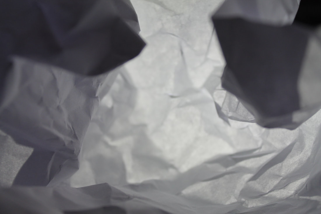
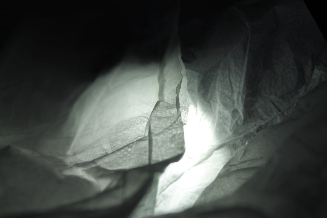
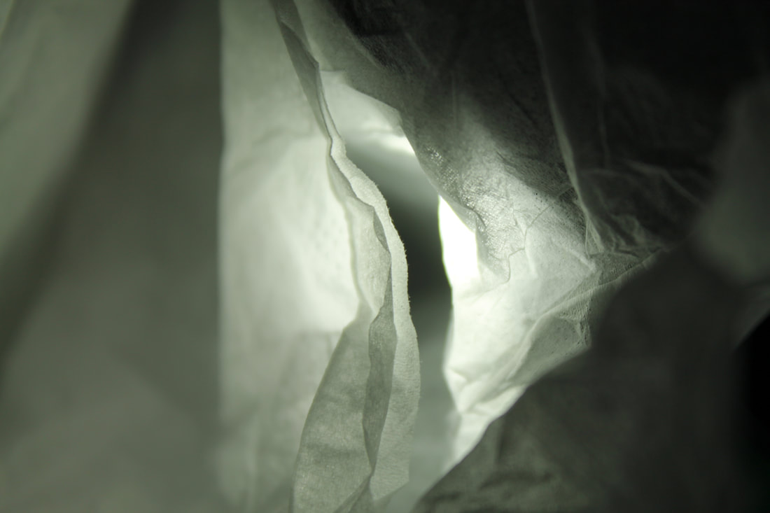
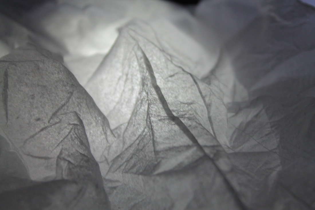
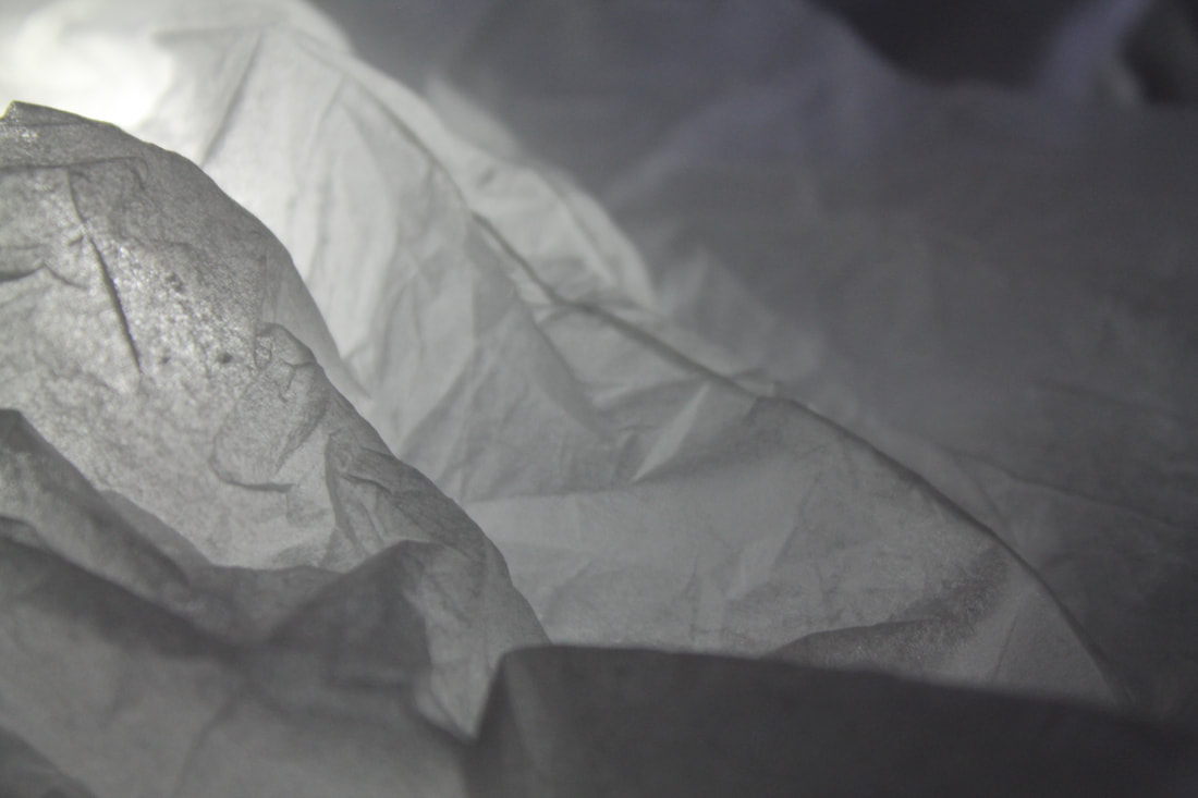
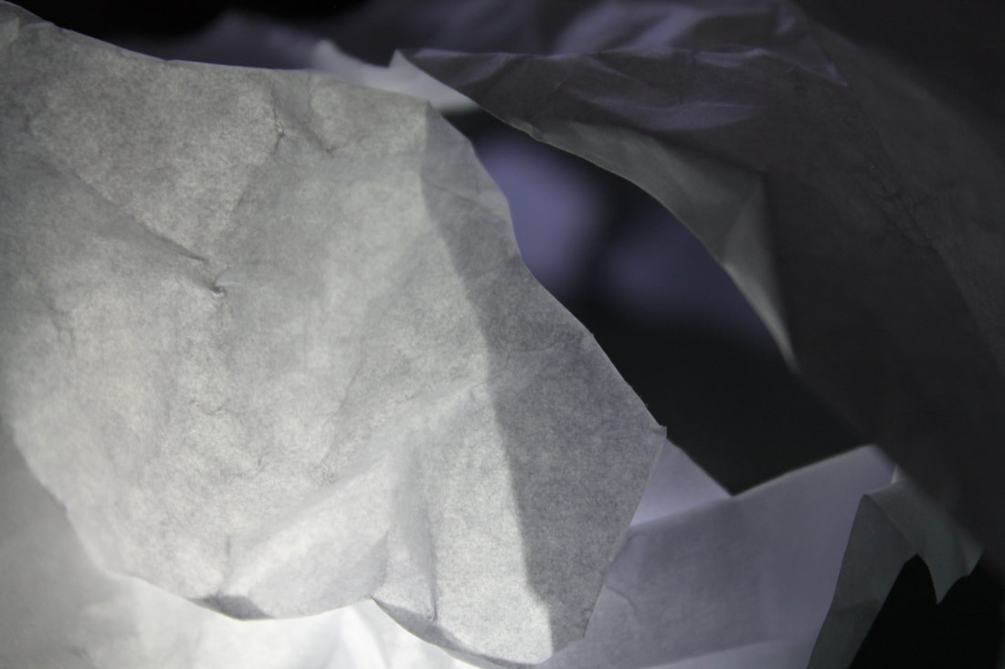
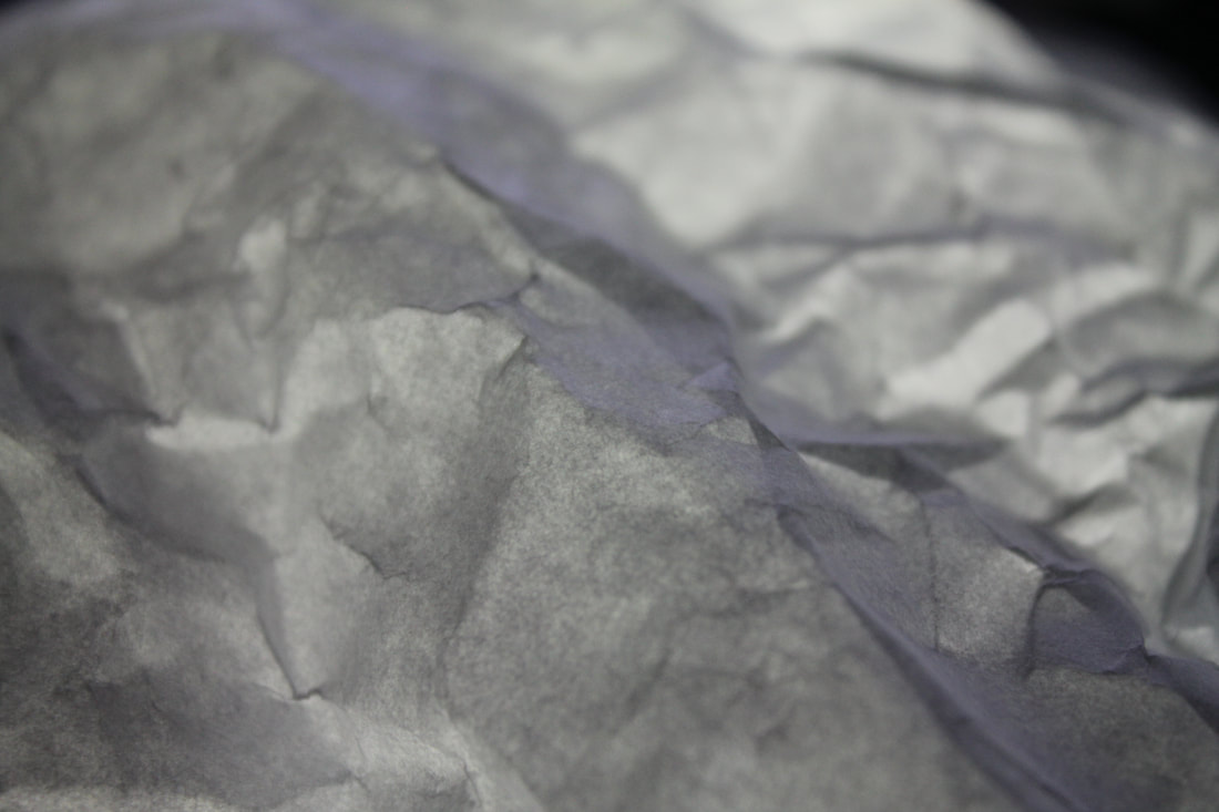
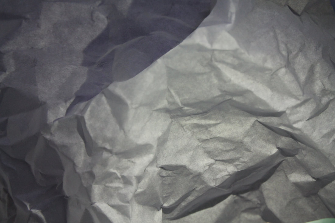
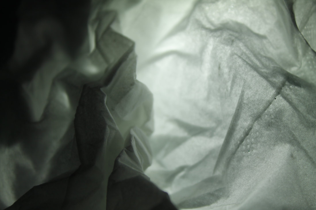
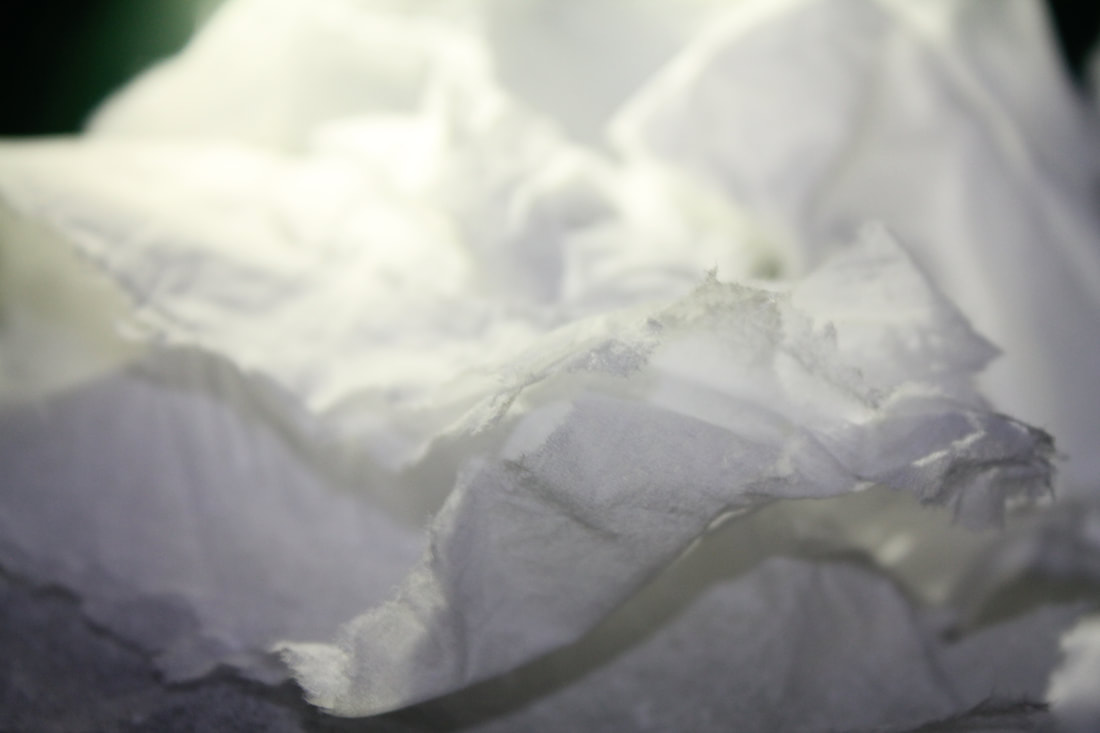
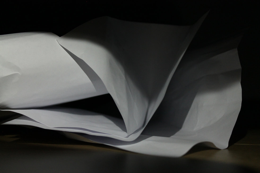
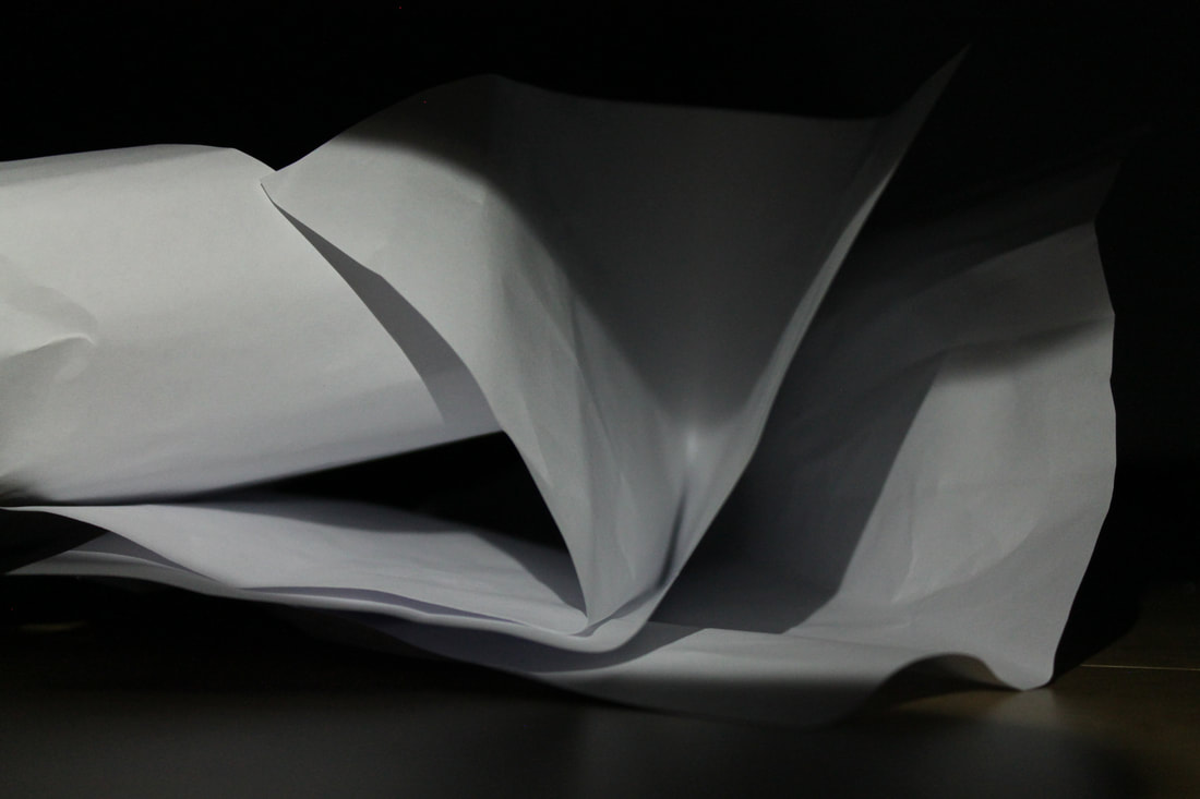
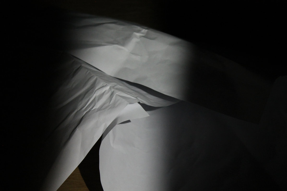
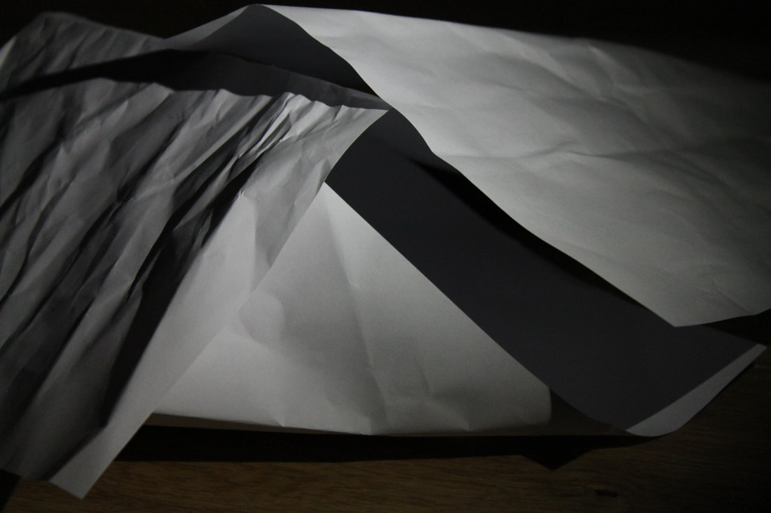
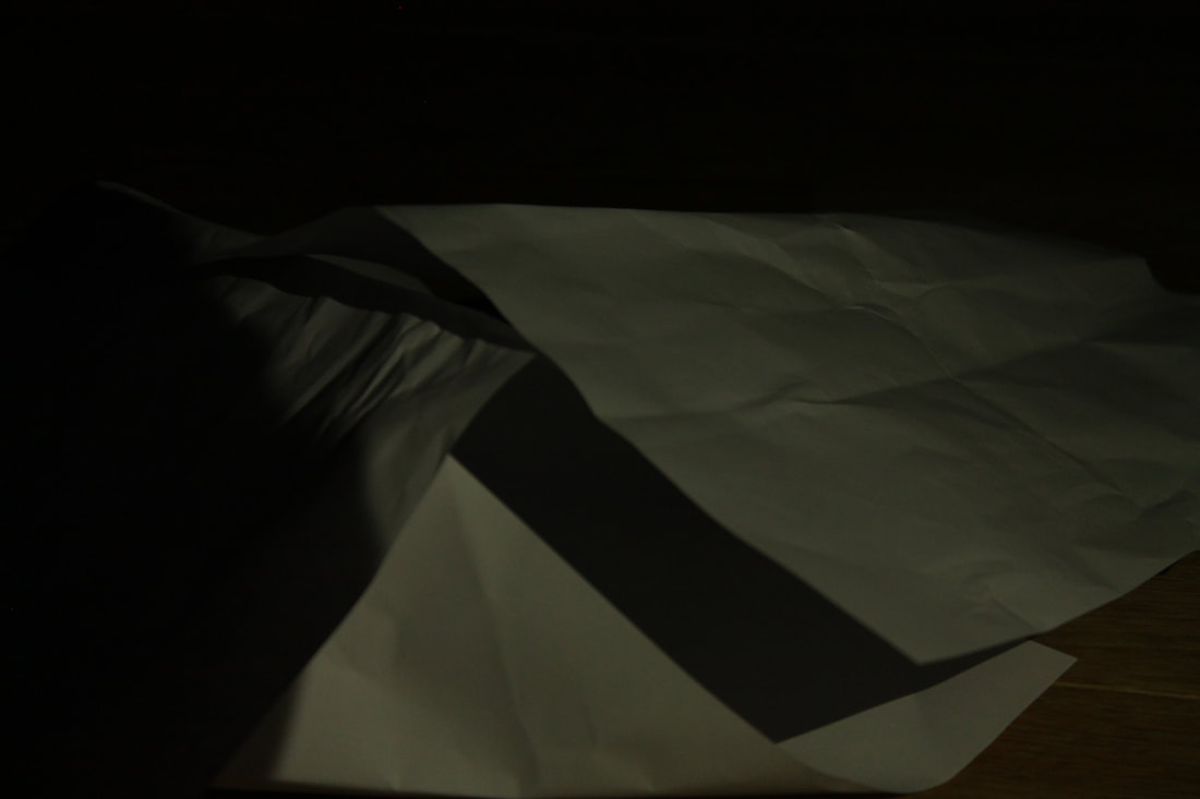
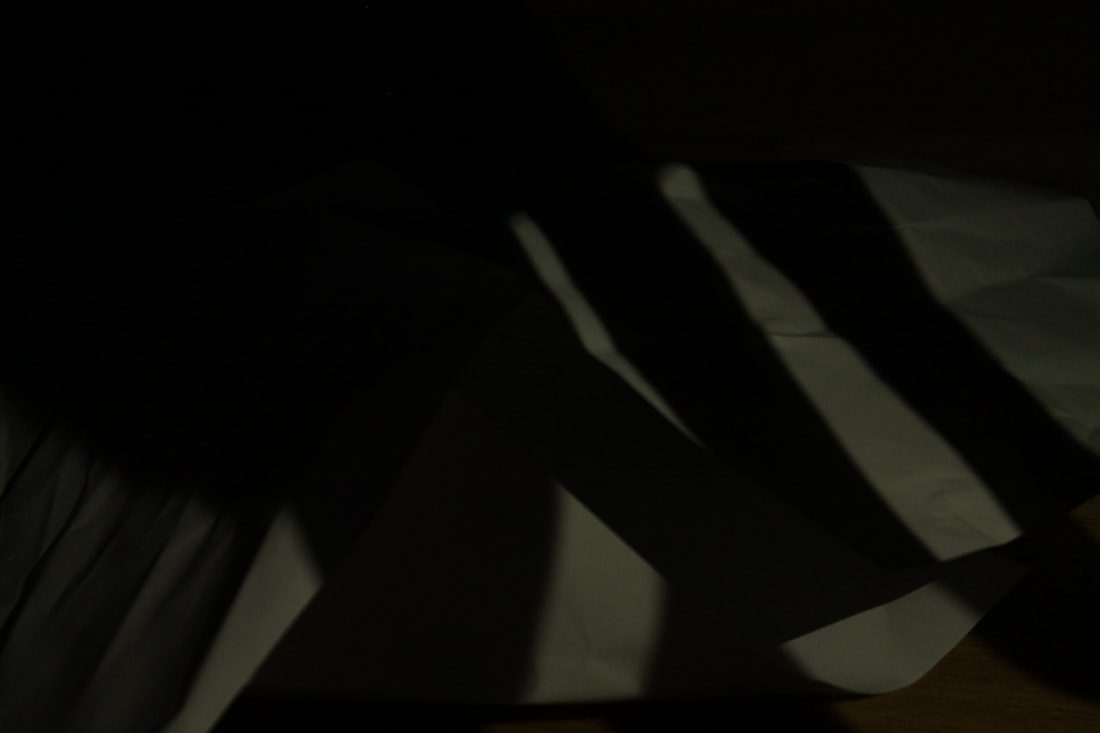
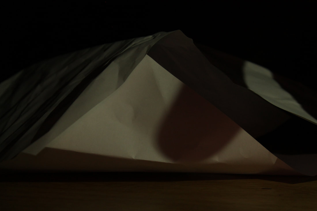
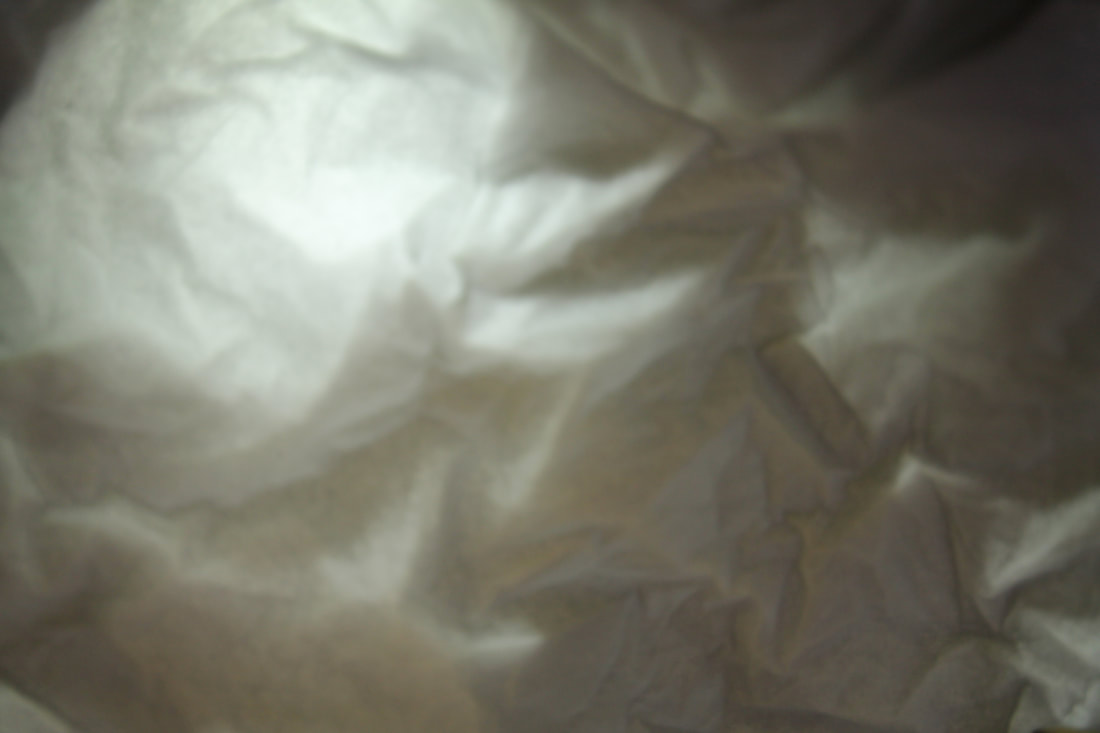
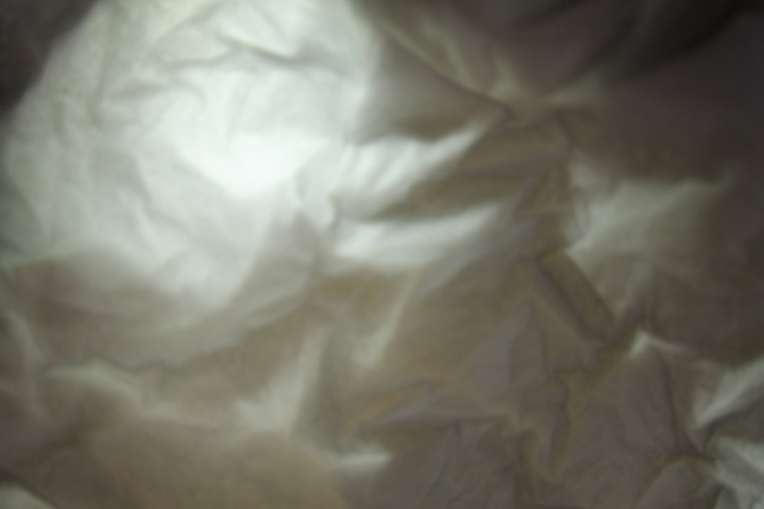
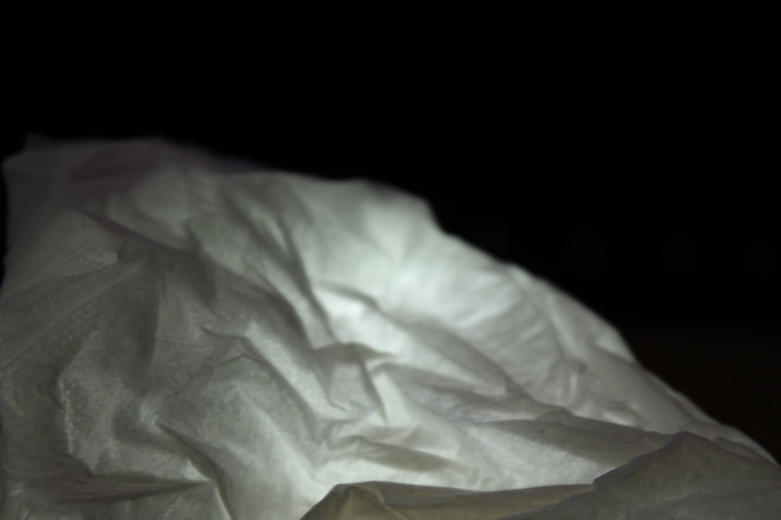
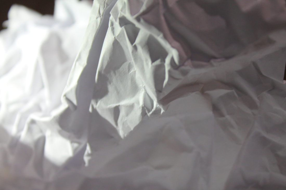
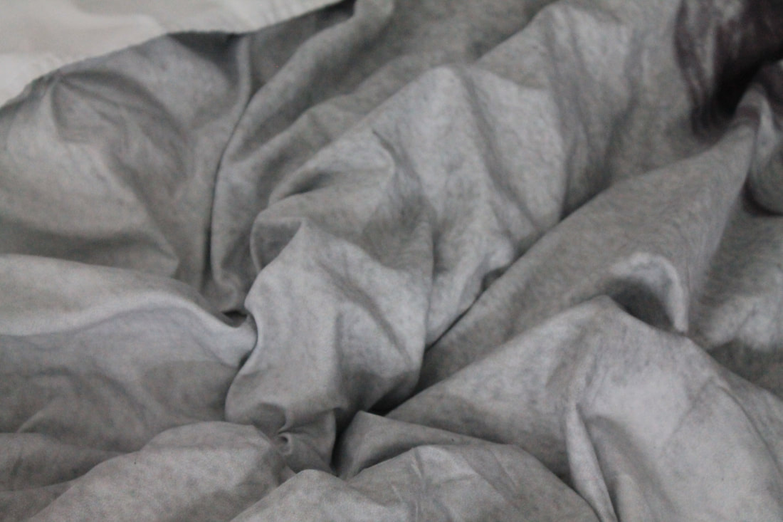
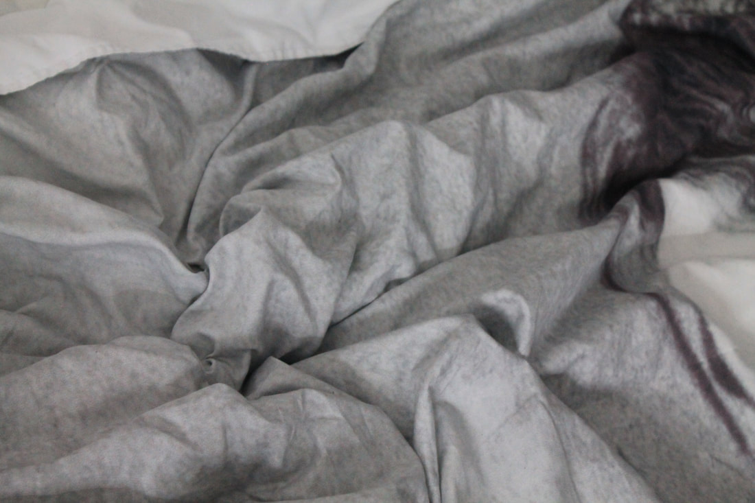
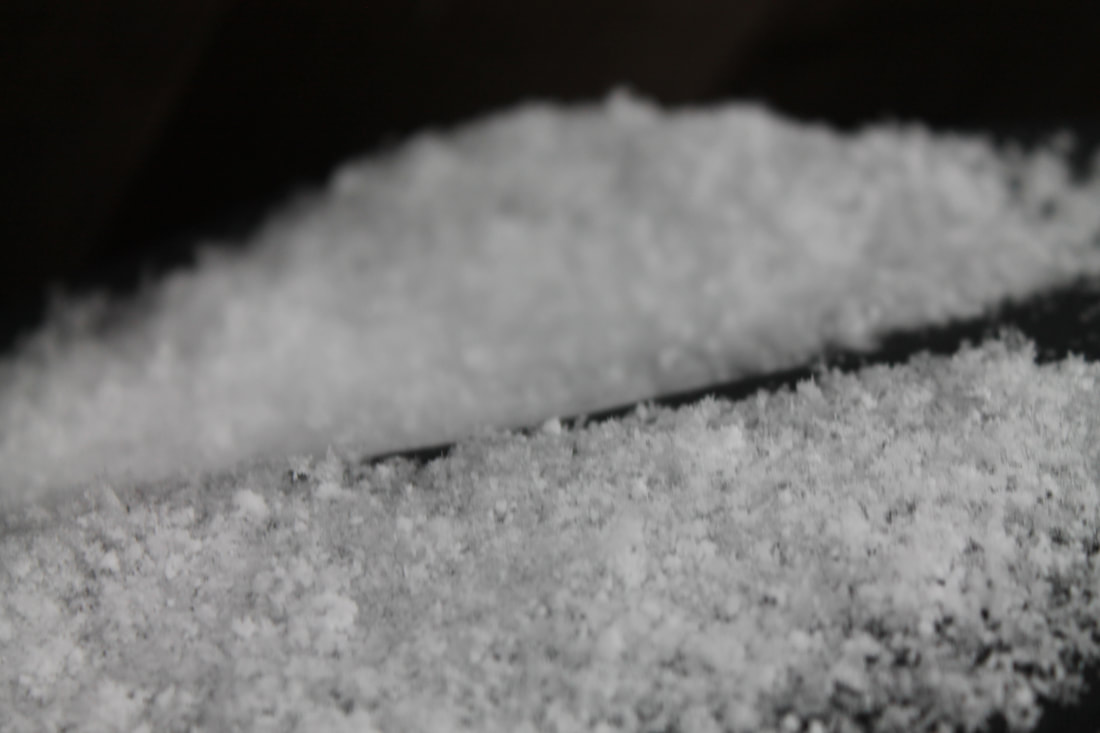
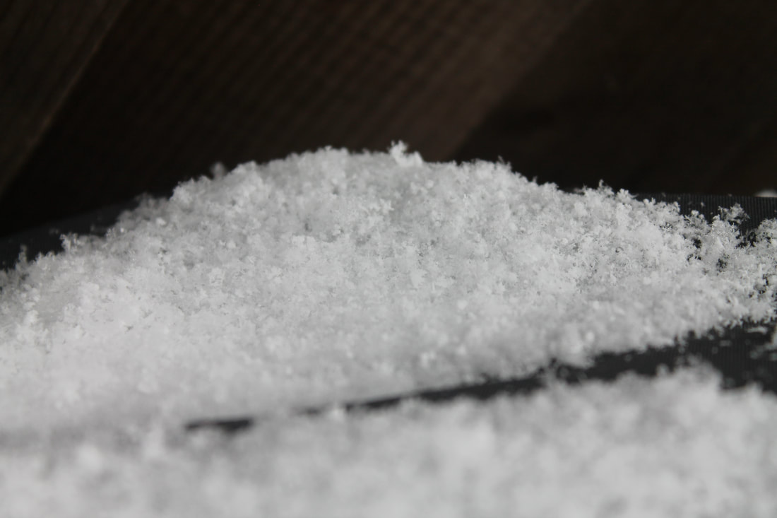
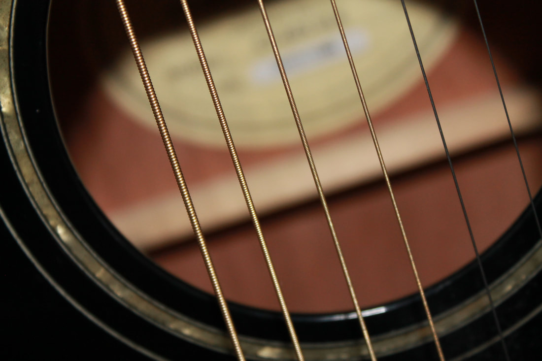
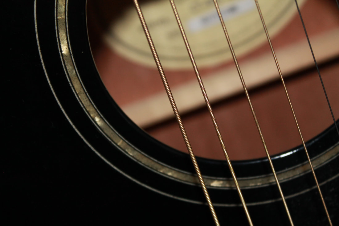
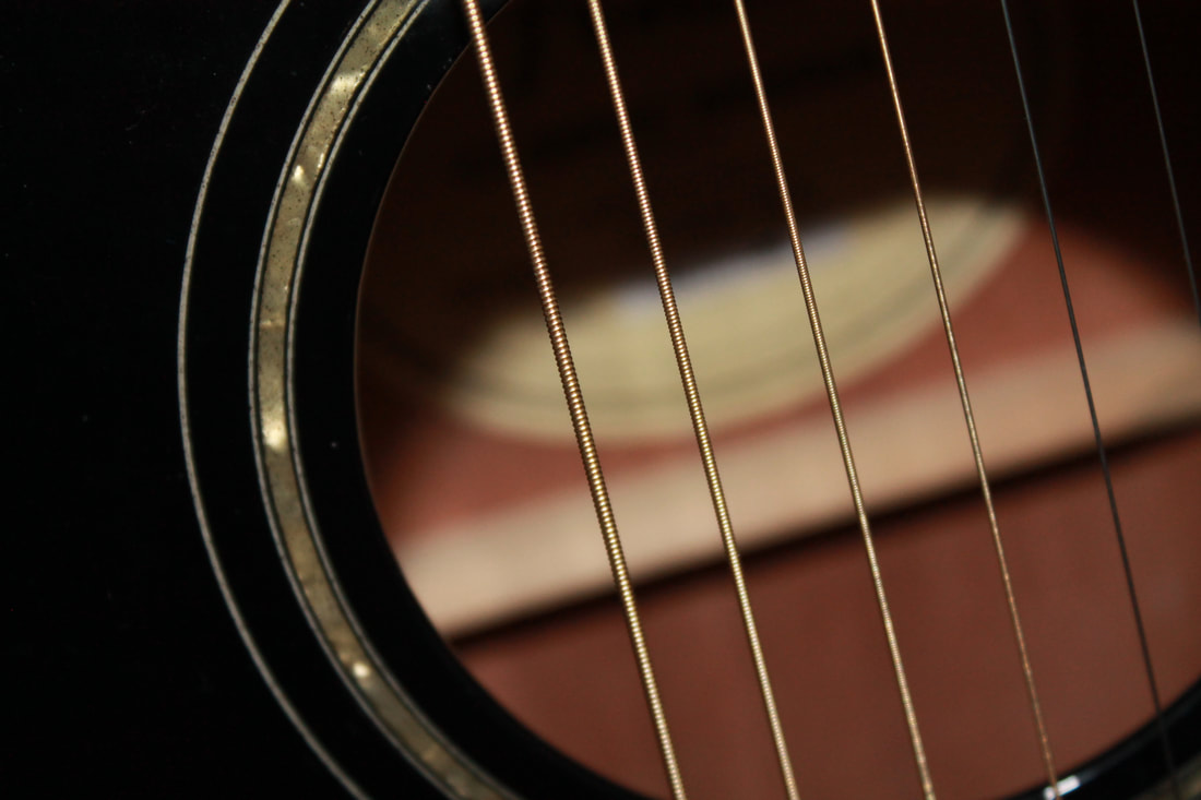
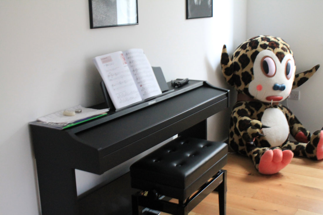
The white paper test
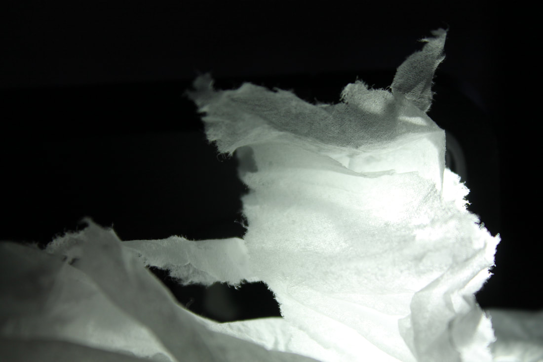
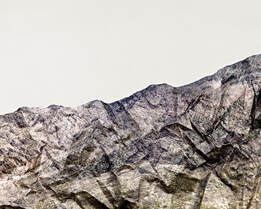
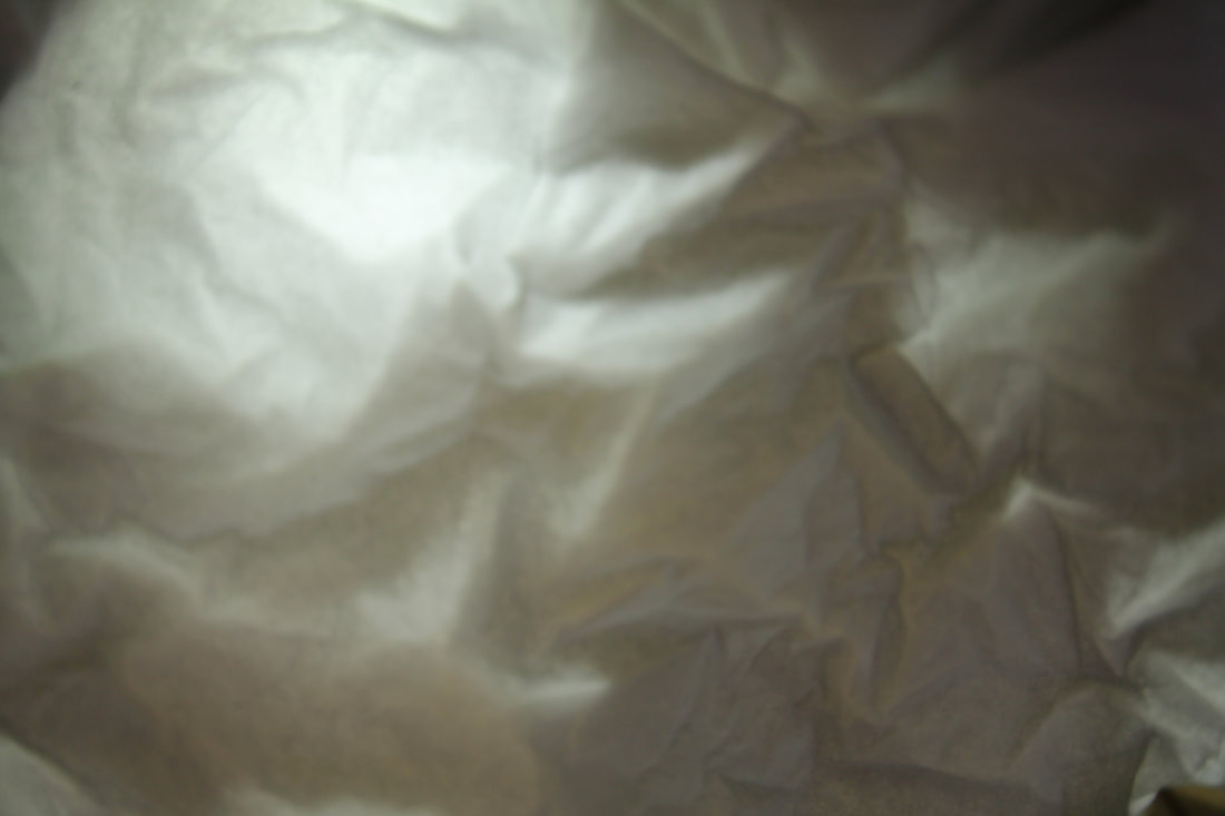
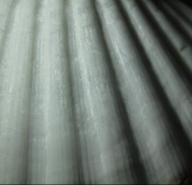
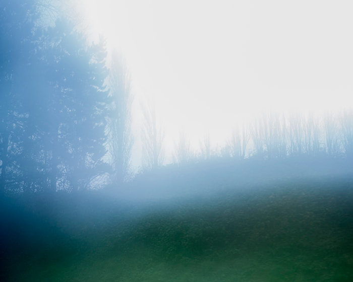
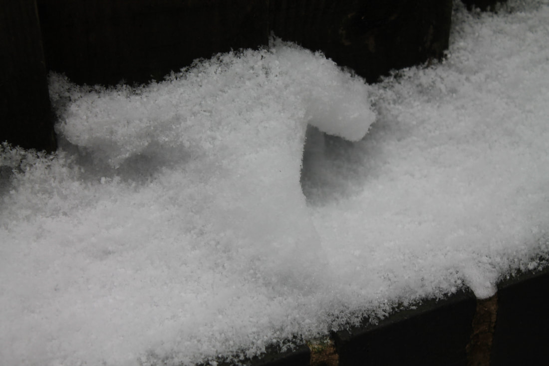
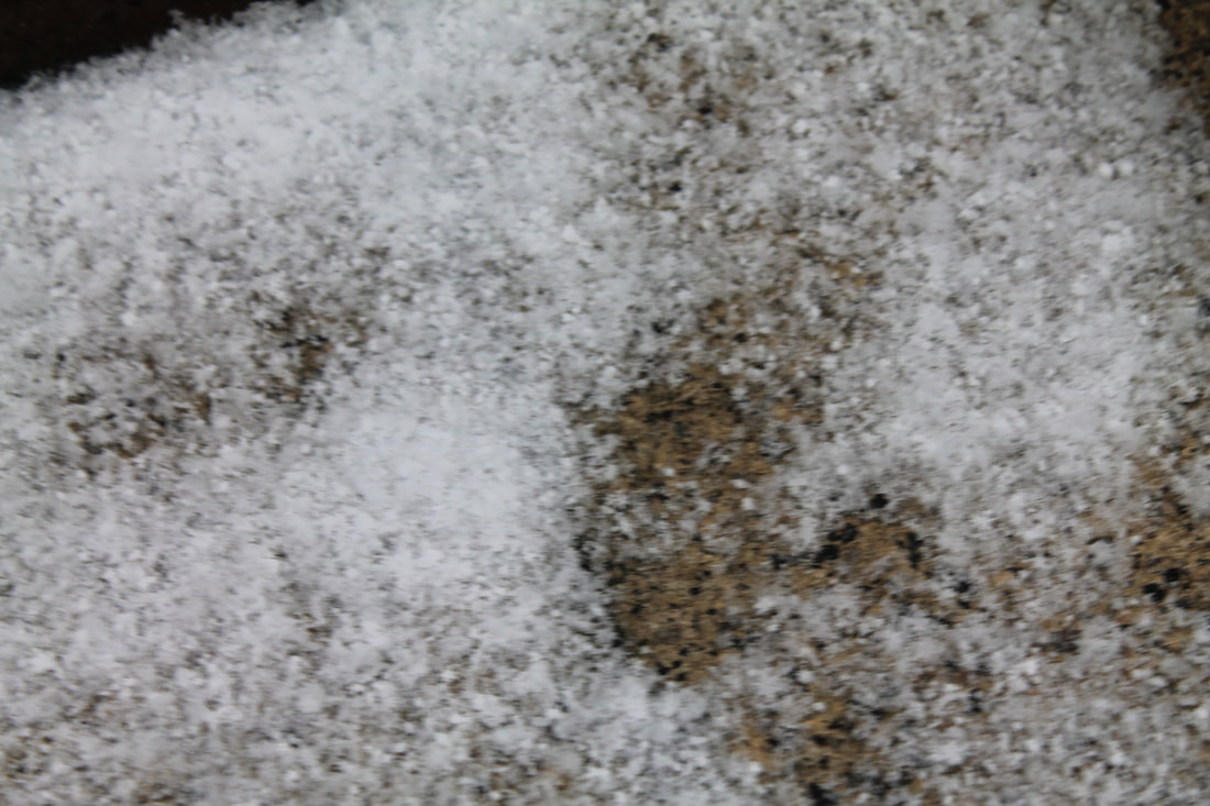
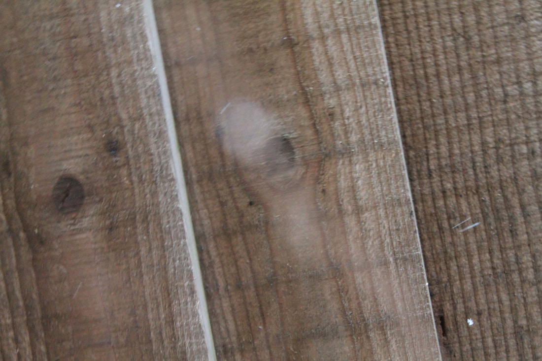
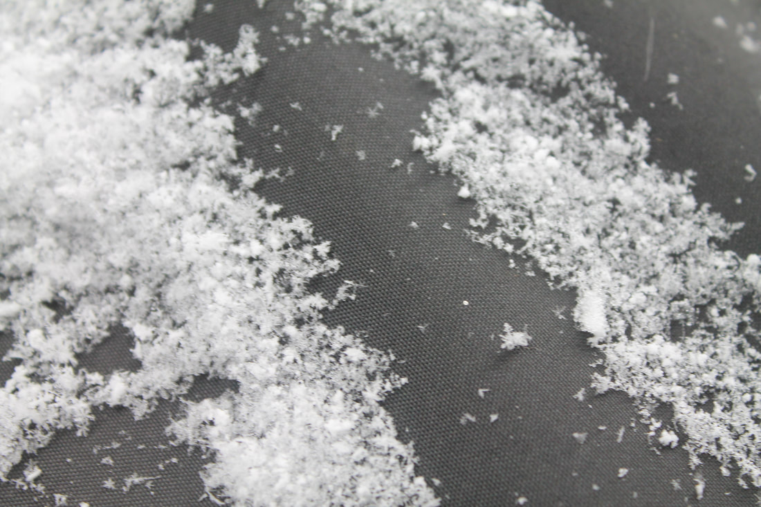
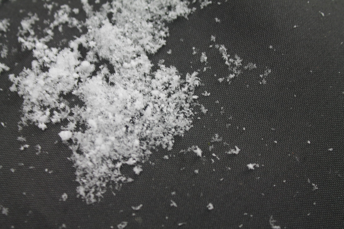
For this task we had to take a series of images of a piece of paper. We had to experiment with the texture of the paper by folding and screwing it up. I also adjusted the light and angles each image to get the desired effect. For my photographs I wanted to give the illusion of mountains and clouds I captured a good sense of light that brought out the effect even more.. Then to edit I added a coloured filters over the top and adjusted the contrast to bring the out the image even more.
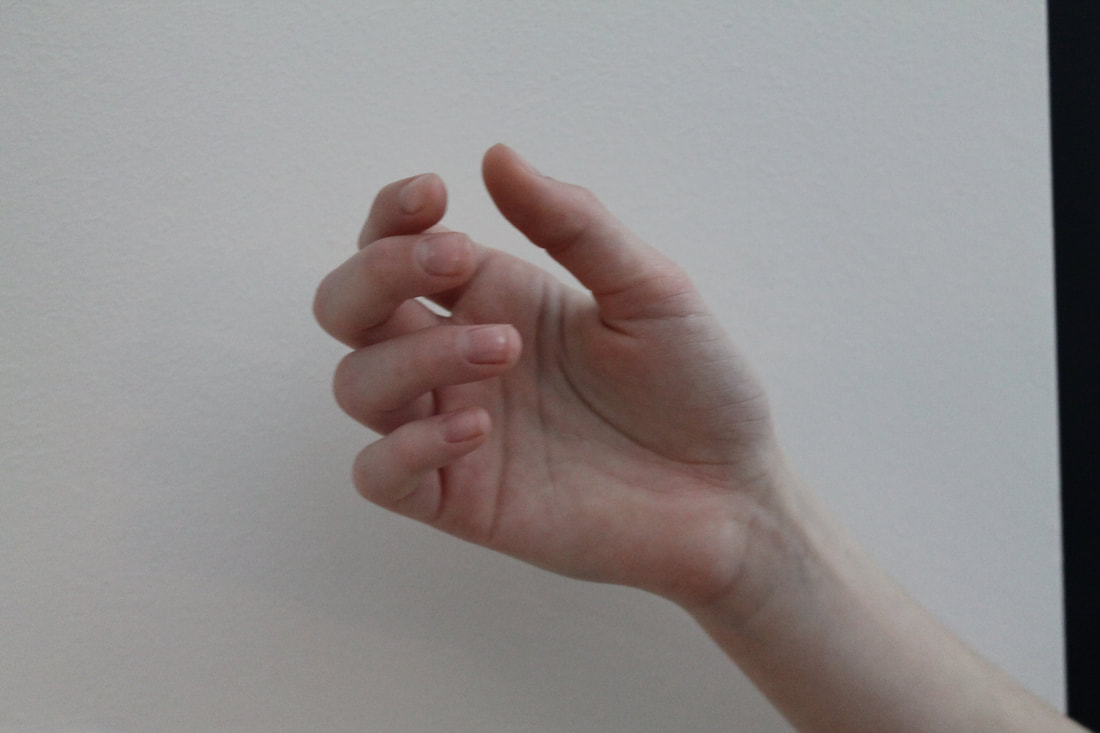
Abstract structure
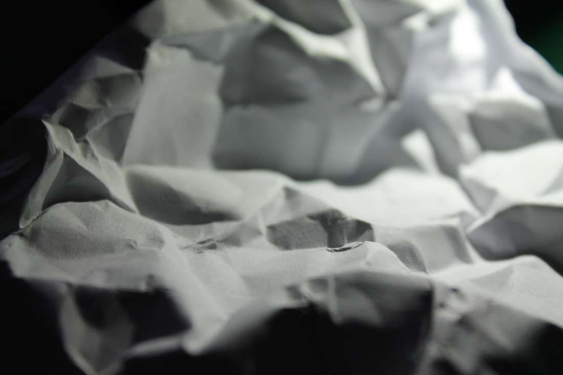
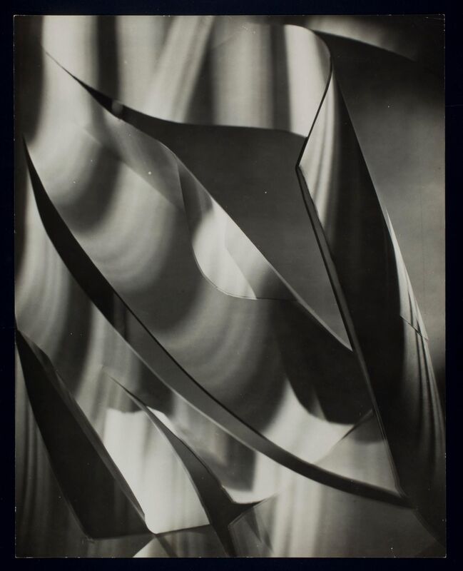
Francis Bruguiere
|
|
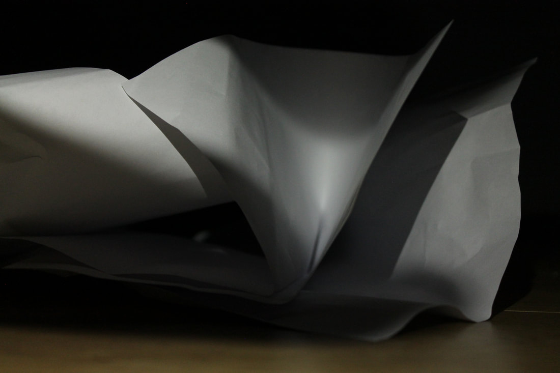
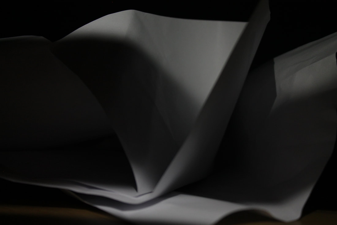
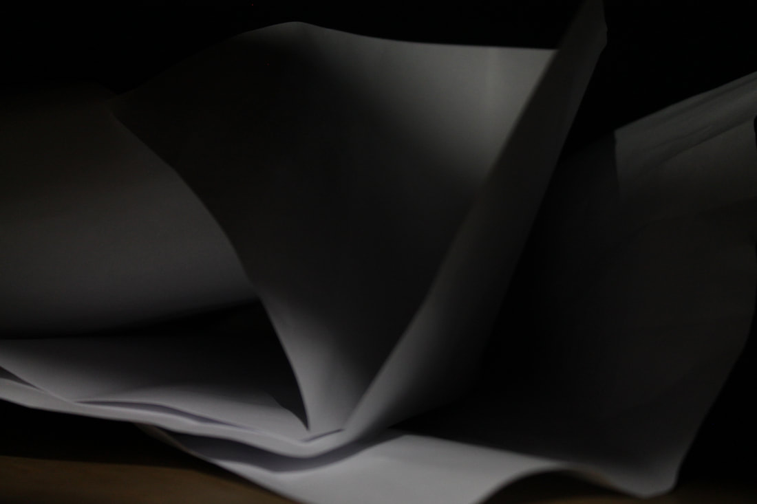
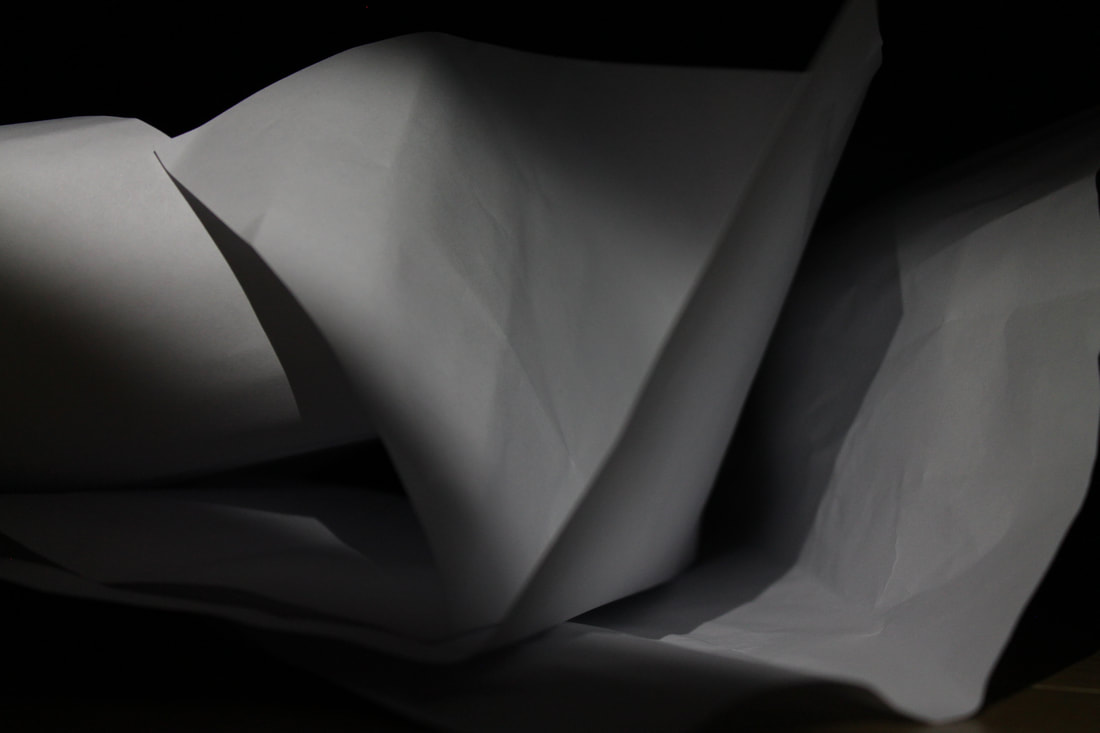
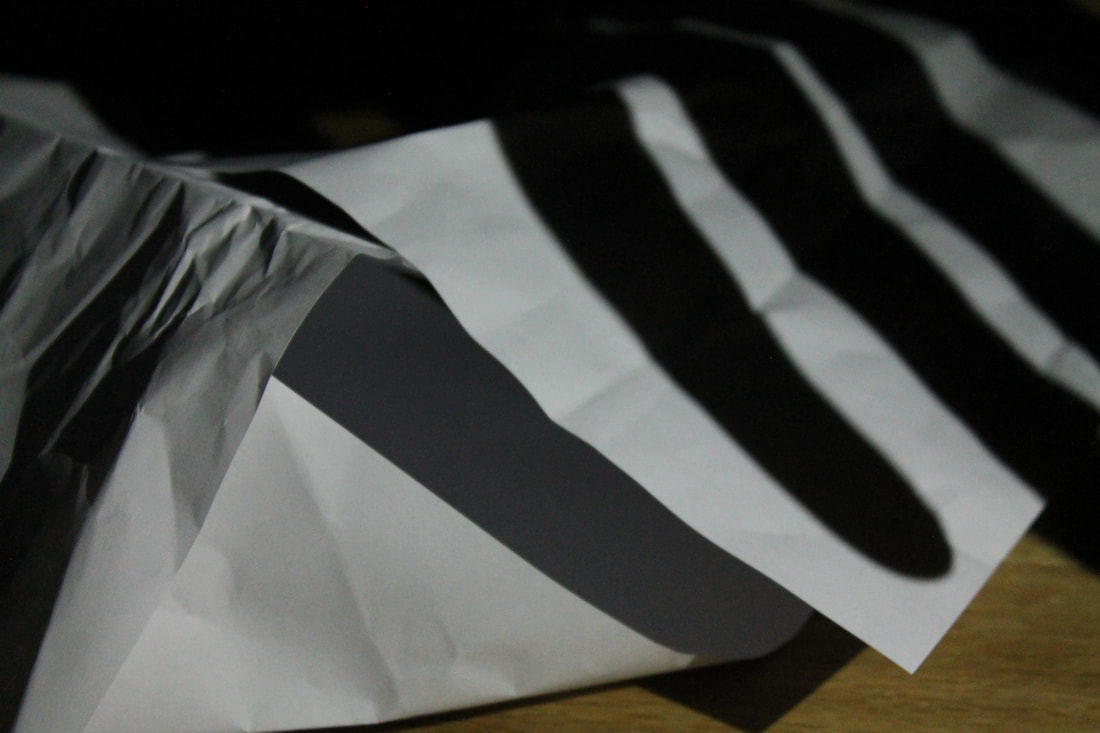
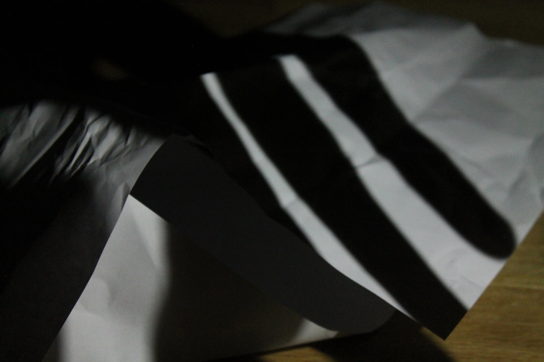
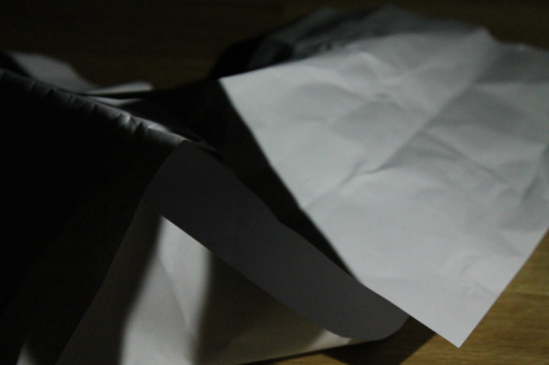
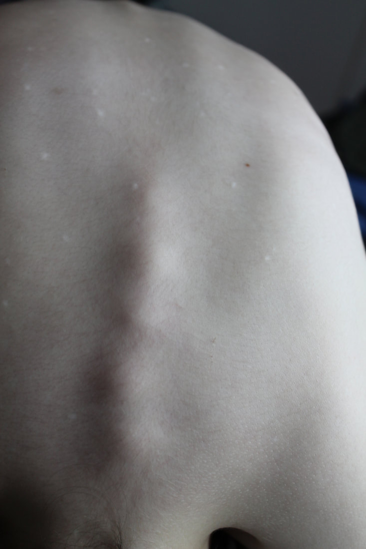
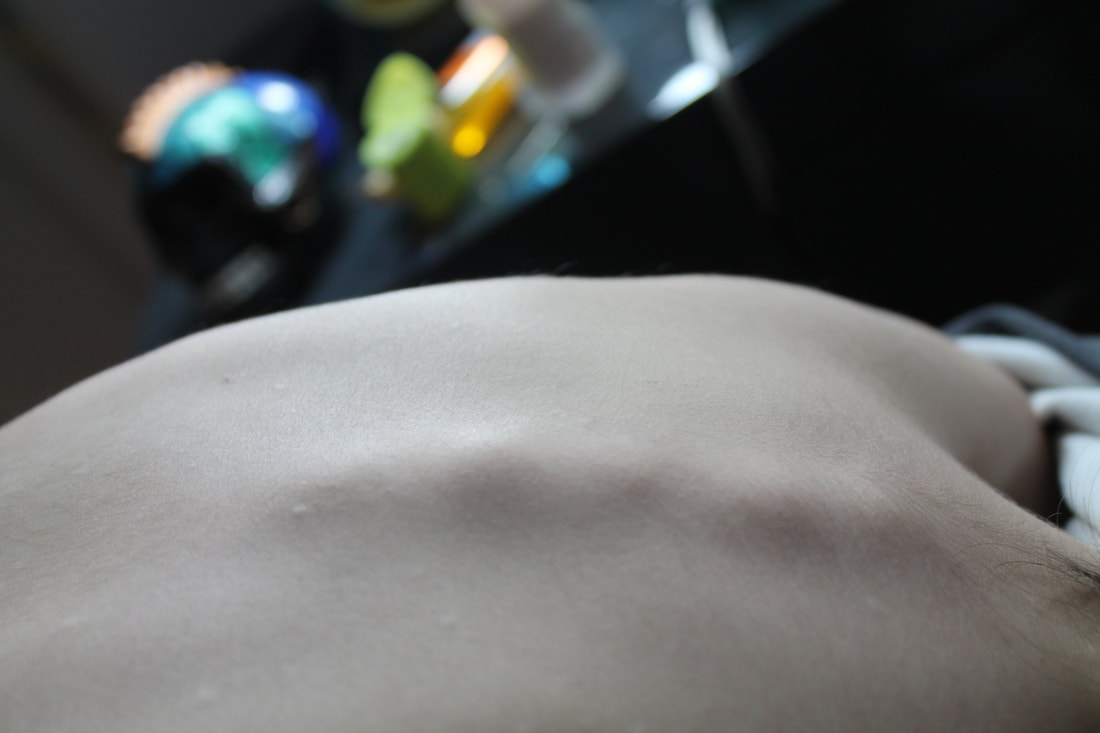
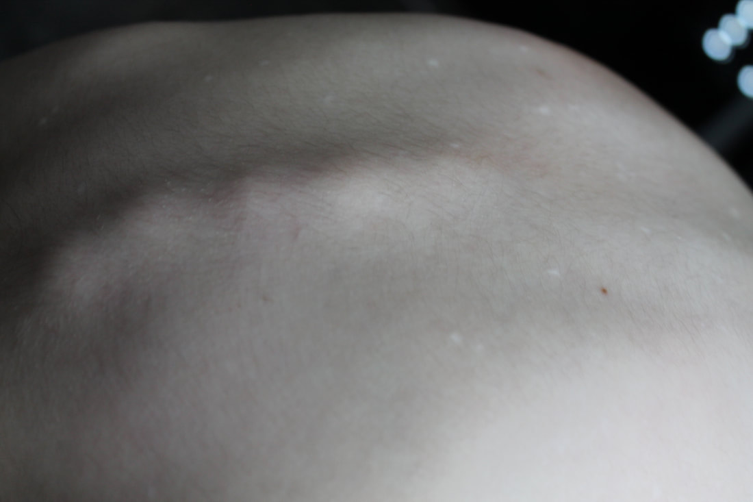
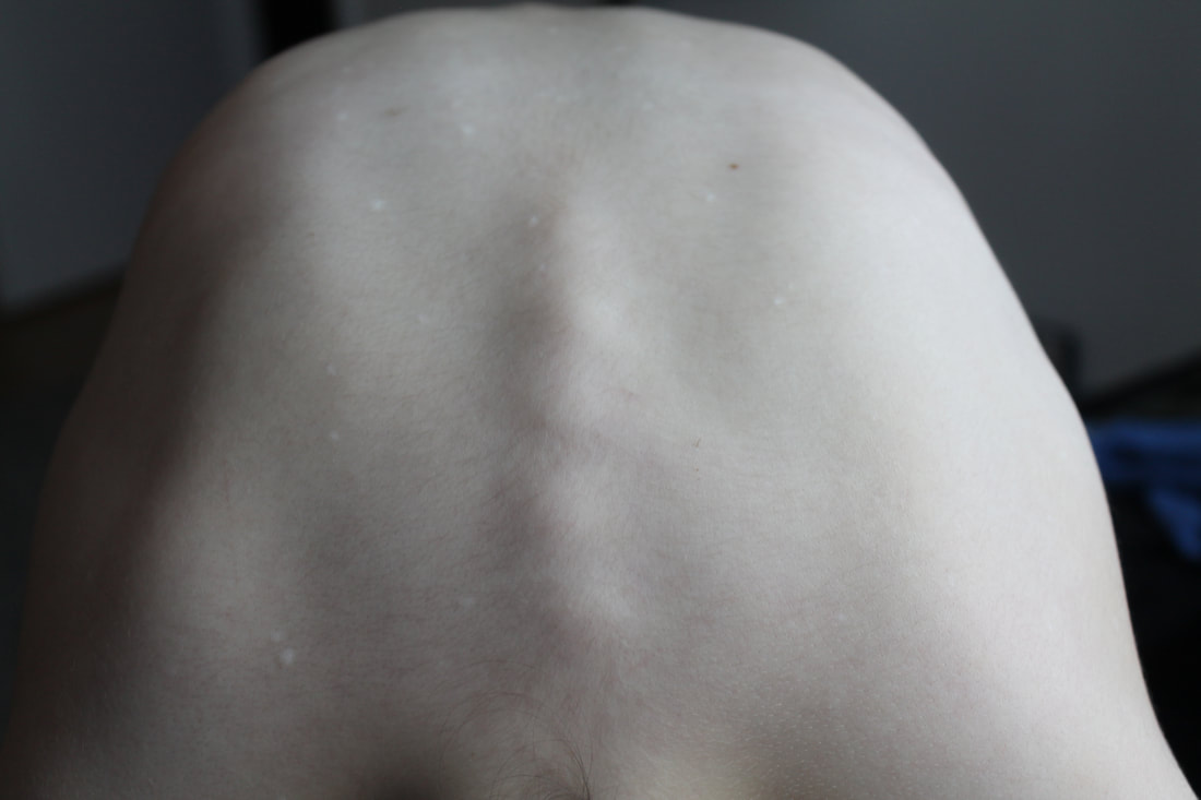
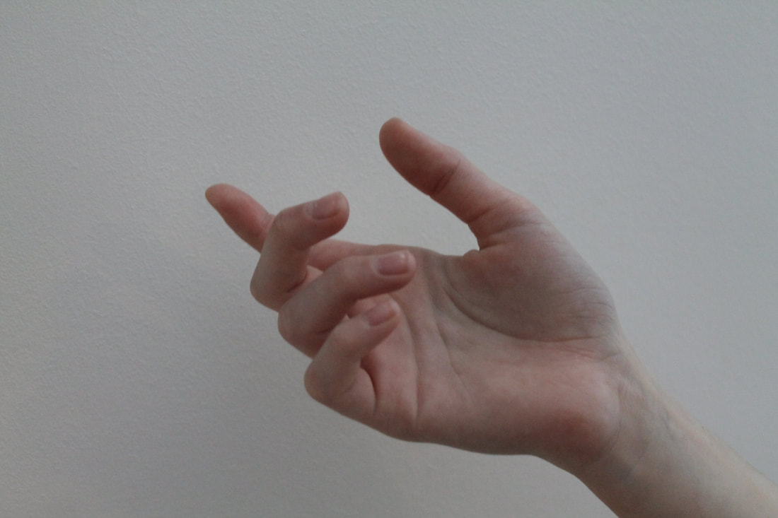
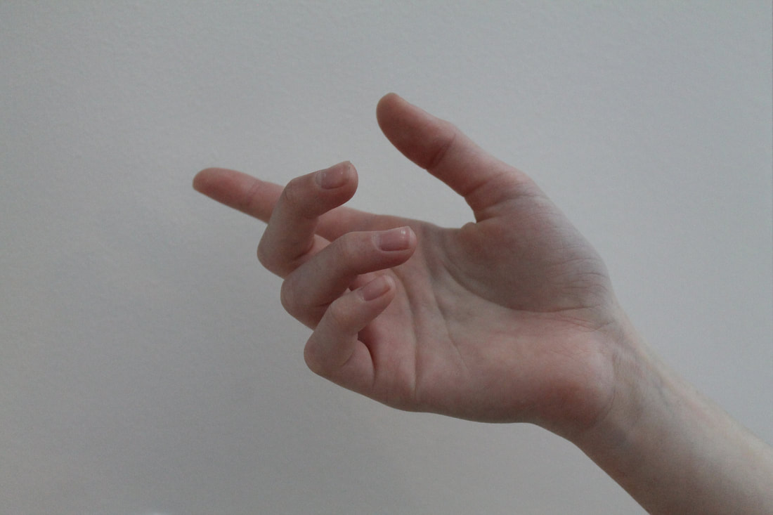
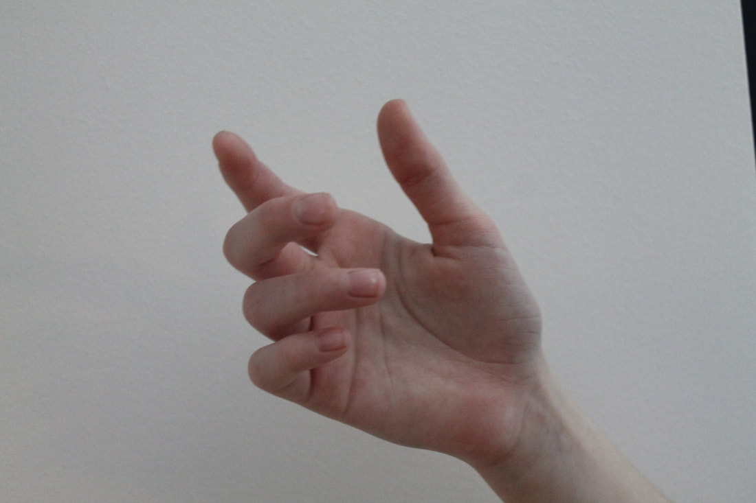
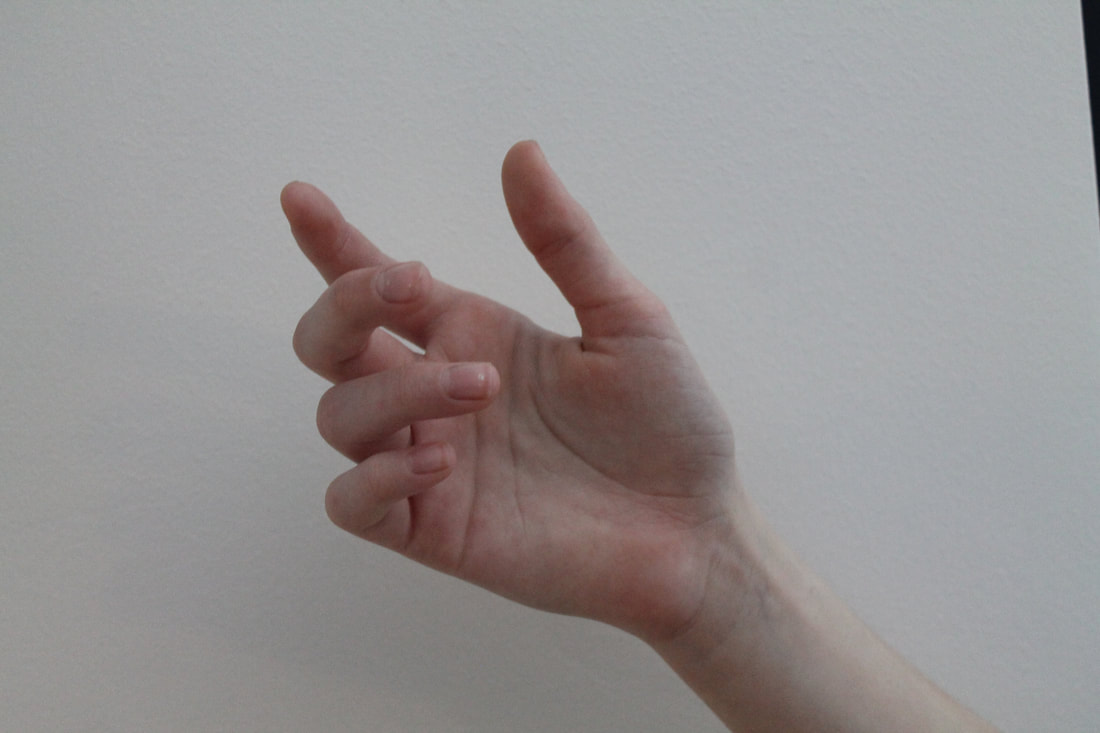
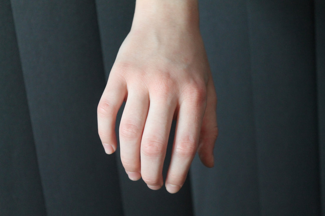
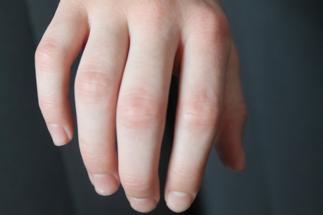
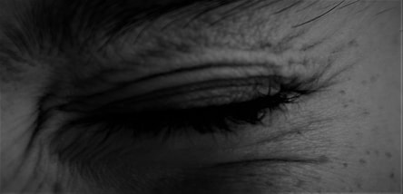
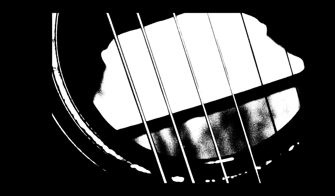
Francis Bruguière was born in san Francisco on October 15 1879. Throughout his life, Bruguière experimented with multiple-exposure, solarisation , original processes, abstracts, photograms, and the response of commercially available film to light of various wavelengths. I used Francis Bruguière as my inspiration. For this task i folded a few pieces of paper to get an abstract shape then place a flash light and took multiple images while placing my fingers in front of the light creating shadows upon the paper. Then to edit i placed a black and white filter over the top and adjusted the contrast where needed.
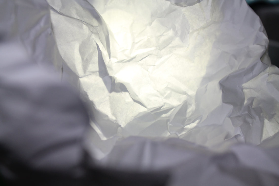
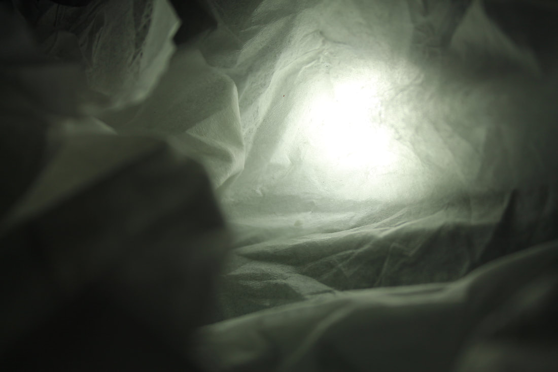
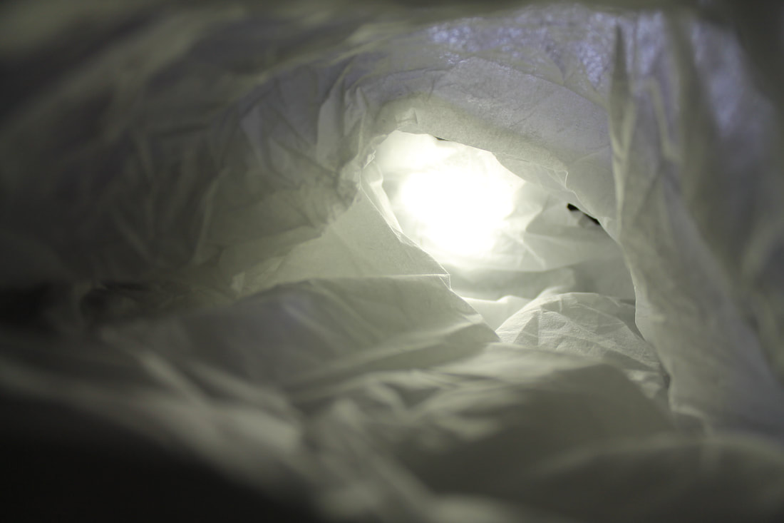
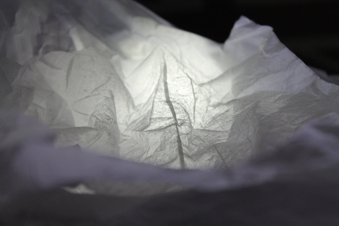
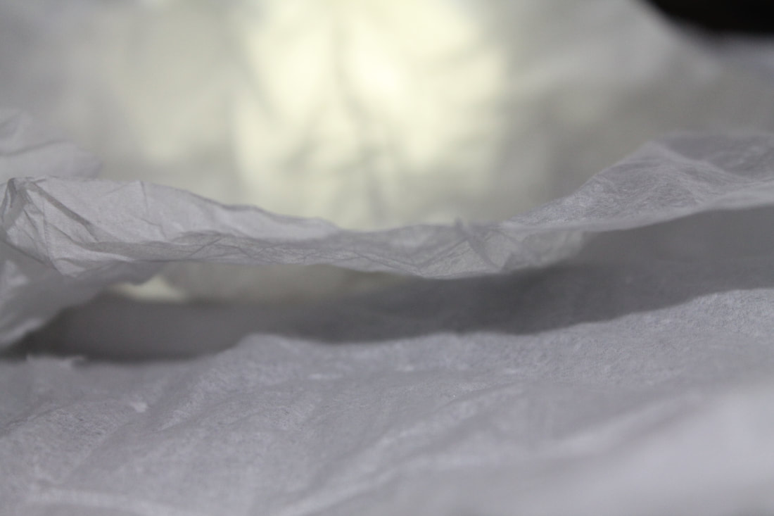
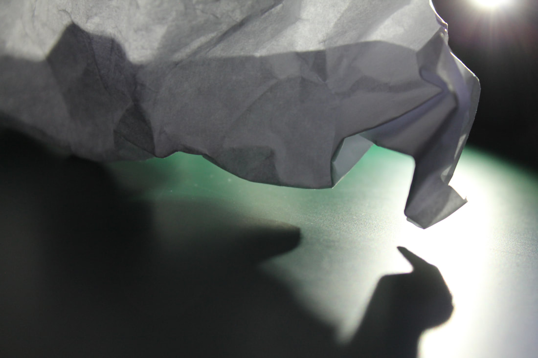
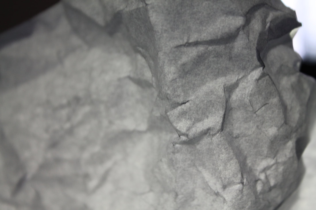
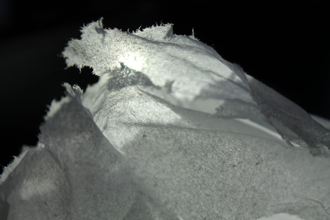
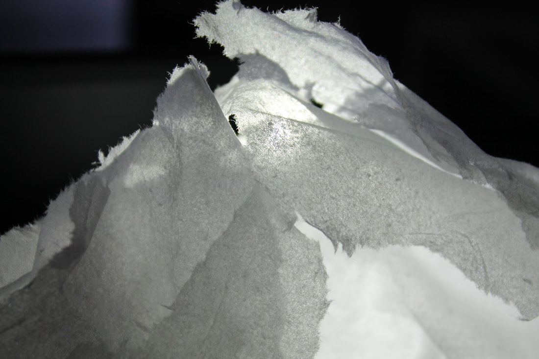
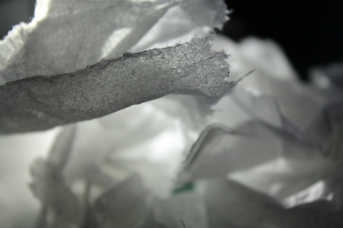
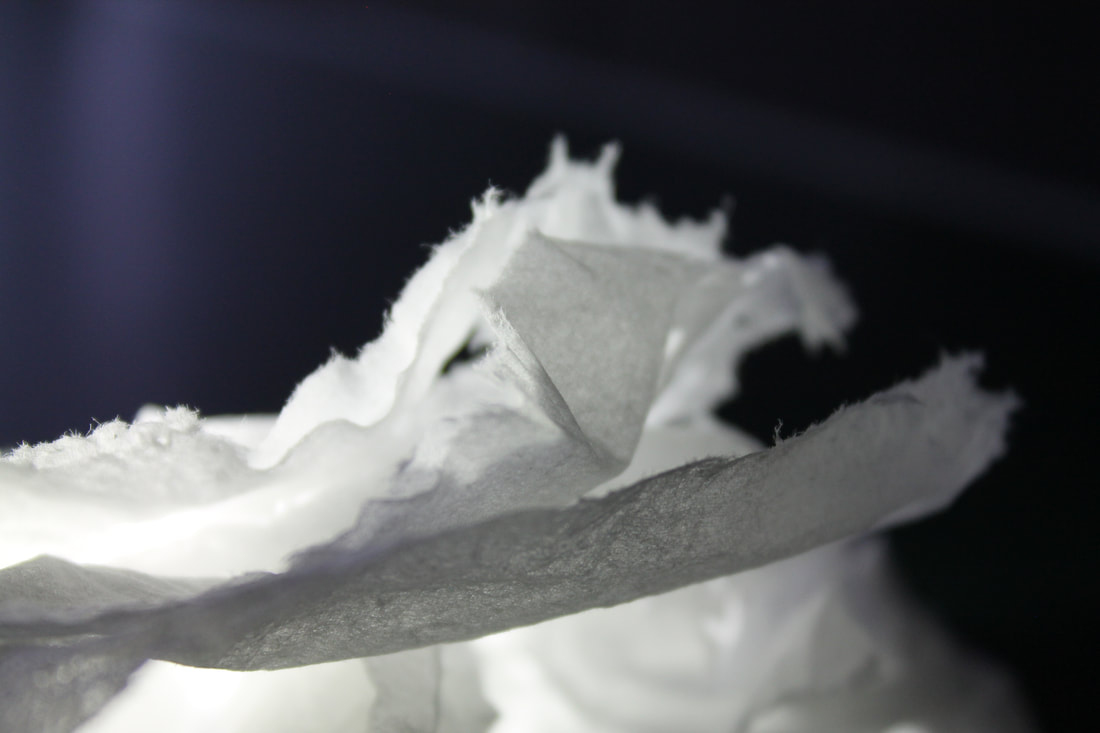
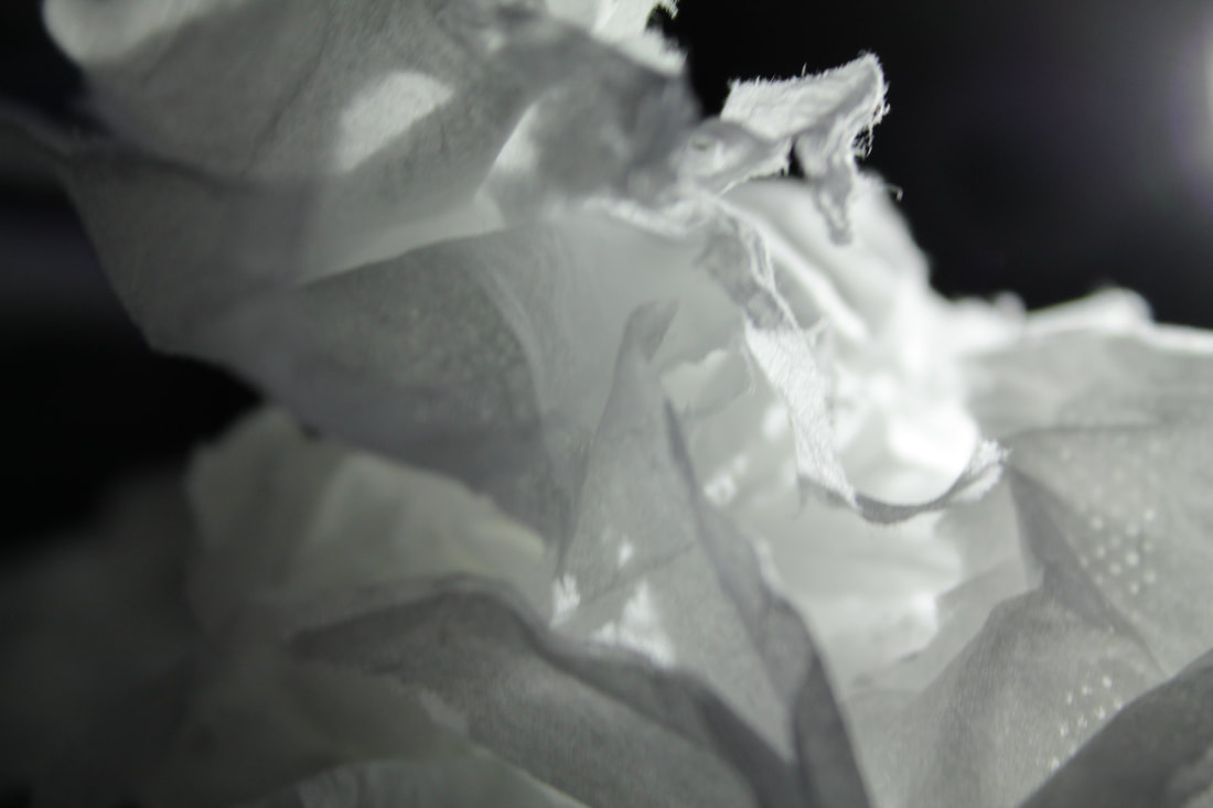
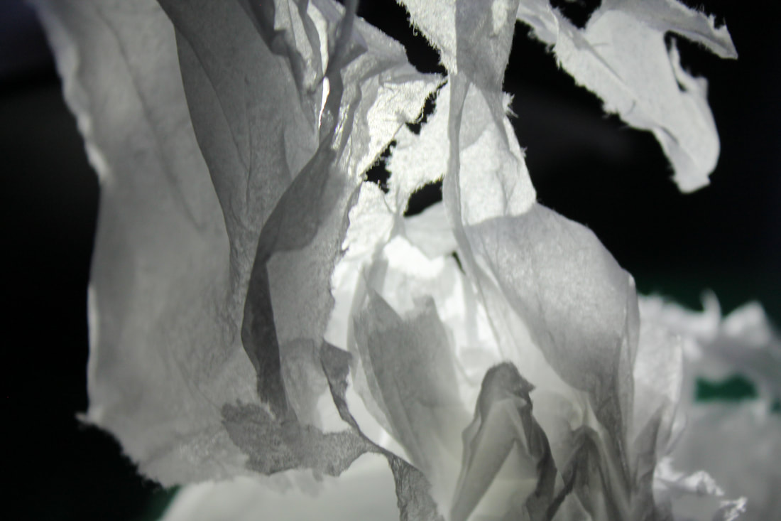
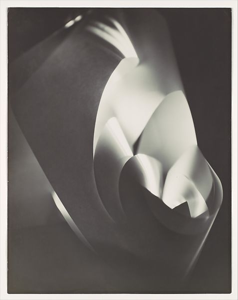
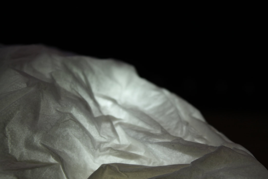
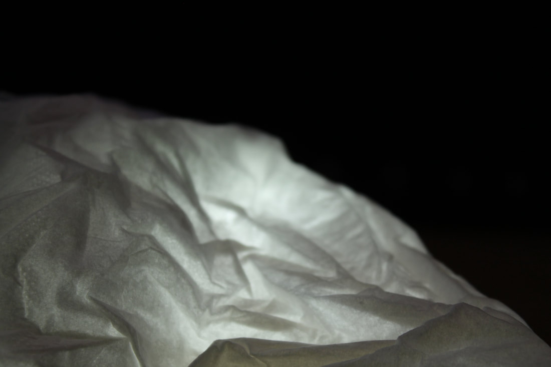
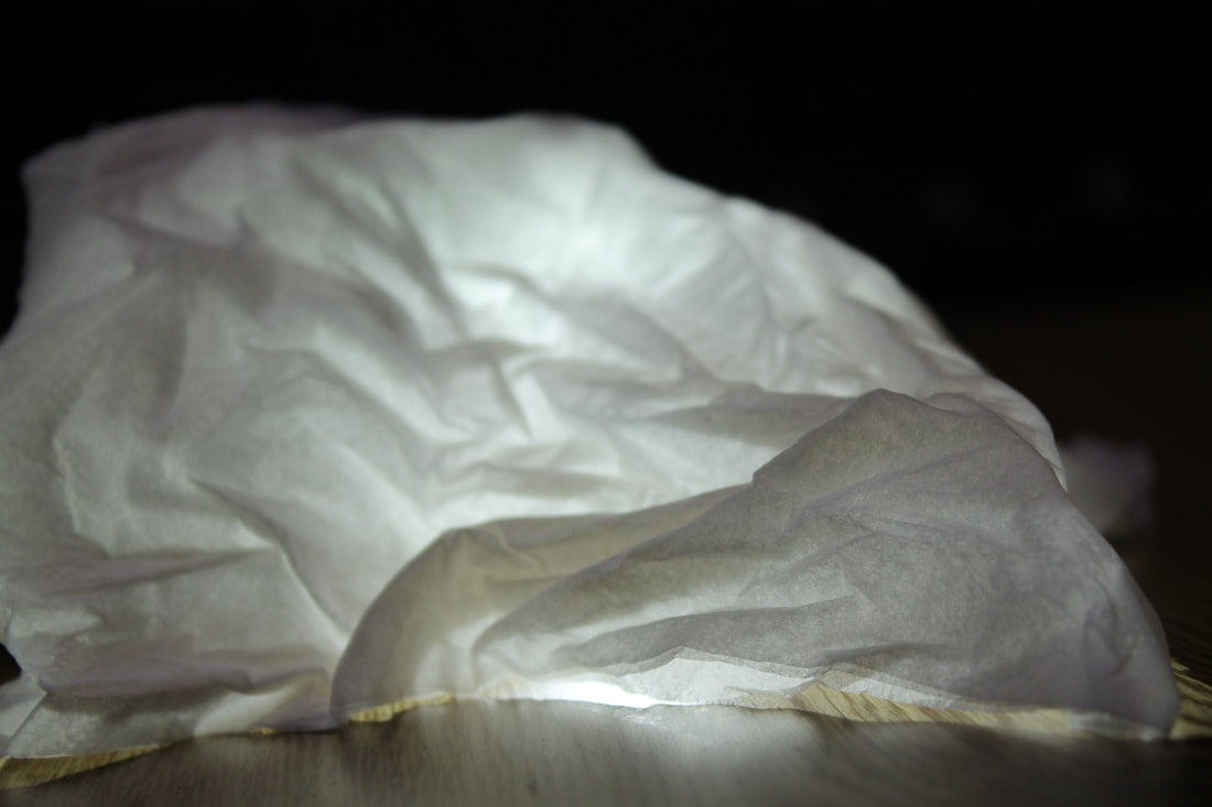
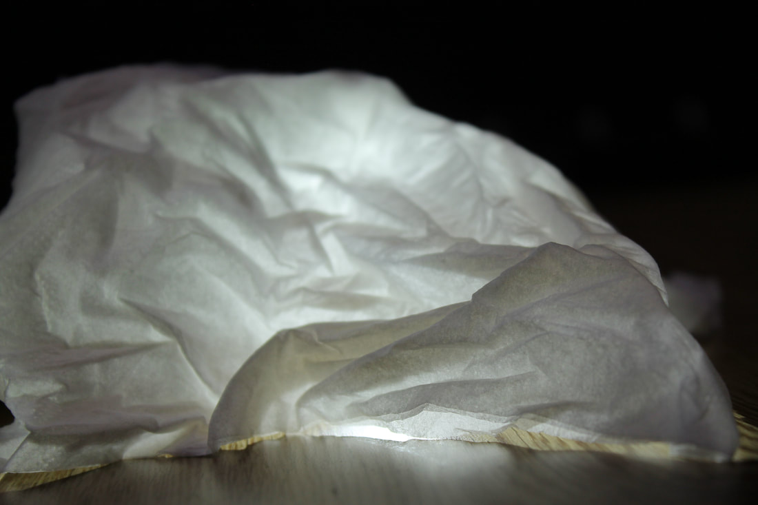
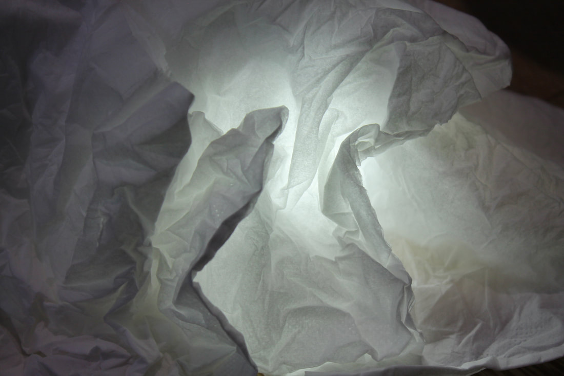
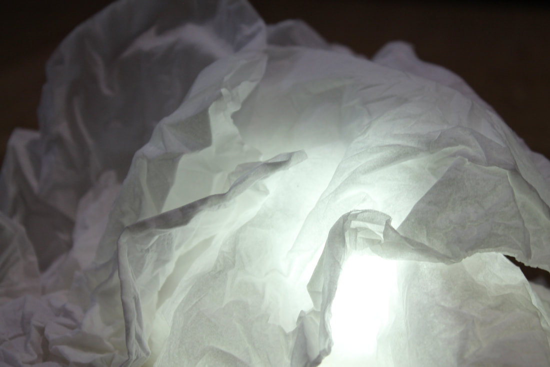
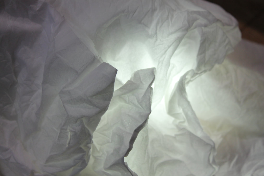
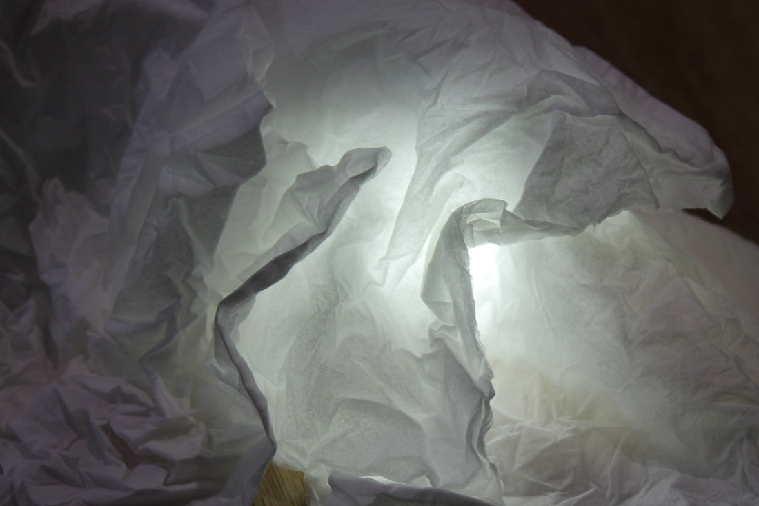
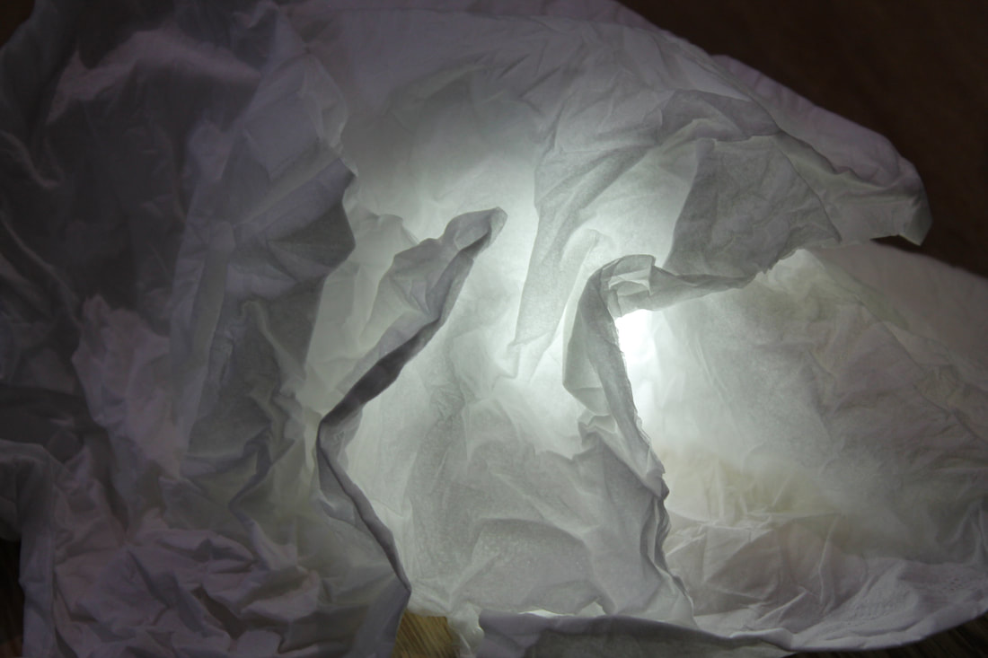
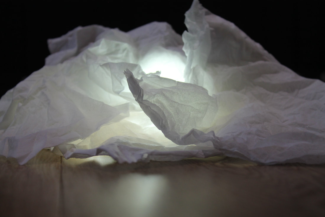
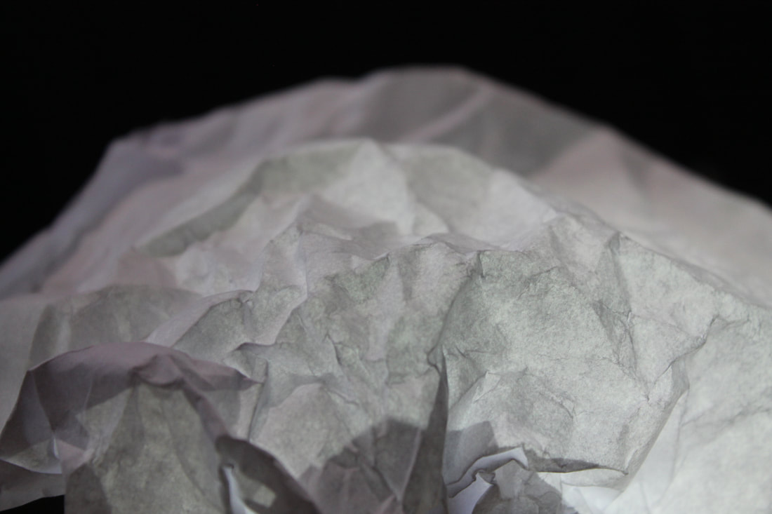
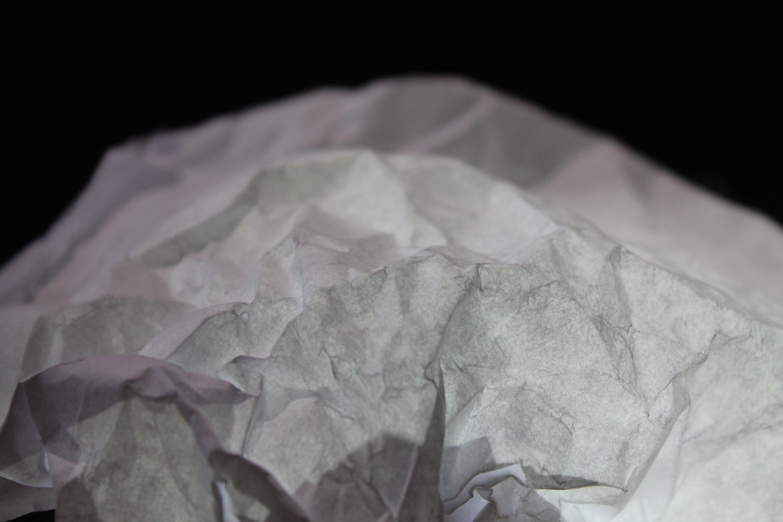
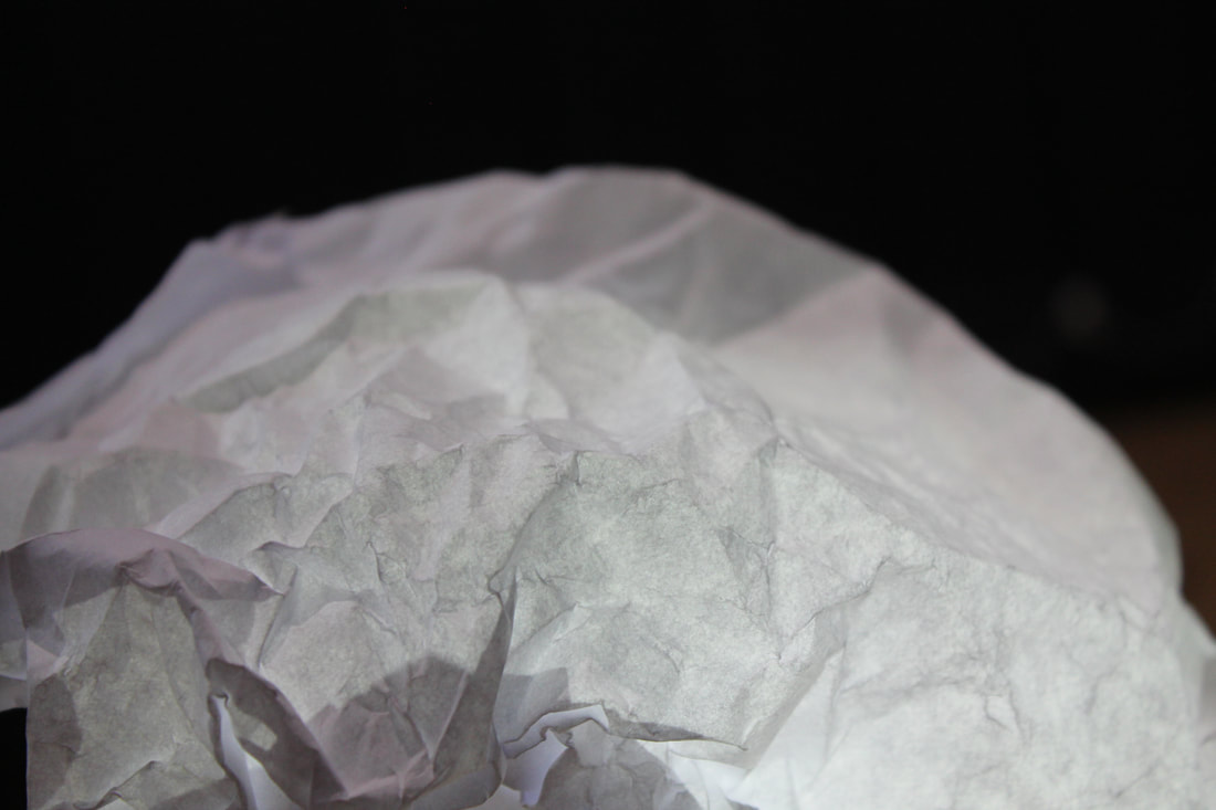
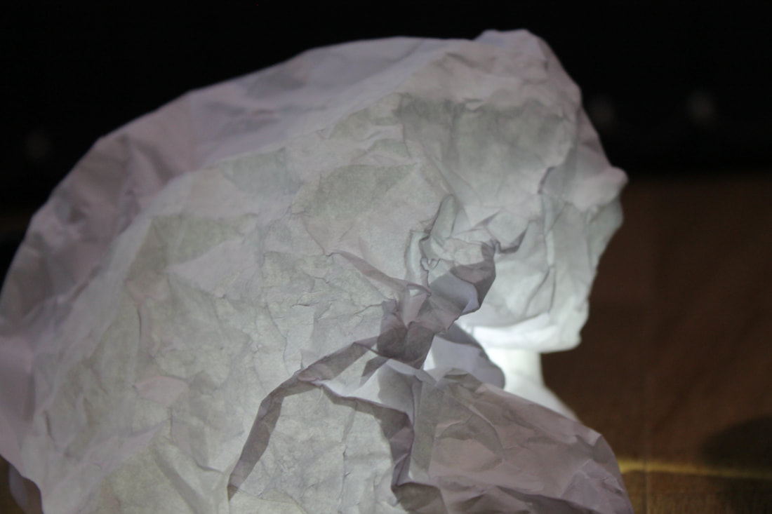
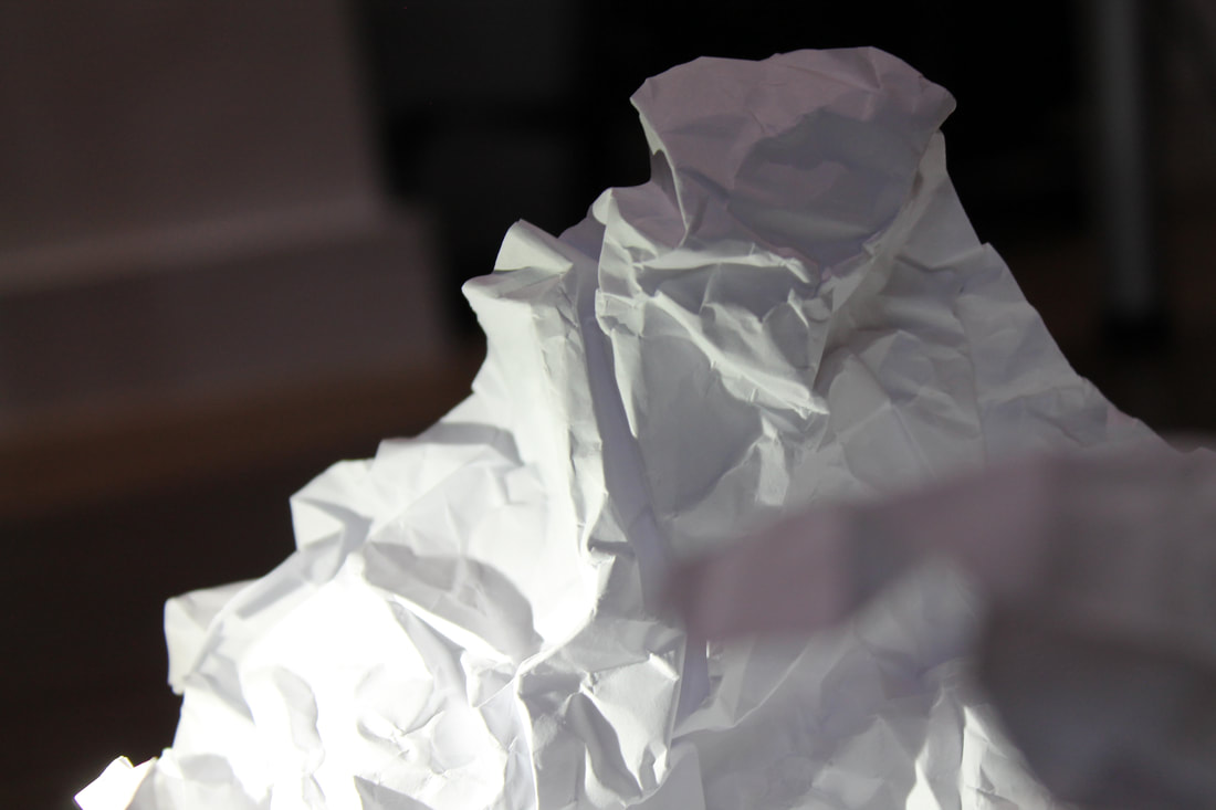
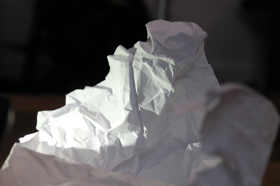
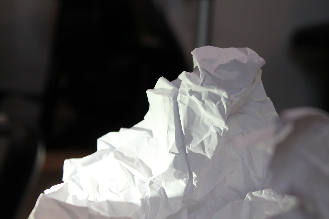
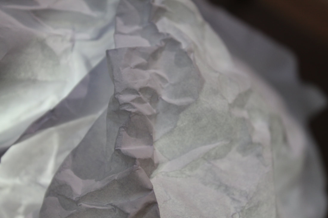
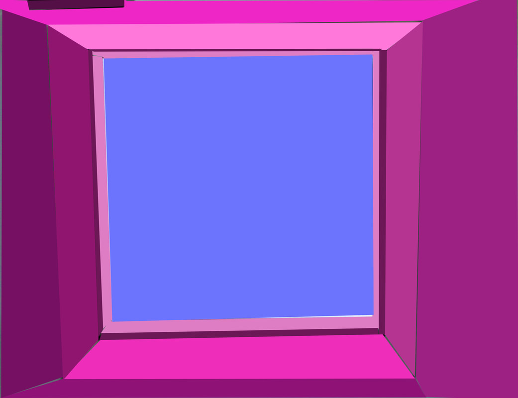
Brendan Austin
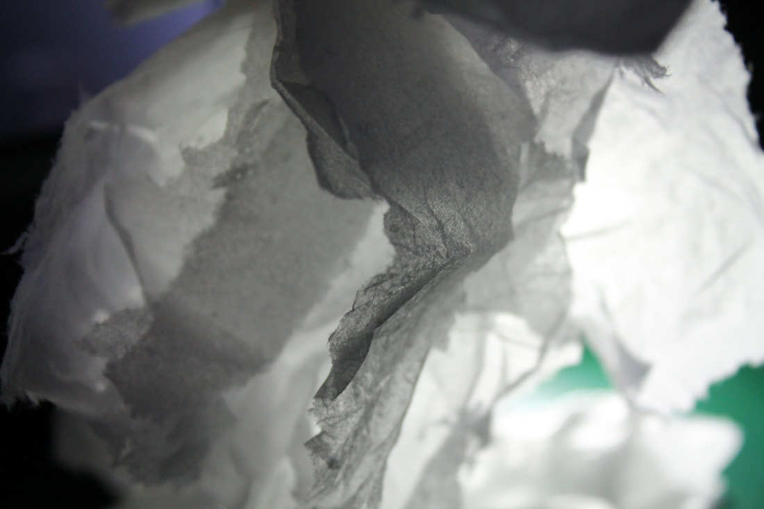
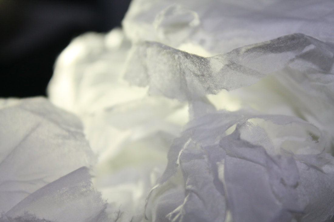
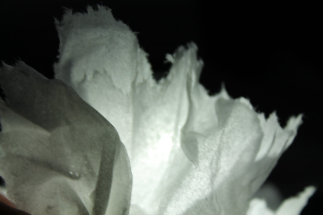
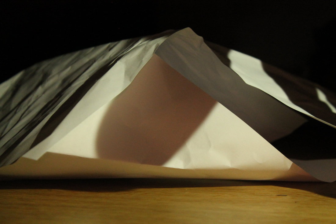
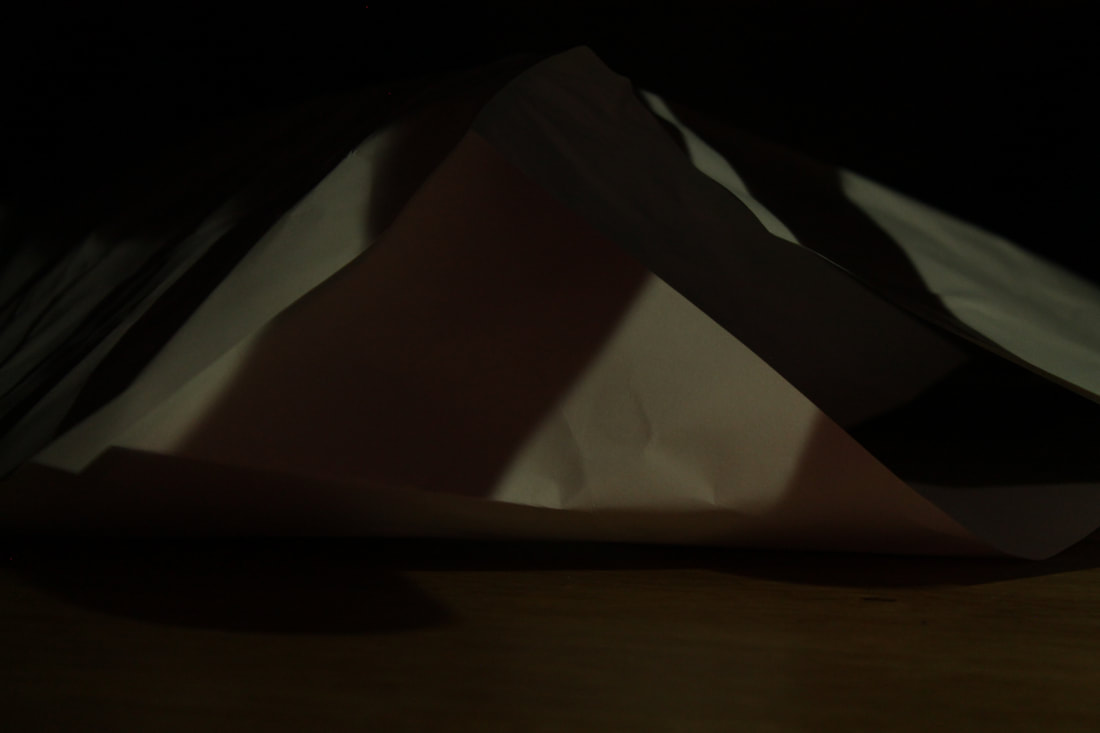
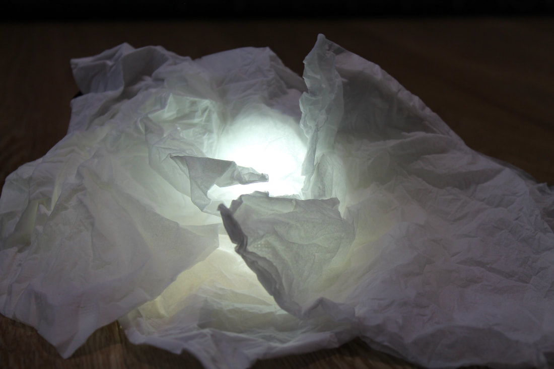
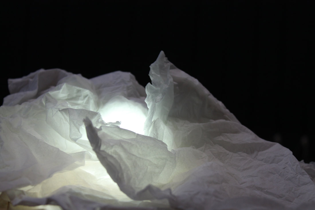
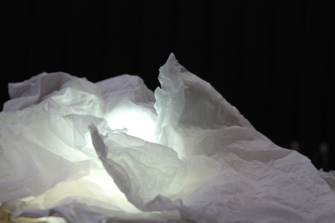
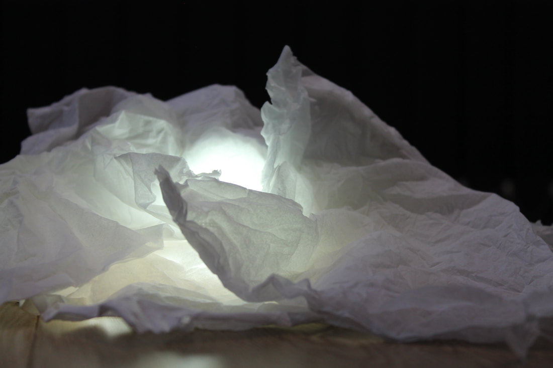
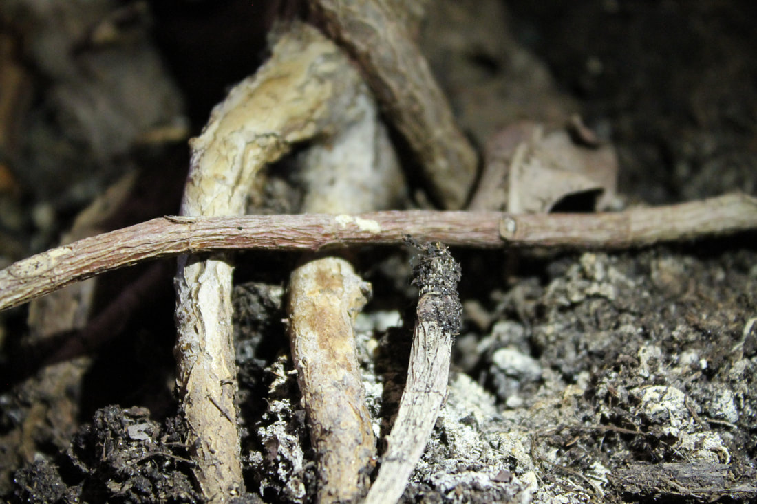
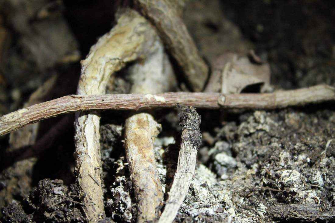
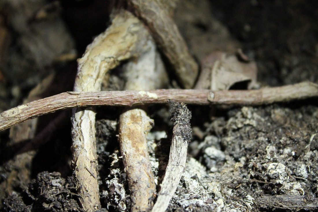
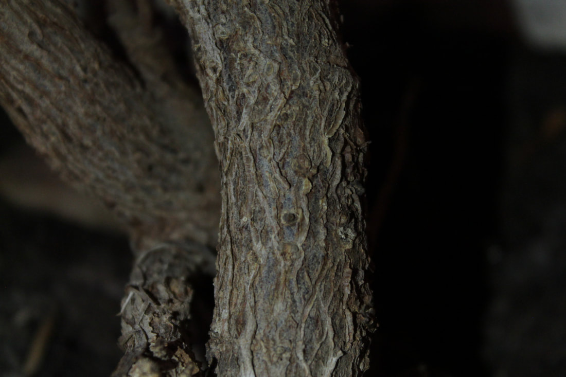
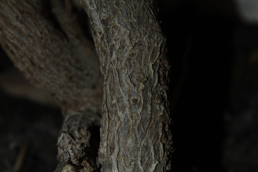
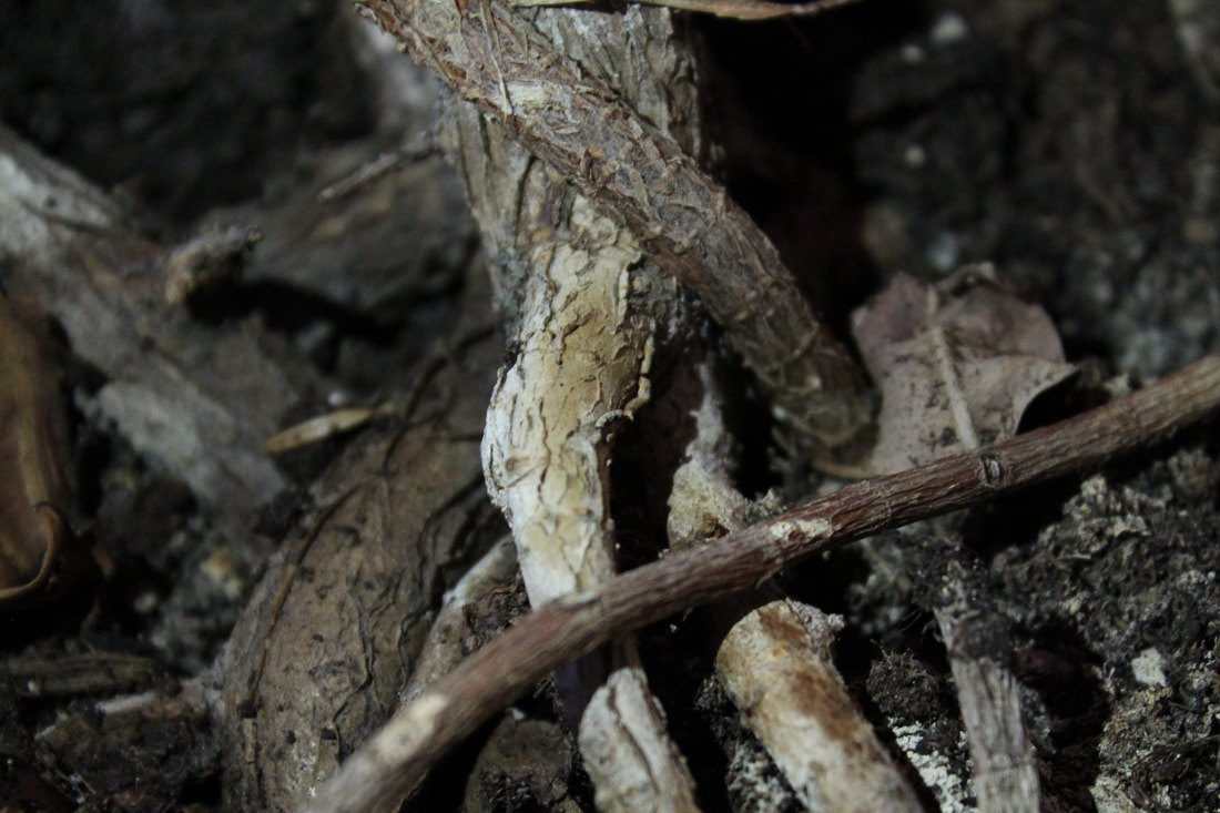
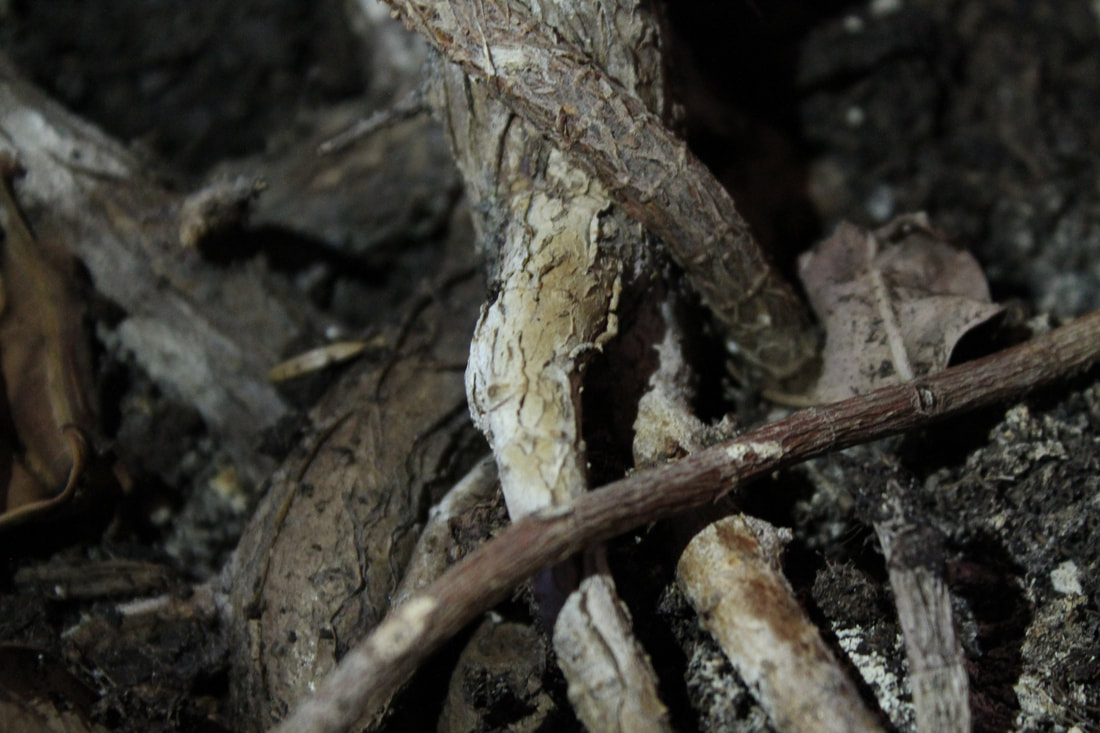
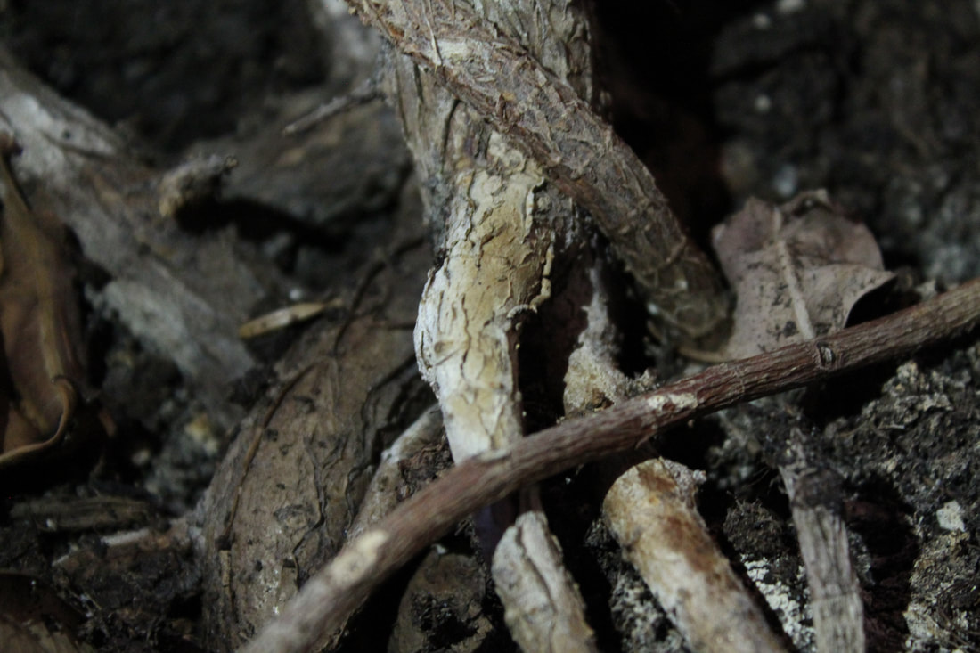
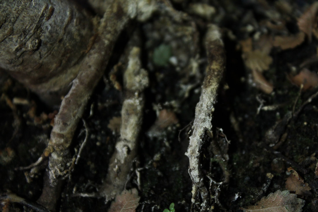
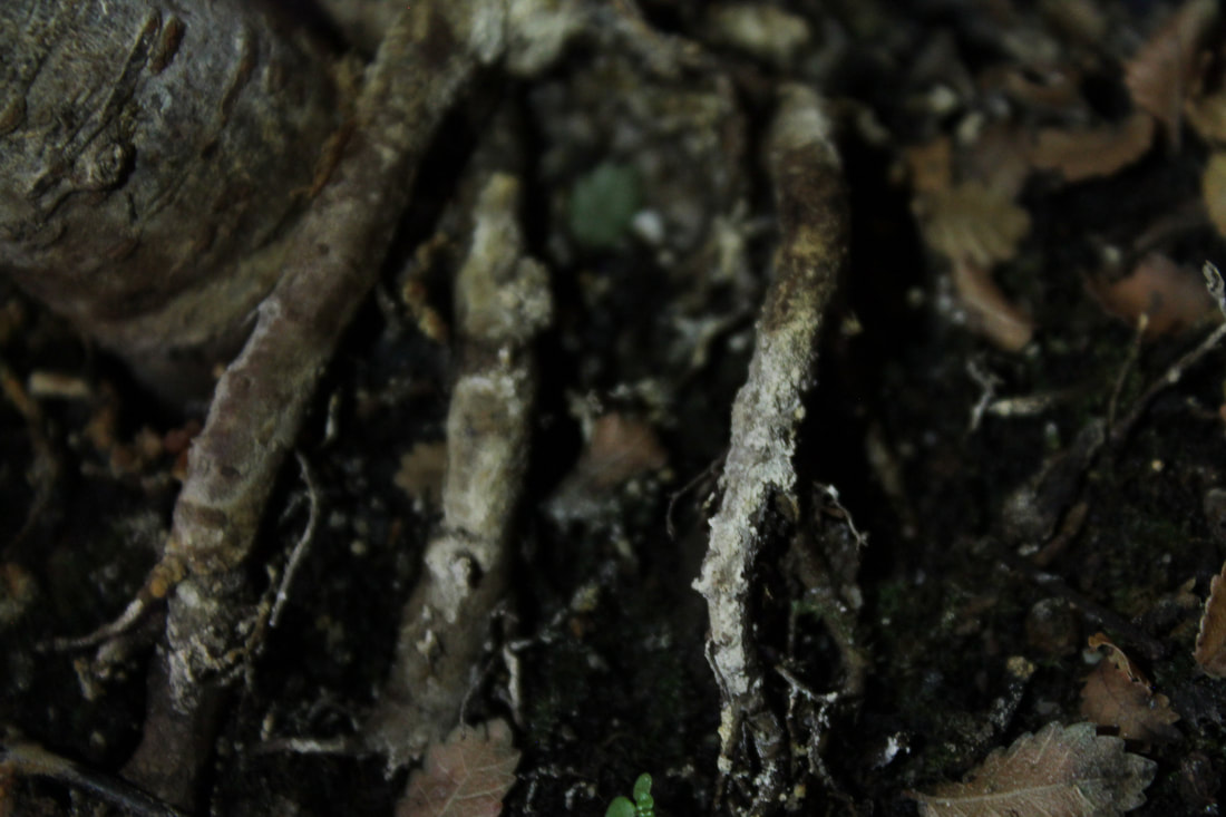
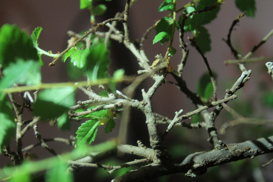
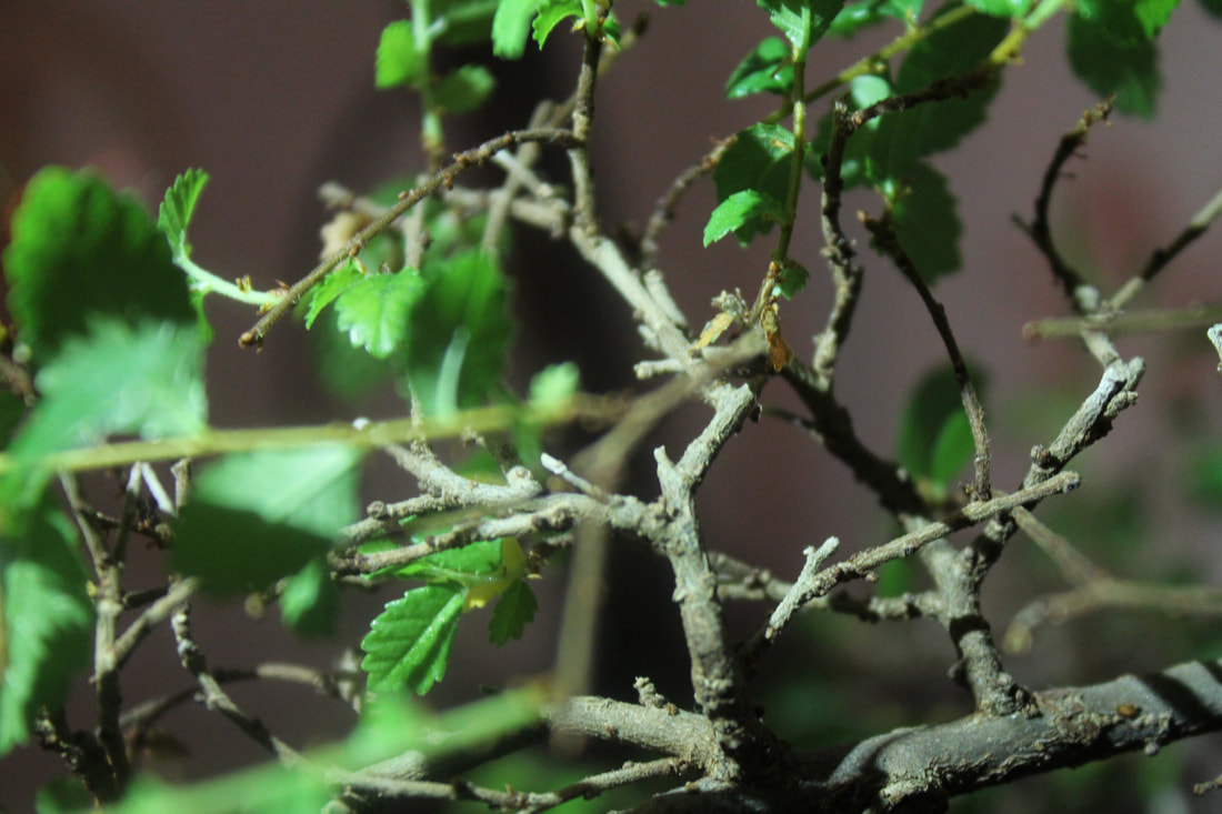
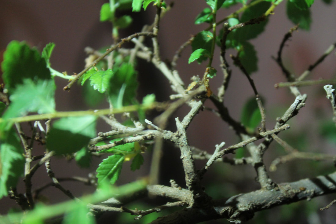
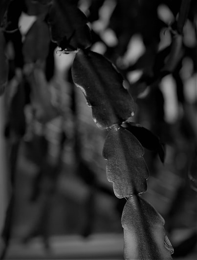
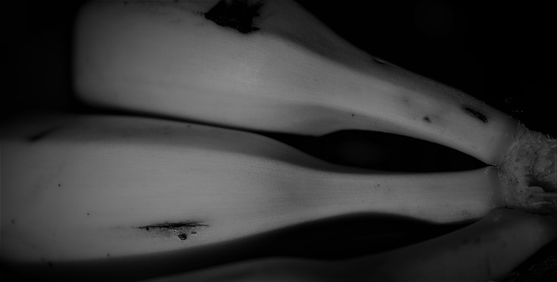
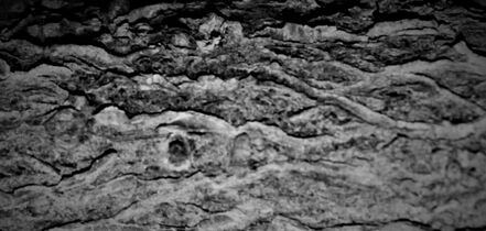
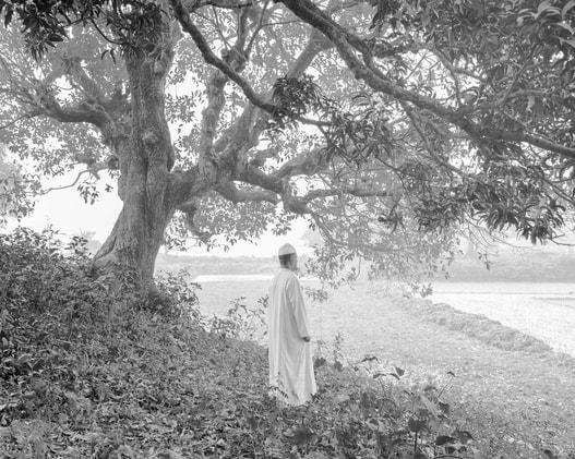
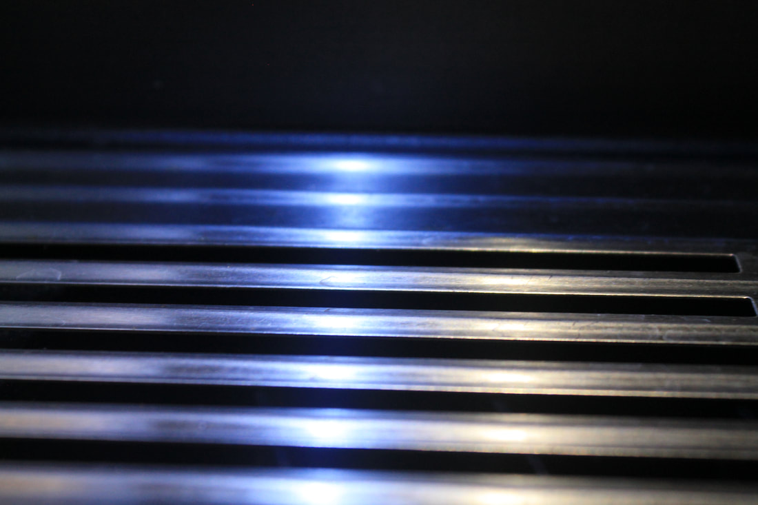
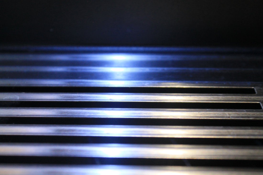
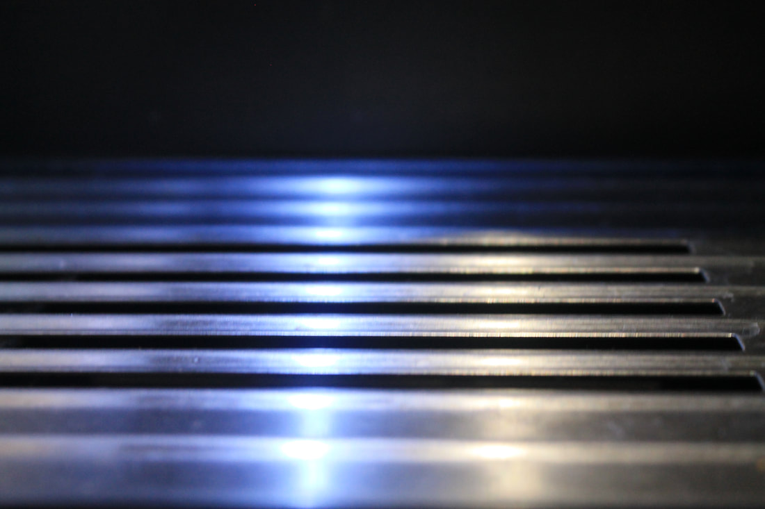
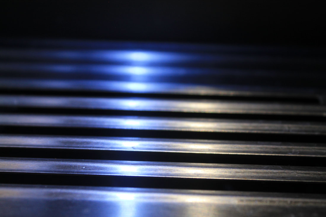
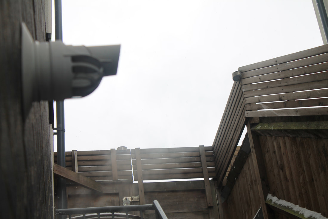
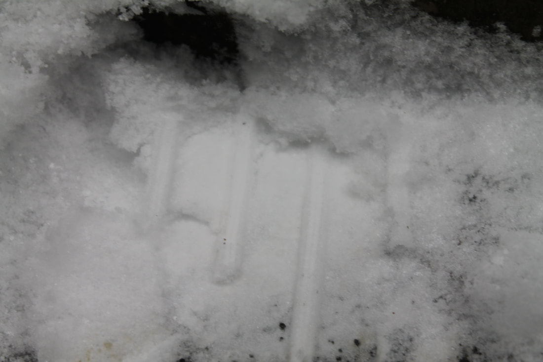
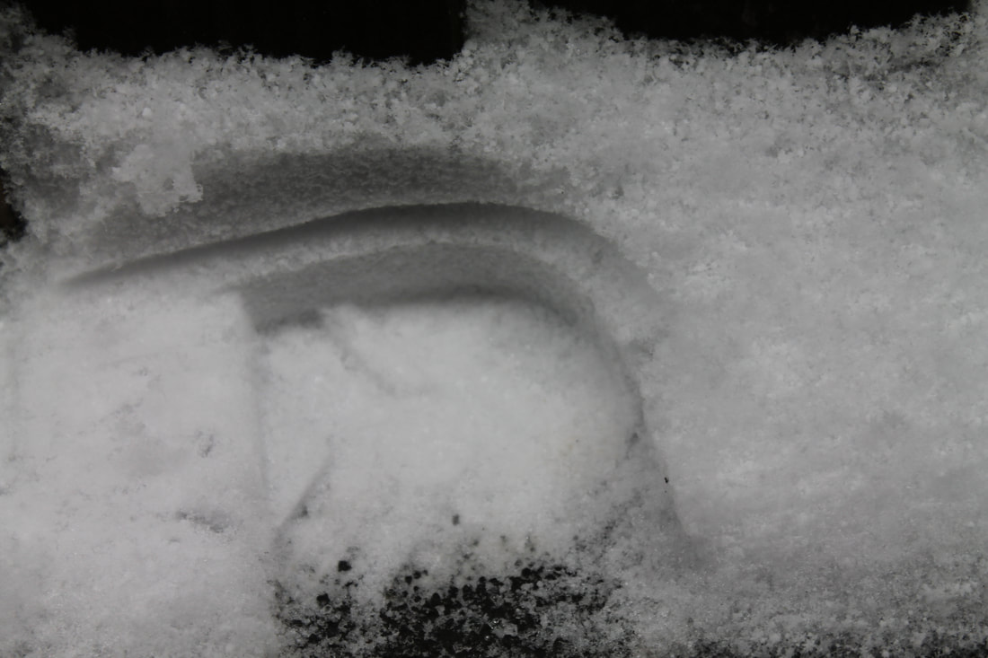
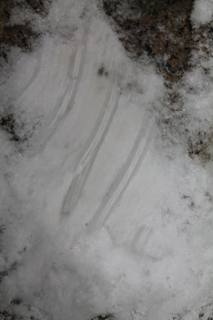
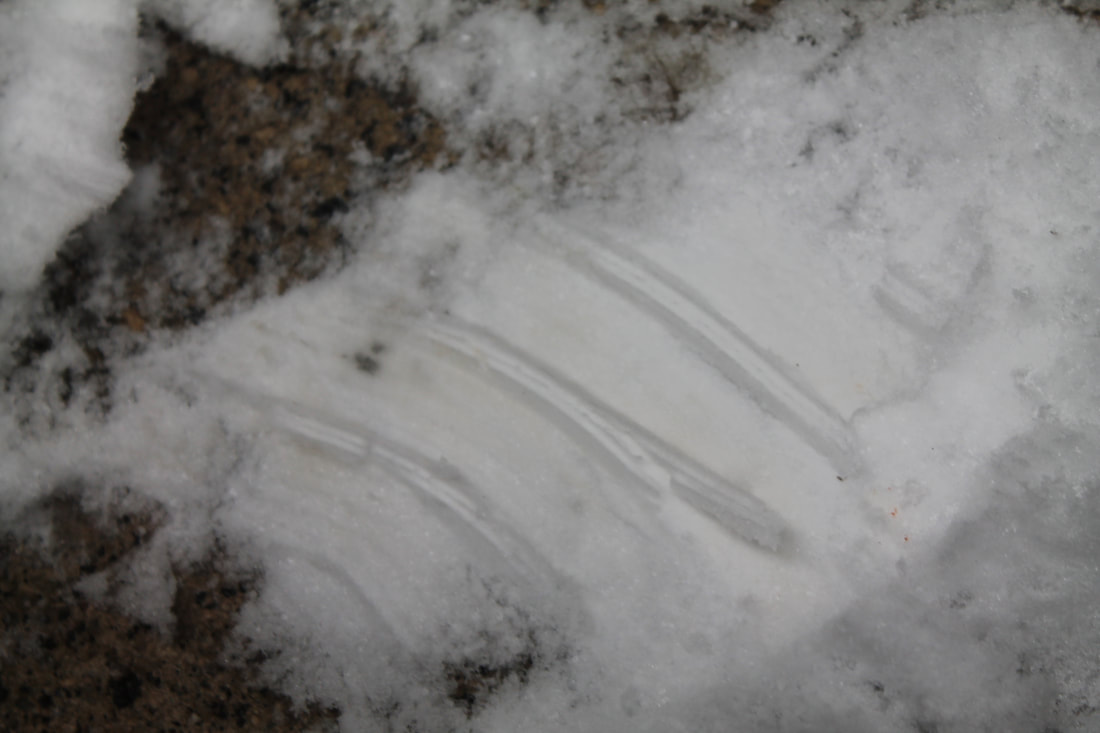
Brendan Austin is mostly known for the paper mountain project. Austin dedicated this project to mountains in mexico that he ffell in love with and wanted to recreated in his own way and not just by taking images of them. To do this task which is inspired by Austins paper mountains i got paper and tissue paper and scrunched it up and placed the torch light behind it.
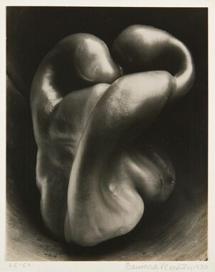
Edward Weston
|
|
Edward Weston is mostly known for his image of the pepper above. He uses a carets camera which he loved to use as it allowed you to see the subject while taking the photo. The rule he kept for his images was the importance of composition which he found a struggle when taking the photo of the pepper. To fix that he place the pepper in a funnel and took the images to give it a more shadowed and defined look. His art work has a plain background whether it’s white or black and has very much a art like look too it like whether it’s been drawn or painted. The depth of each image is incredible as the pepper is no longer a pepper it has loads of twist and turns which take the form of a human body that looks as if it’s curled up away from the camera.
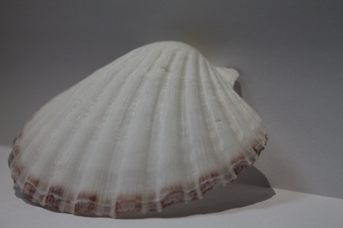
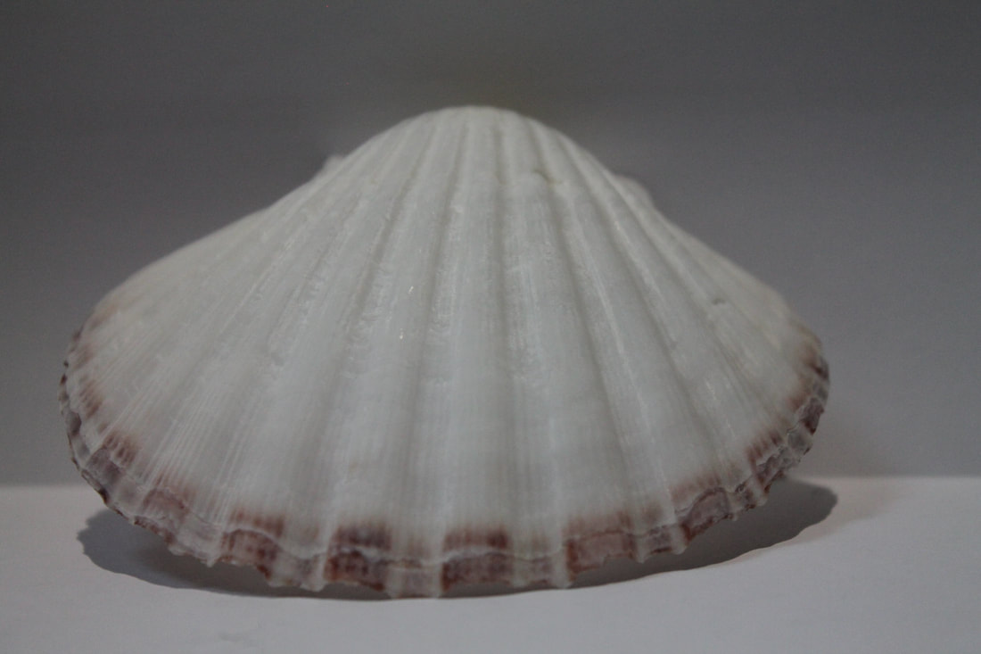
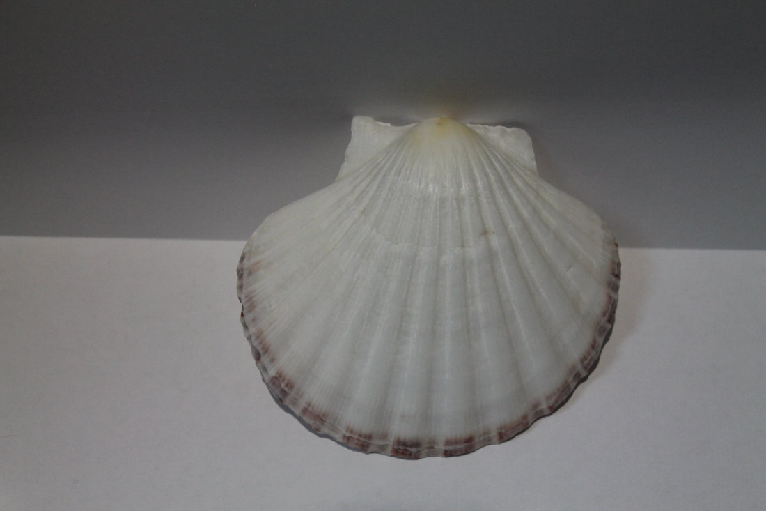
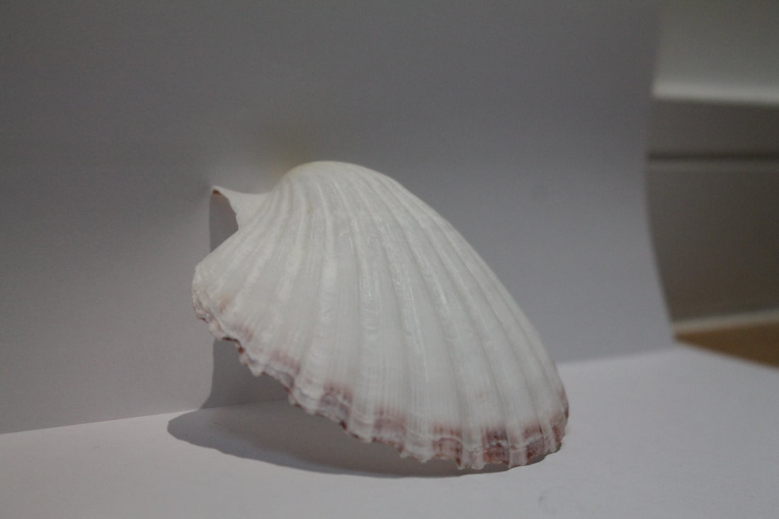
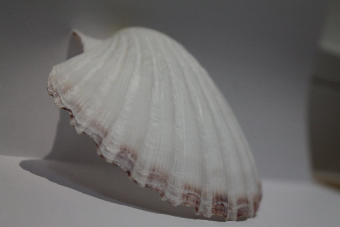
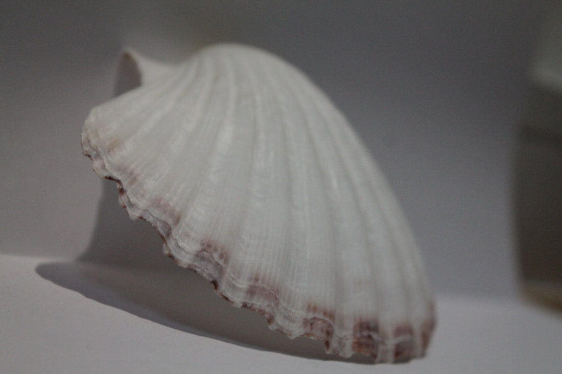
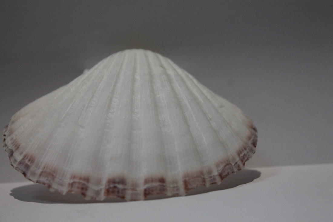
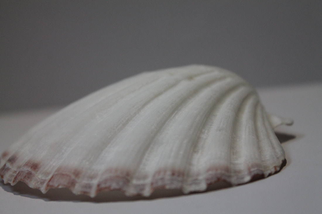
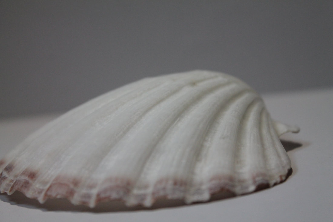
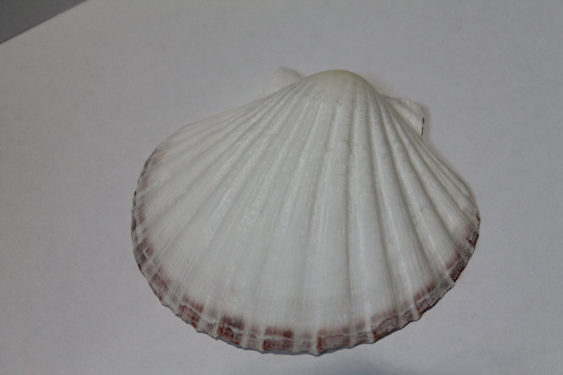
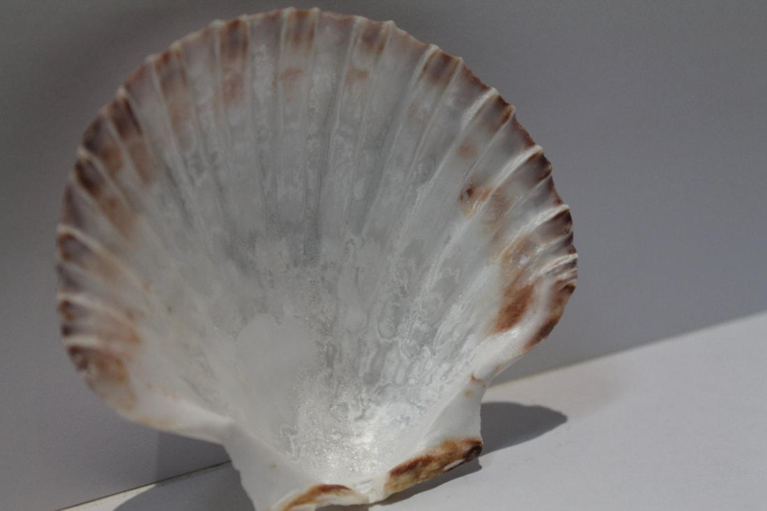
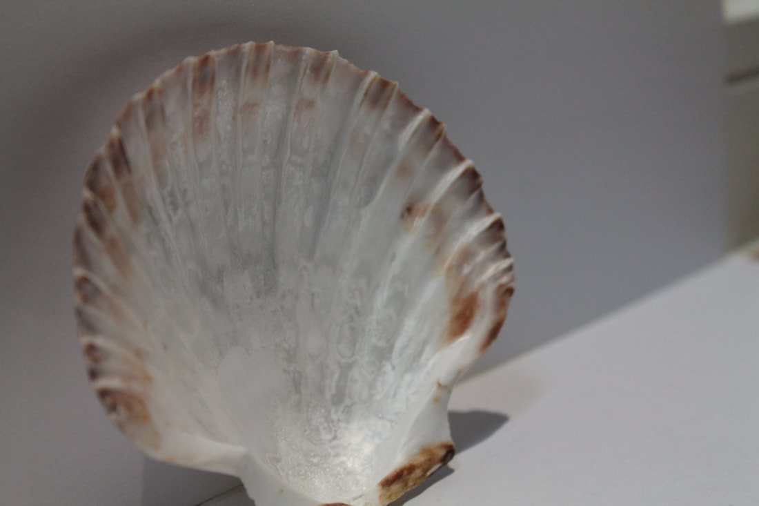
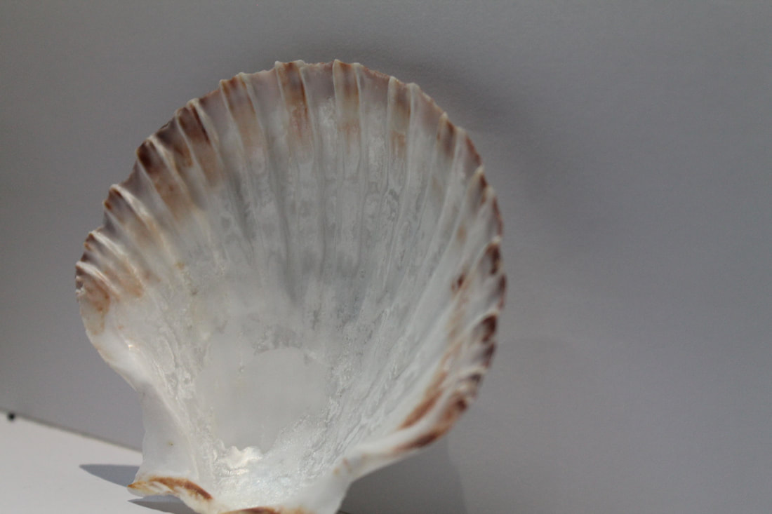
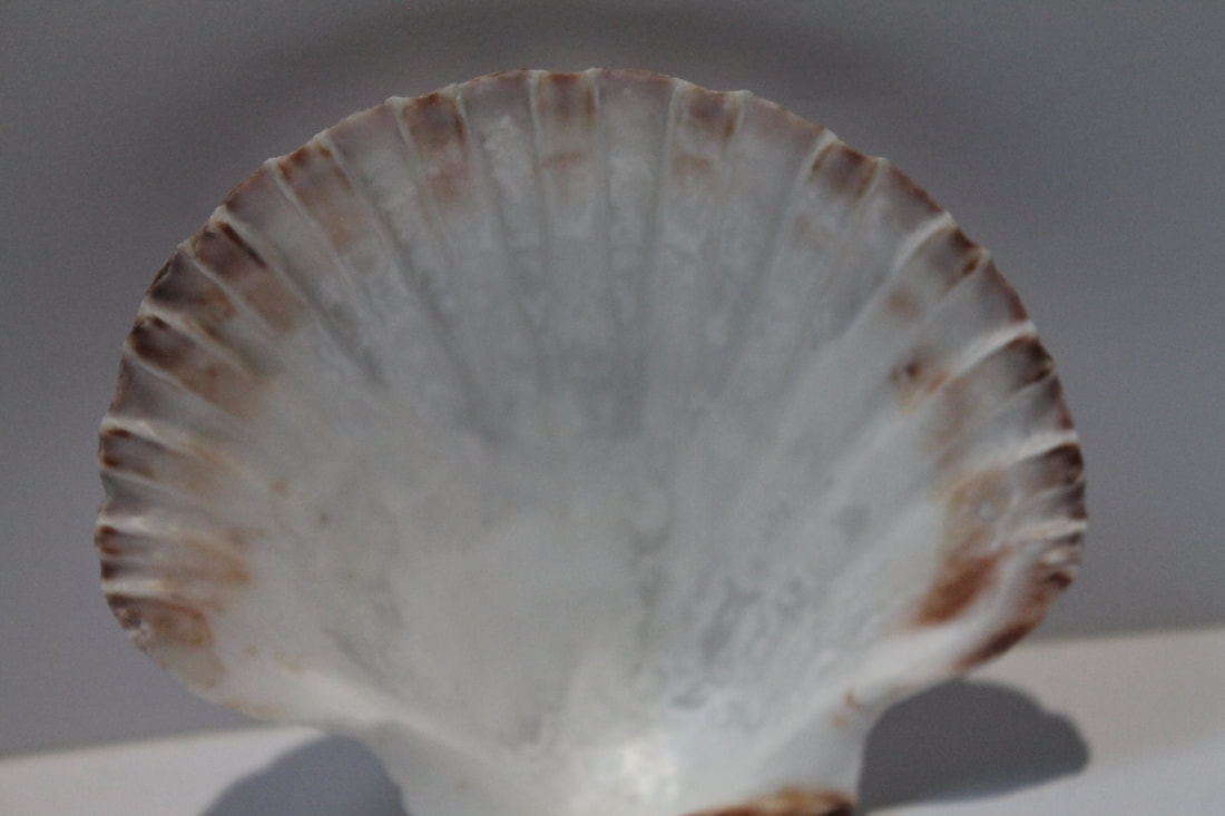
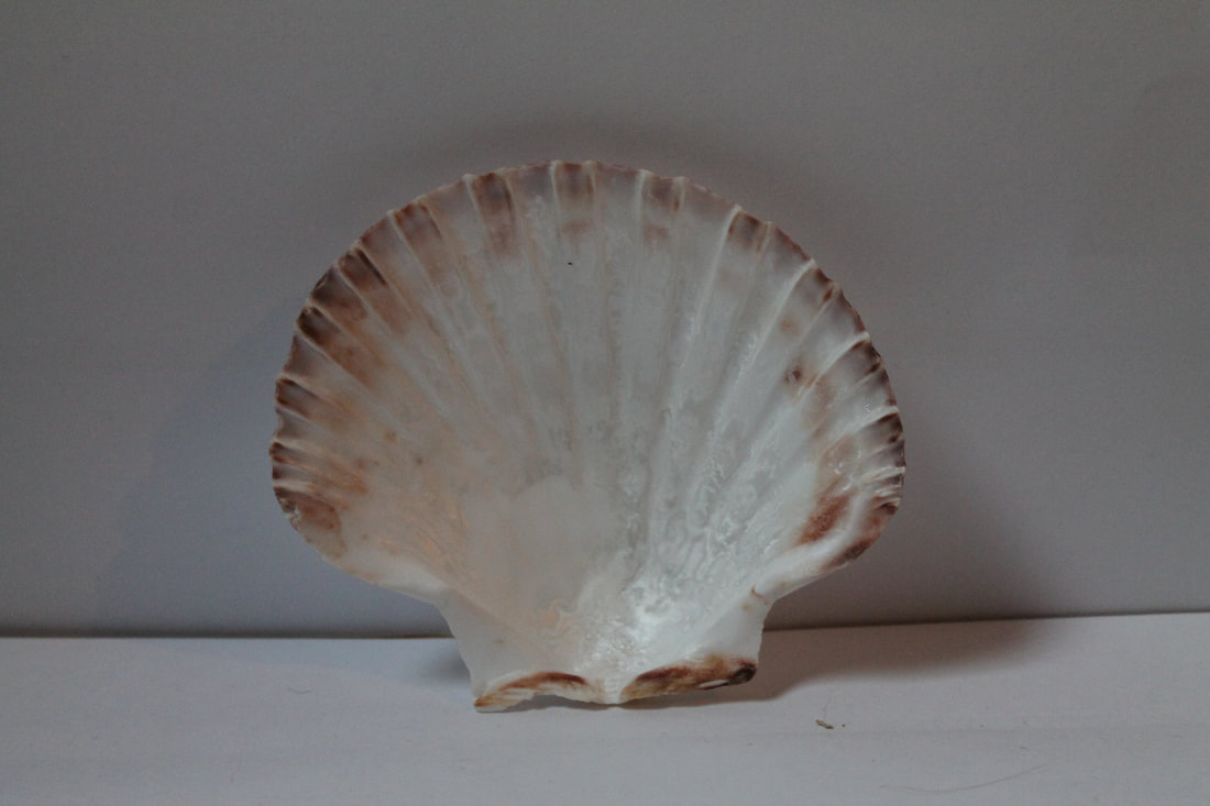
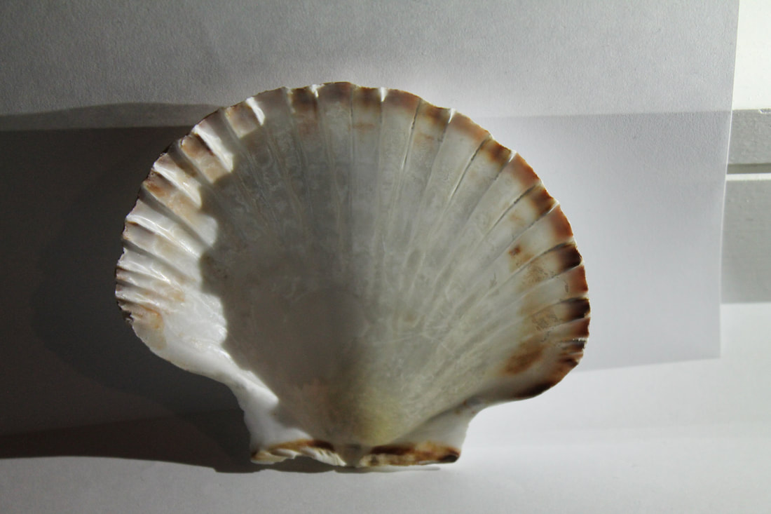
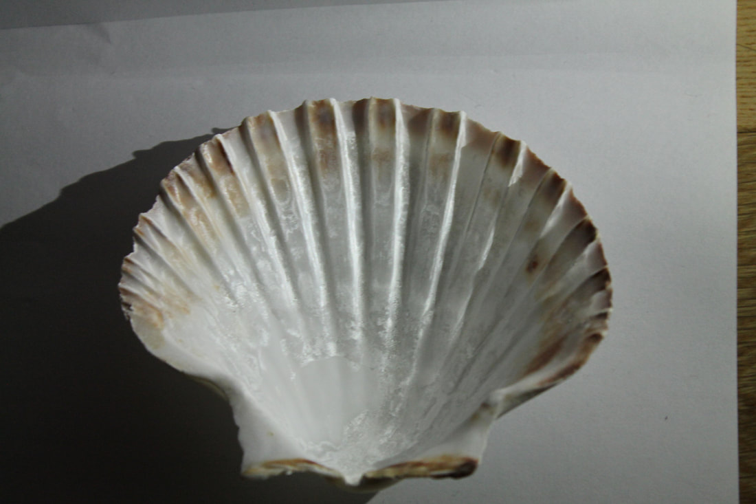
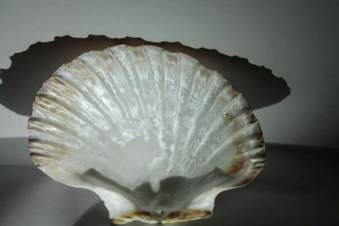
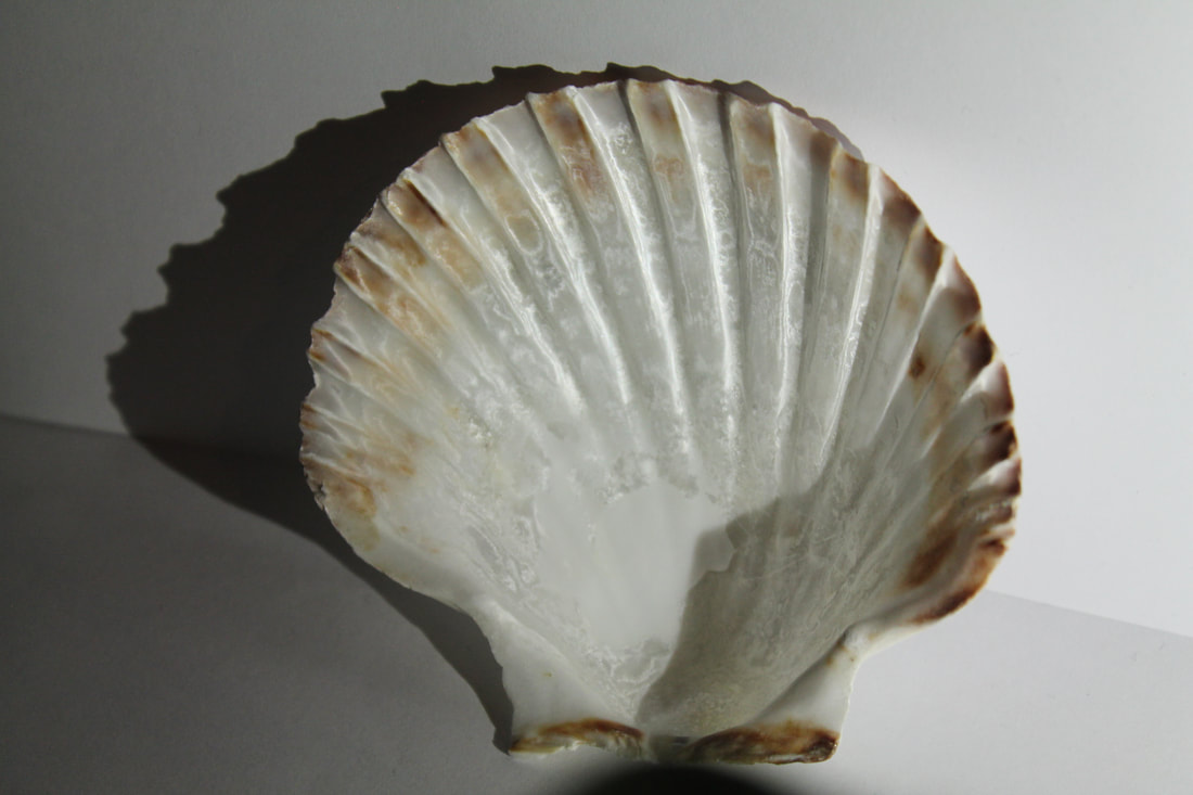
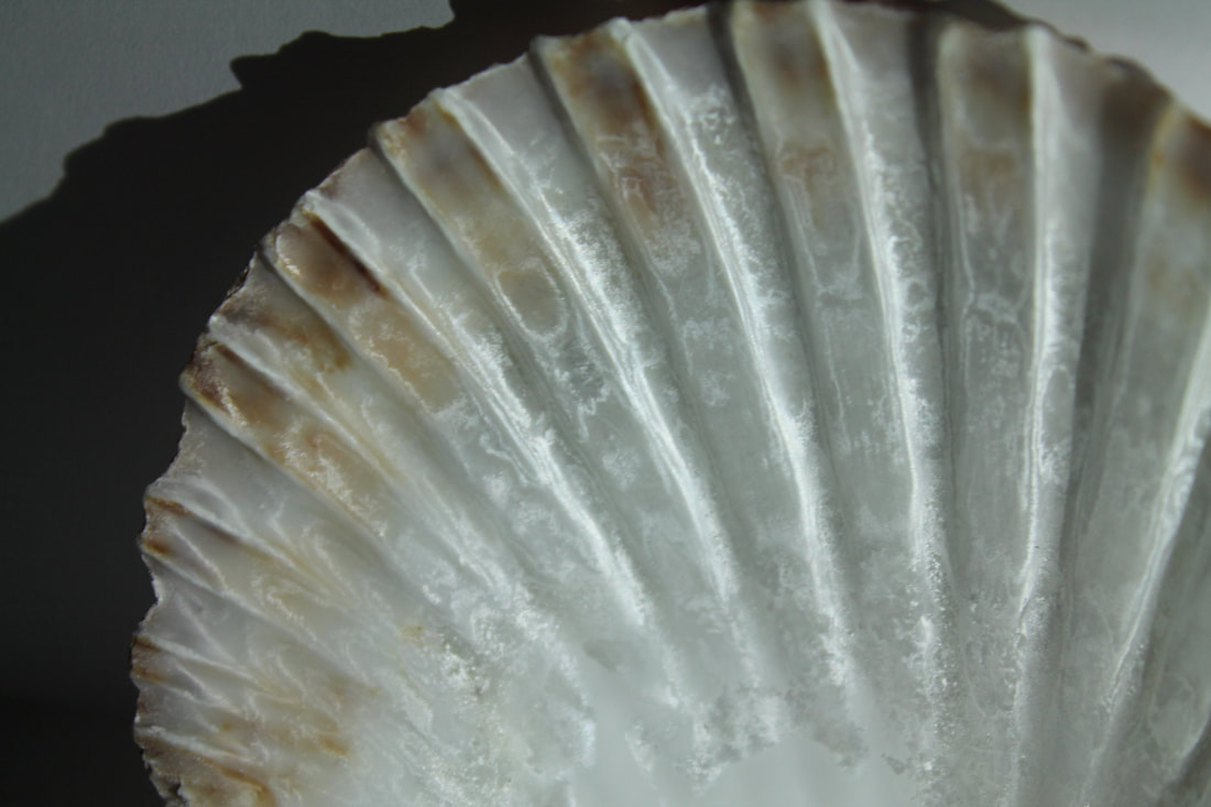
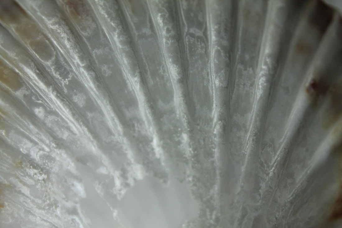
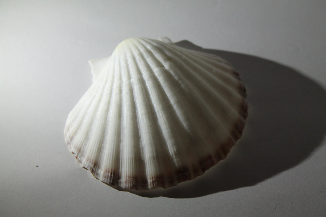
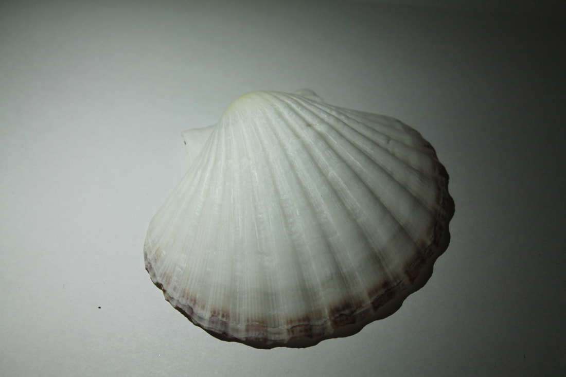
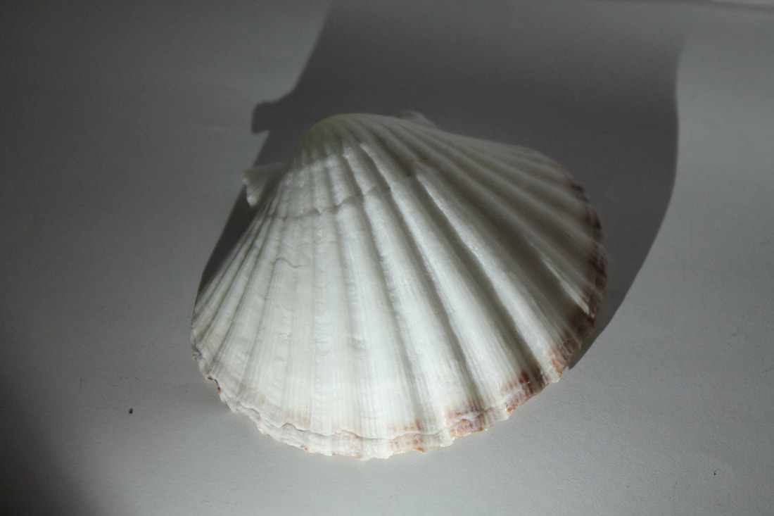
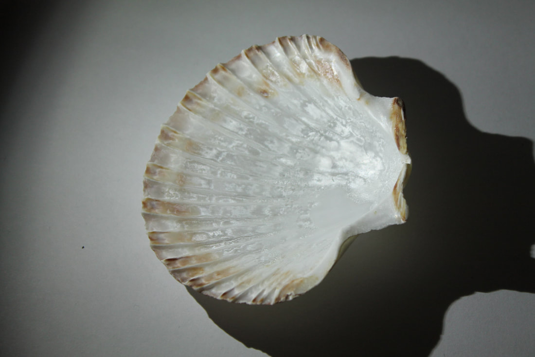
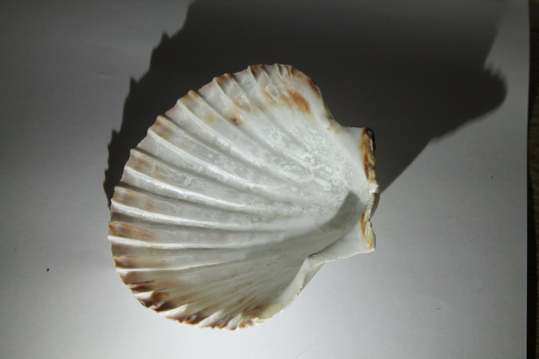
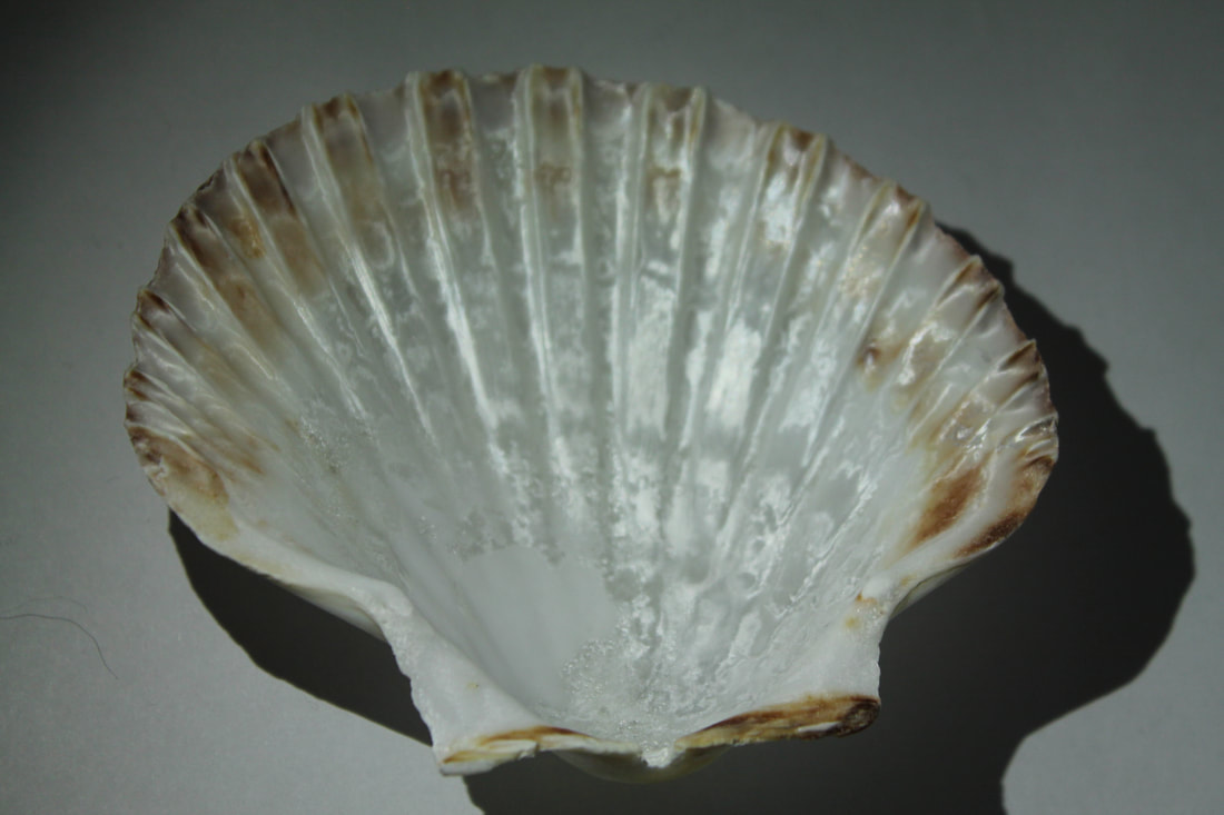
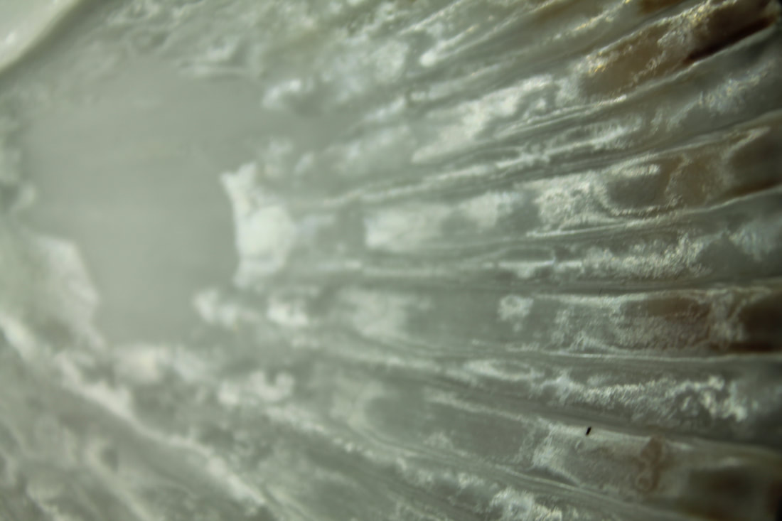
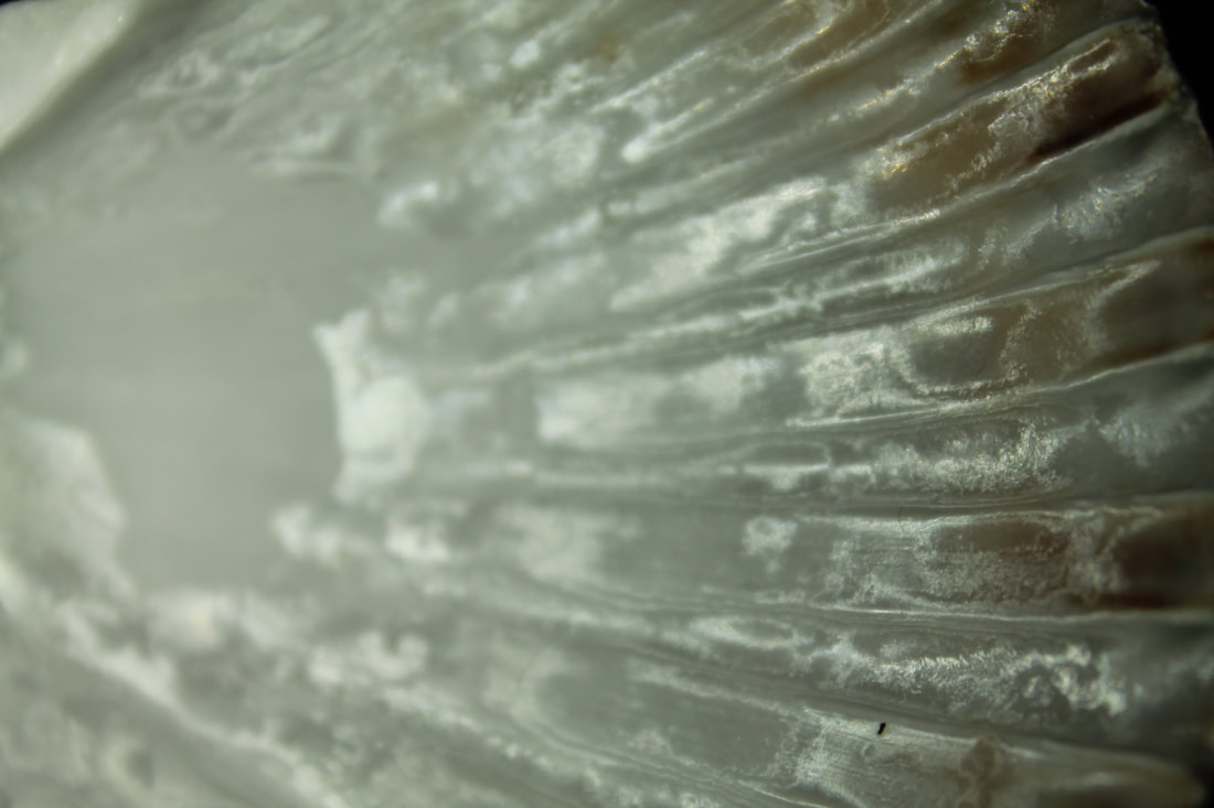
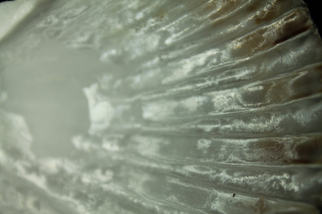
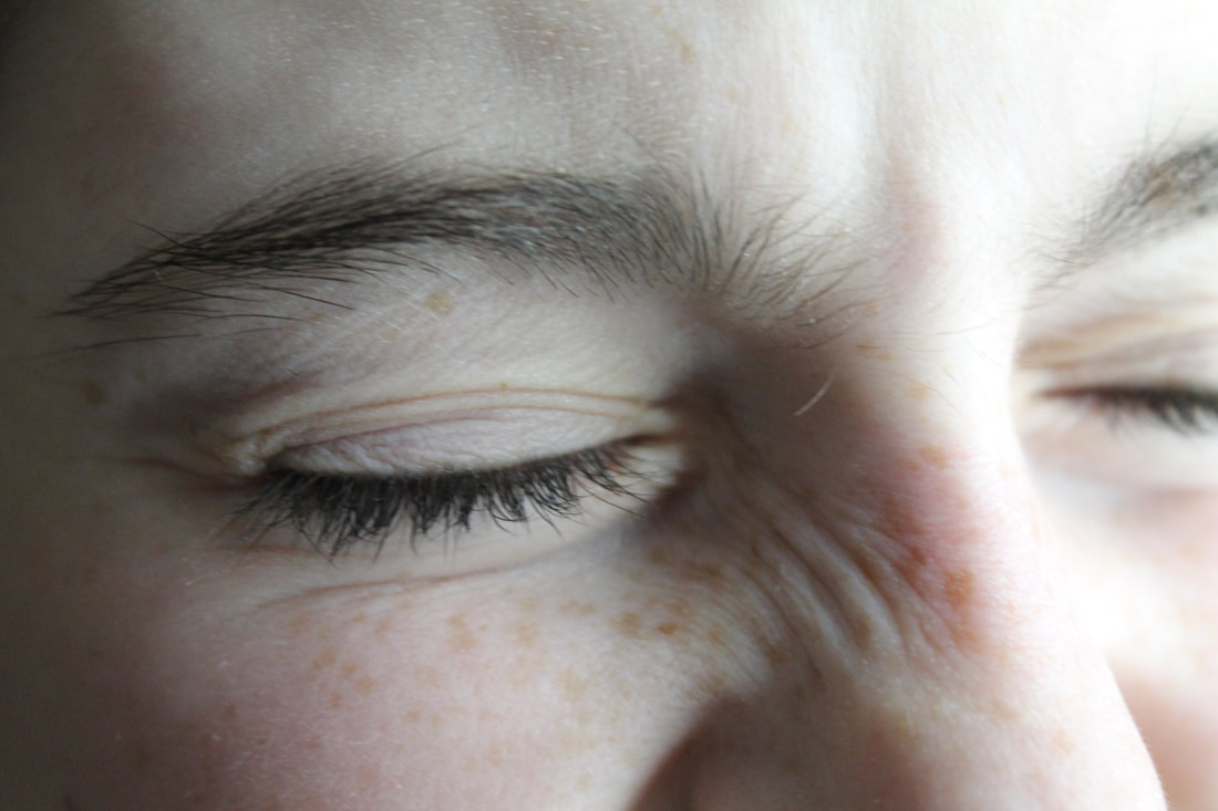
First attempt with natural light
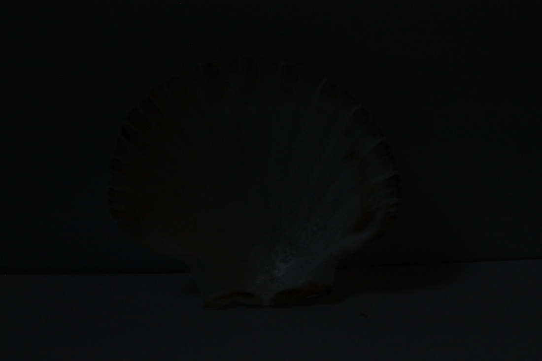
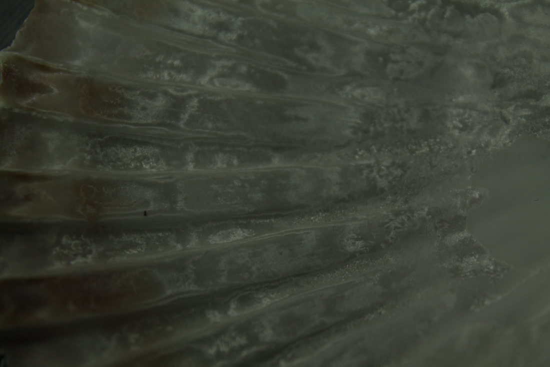
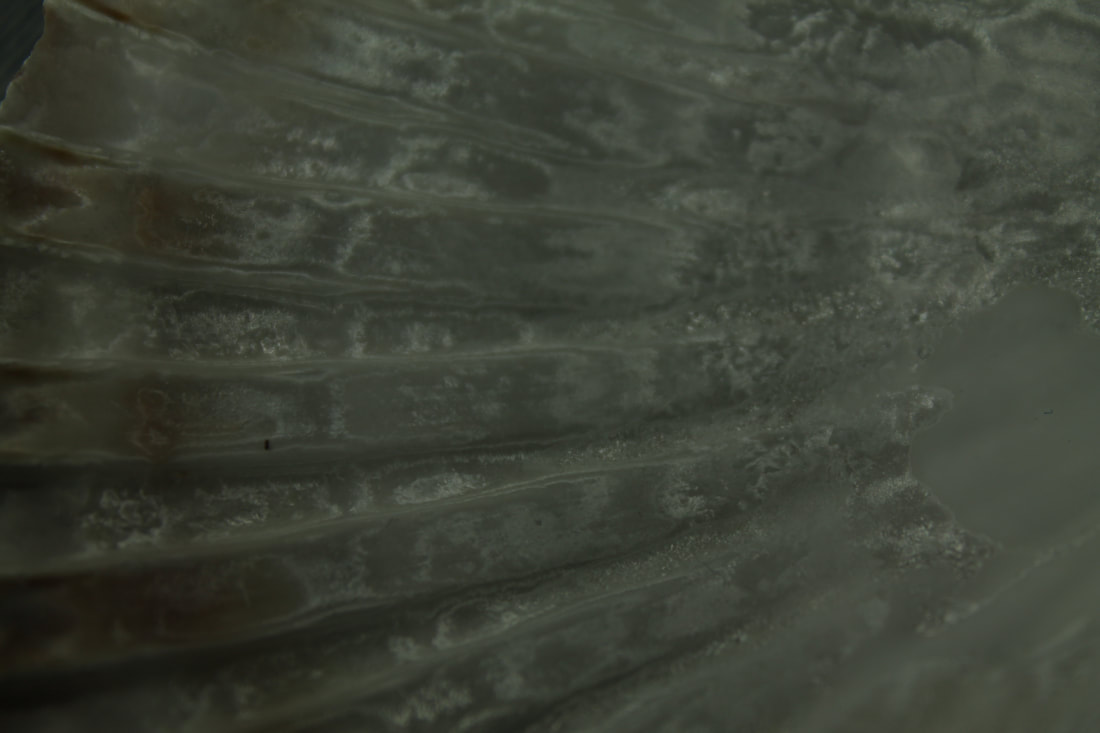
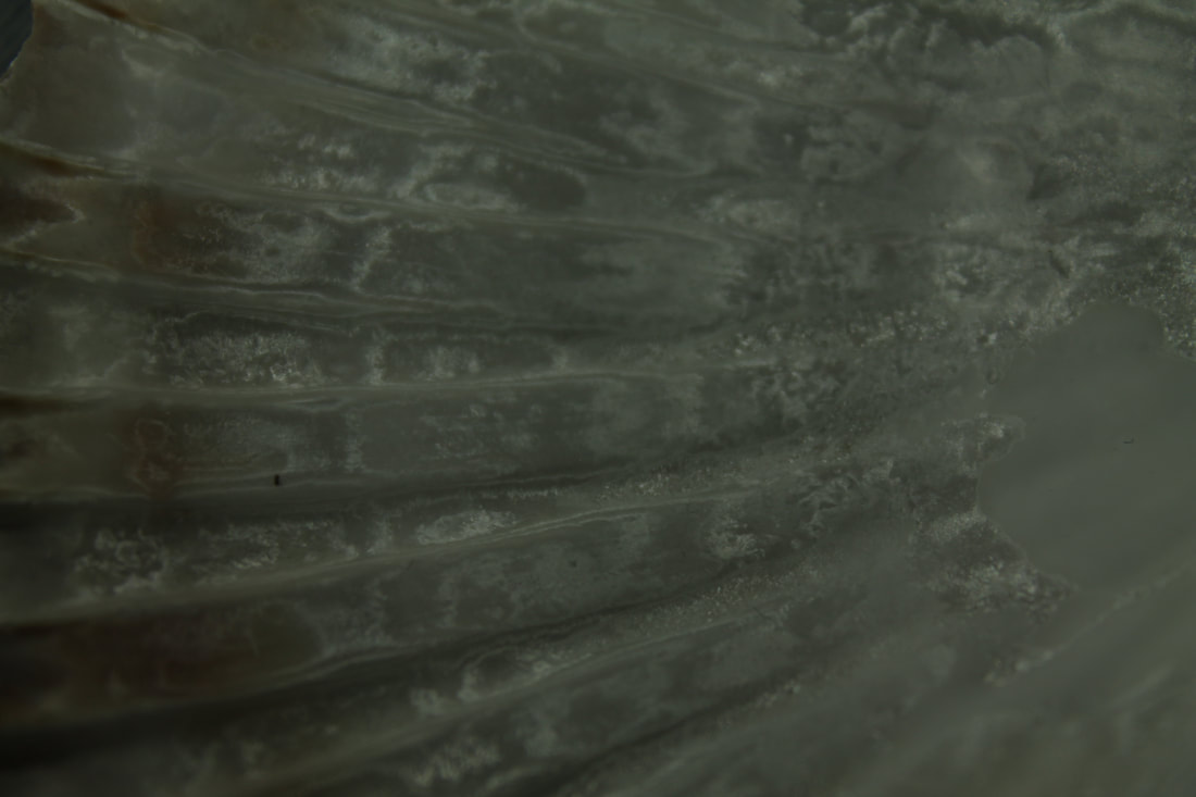
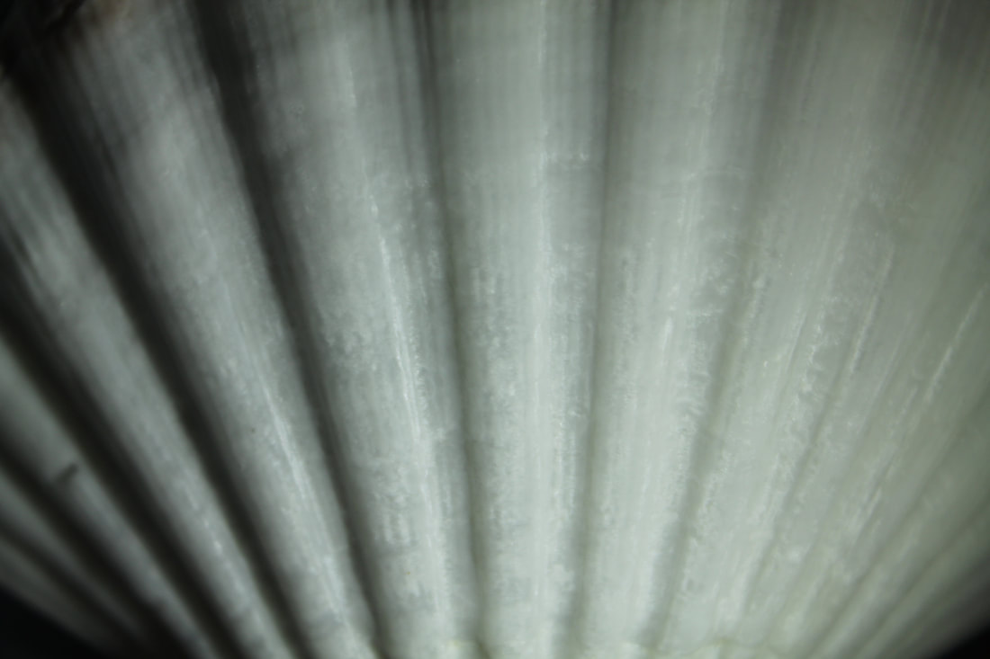
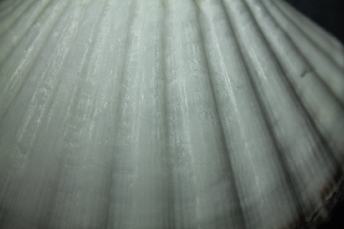
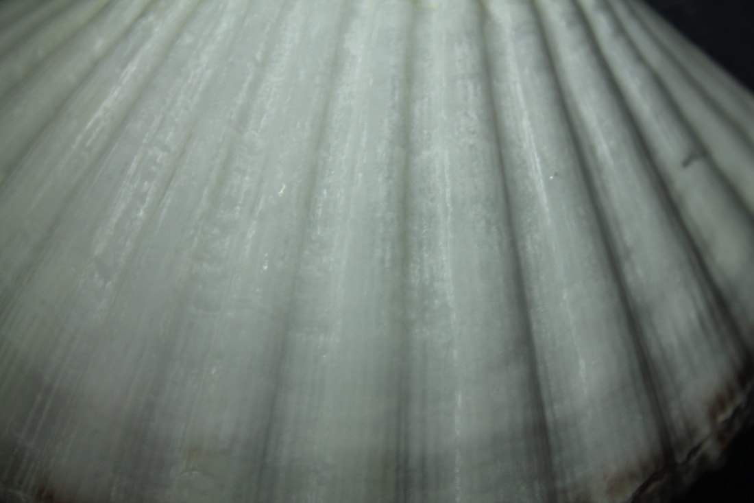
For this task I set up two pieces of paper one against a wall and one on the floor which was near a window to capture the natural light. Then placed the shell on it in different positions and captured it from different angels to get different definitions and textures brought out. Then to edit i placed a black &white filter over top then adjust the contrast to bring out any perfections or indents in the shell and any discolouration.
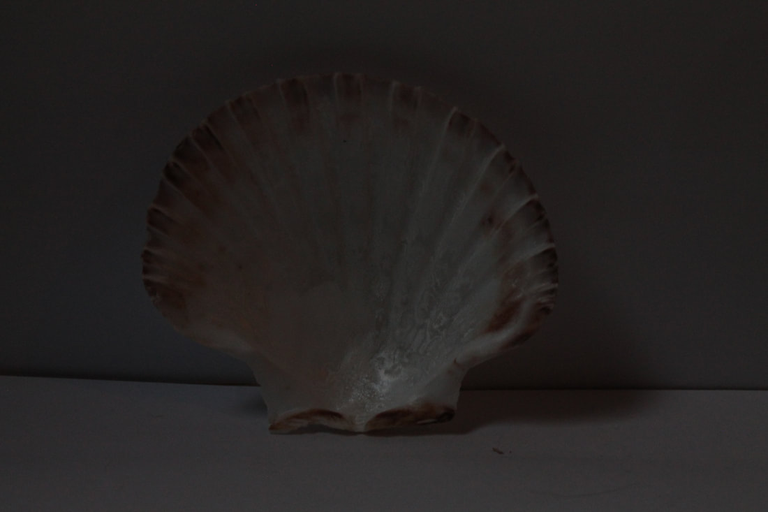
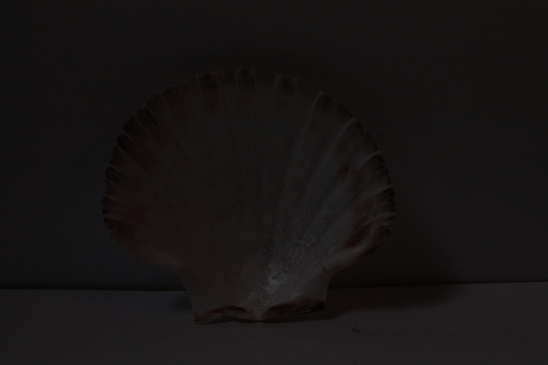
bracketing
|
|
|
|
|
F5 F7.1 F10 F13 F16
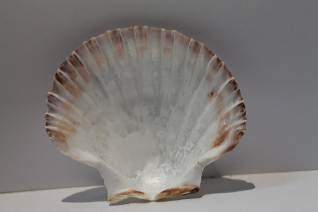
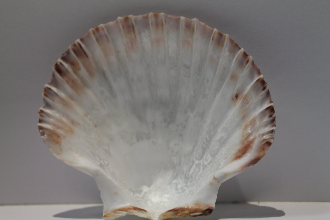
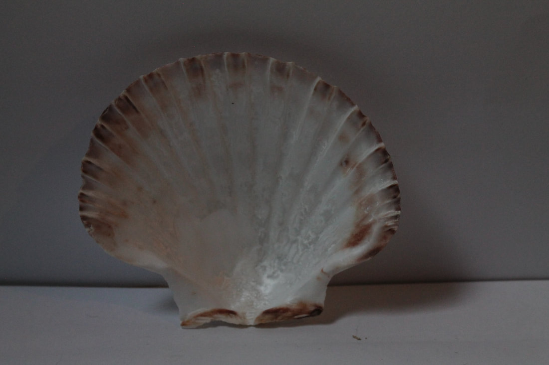
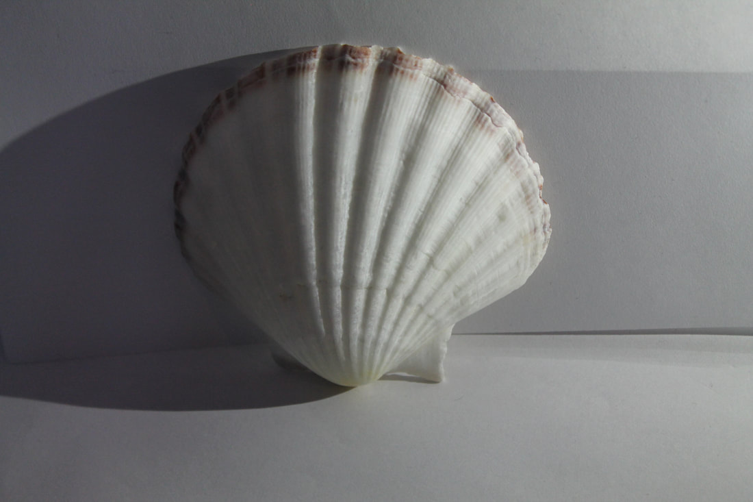
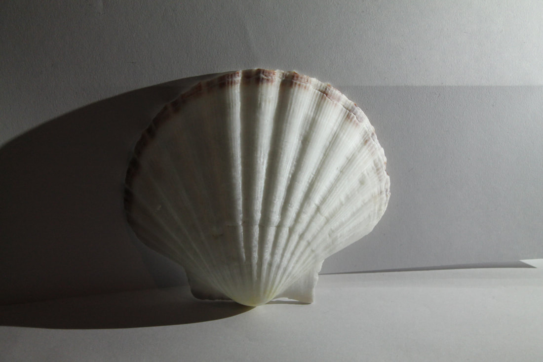
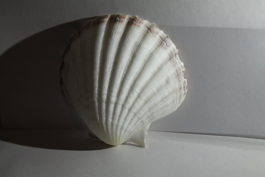
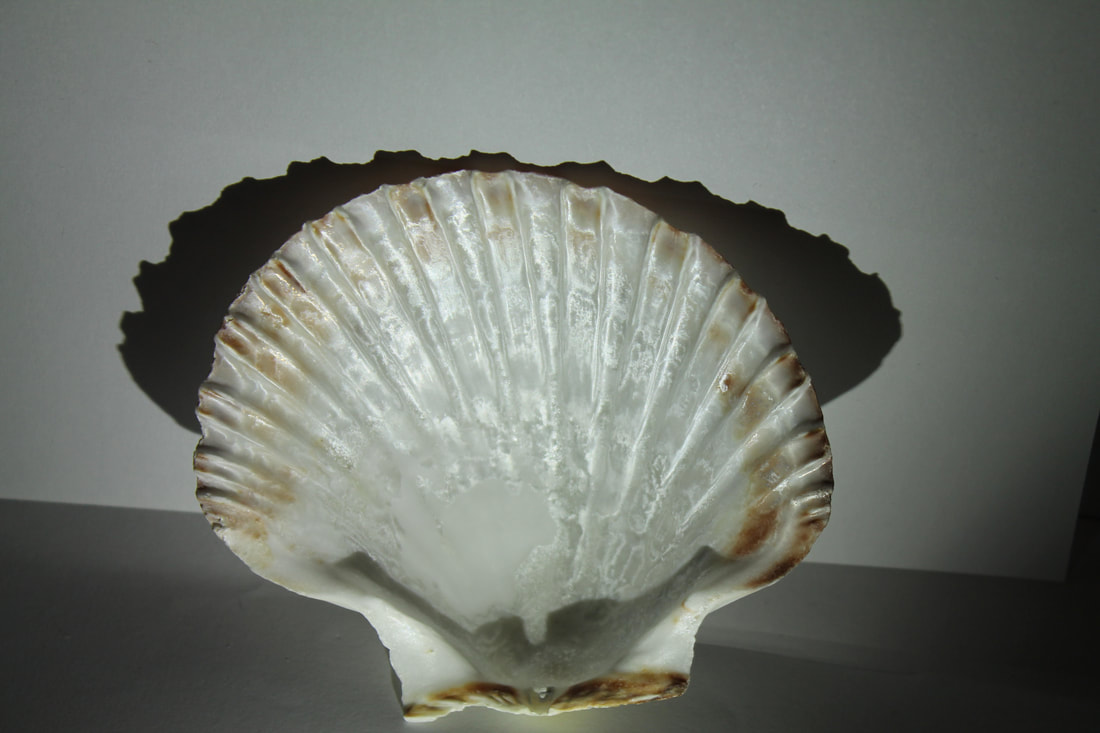
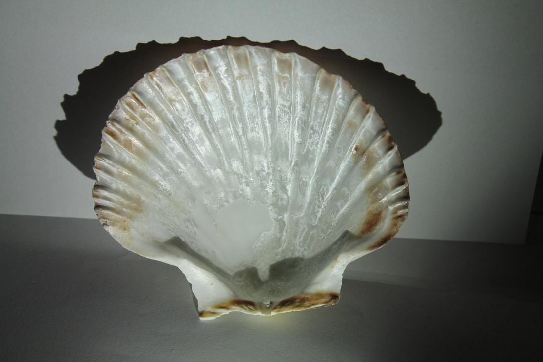
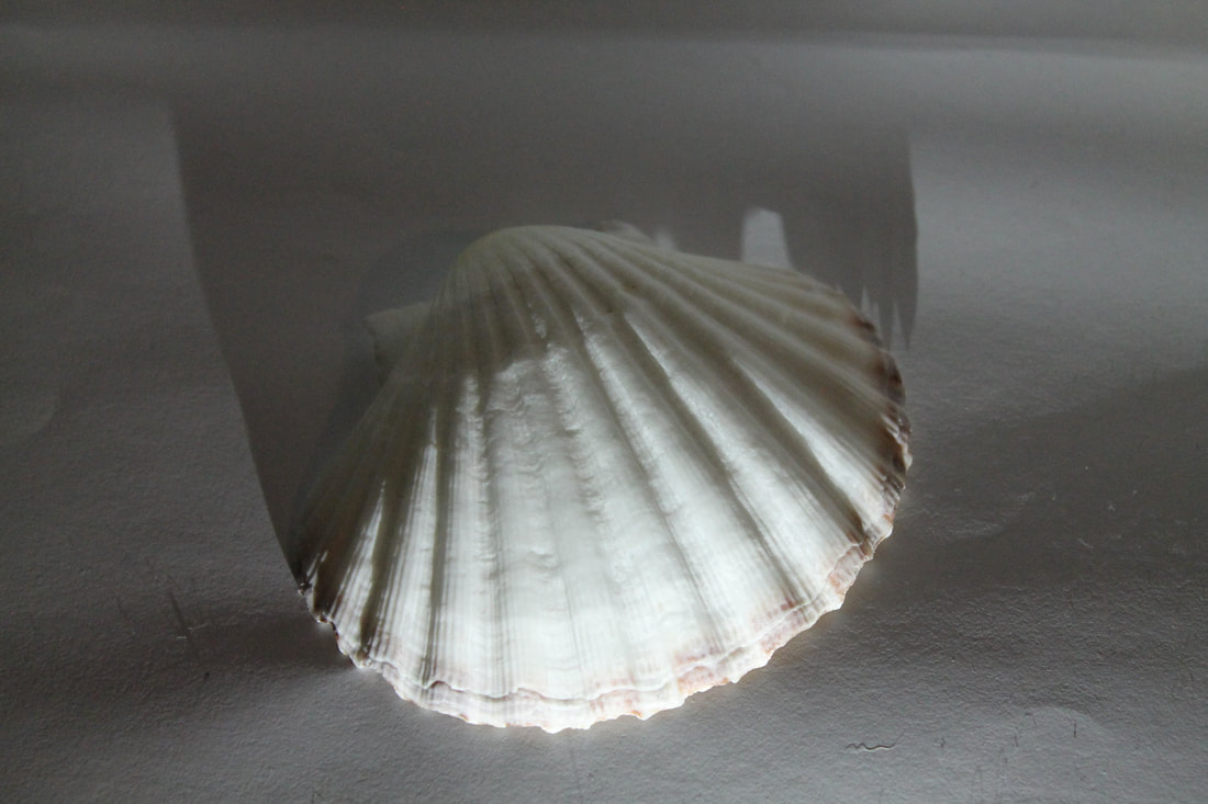
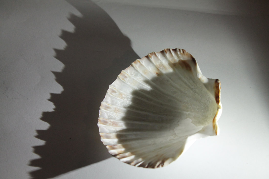
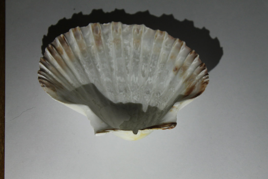
Second attempt with unnatural light
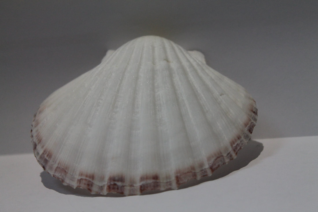
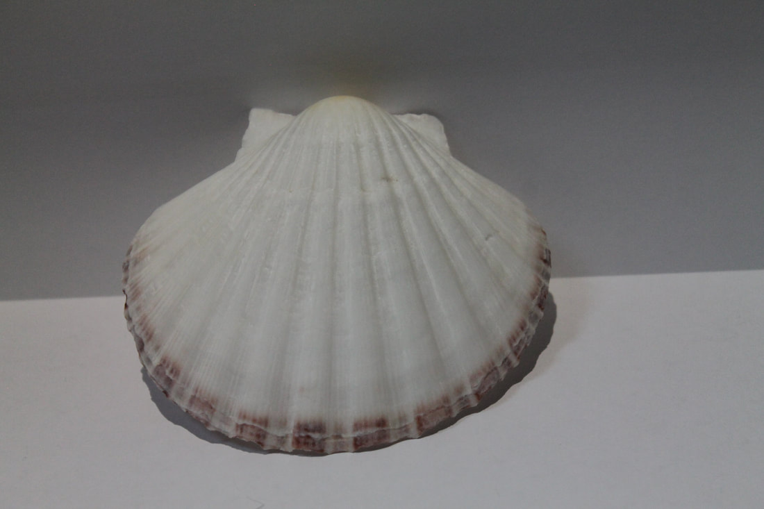
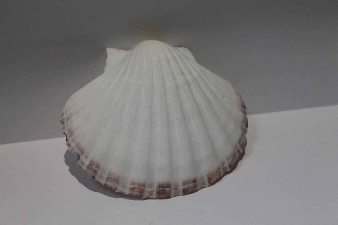
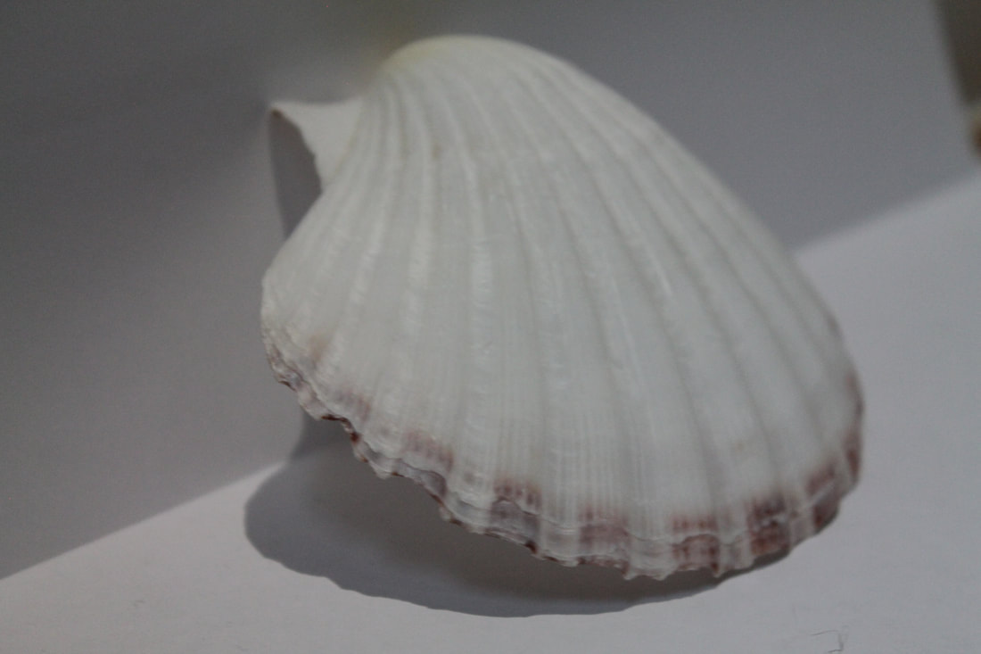
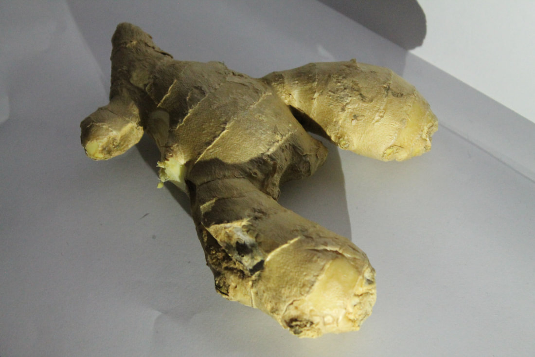
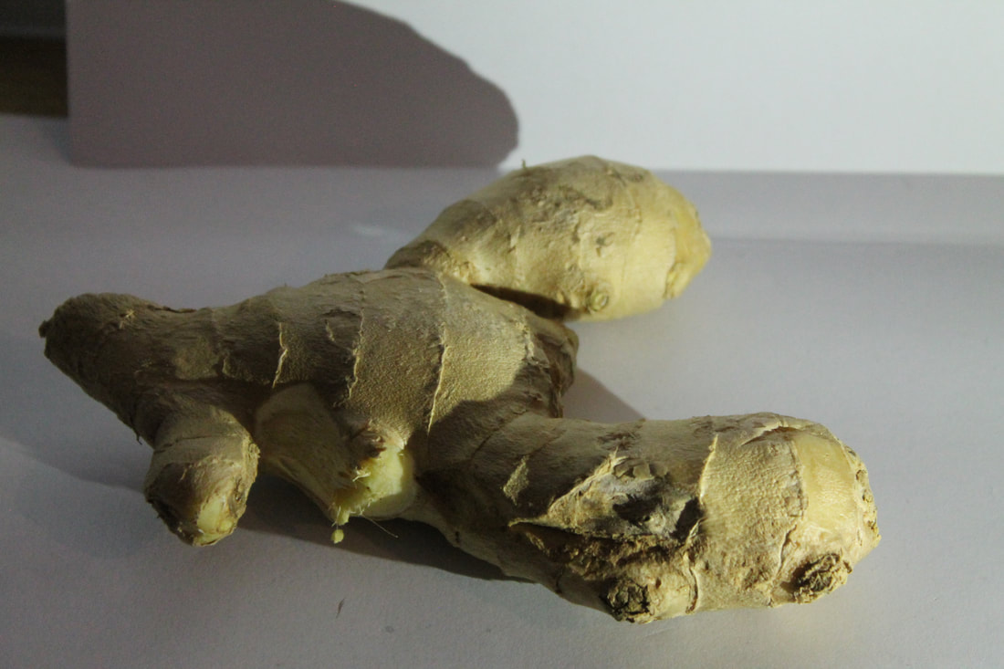
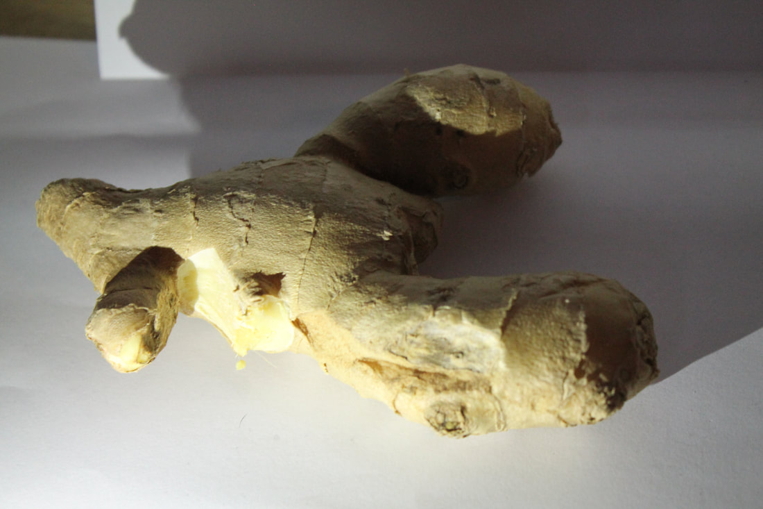
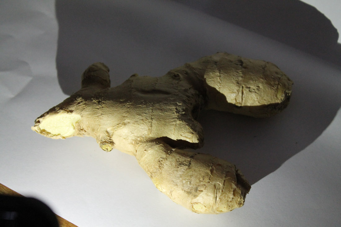
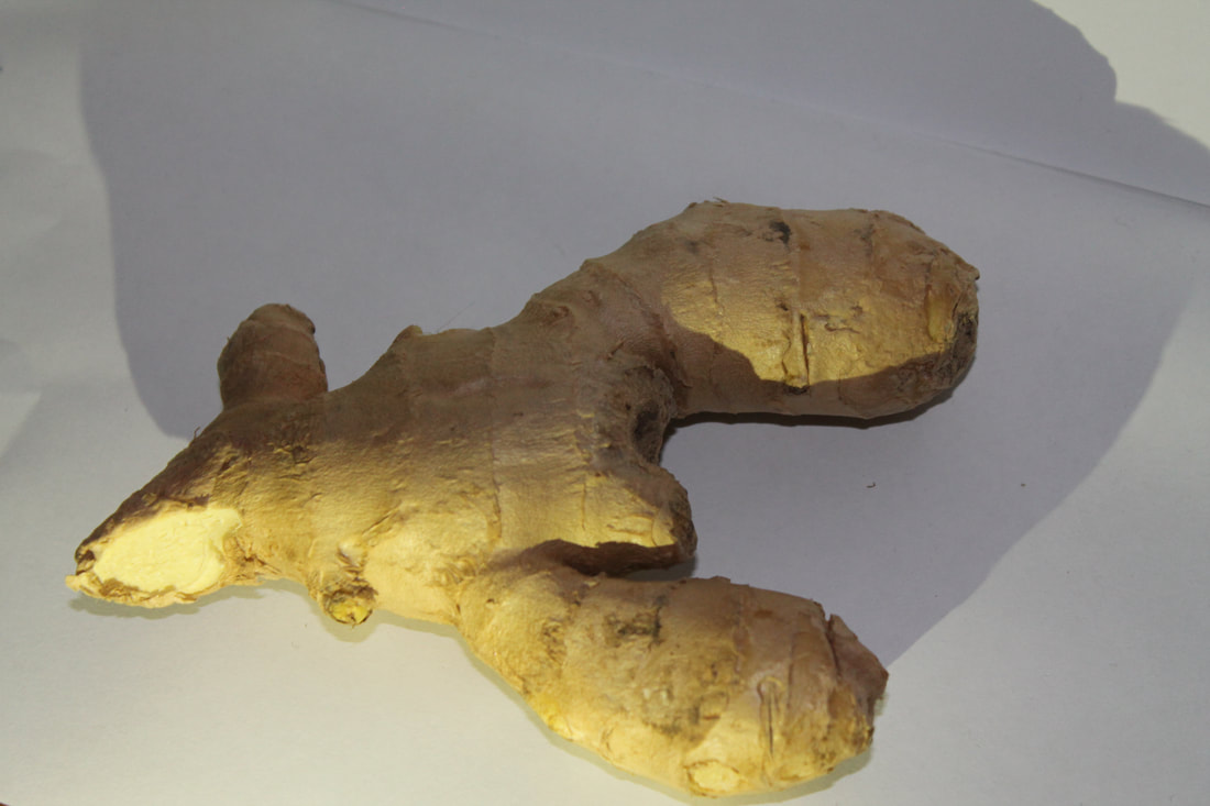
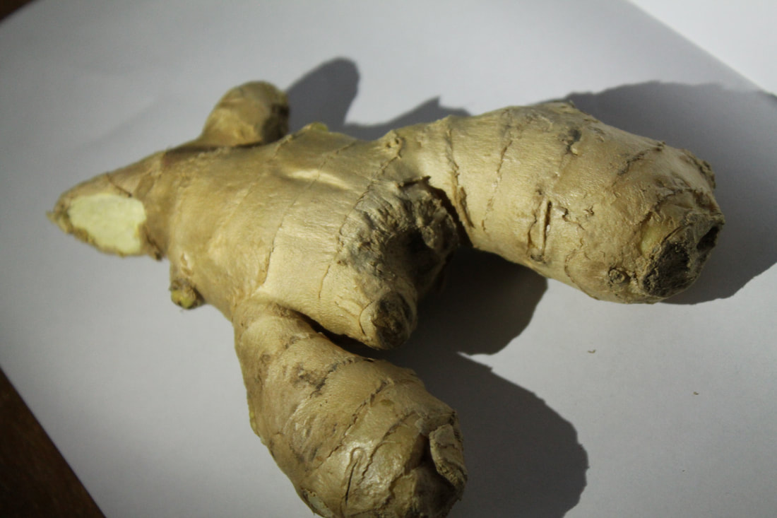
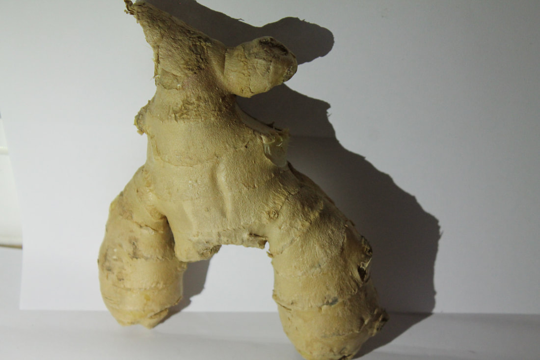
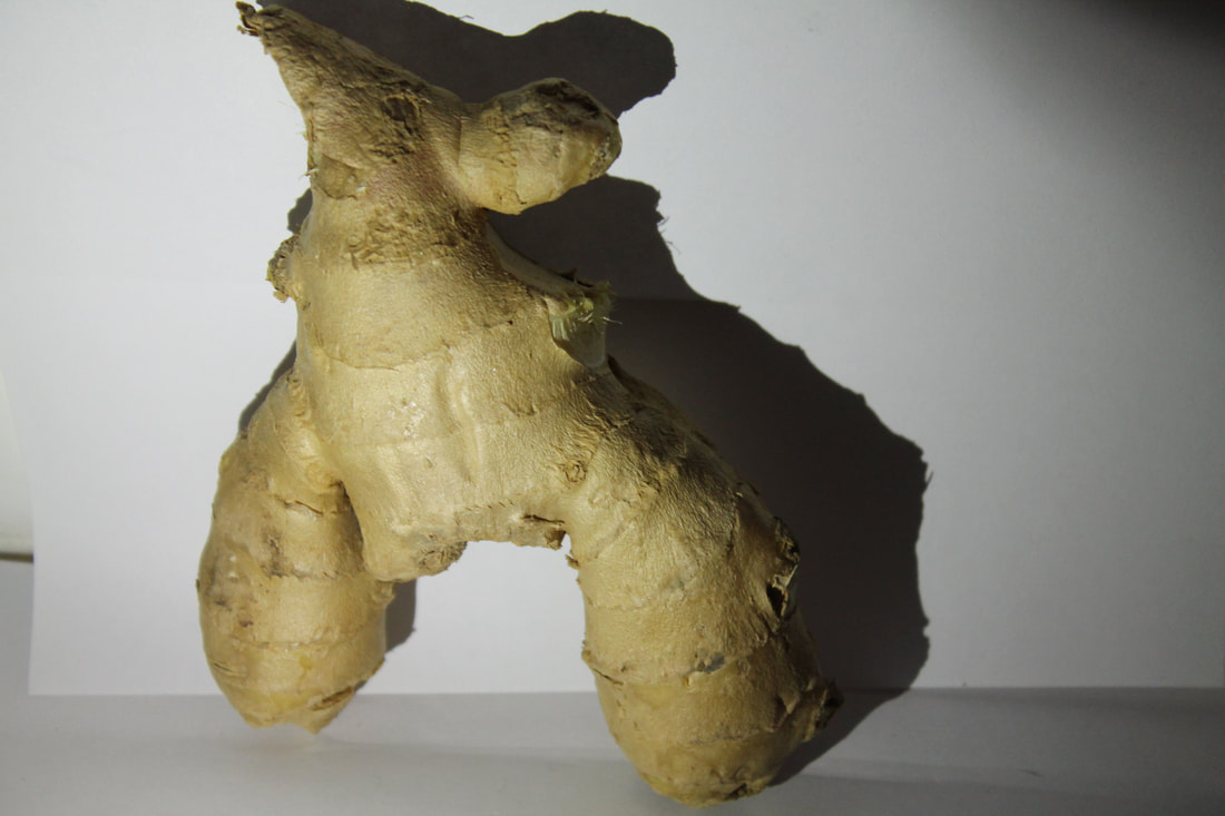
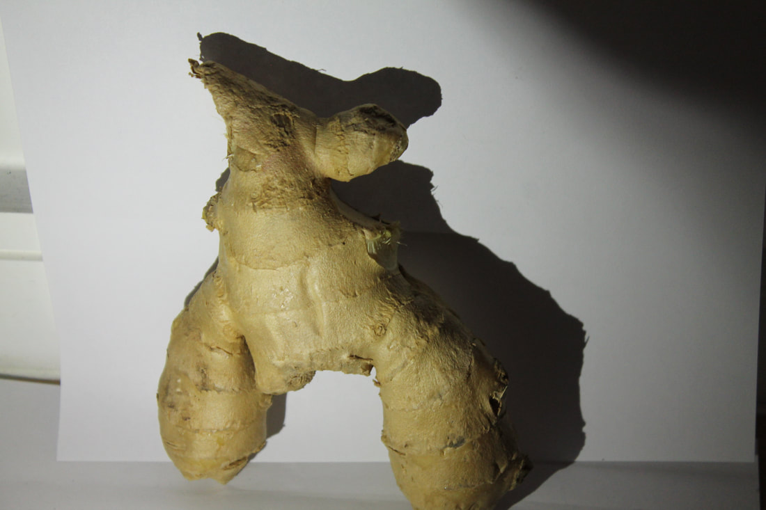
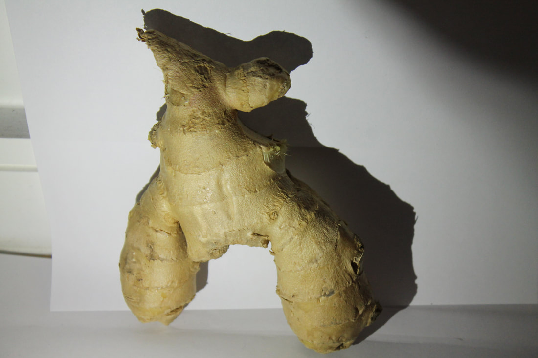
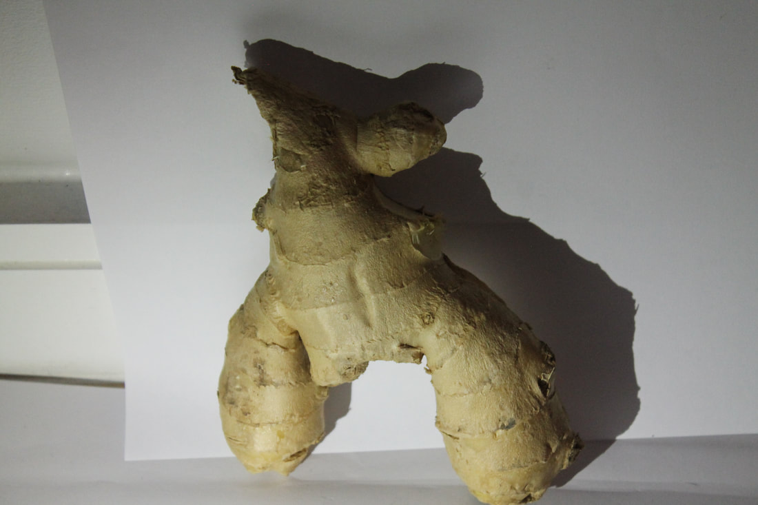
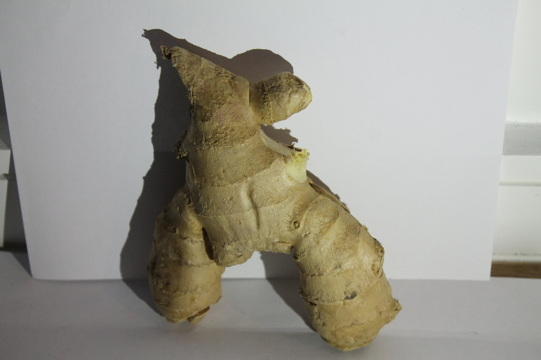
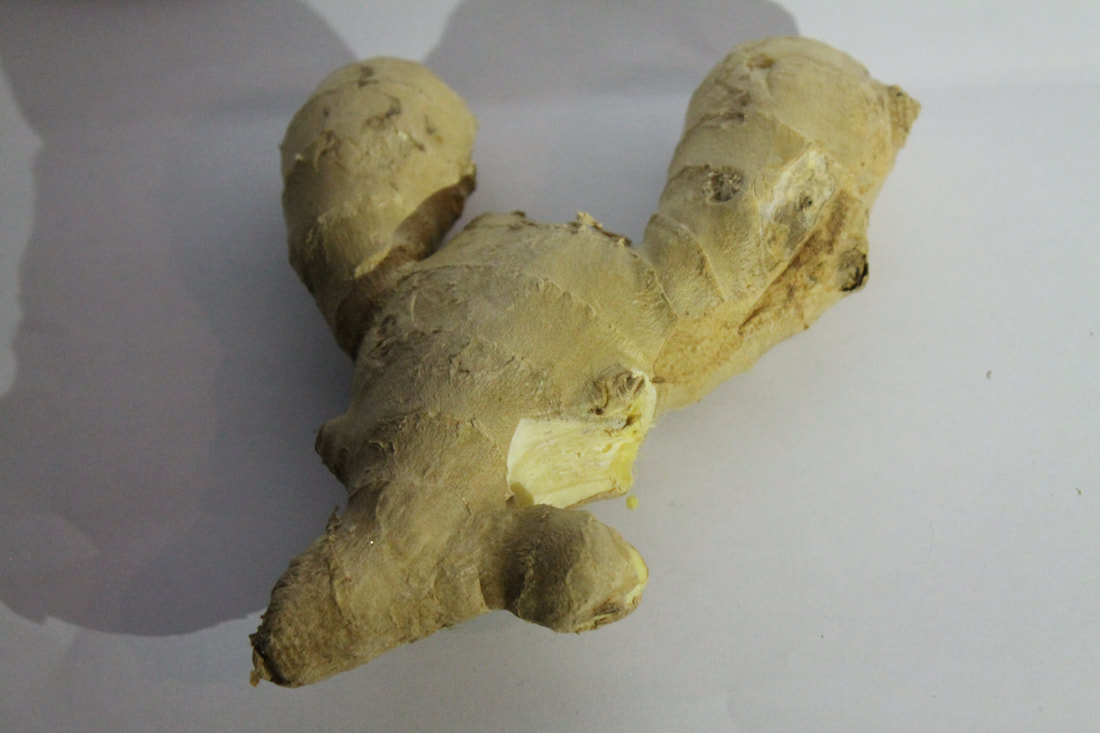
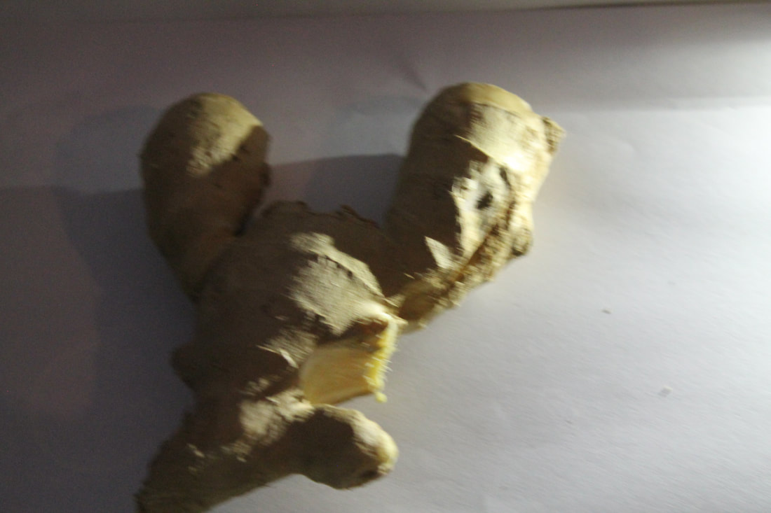
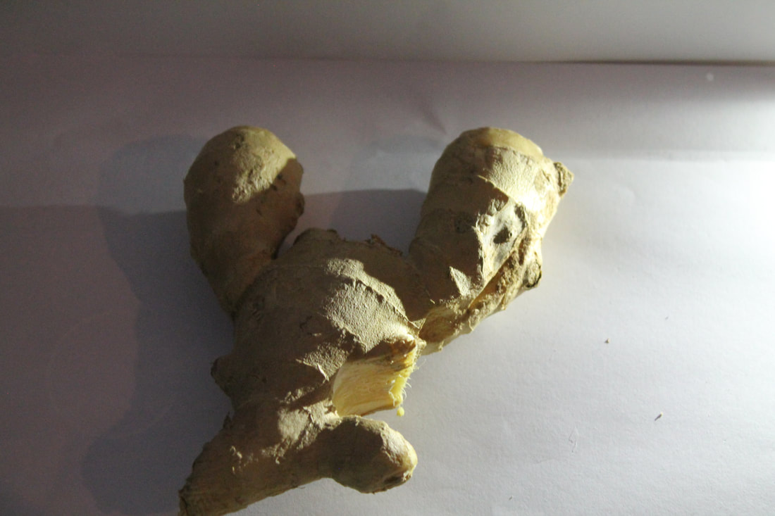
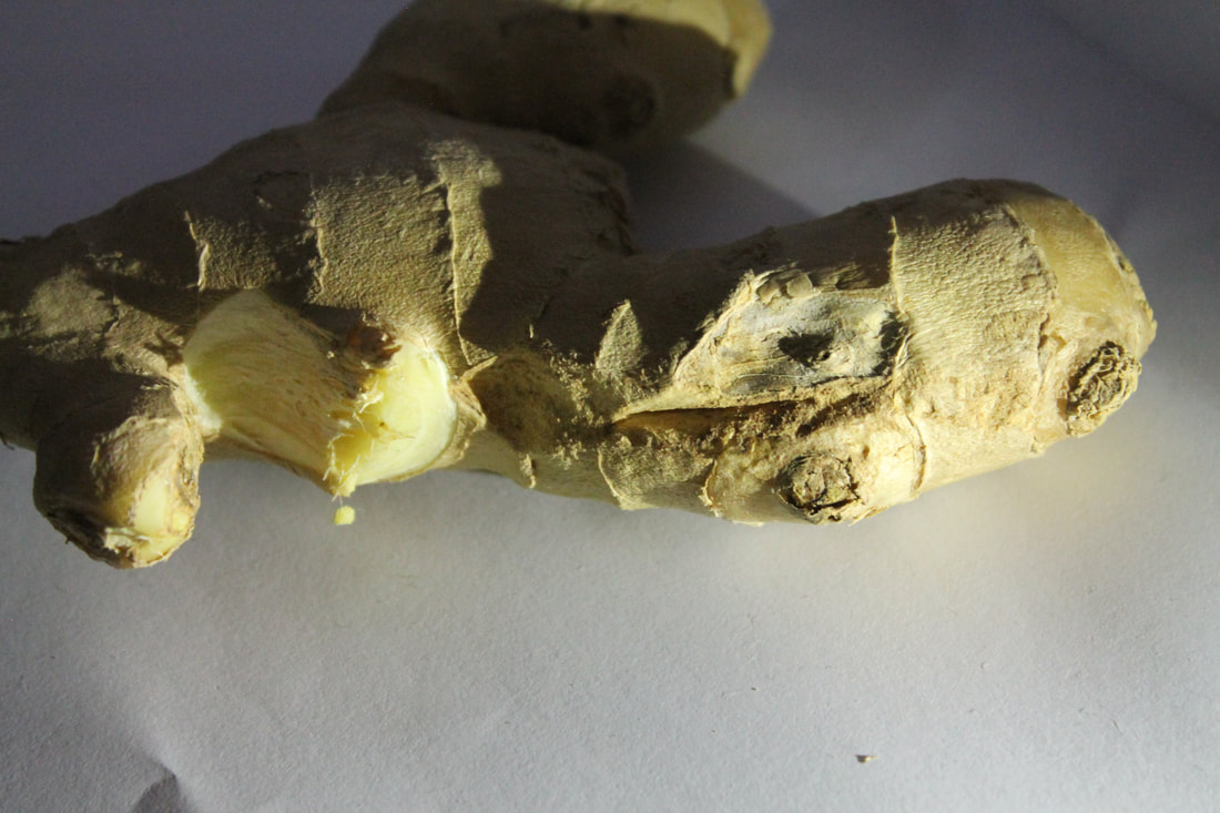
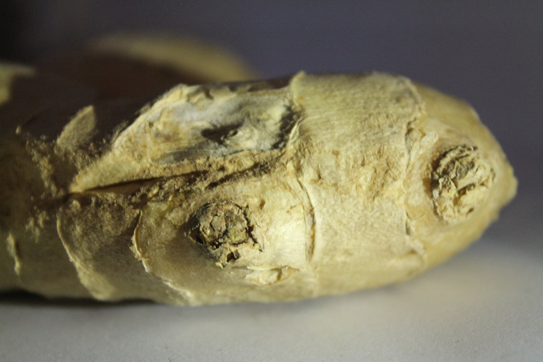
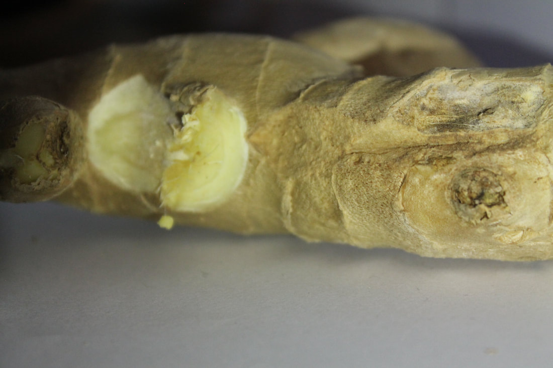
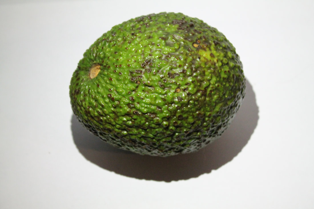
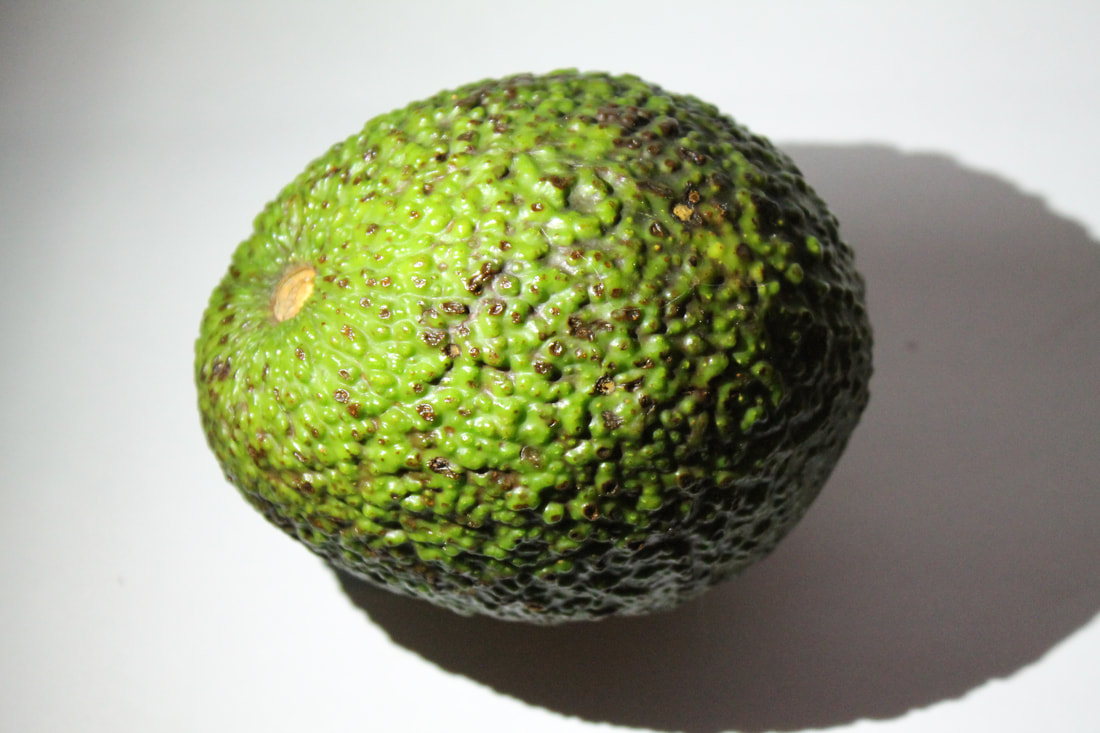
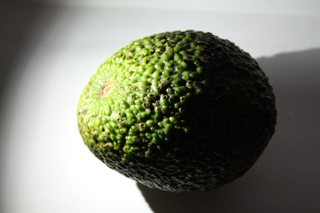
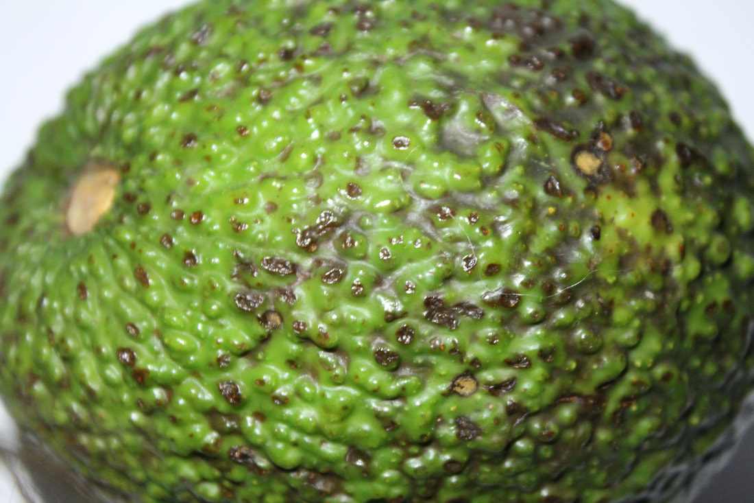
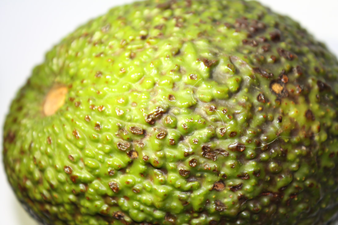
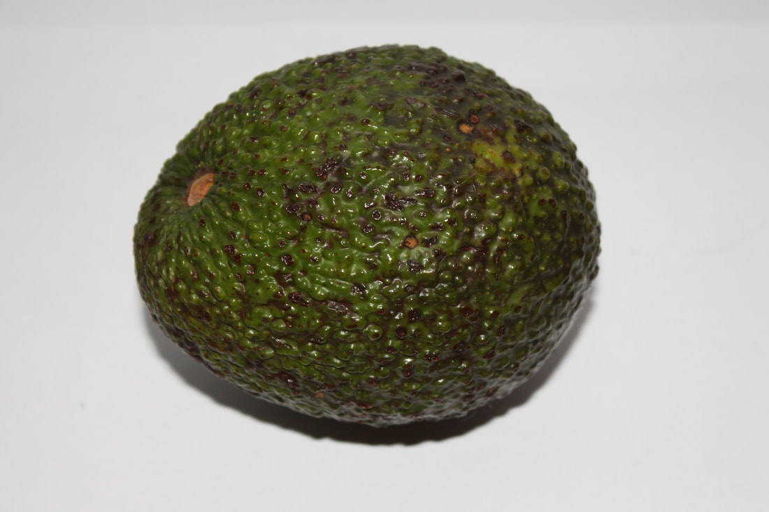
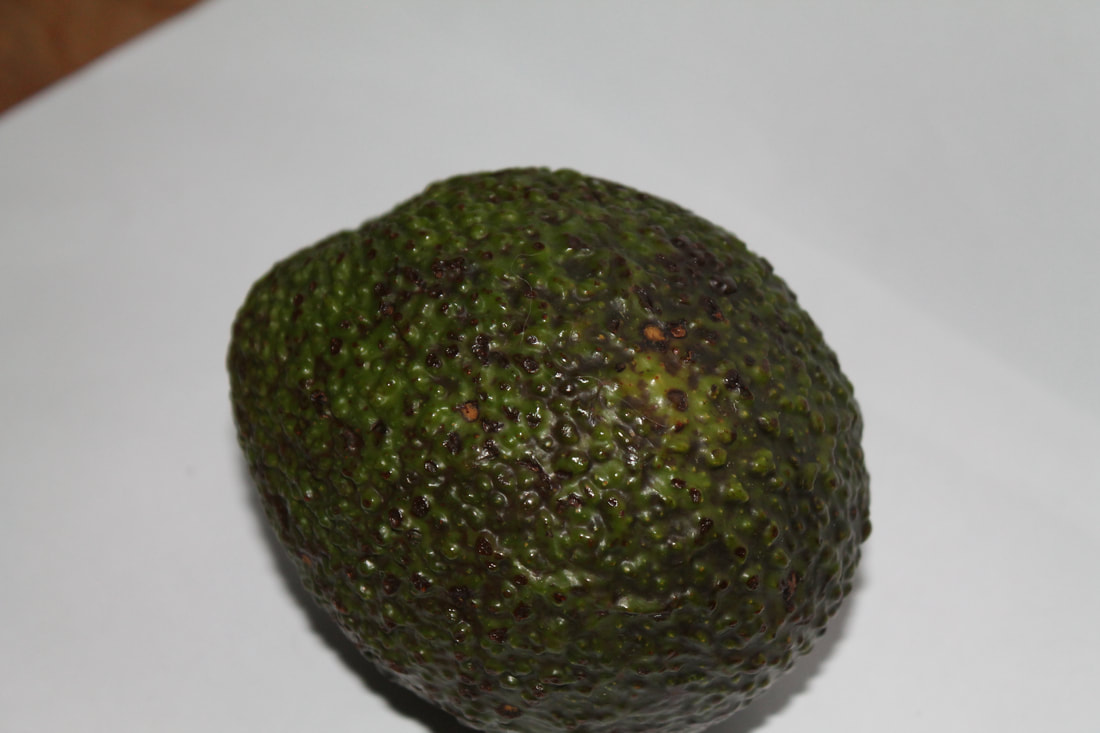
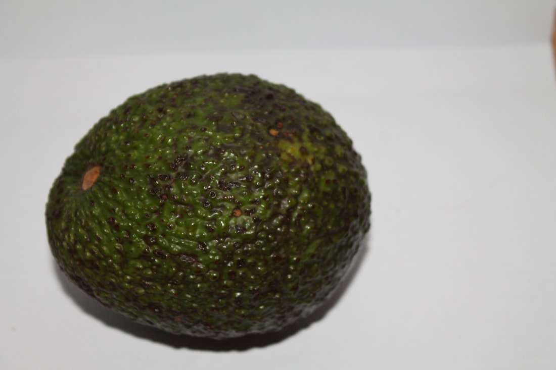
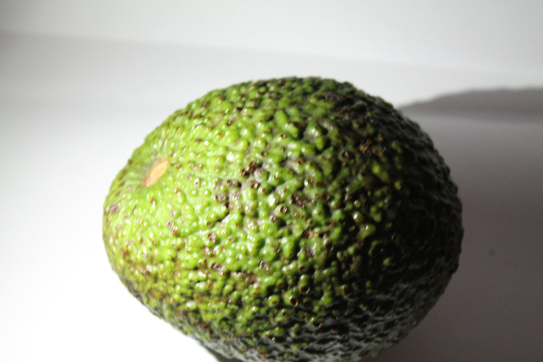
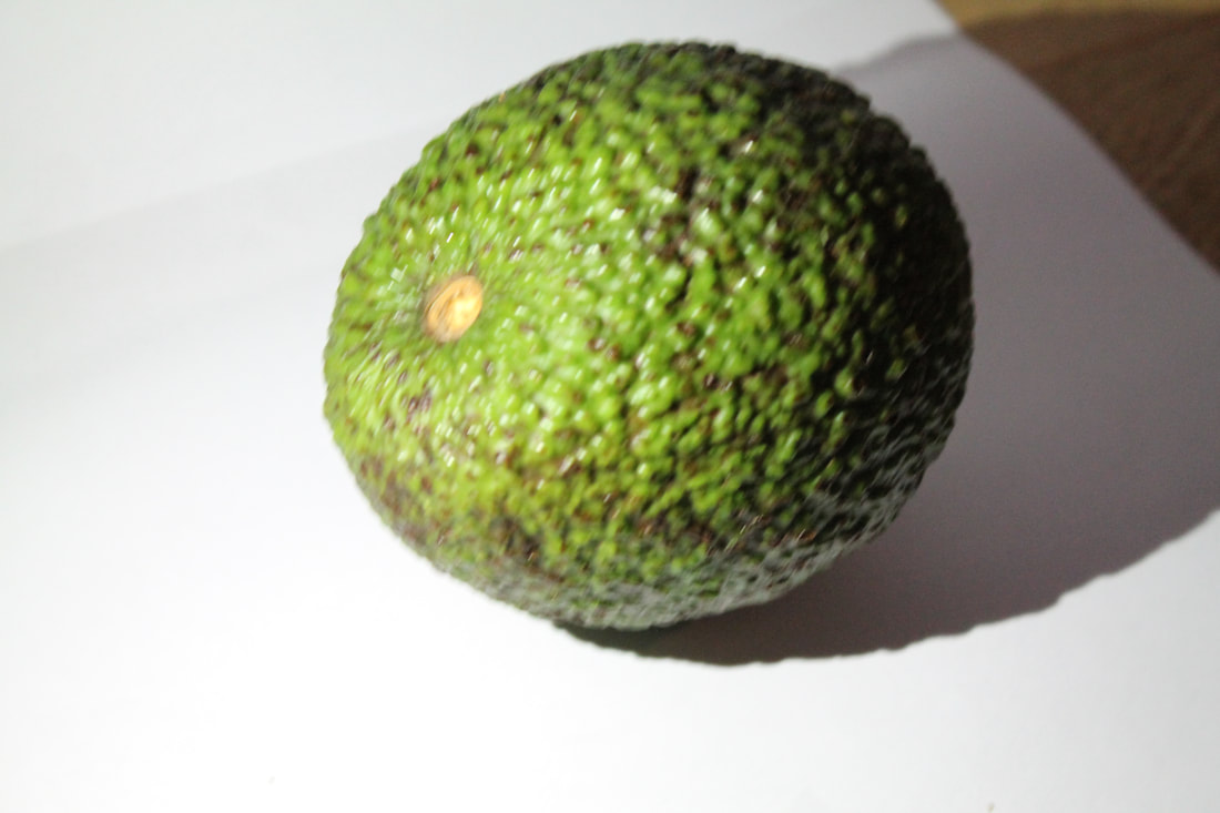
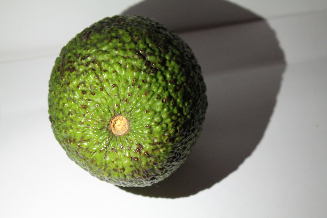
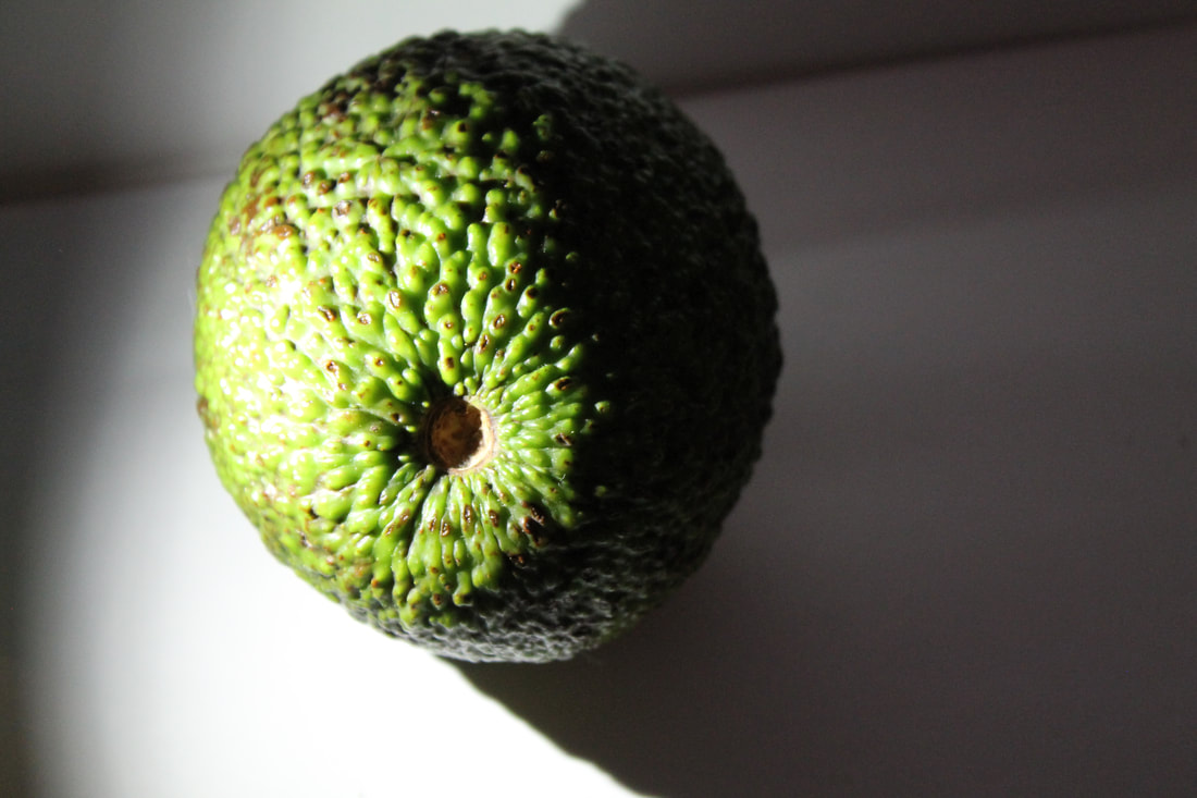
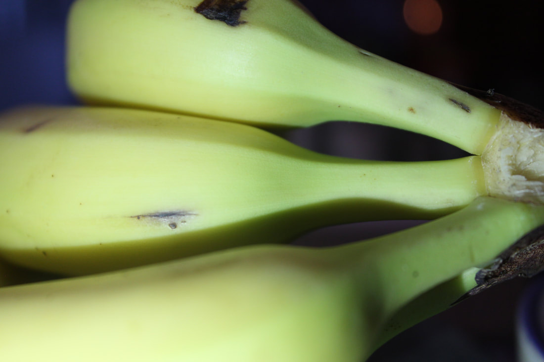
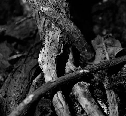
For this task we had too take images of an object of choice that had an interesting texture or pattern on it . I chose a shell, avocado and ginger due to them all having an interesting shape or pattern. We wanted to try the Edward Weston task but this time with an unnatural light. To take these images I turned off the lights and ha two pieces of white paper stuck together to create the background.
I placed a torch light upon the object and started to capture my images. To give a more diverse selection of images I moved the light around the subject matter to see what it would look like from different angles I also moved the camera around and the object .Then to edit I placed a black and white filter over the top and then adjusted the contrast and brightness where needed.
I placed a torch light upon the object and started to capture my images. To give a more diverse selection of images I moved the light around the subject matter to see what it would look like from different angles I also moved the camera around and the object .Then to edit I placed a black and white filter over the top and then adjusted the contrast and brightness where needed.
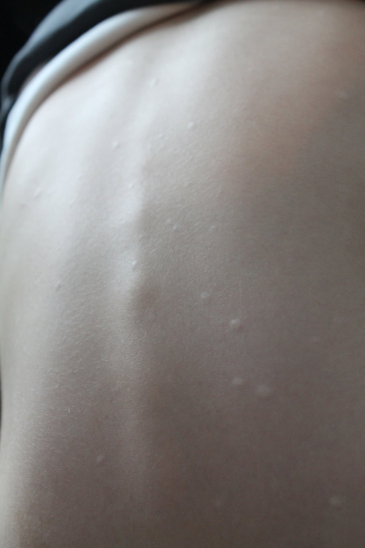
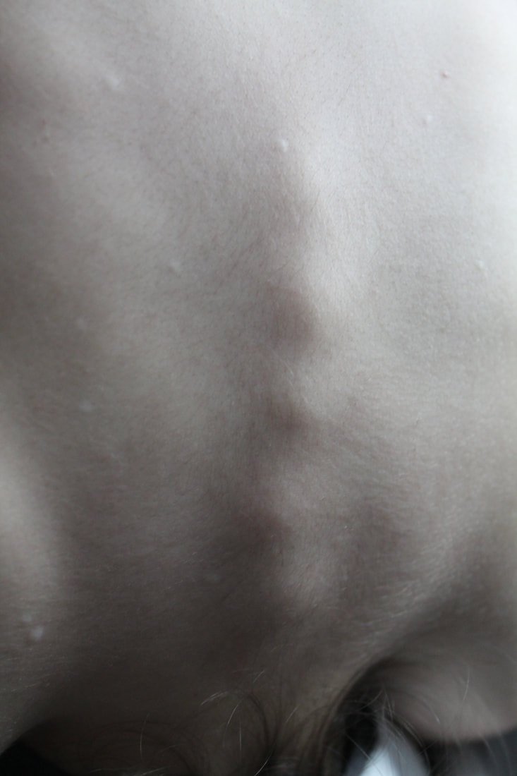
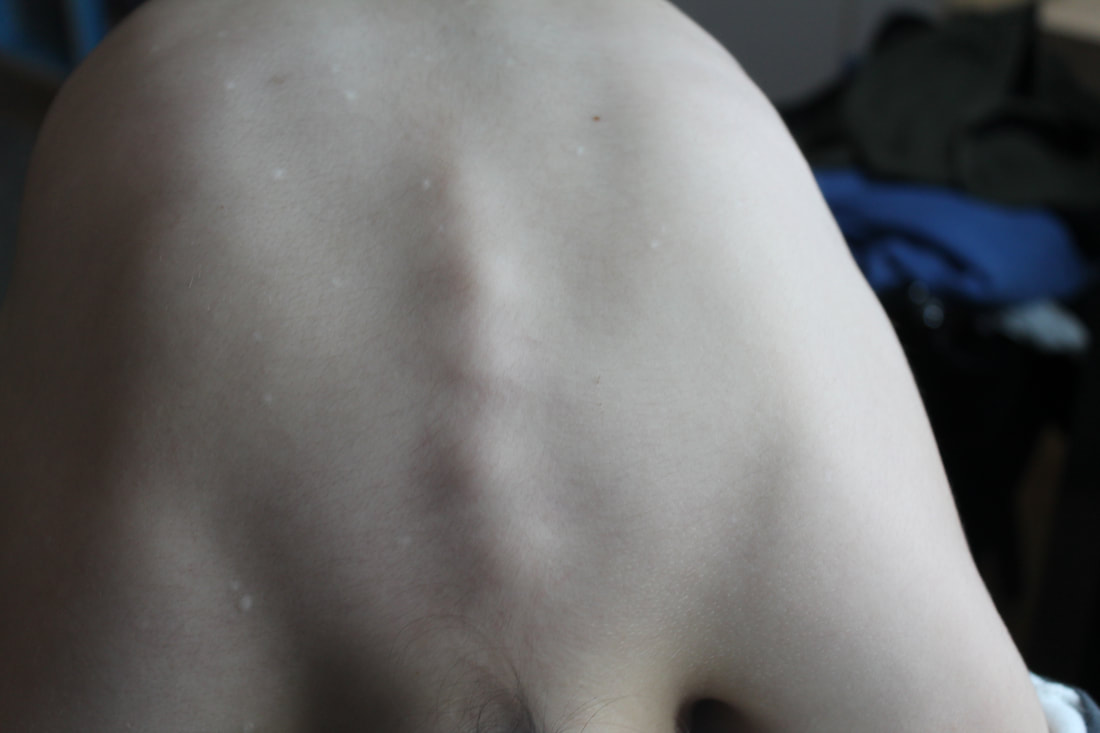
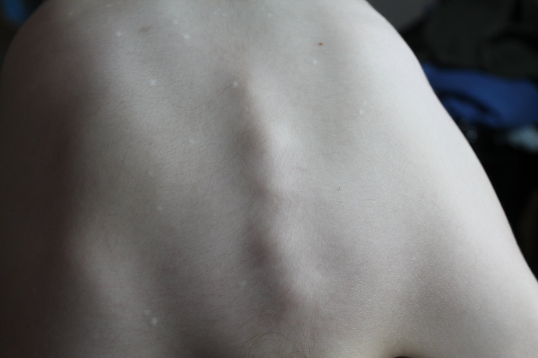
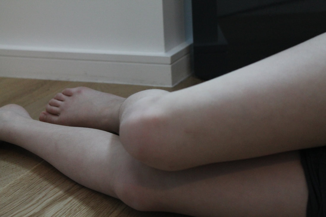
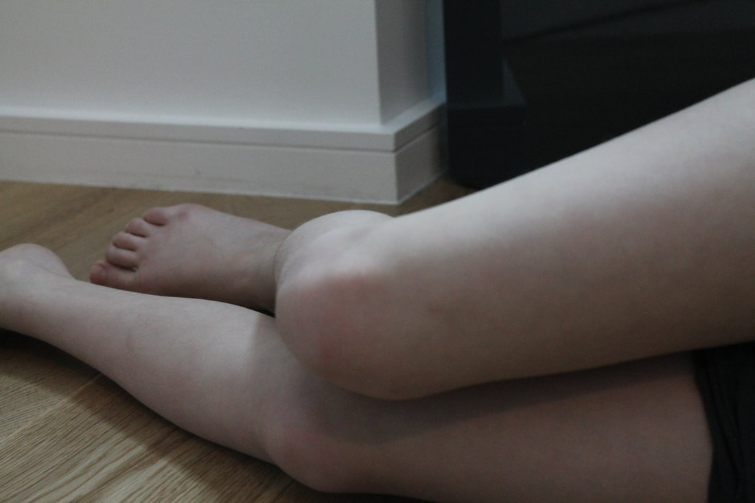
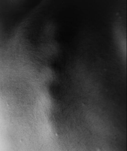
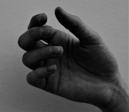
Abstraction of the body and nature
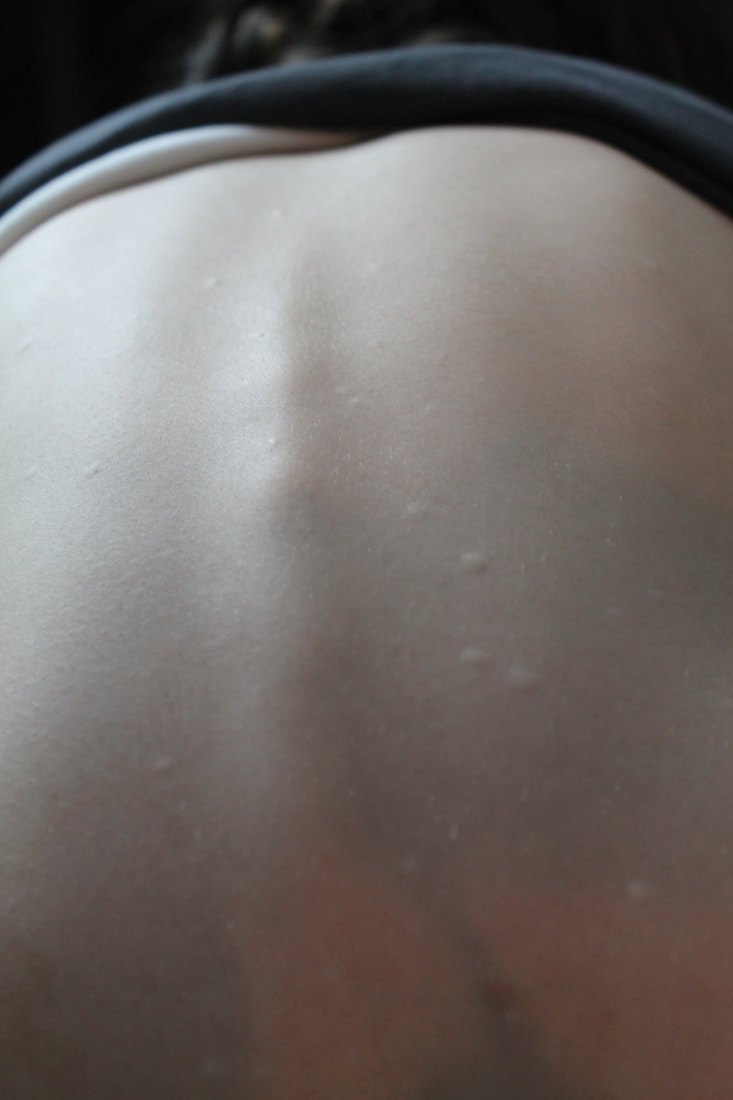
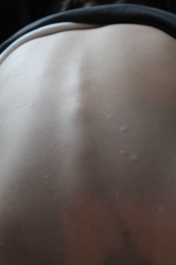
For this task we had to take images of nature and then body. I found plants that resembles a body part or a feature of a body. I then got my subject to get into position that create or enhance the body part. Then to edit I cropped the images in then placed a black and white filter over top and adjusted the contrast and brightness where needed.


Body images
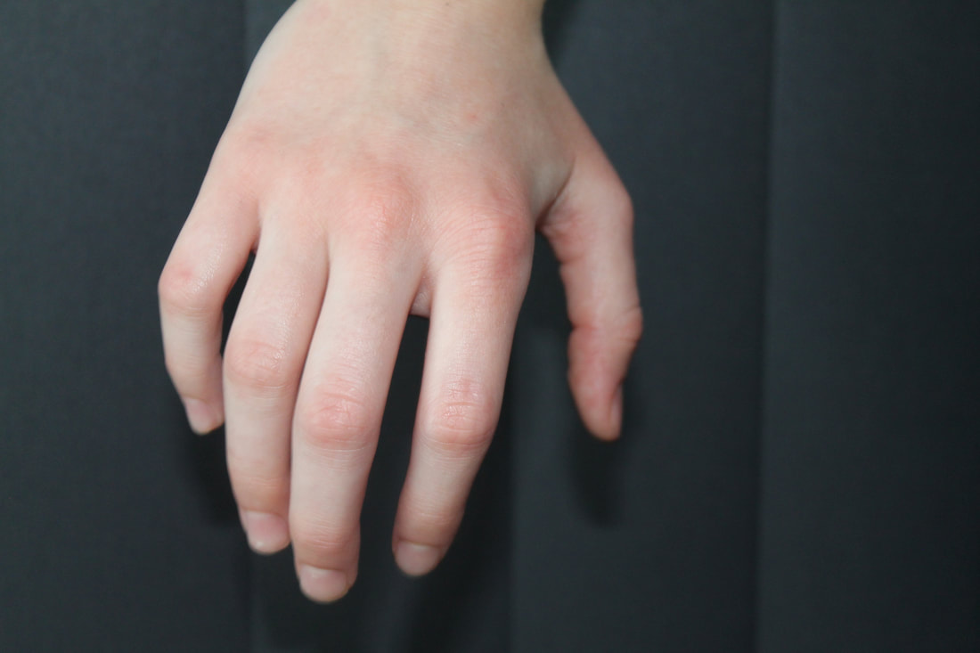
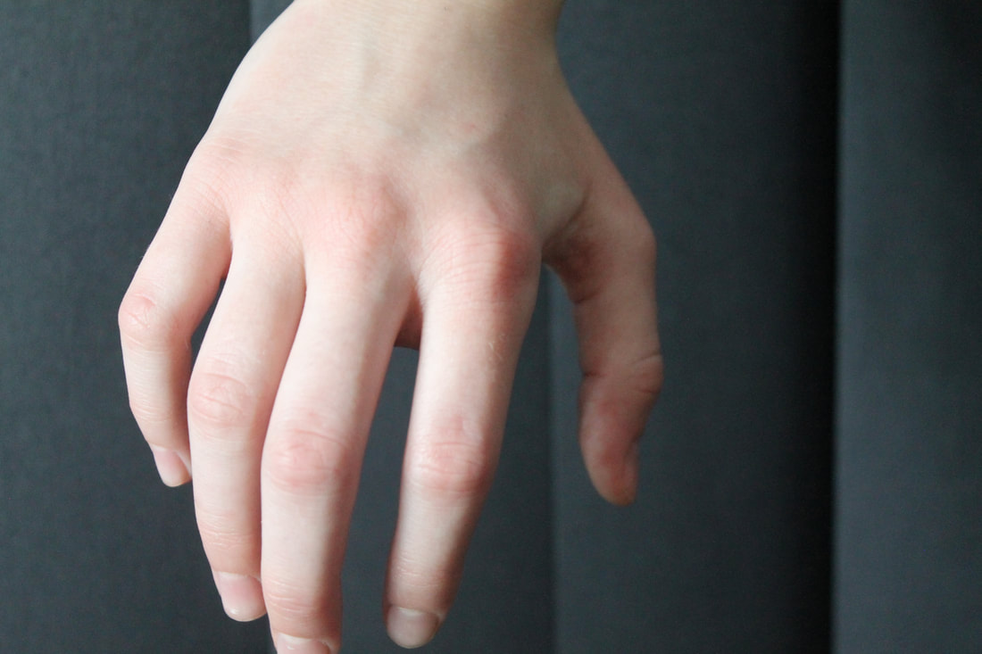
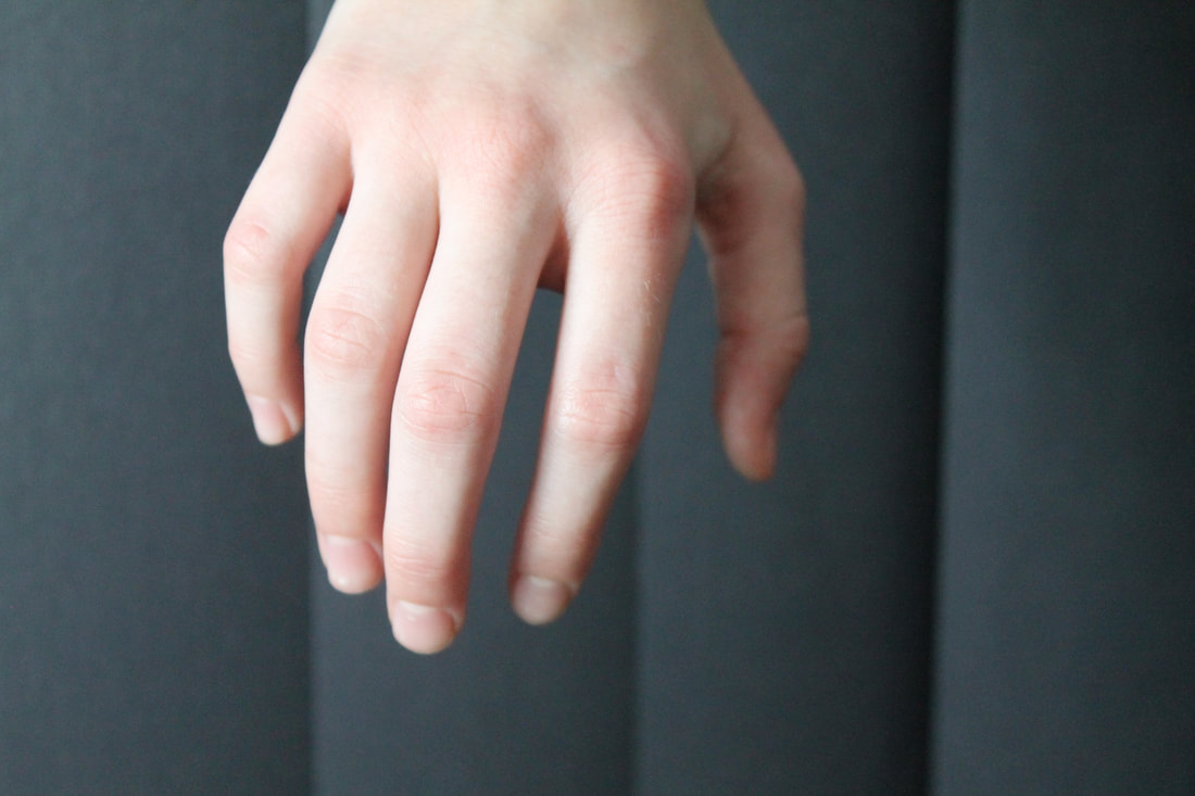

Body vs nature
|
|
|
|
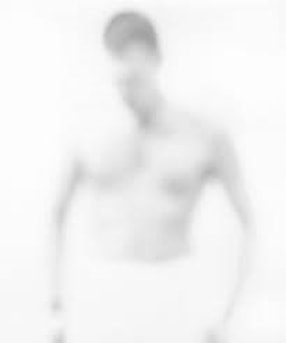
Bill Jacobson
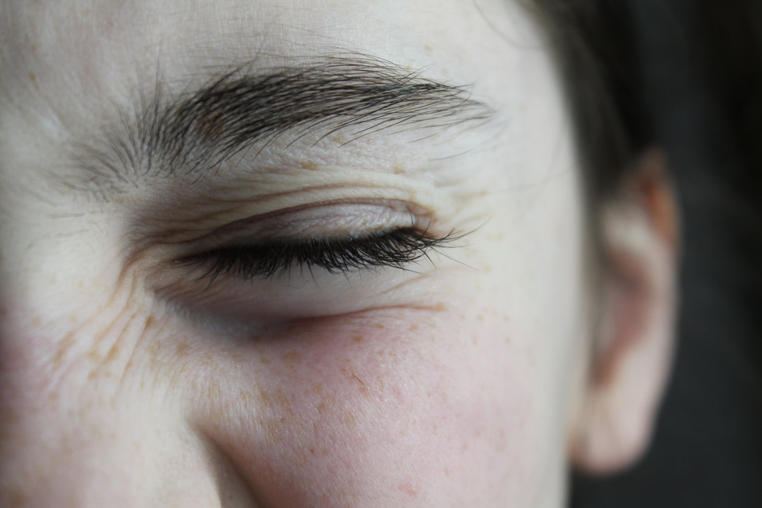
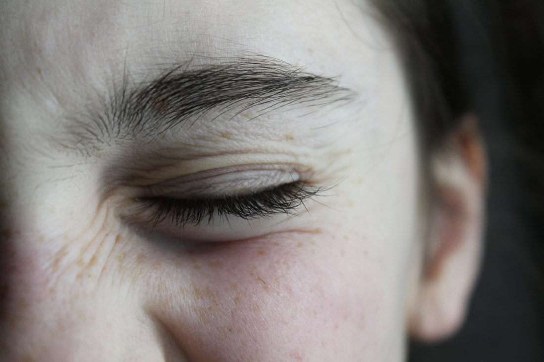
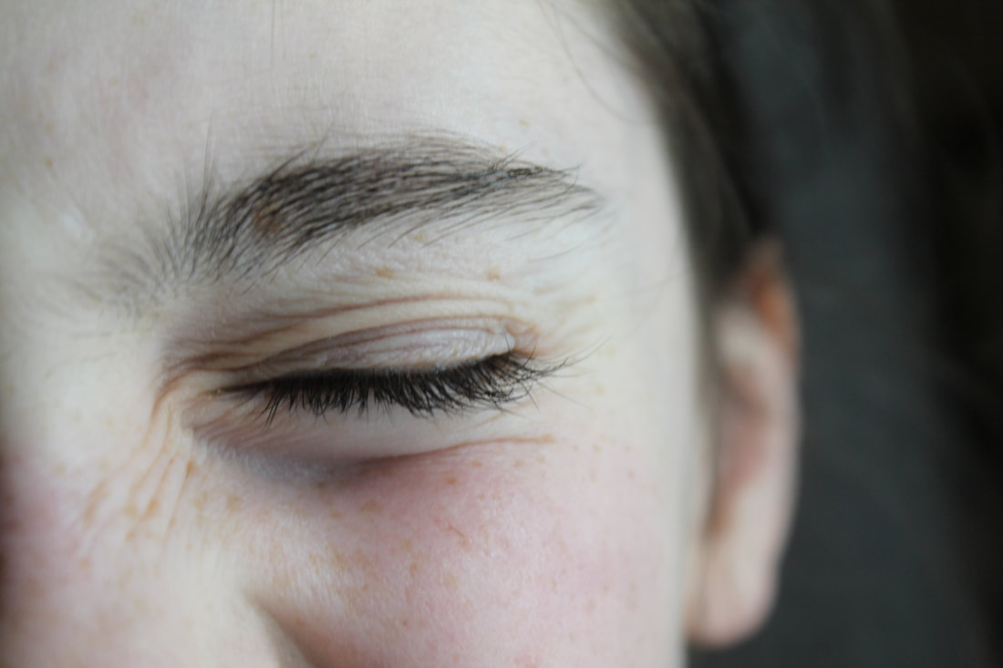
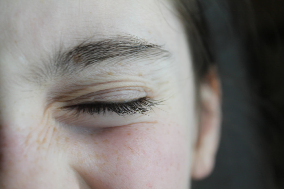
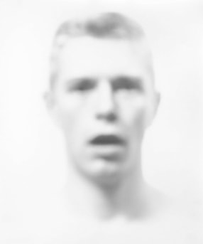
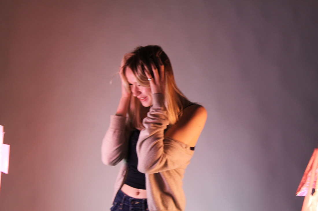
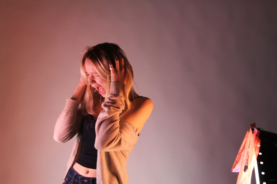
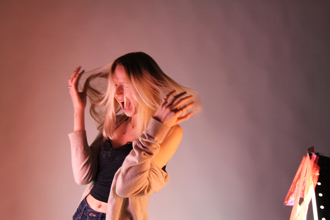
Bill Jacobson is an abstract photographer who took images from the late 80s to the early 2000s. His distorted face images are influenced from the AIDs epidemic where many people died including some of Jacobson's friends. For these images he want to show what he thought looked like a memory of someone which is highlighted by his images don't have any clear features just a blurred image that has the use of tone to show where the facial features would have been. These images show the loss of people that died and how they suffered before there life ended which Jacobson shows by have he subject look like they are in pain of shouting in agony. He was also inspired by 20- century photographs that he found at flea markets. These images had lost colour and faded over time again linking to his idea of showing how the mind slowly forgets details of a time and a place or a moment and how it slowly fades away.
|
|
|
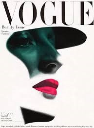
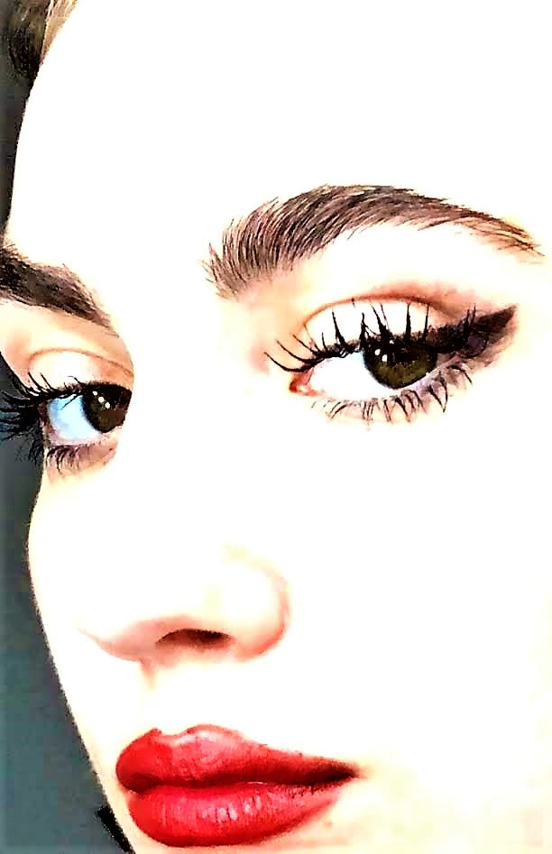
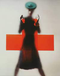
Erwin Blumenfeld
Erwin Blumenfeld was a German Jew that moved to New York in his 40s. His inspiration for his images was beauty and trying to find the 'perfect woman'. He took images for vouge magazine for years and was known for his abstraction photography and variety he brought to fashion photography. Due to him being an immigrant and seeing new York from an outsiders perspective he wanted to show the city the way he saw it. He not only took images of things he thought where beautiful but images he thought the worst about, himself. he took self portraits using masks, photographic masking and paper bags to cover up his insecurities. The intention for his images was to uncover the reality under the surface.
|

|
|
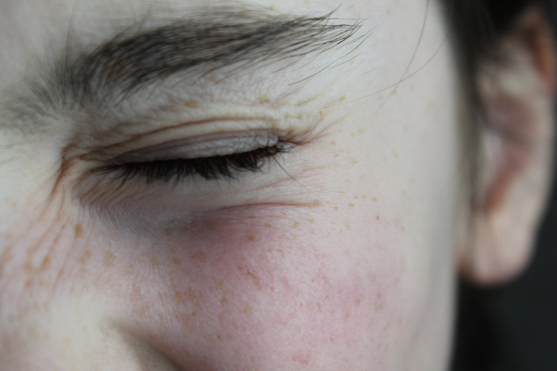
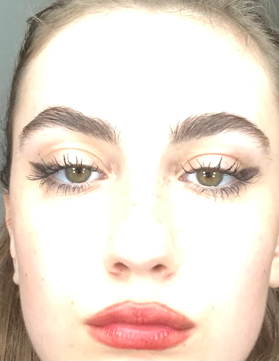
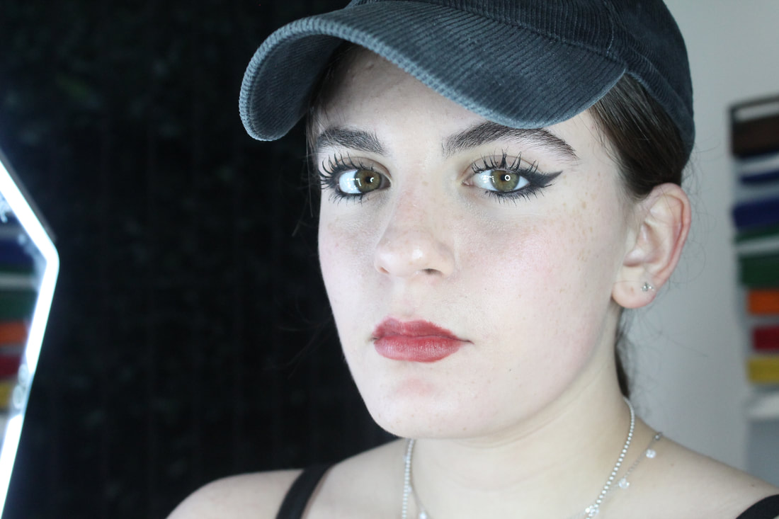
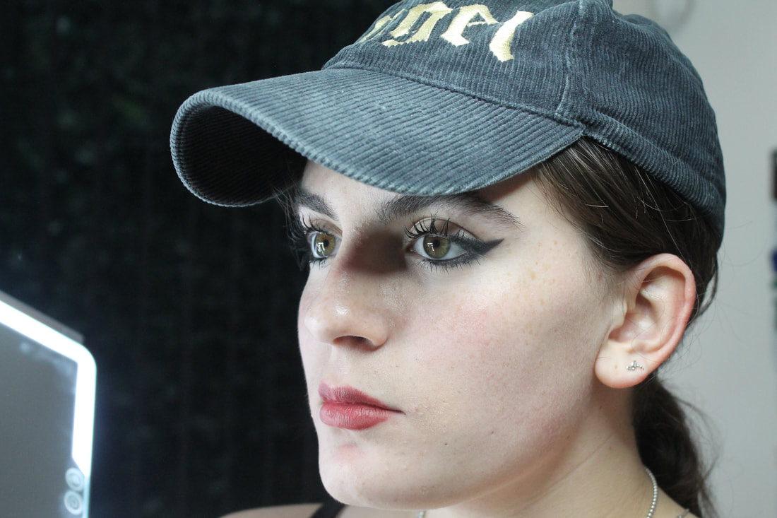
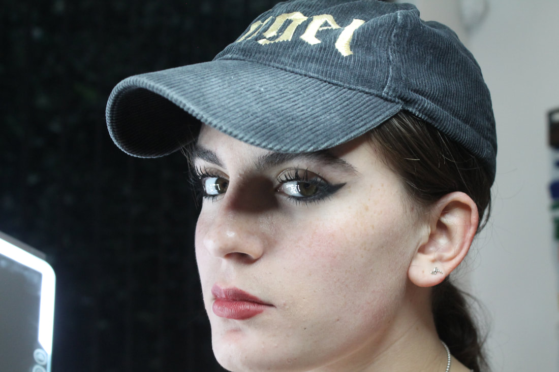
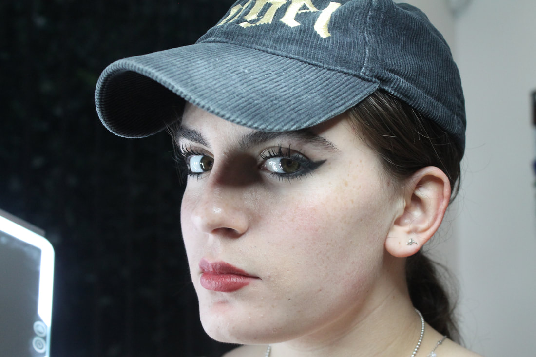
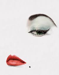
Abstract Photography
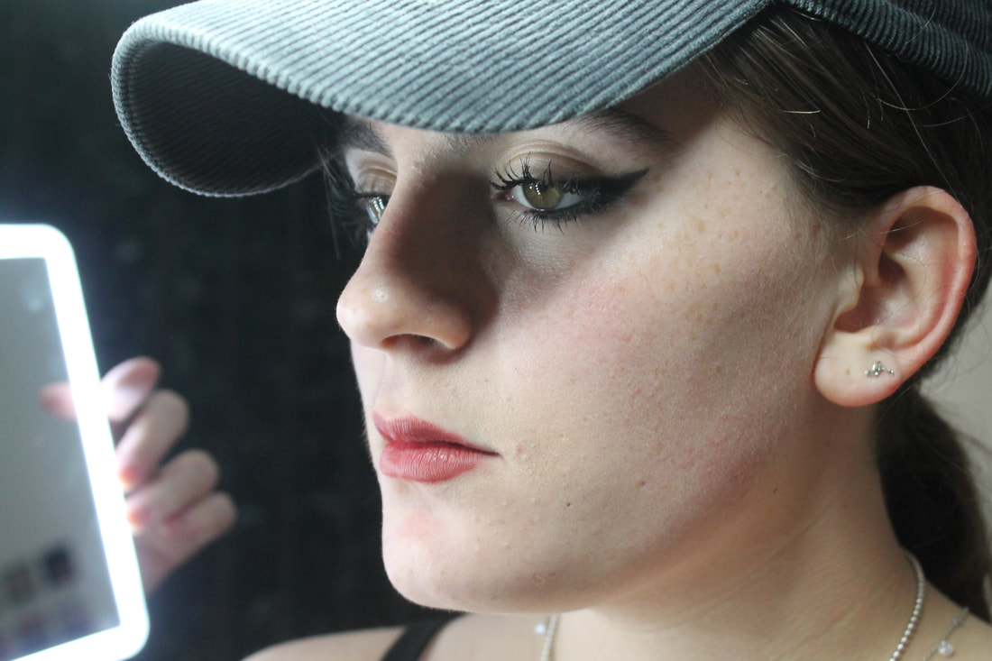
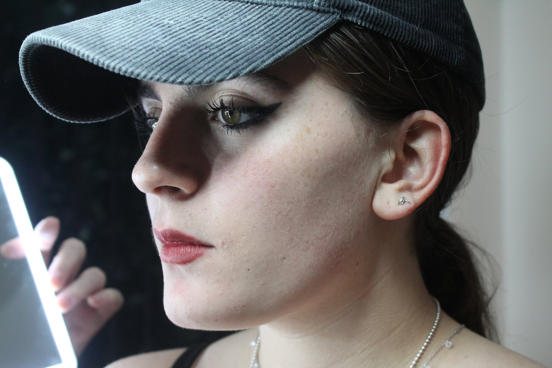
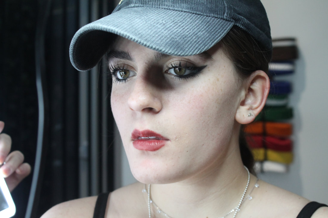
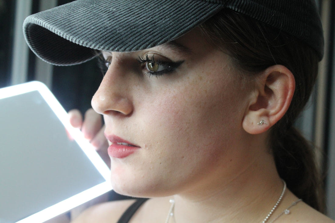
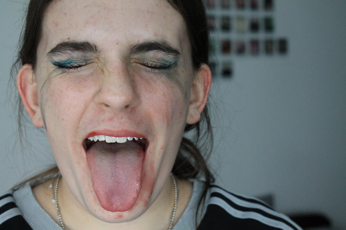
First attempt
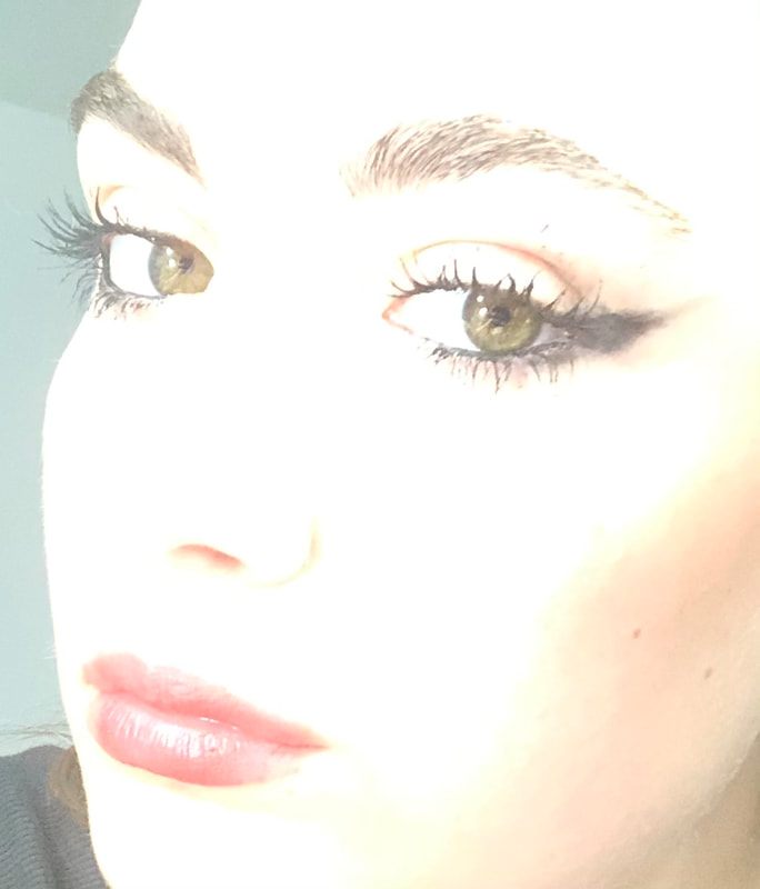
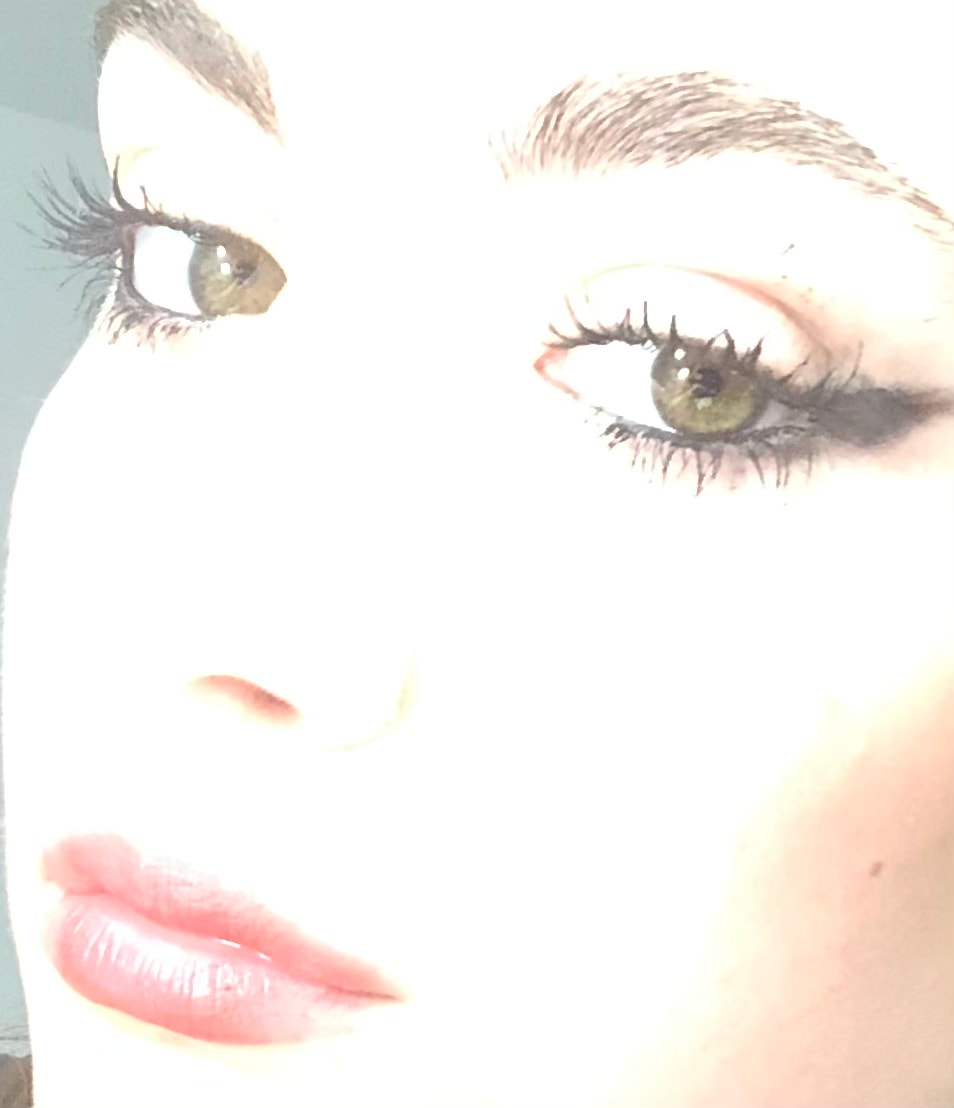
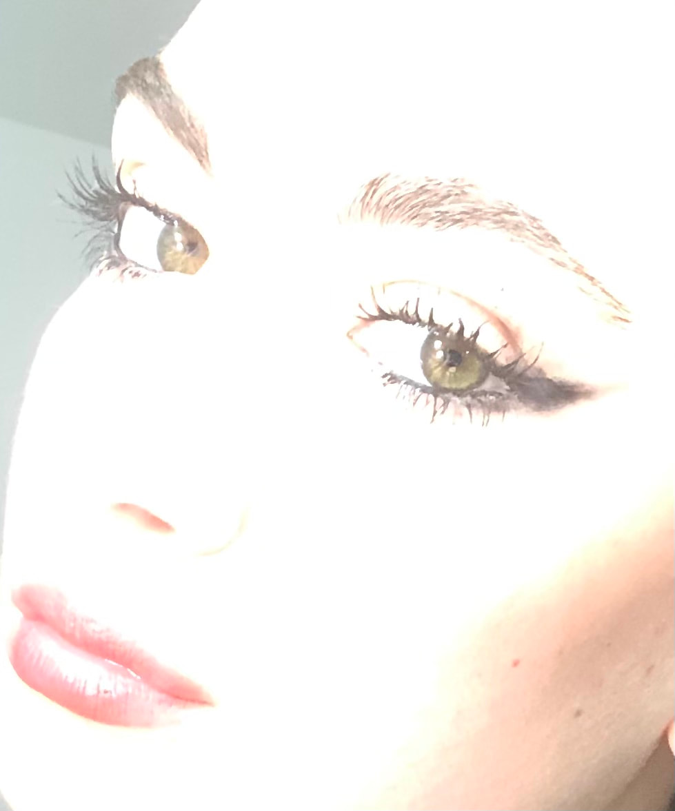
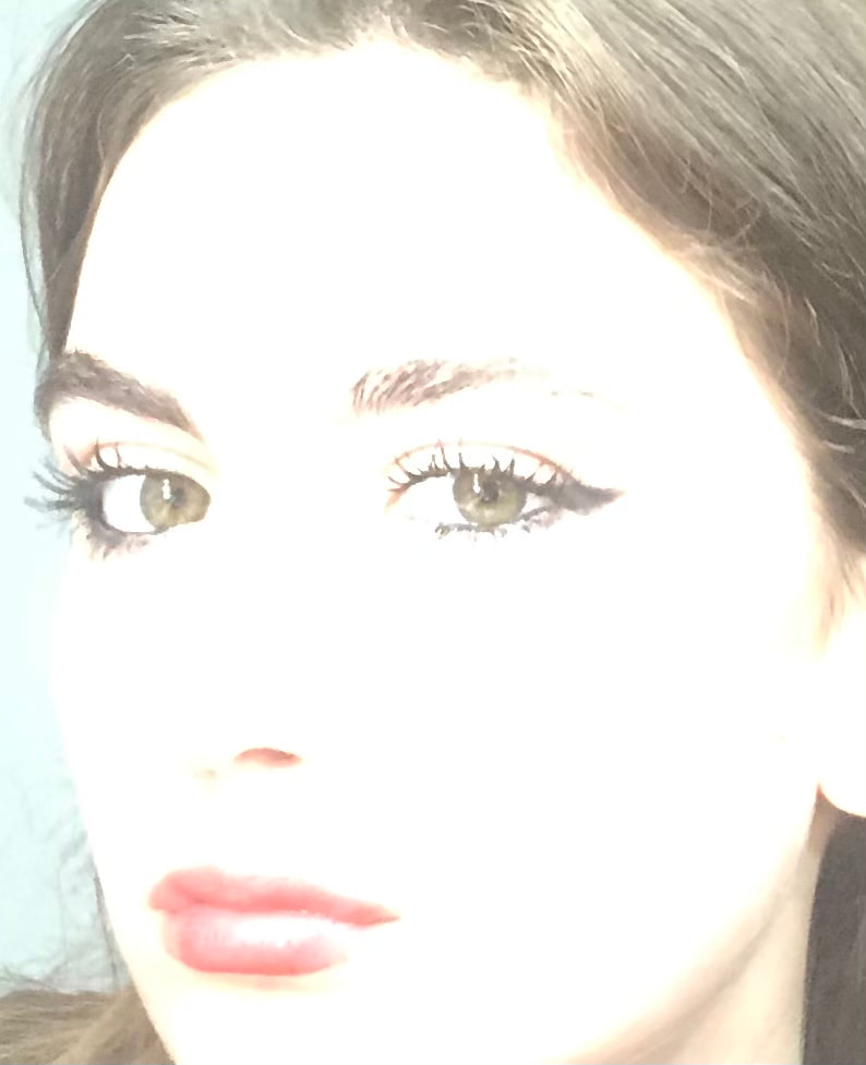
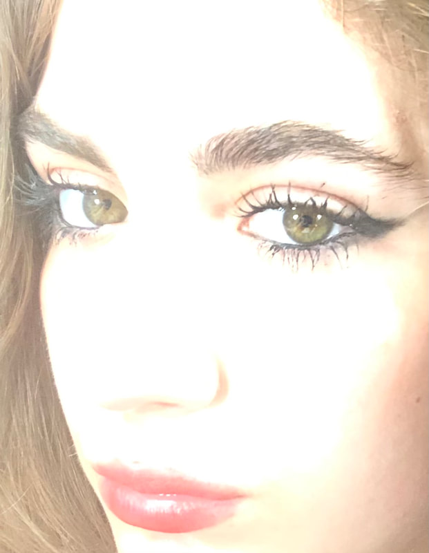
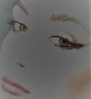
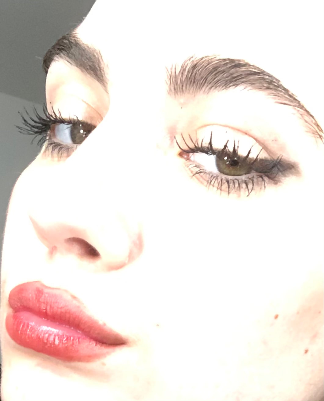
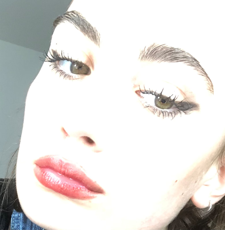
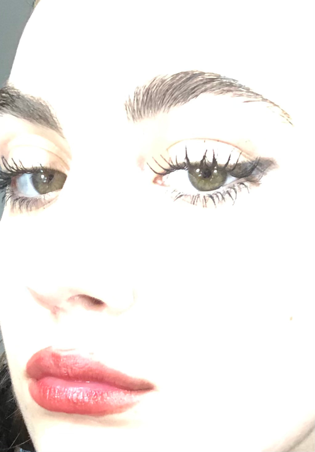
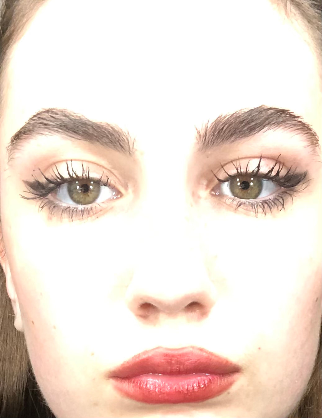
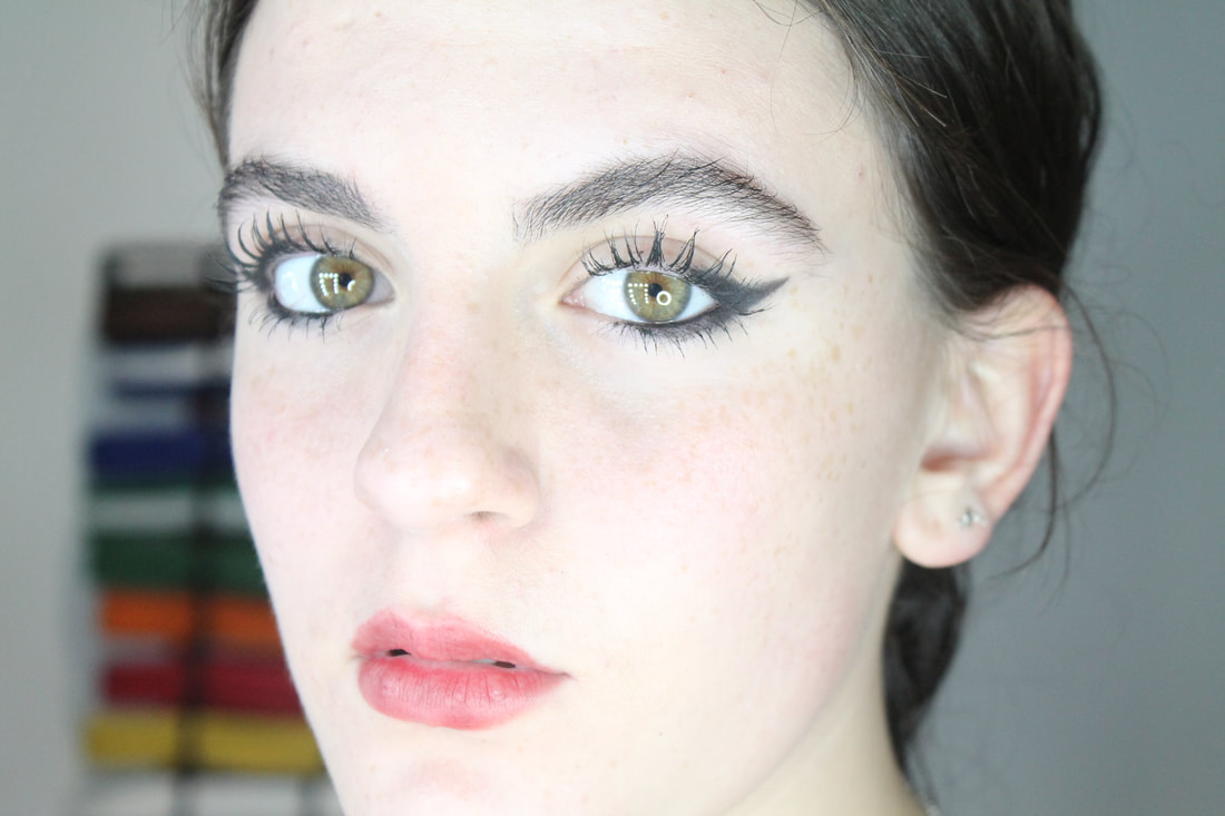
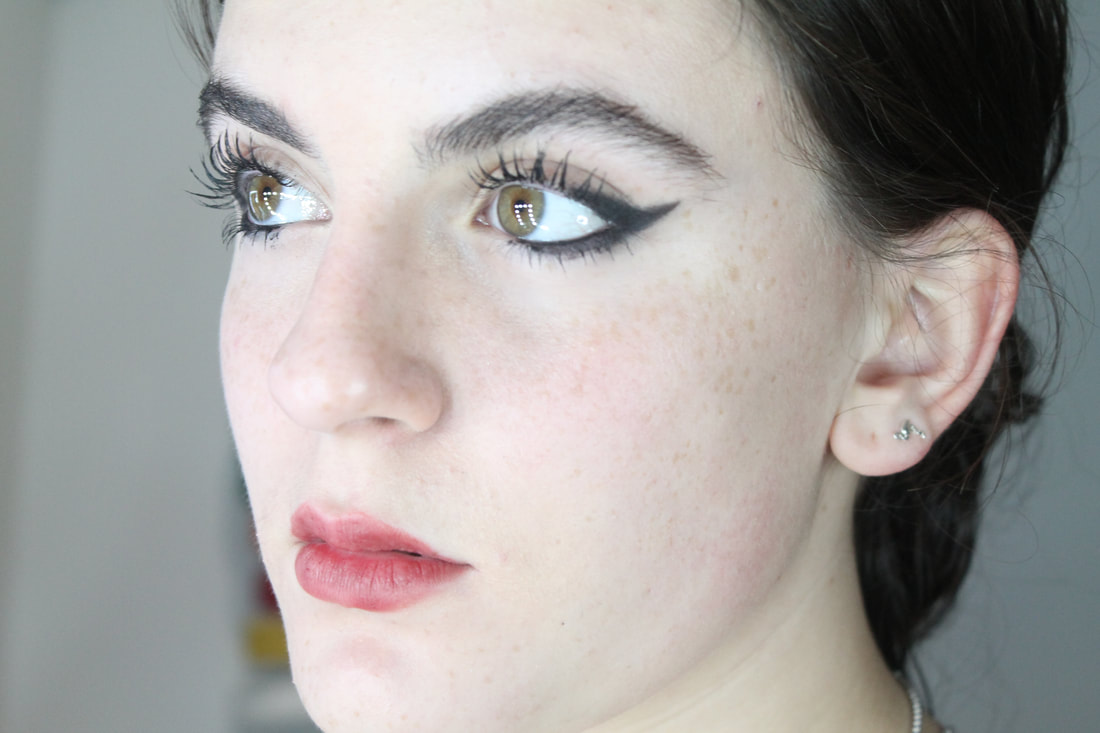
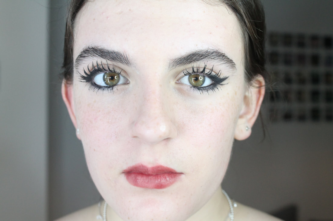
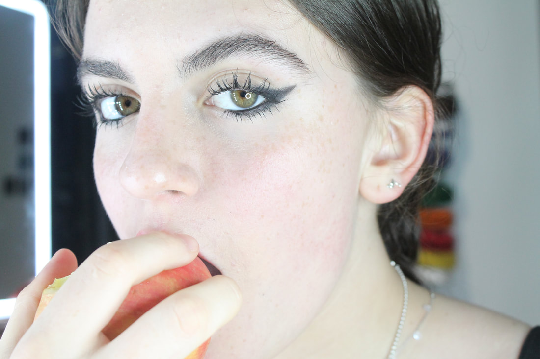
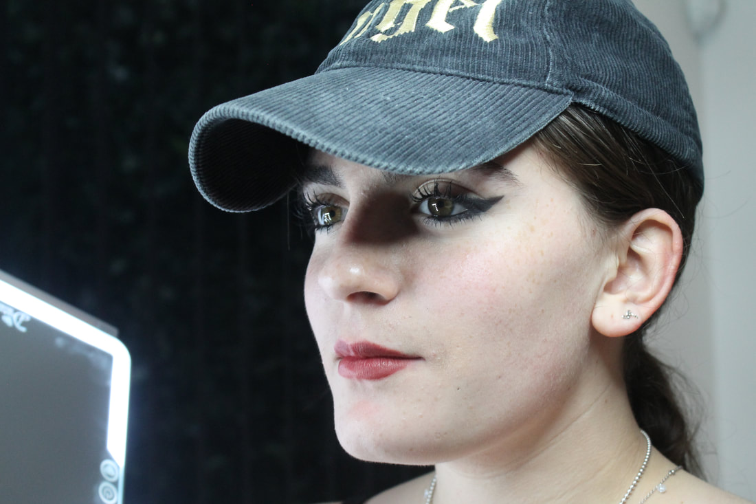
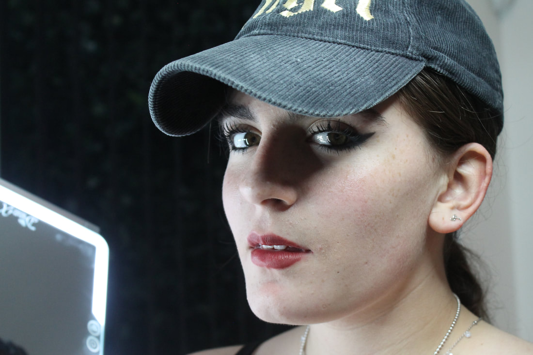
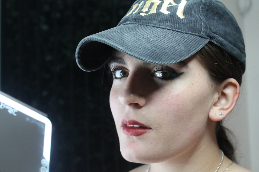
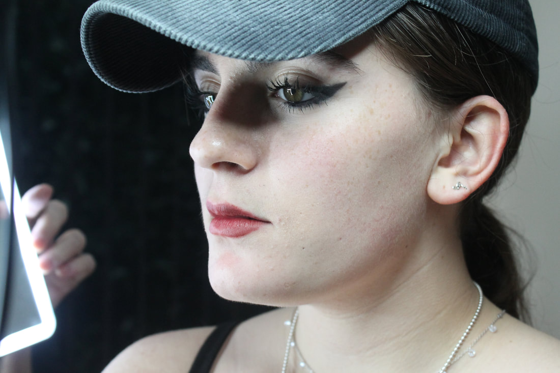
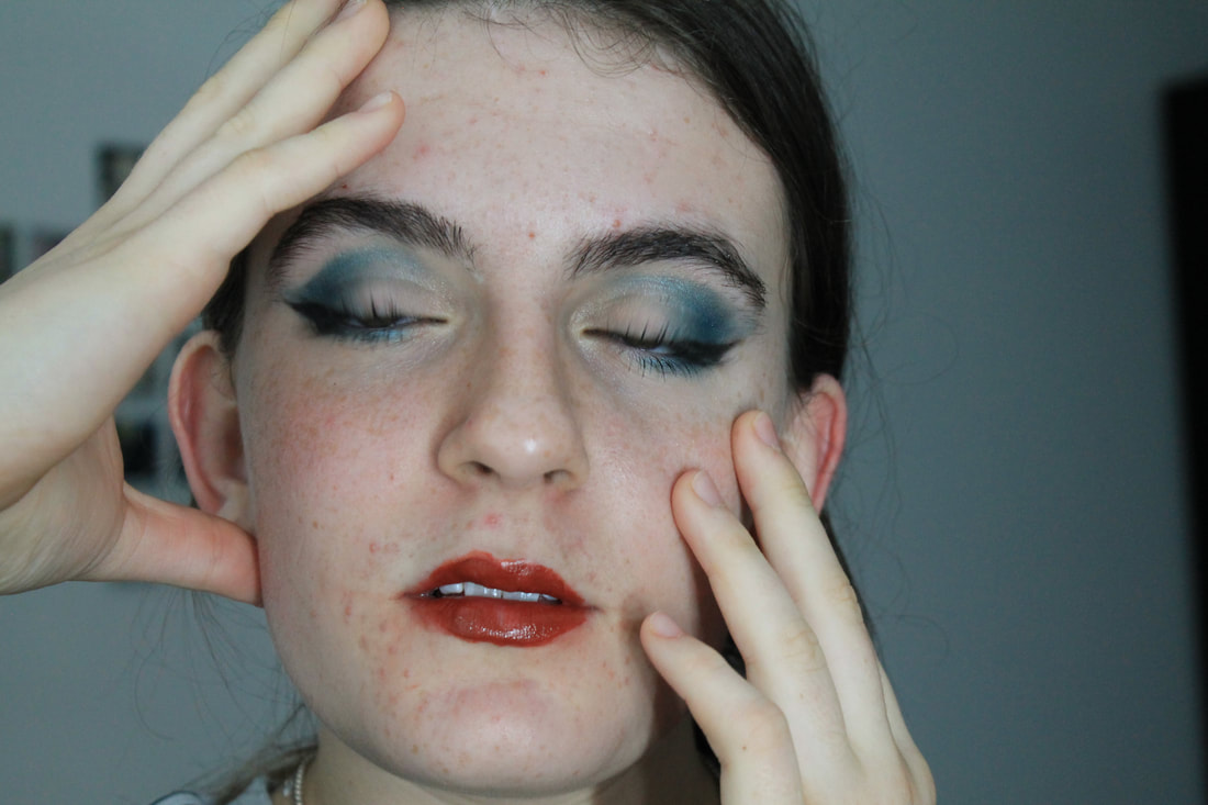
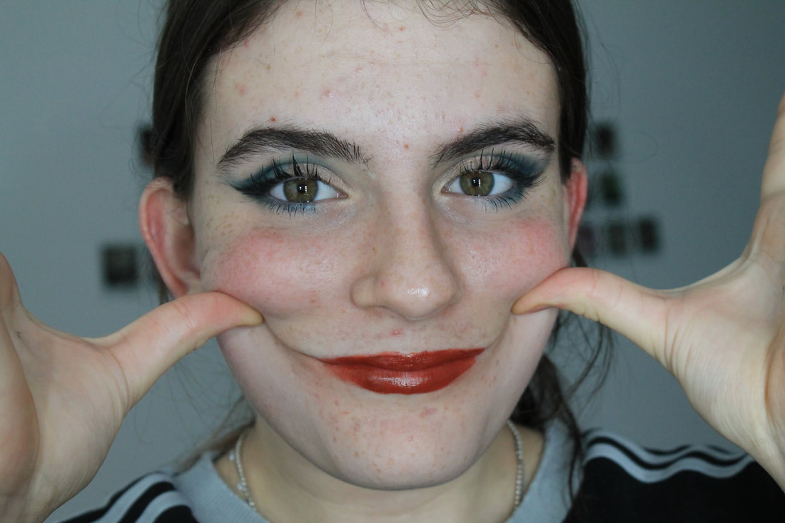
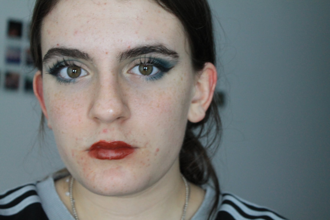
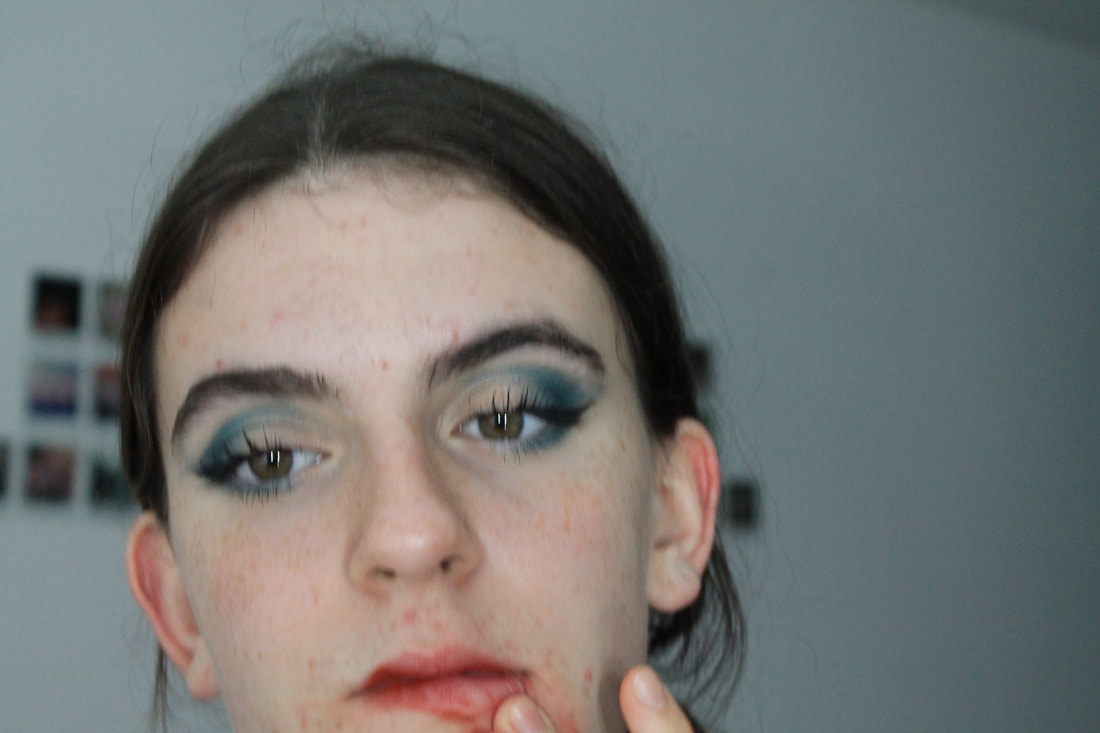
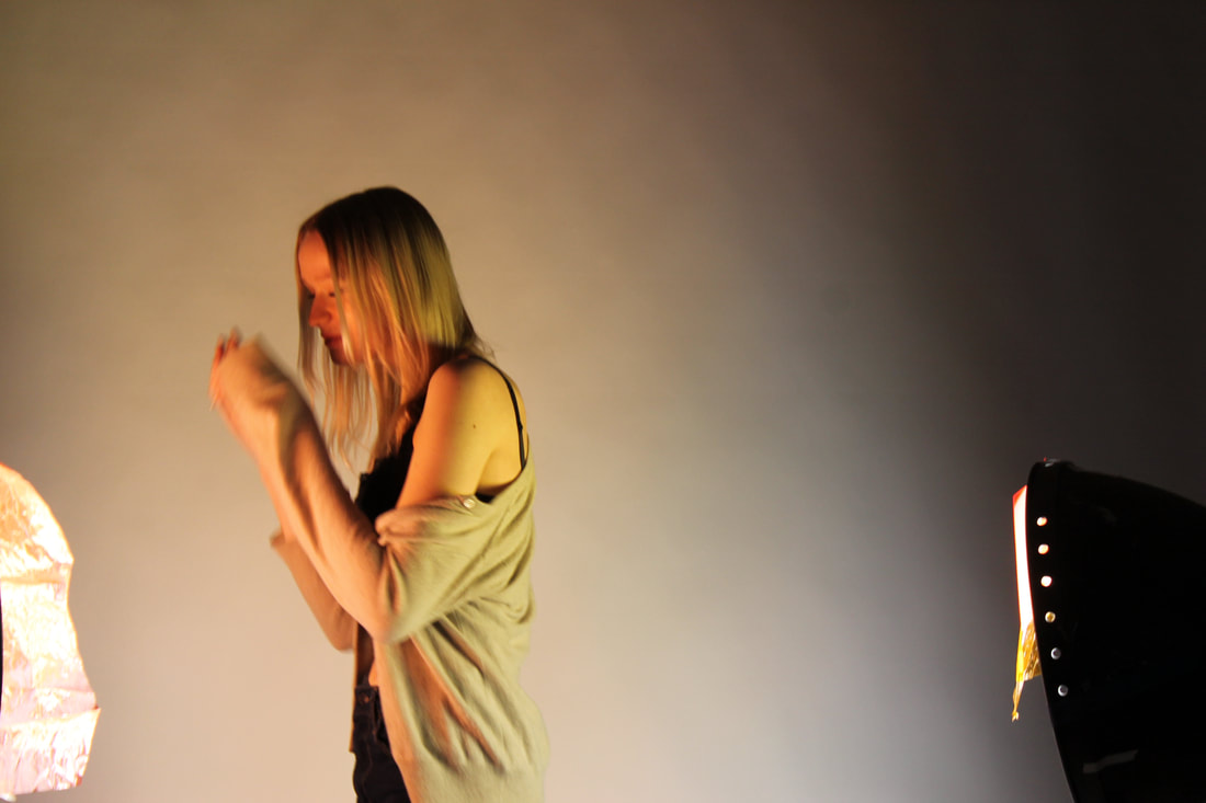
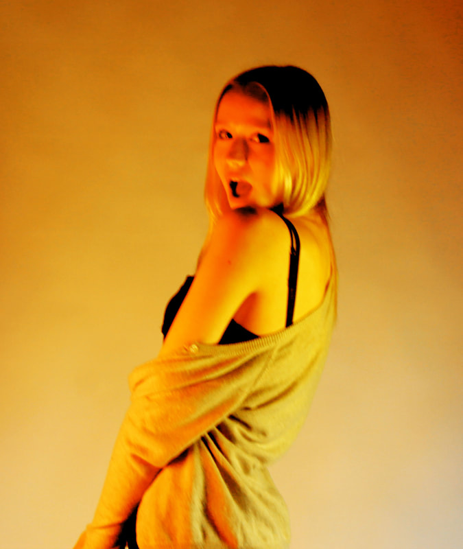
This was my first attempt at trying to create and image like the Blumenfeld one. To take these images i took them on my iPhone on a selfie mode with a timer and to get a white background i over exposed the image. However I lost a lot of colour and definition and the picture became very grey and it lacked colour in the lip and eye area which was where I want the picture to be the boldest.
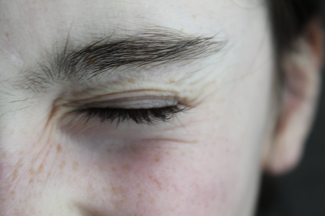
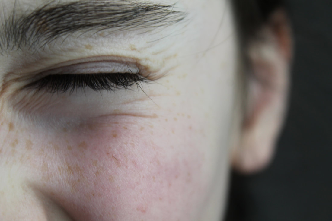
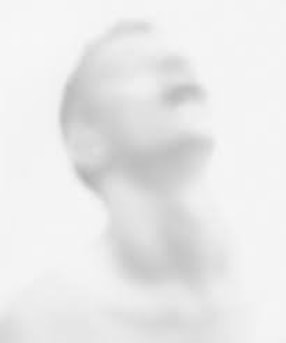
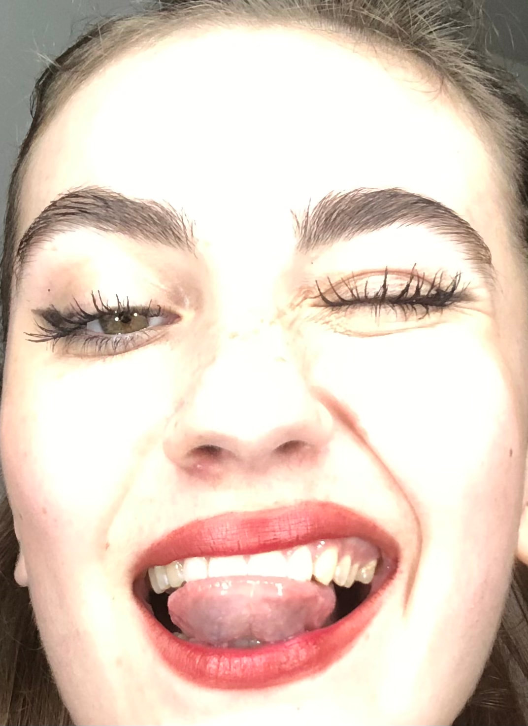
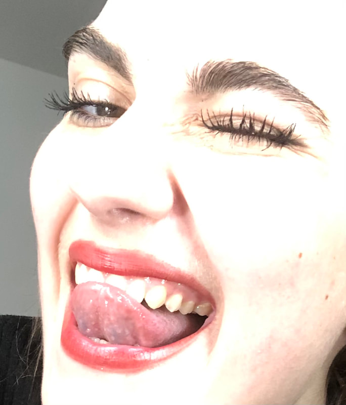
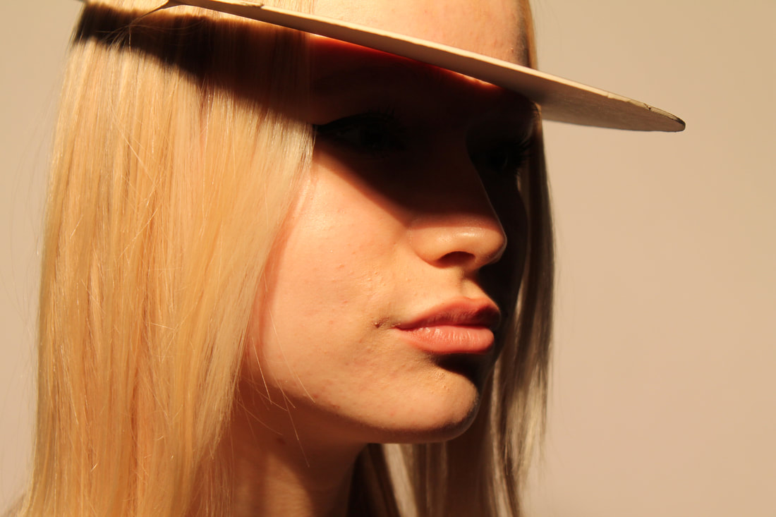
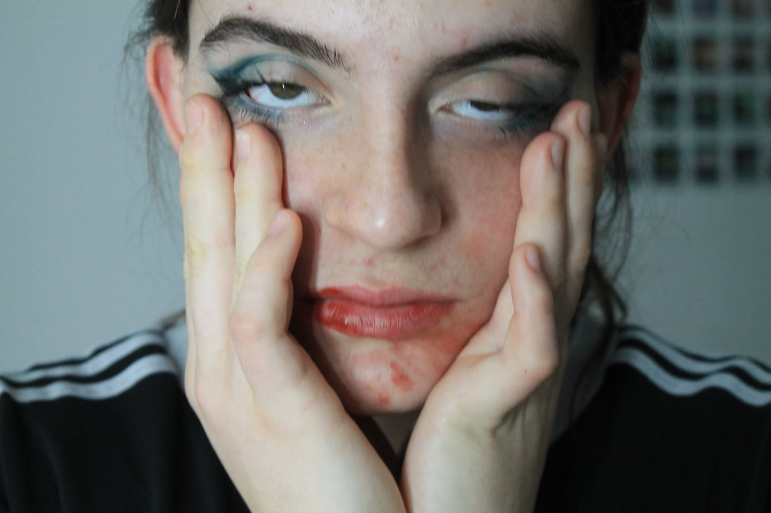
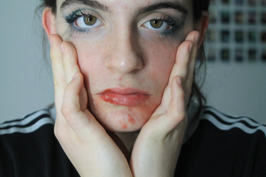
Second attempt
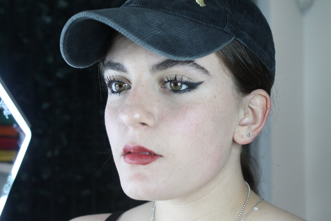
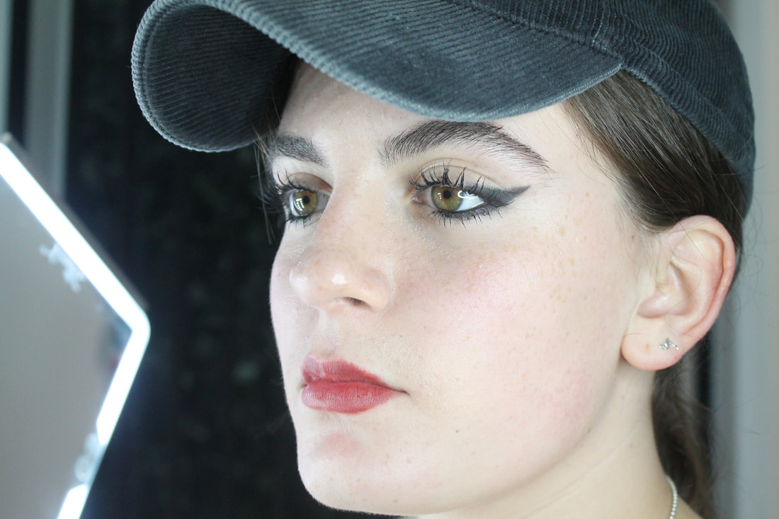
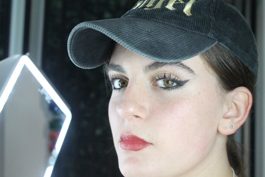
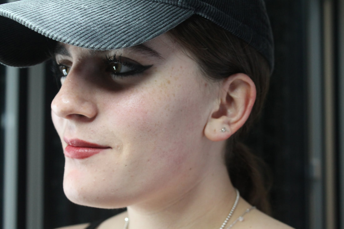
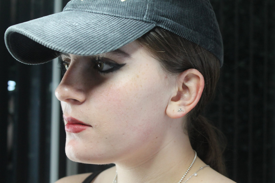
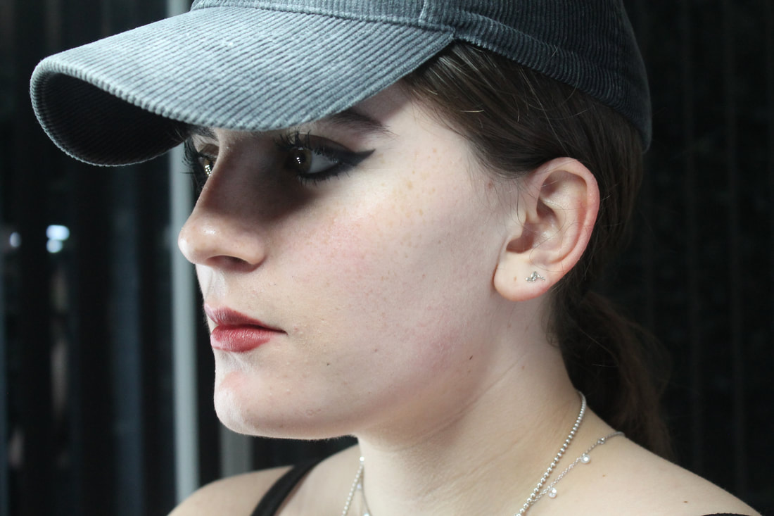
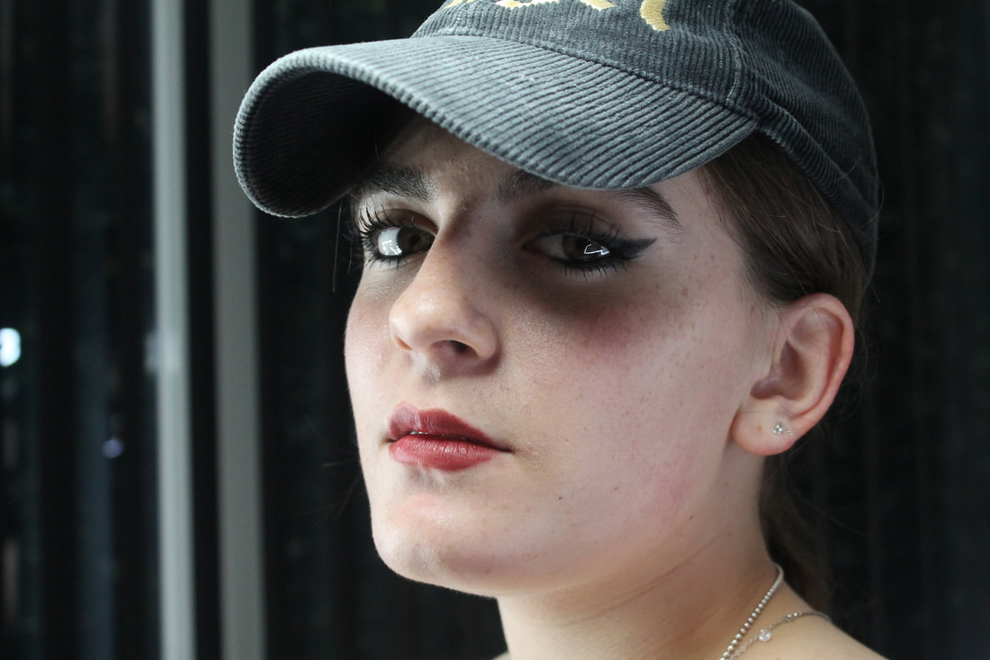
Then for my second attempt I used lighting and objects such as a cap or card to create shadows upon my subjects face where I specifically wanted them to be. I then edited the image by placing it in photoshop and using the white paint tool to make majority of the image white and keep out the key features of the face and used the brightness and contrast and adjusted it till i got the desired results. Also in some i a]painted on the red lipstick or enhanced it with the saturation

Johnny Kerr
|
|
|
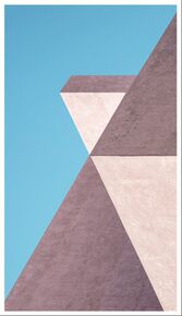
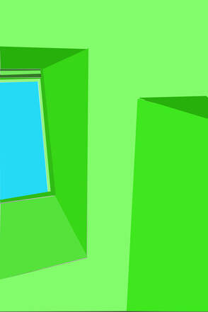
Johnny Kerr is a architecture photographer. His images are very abstract due to the colours uses are very bold and bright which give the image a drawing like feel and take away any sense of naturalism from his photos its also the way the images are cropped to allow the viewer to only see a small amount of the building or structure that he is photographing which allows the veiwer to try and think about what they are looking at.
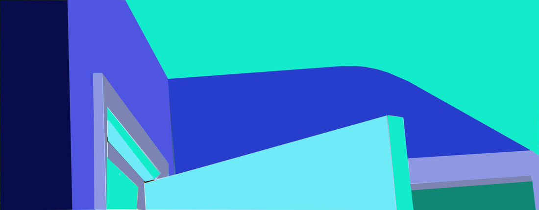
Mathew Venot
|
|
Mathew Venot is a French contemporary photographer that takes images of buildings and edits them using bright, bold and unrealistic colours to give it a drawing like feel to the photo.
My Attempt

Edits
|
|
To edit these photos I used photoshop. I began by cropping each image to where it looked best then I got the lasso tool and selected an area I wanted to fill with colour, I chose bold colours to try and match Kerr's work and give it that abstract feel. Once I selected the selection and colour I did it to each place where I wanted to add shadow or depth the the photo and adjusted the colours accordingly.
Sarker Proticks
Sarker Proticks work revolves around the subjects of temporality, time and the metaphysical prospects of light and space. he works with video and sound that focus on living in Bangladesh but also blur geographical boundaries. He looks into the little details of thing but also the vast and wide look into space.
|
|
Abstraction of Personal Truth and Temporality
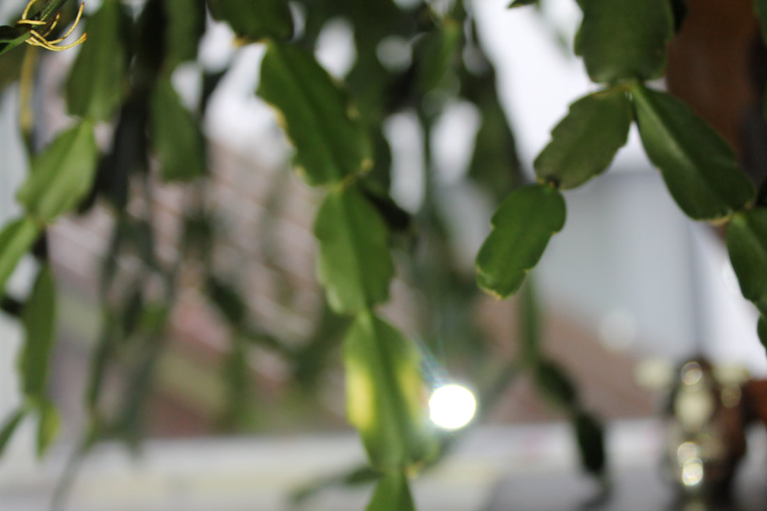
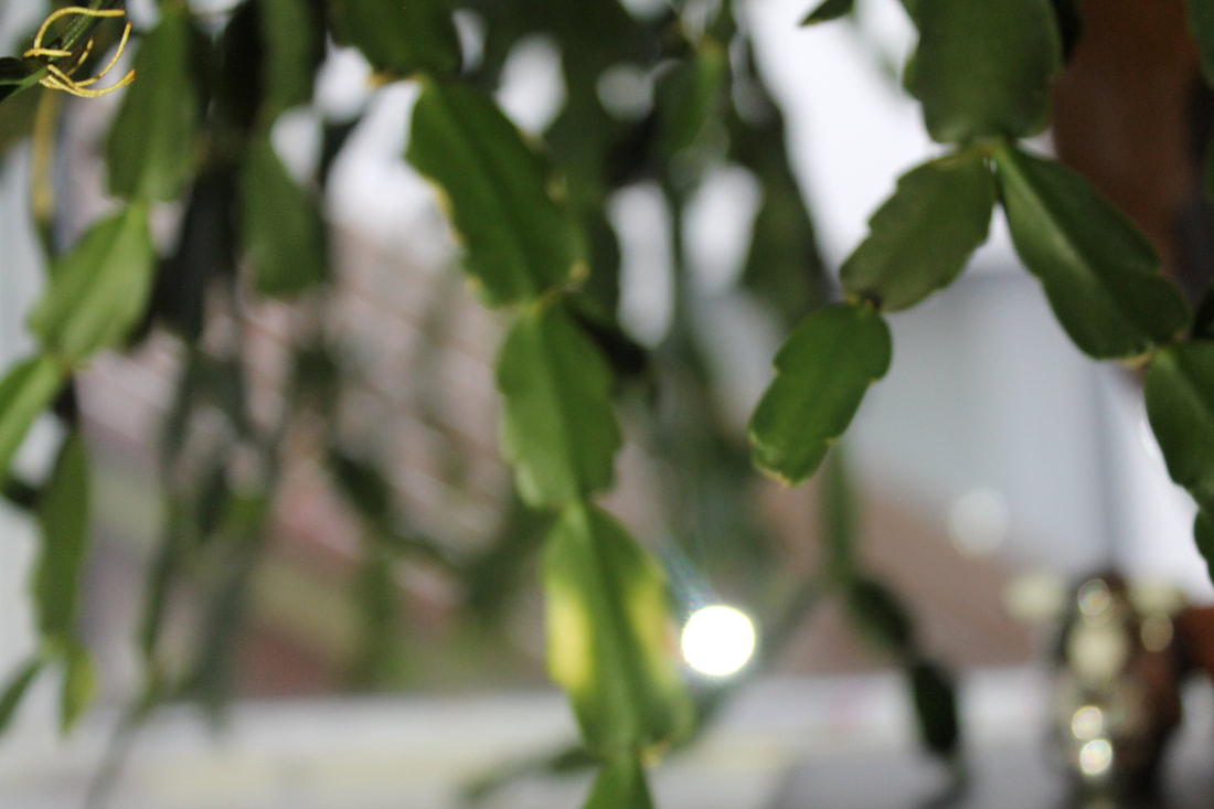
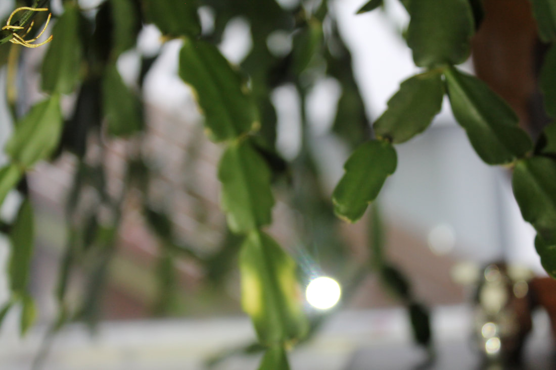
For this task I took images around my home of my everyday routine. I then edited some in black and white and also inverted some too. I then placed all the images into photoshop and created a gif with all the images overlapping each other in the order I liked.

Edits
3 strands
For my 3 strands i choose Erwin Blumenfeld, Mathew Venot and Guy Bourdin.
.
.
The edits
Mathew Venot
For this task i took images of the interior of my house and then edited them with bright colours that are unrealistic and very bold. To edit I began by choosing a colour palette for each to I was editing then had to decide what colour I wanted each shadow, object and light. I selected each area with the lasso tool (which gives e more control of what I'm
edits
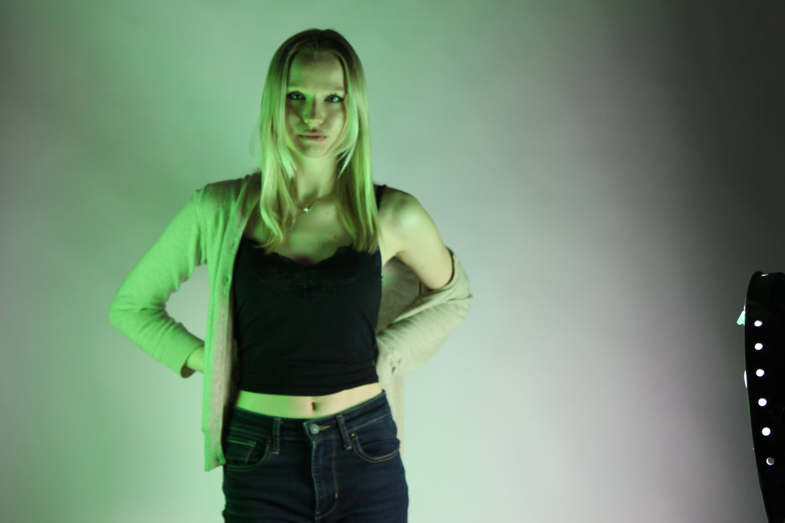
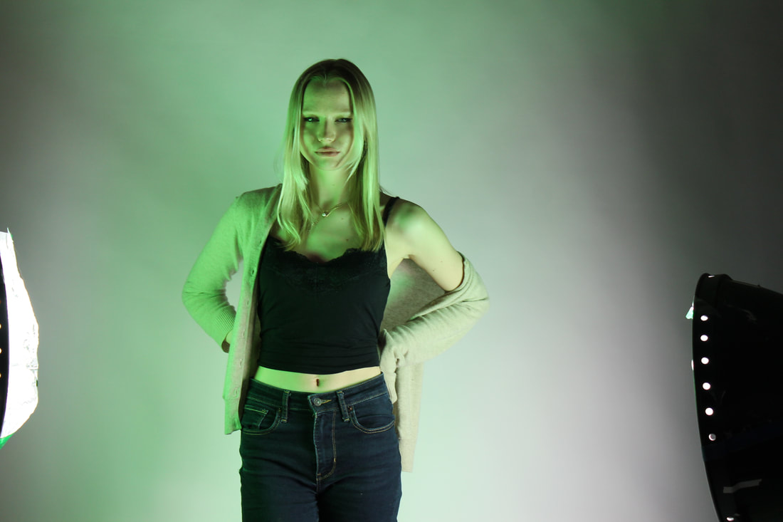
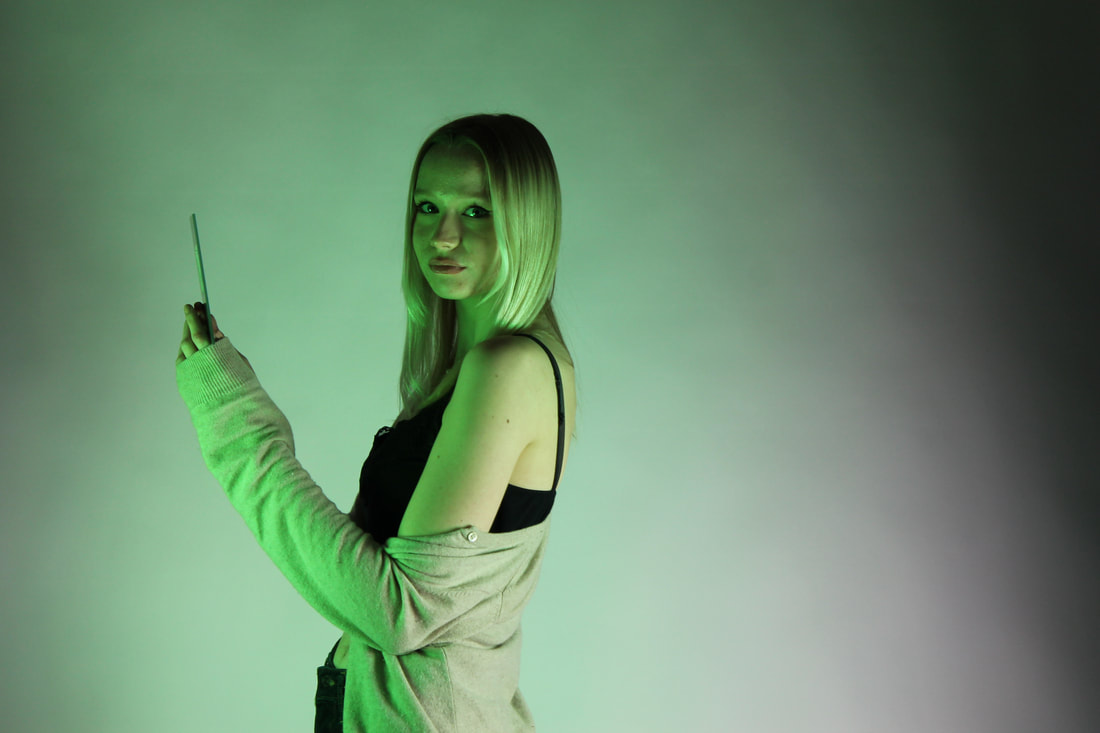
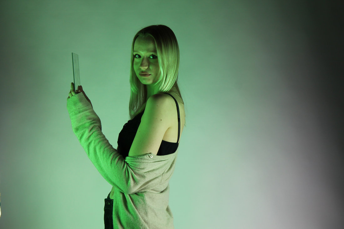
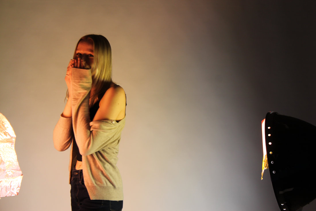
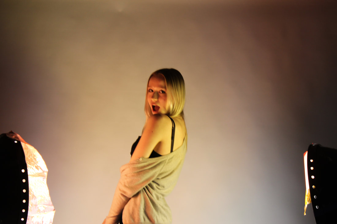
The two studio images aren't supposed to be in here it was a glitch in Weebly
Shadow, light and shape development
First development
|
|
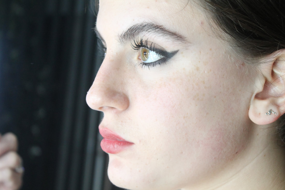
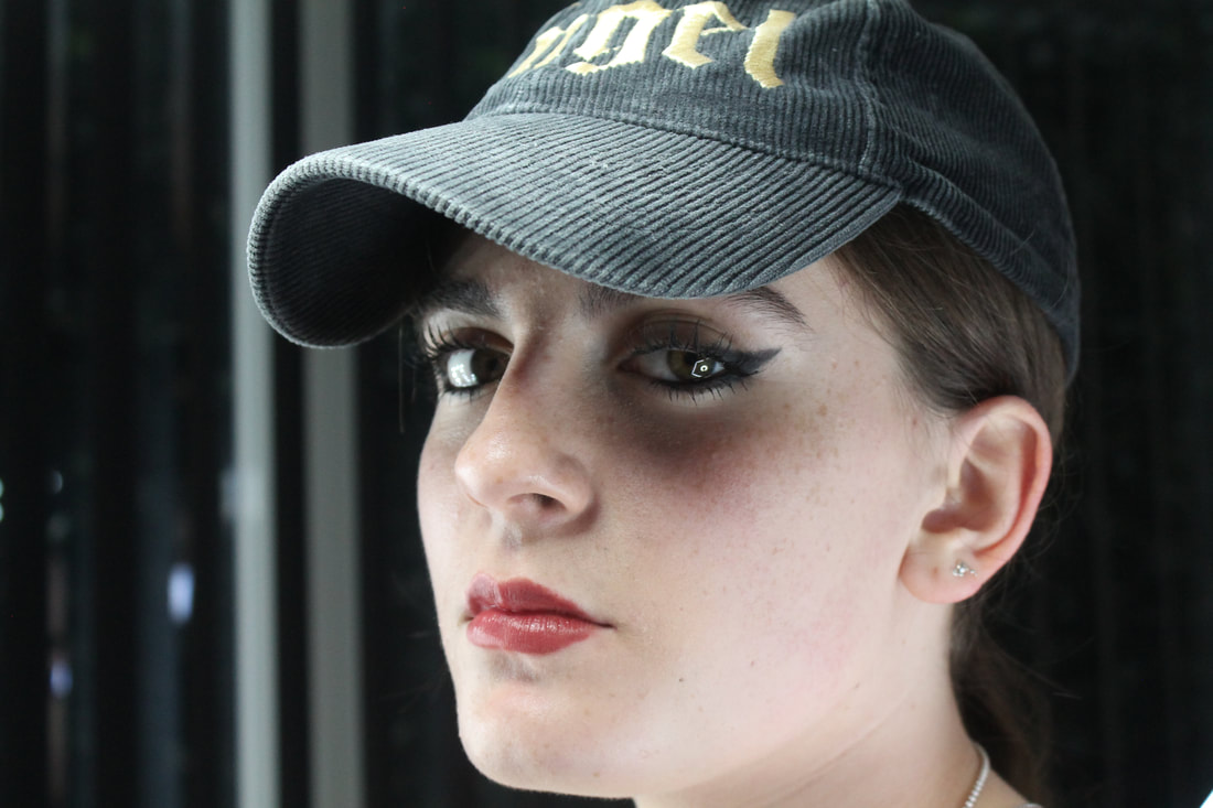
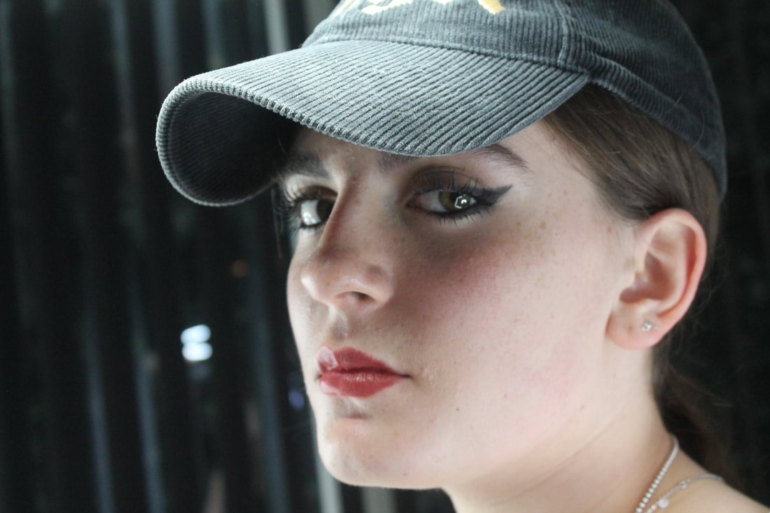
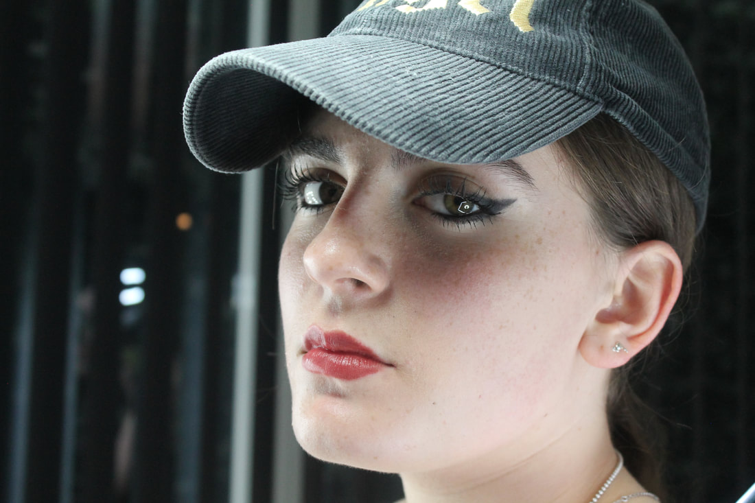
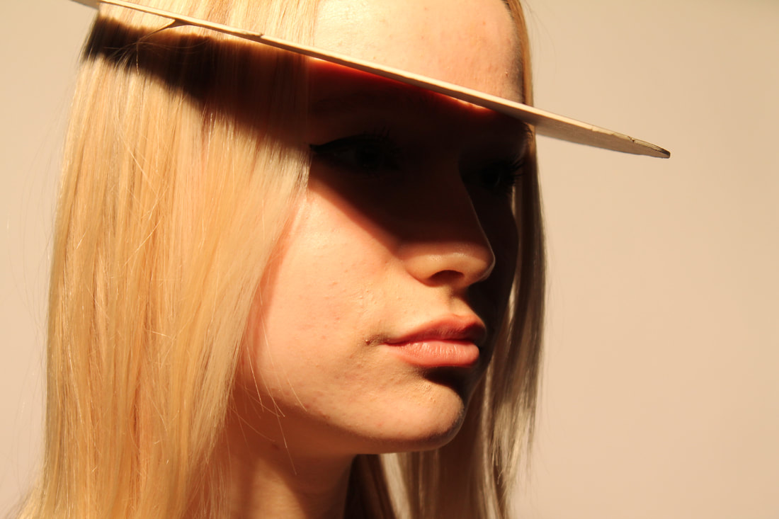
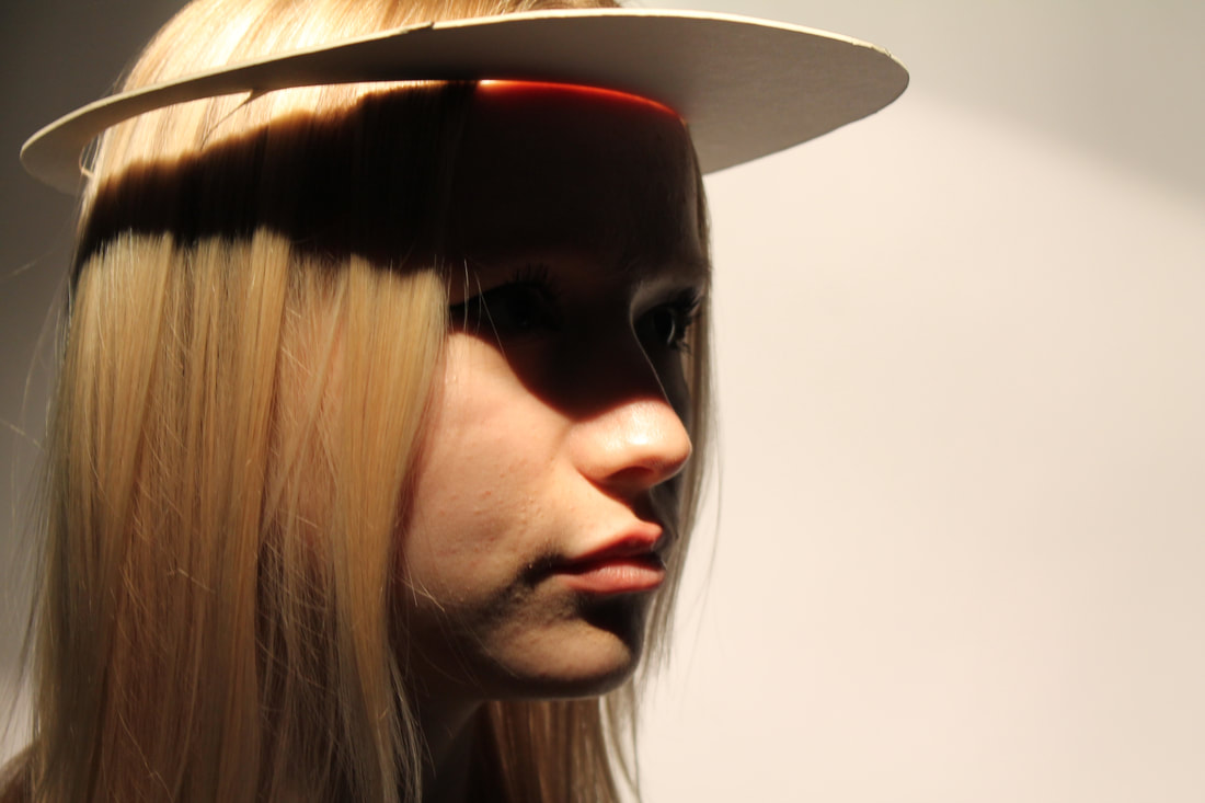
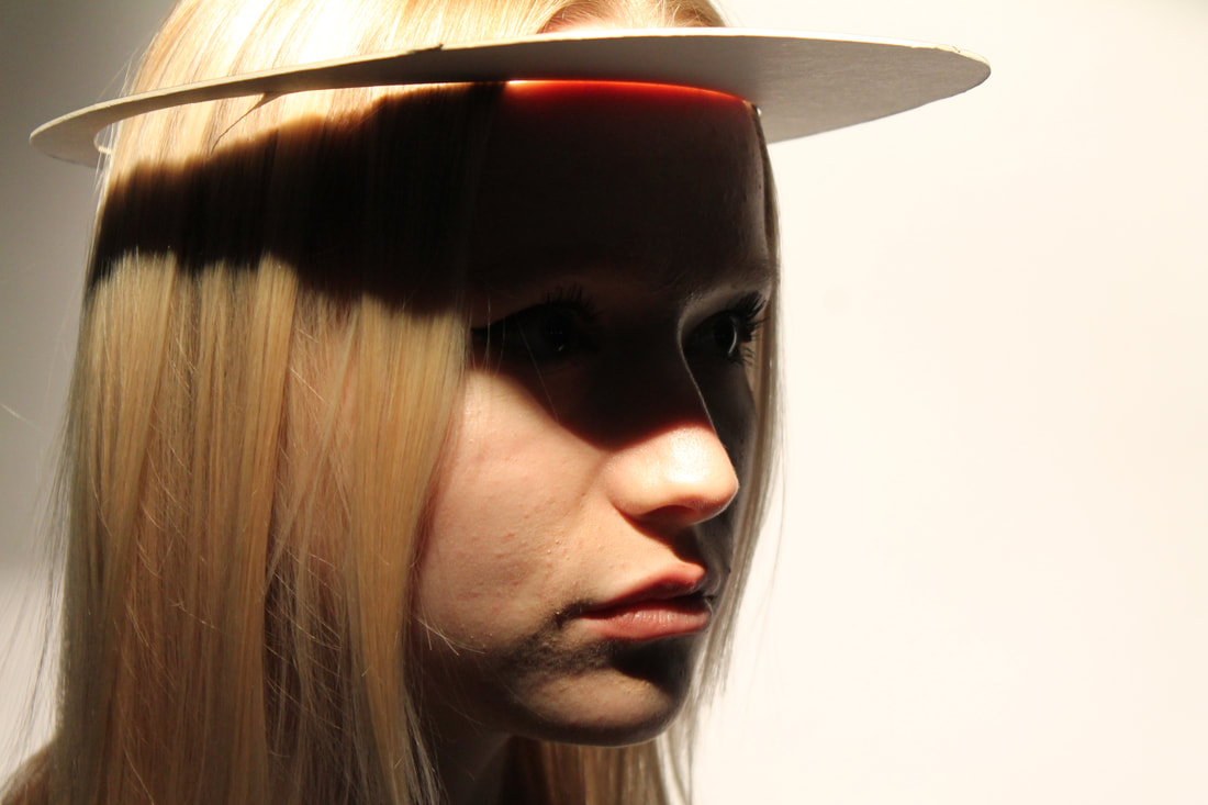
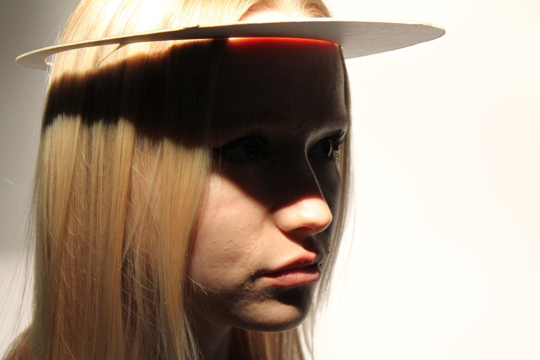
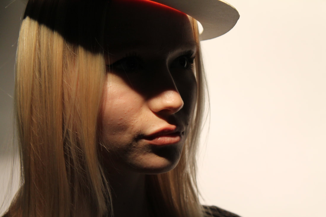
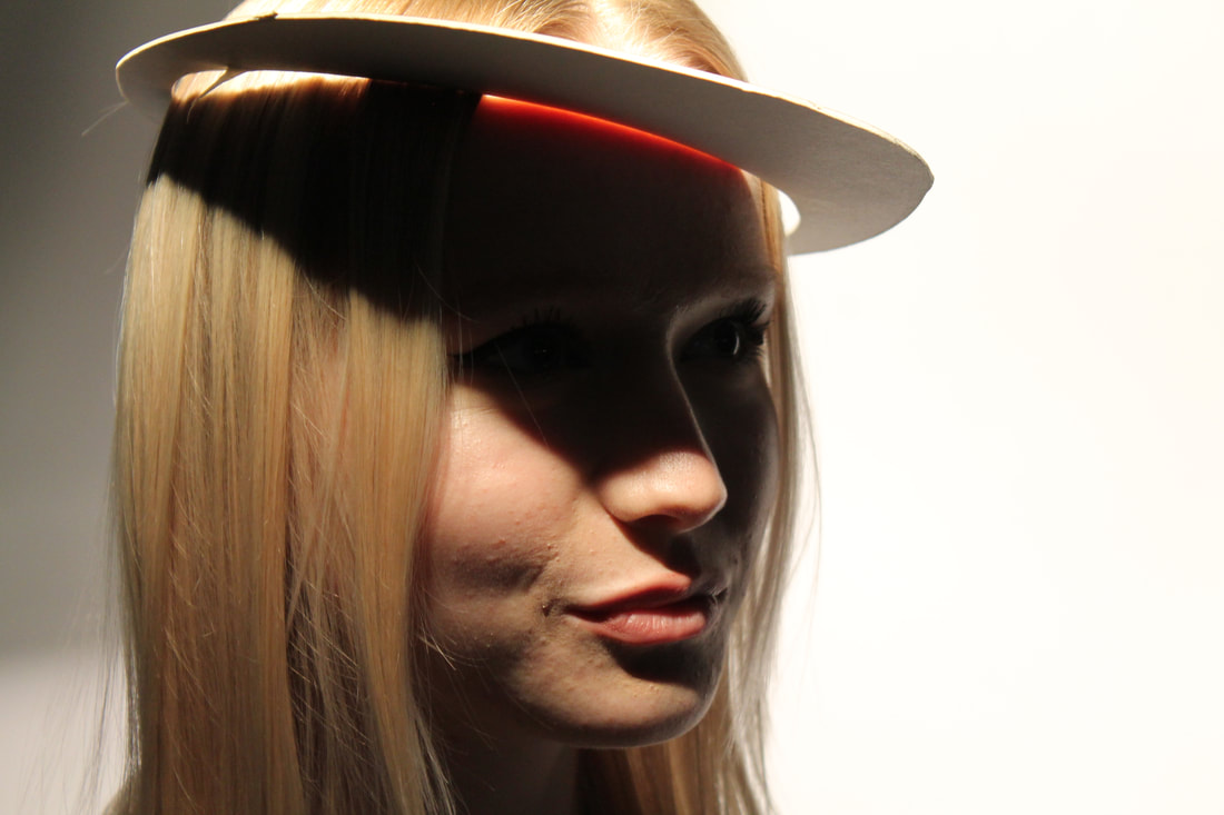
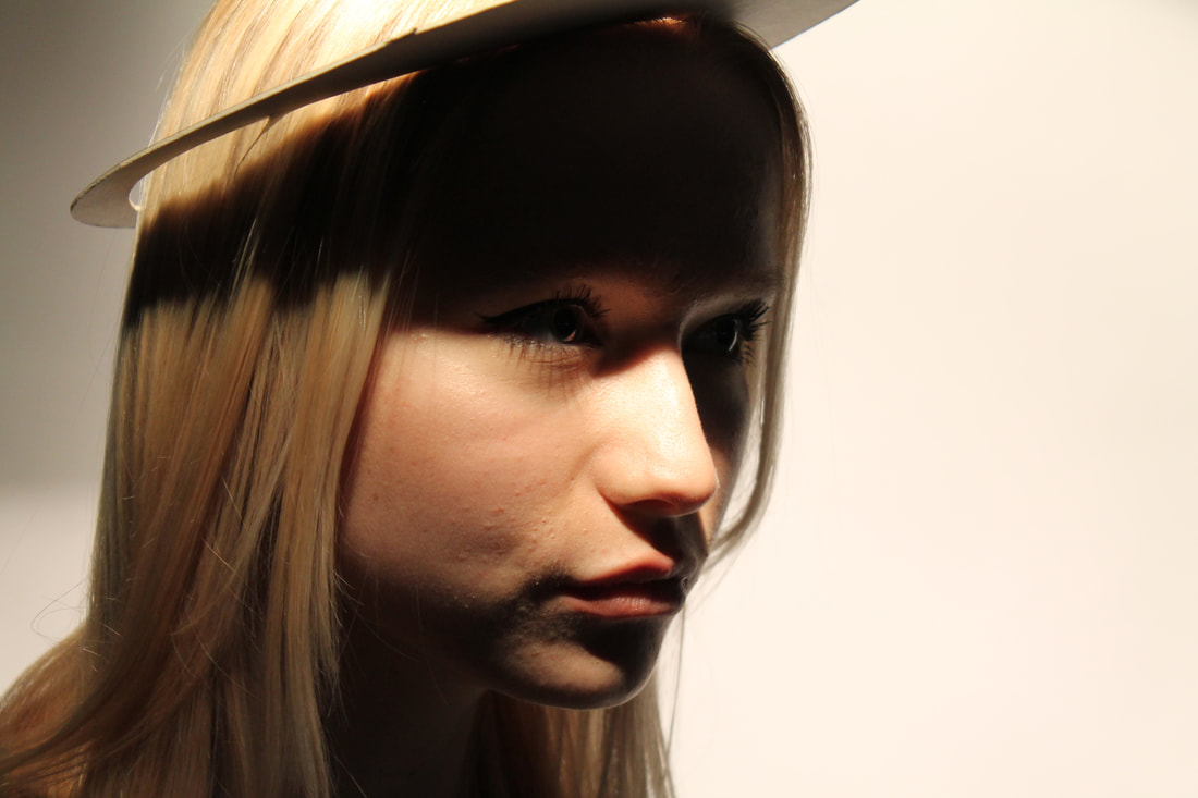
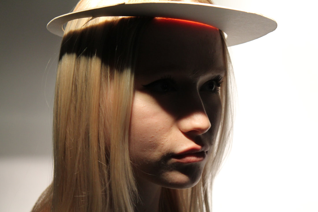
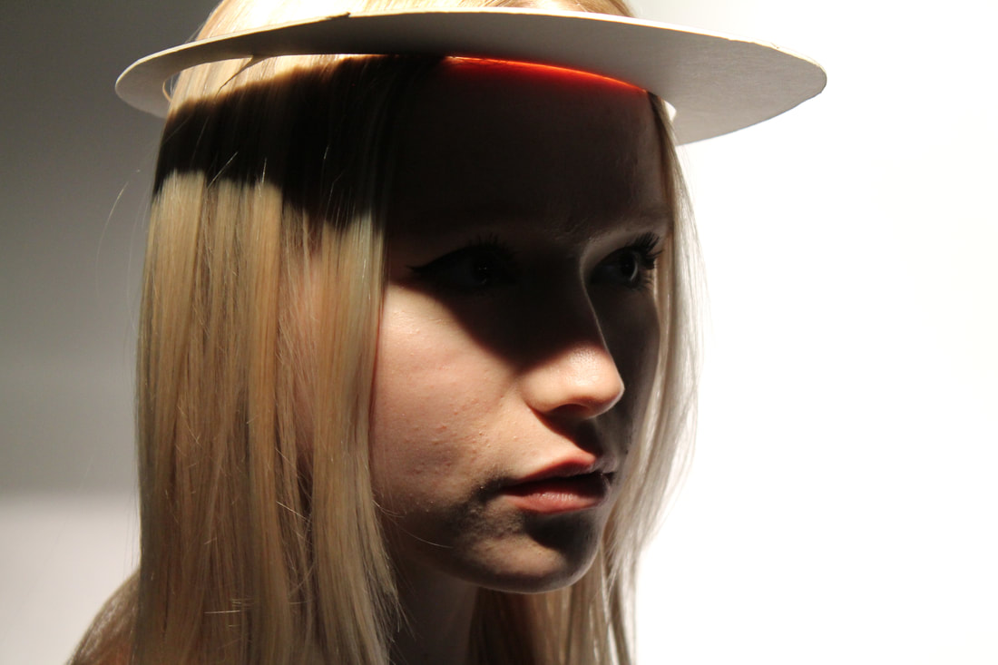
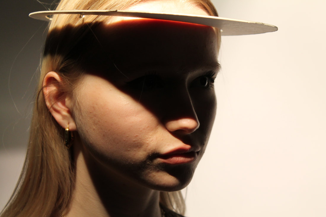
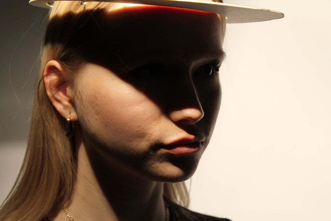
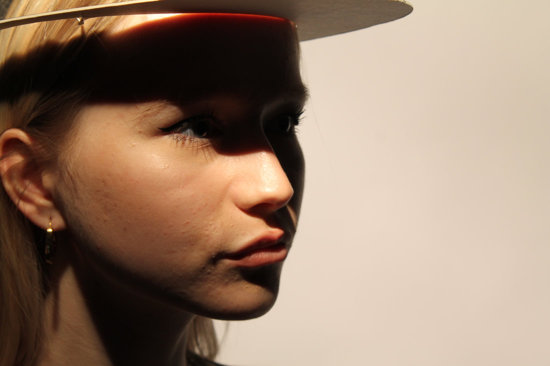
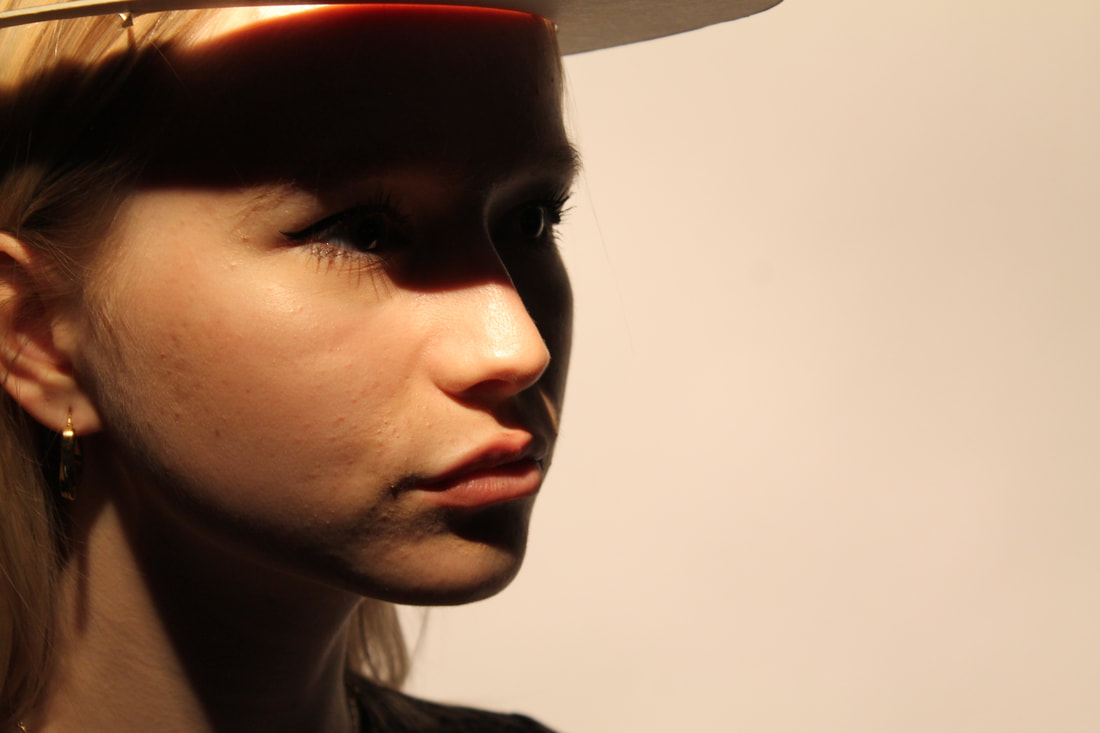
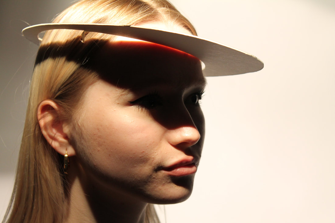
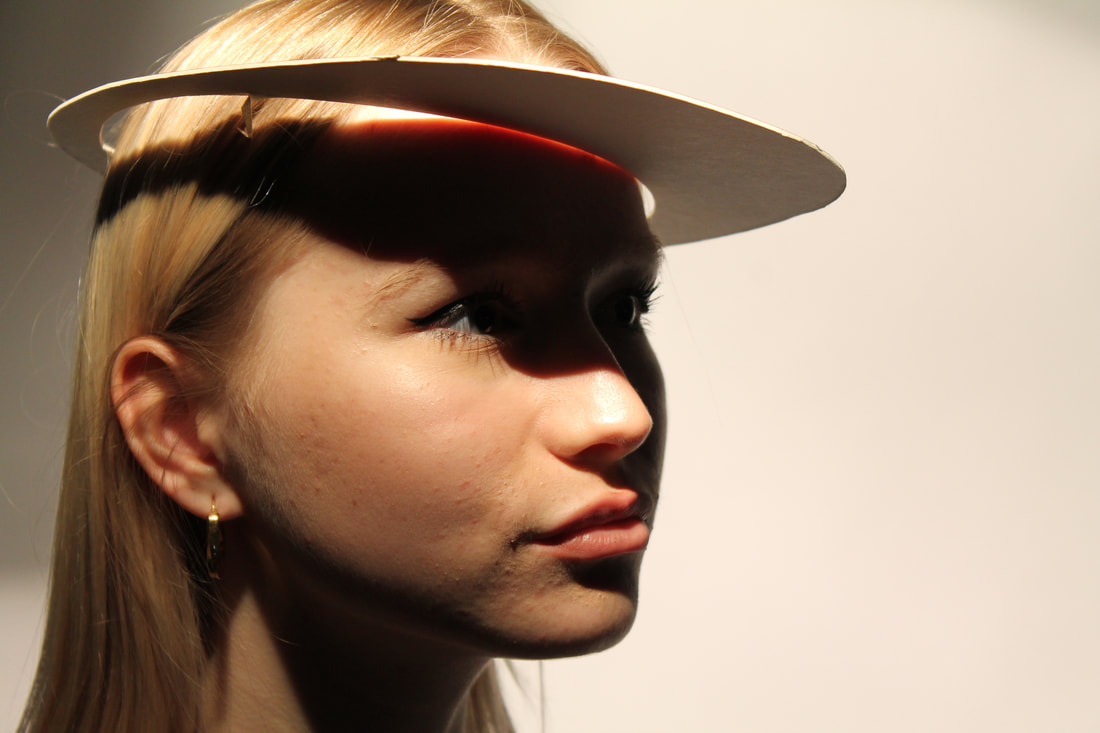
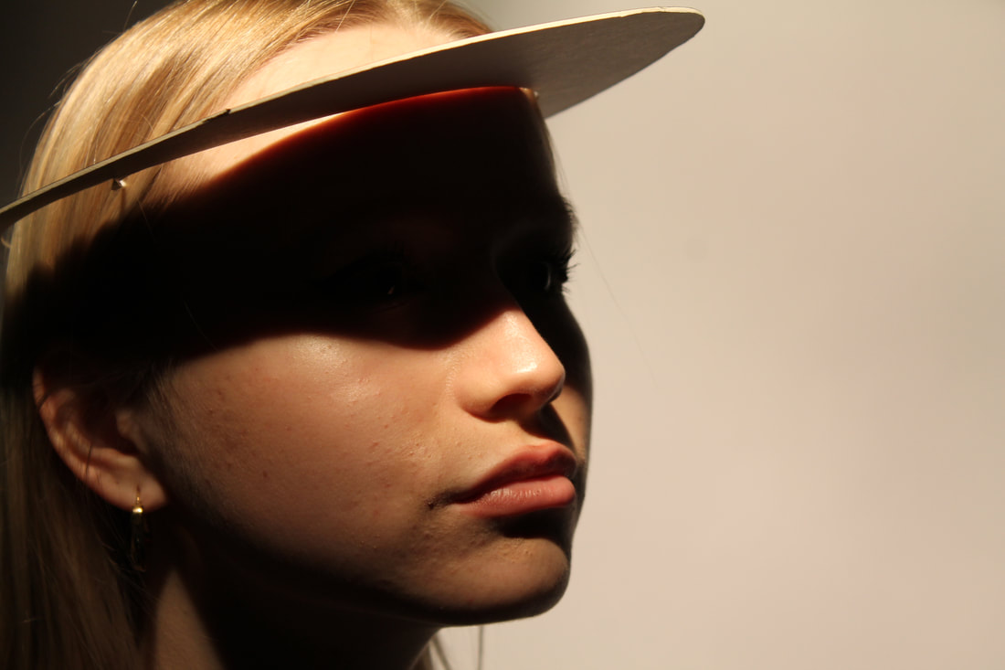
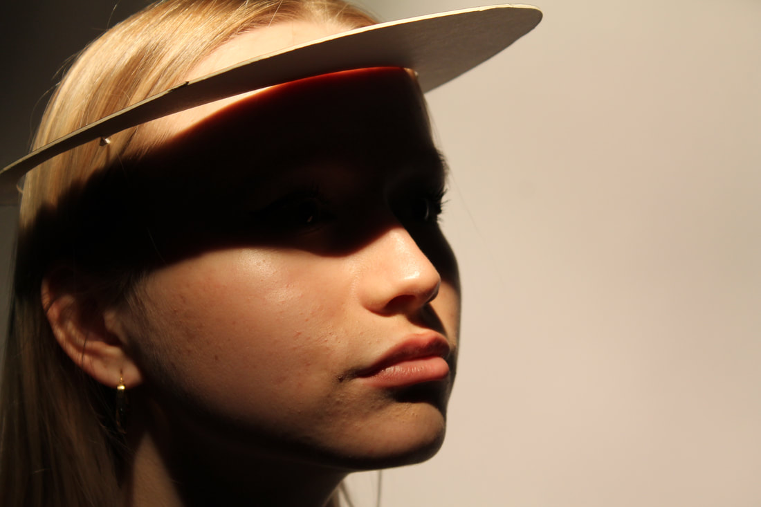
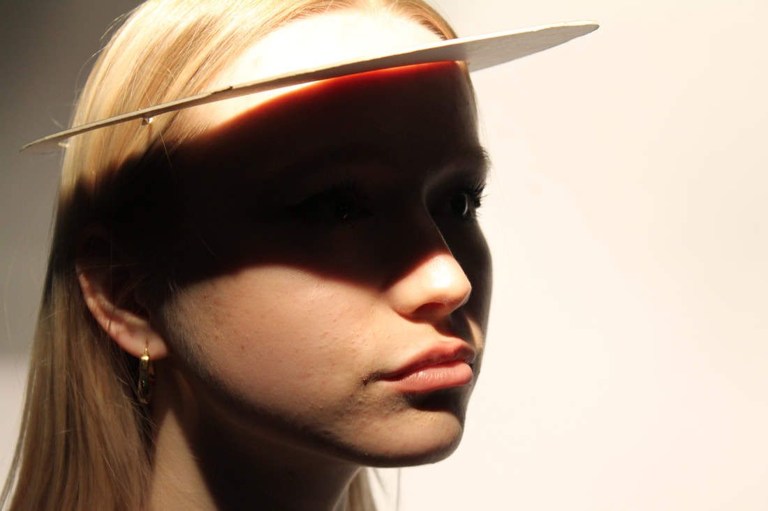
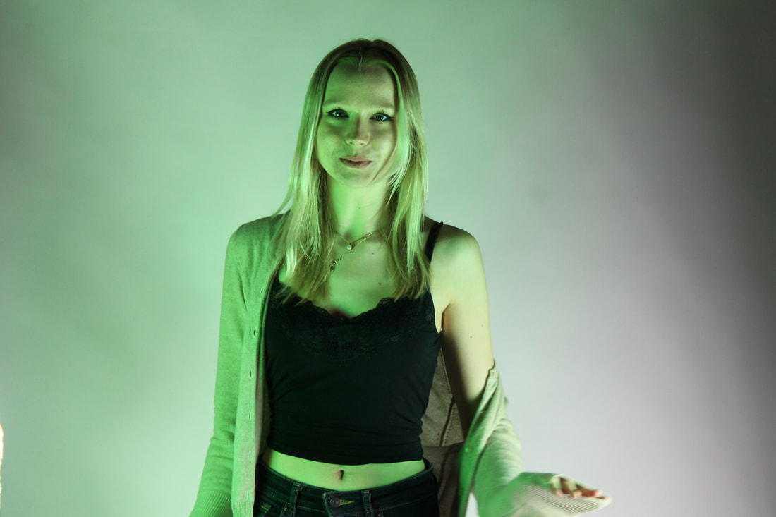
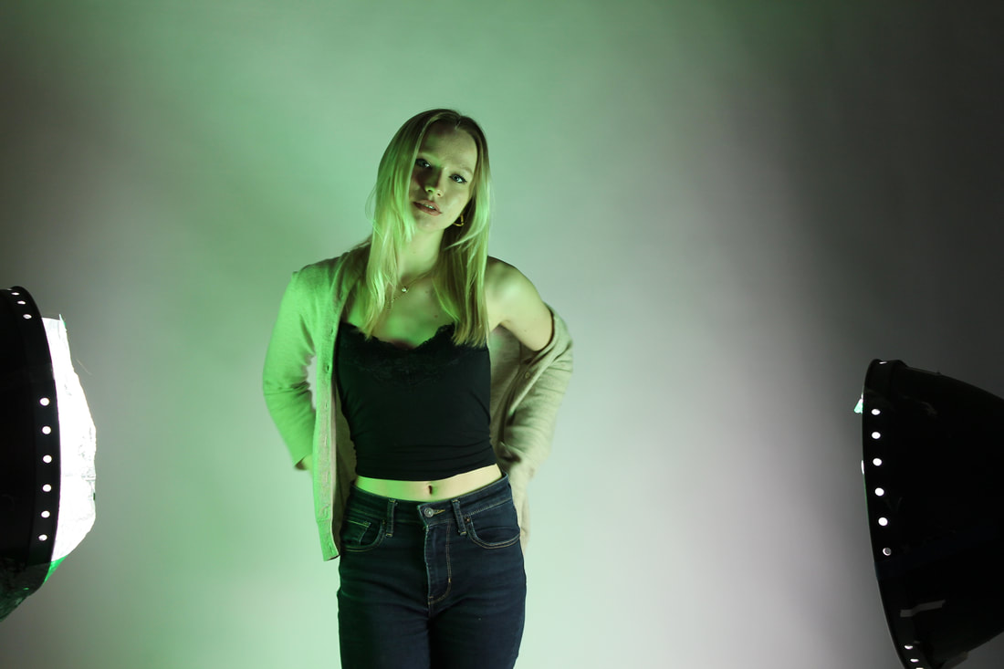
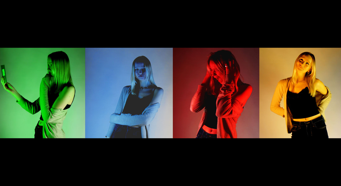
For this development I took images inspired by Erin Blumenfeld's picture picture of the woman with the green cap on. I started this development by cutting out a cap out of carboard which just left a dark shadow upon the models face. Then to continue to develop I put different colour gels into of the hole of the hat to get different coloured shadows. However this didn't give me the desired effect and I wanted to try again.
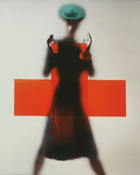
Erwin Blumenfeld 2nd attempt
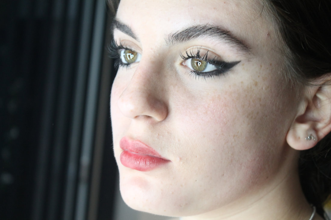
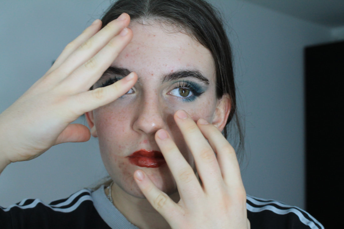
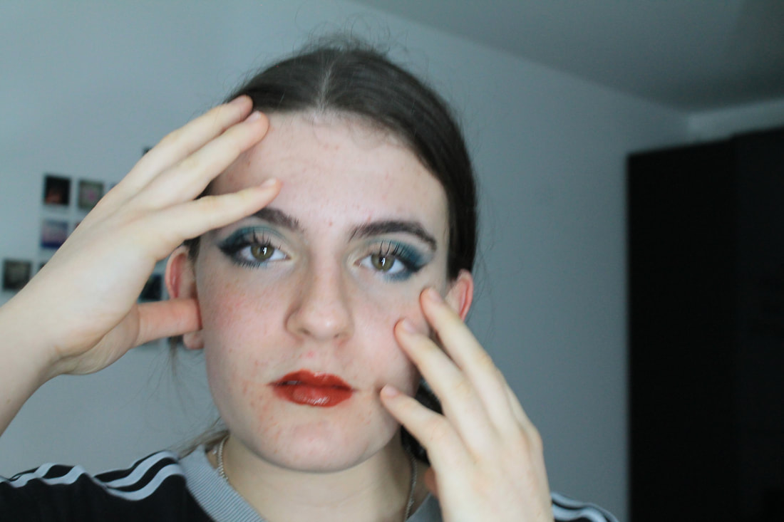
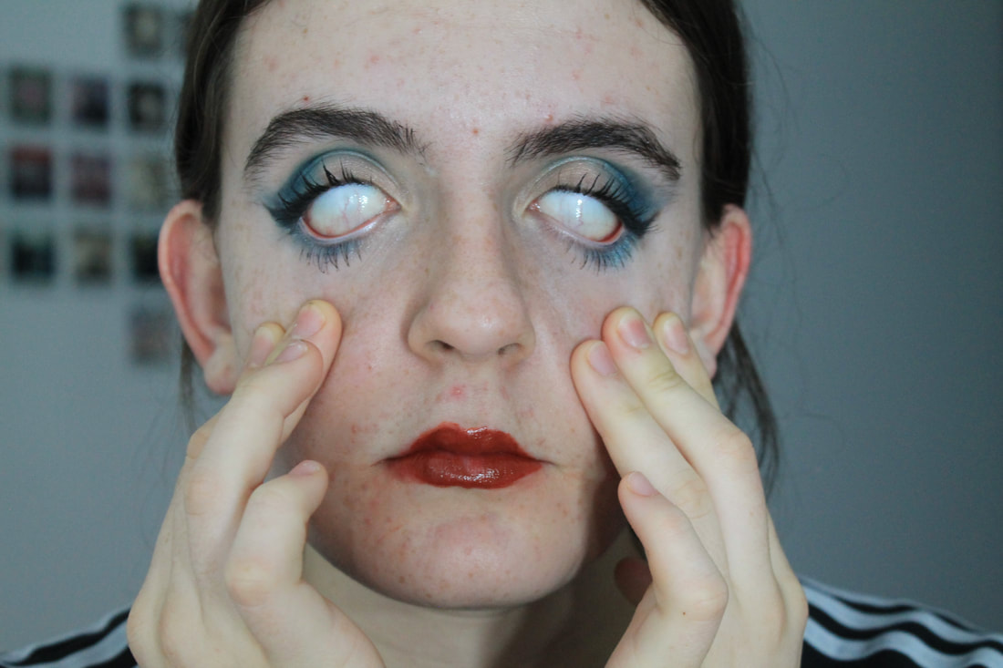
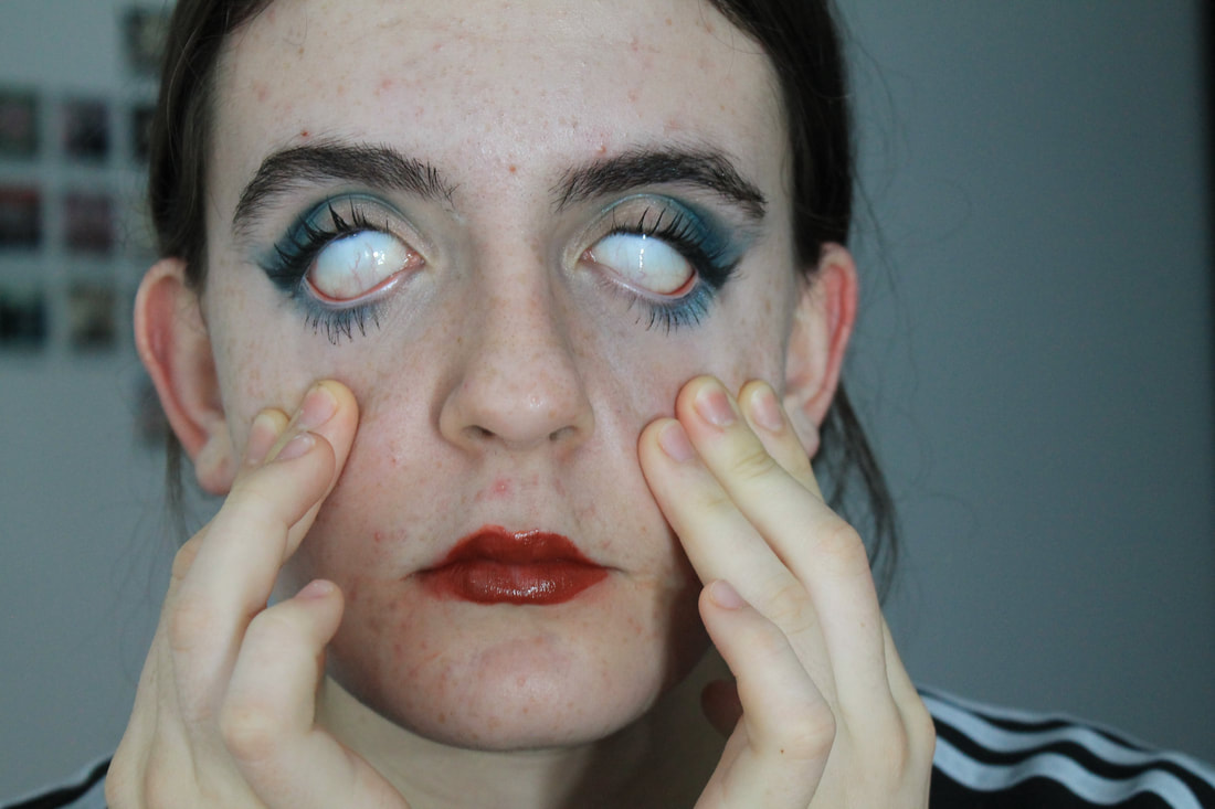
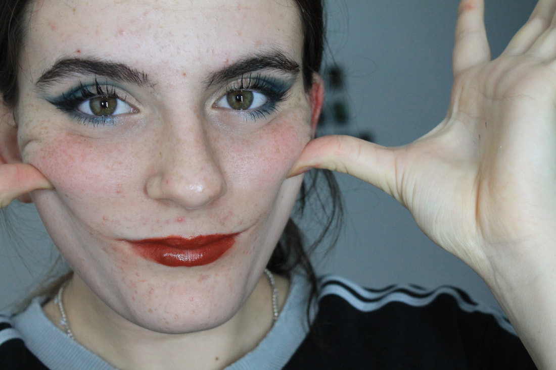
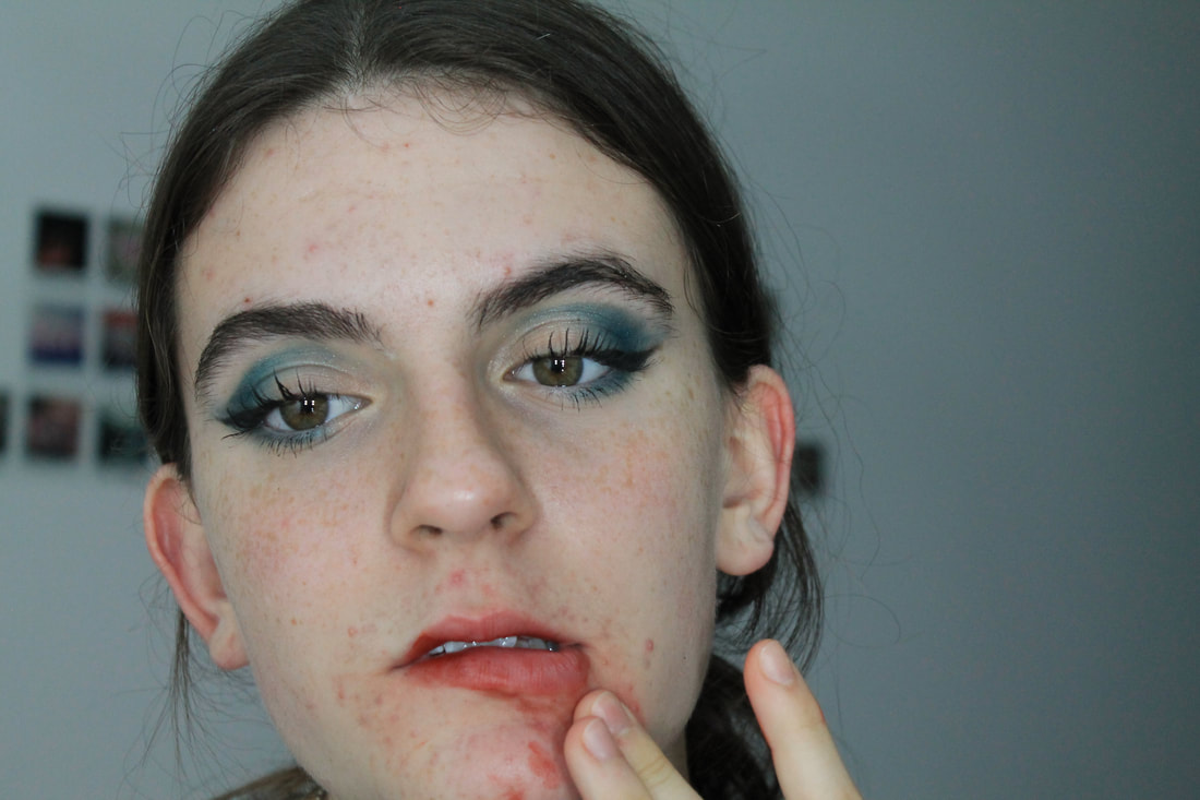
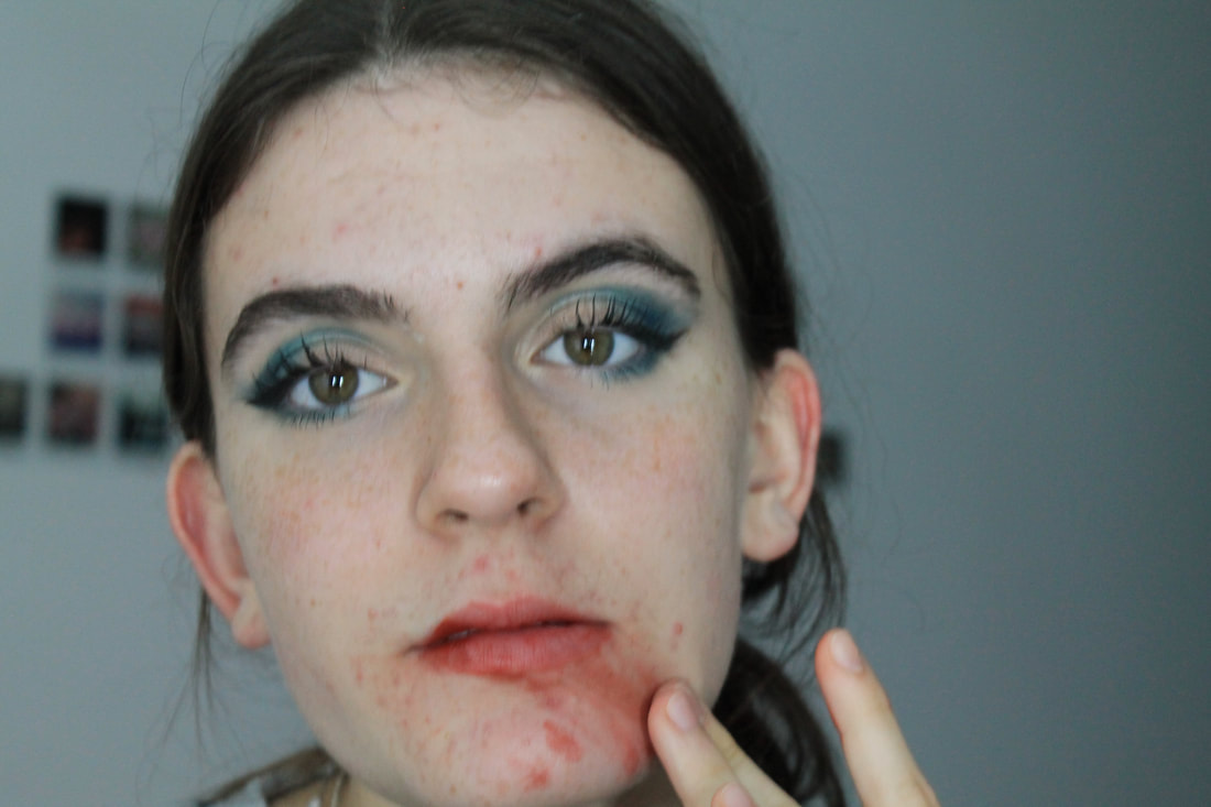
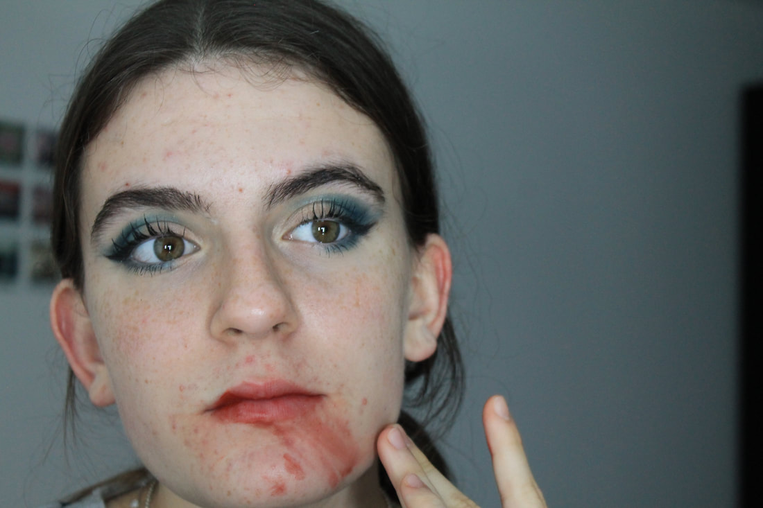
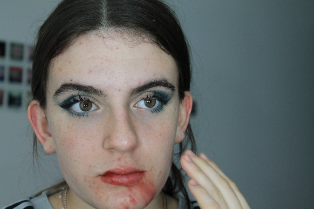
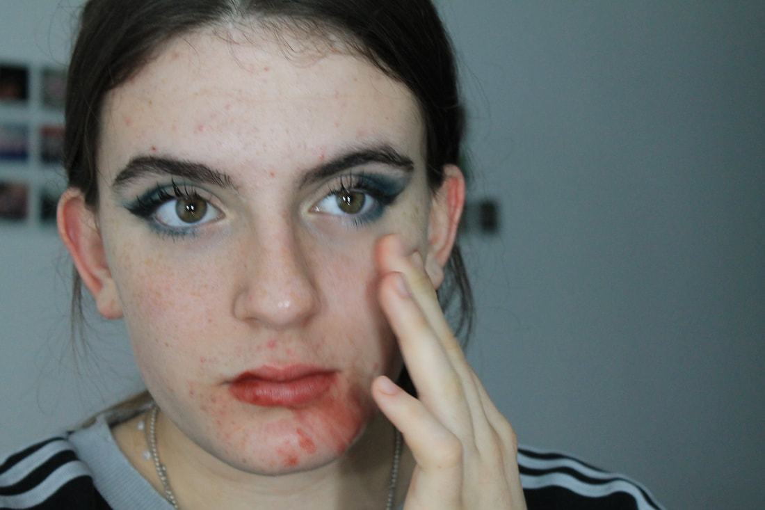
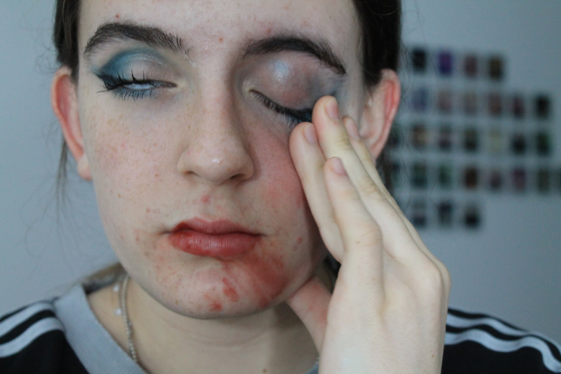
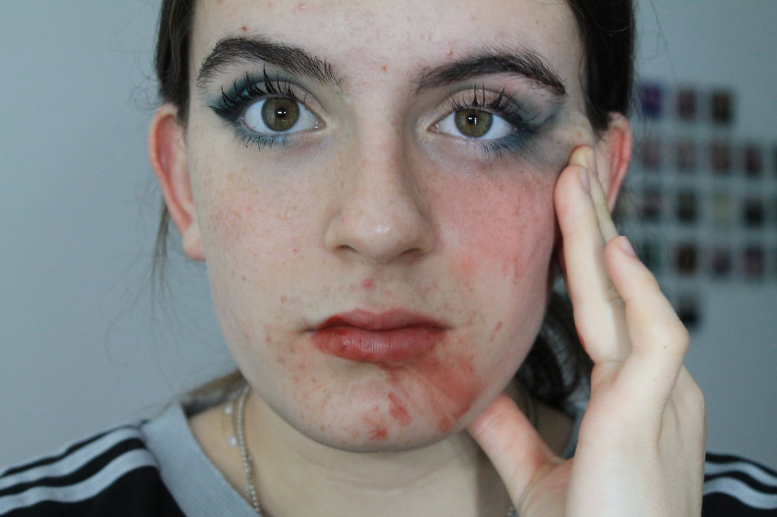
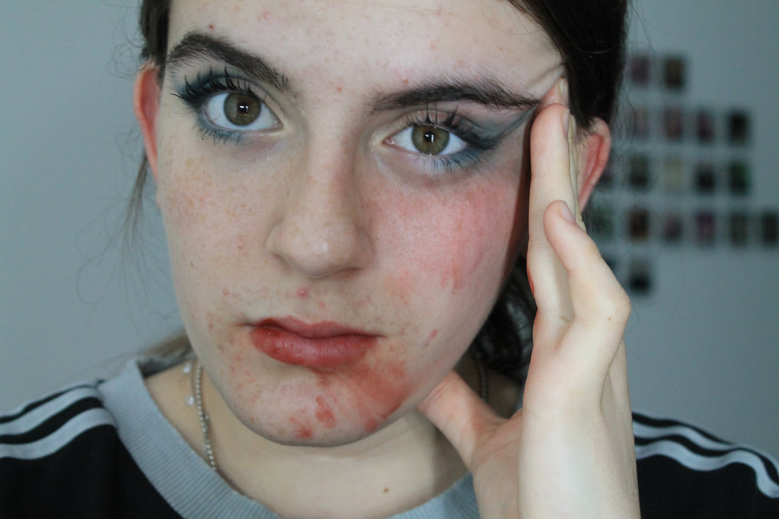
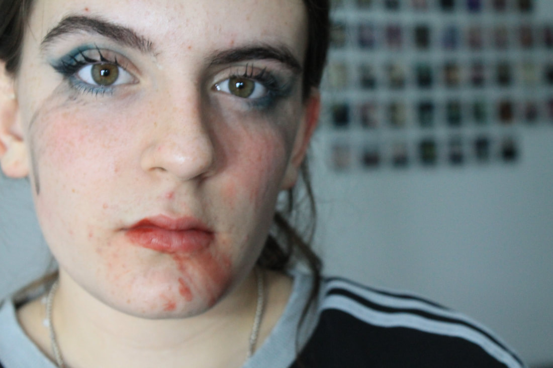
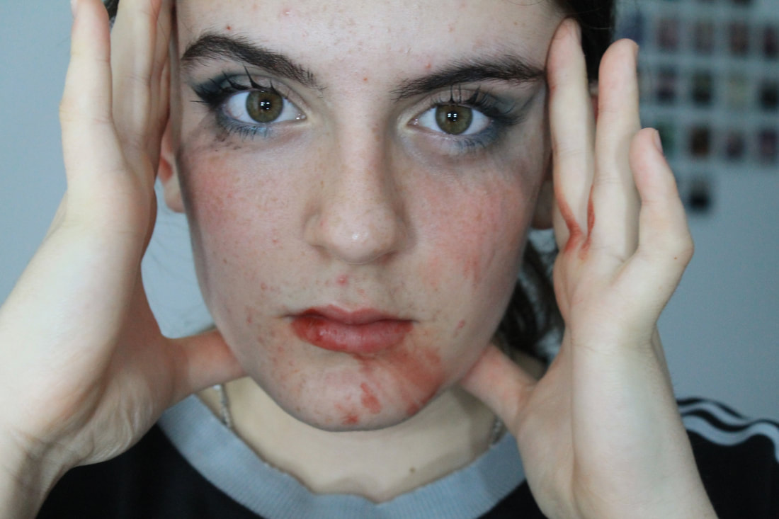
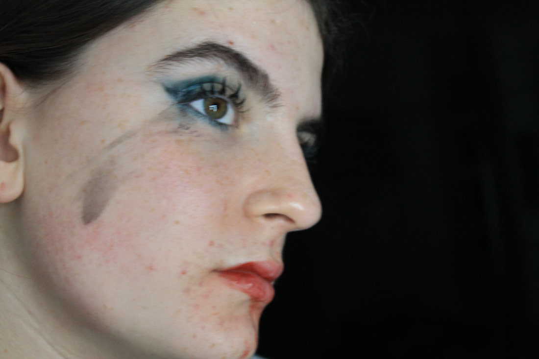
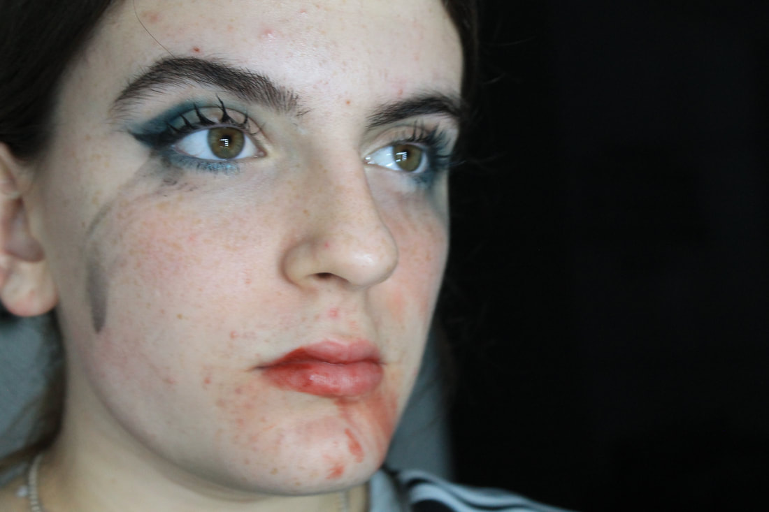
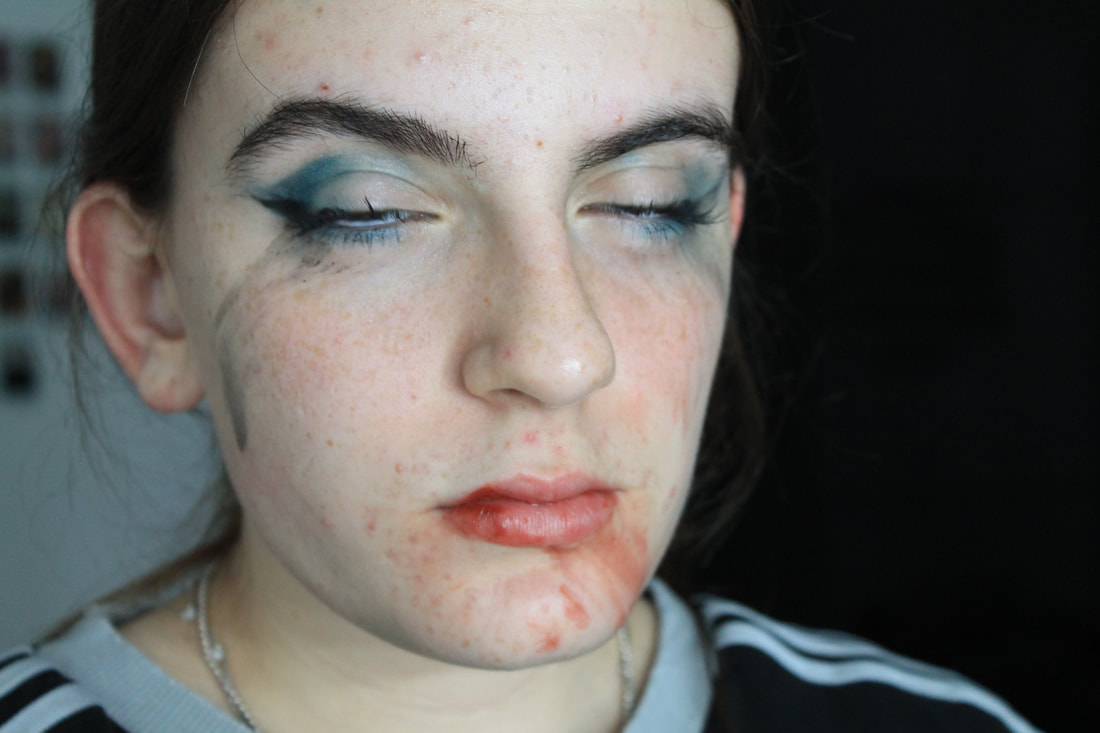
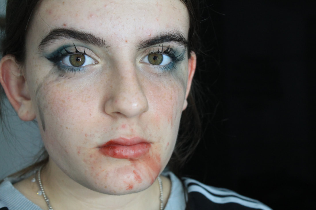
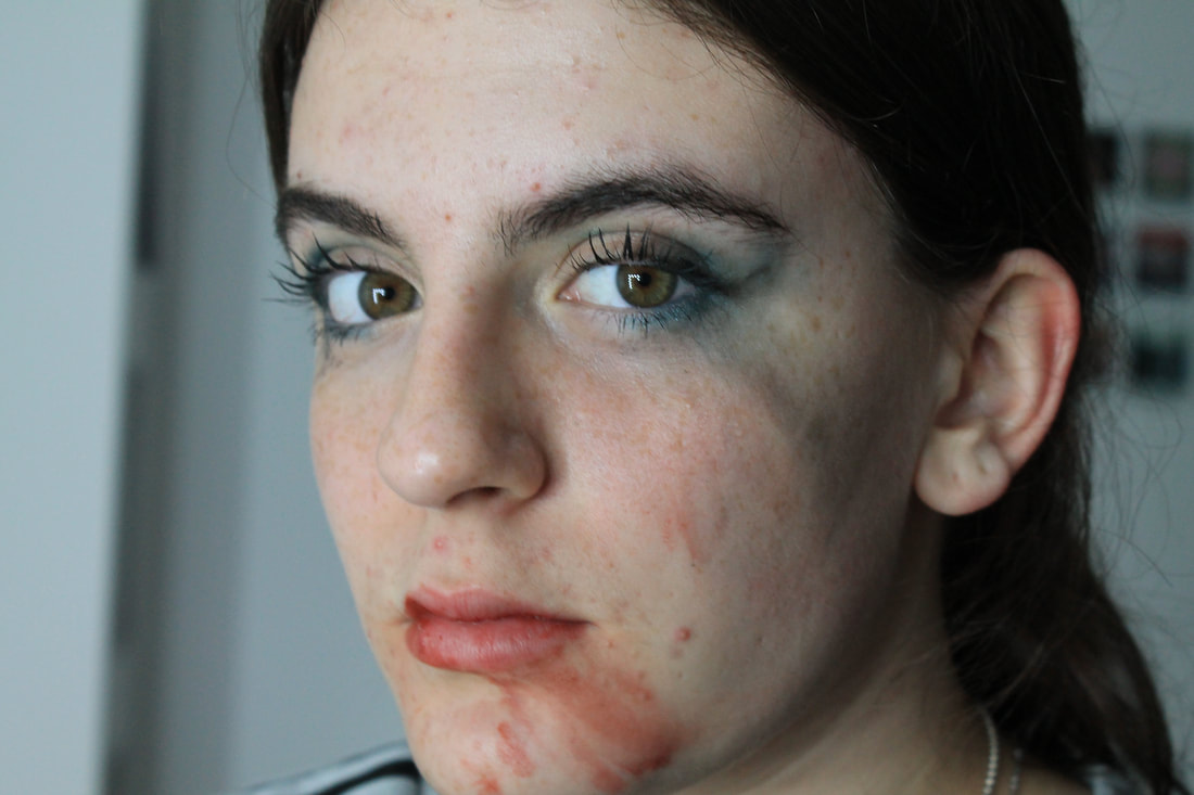
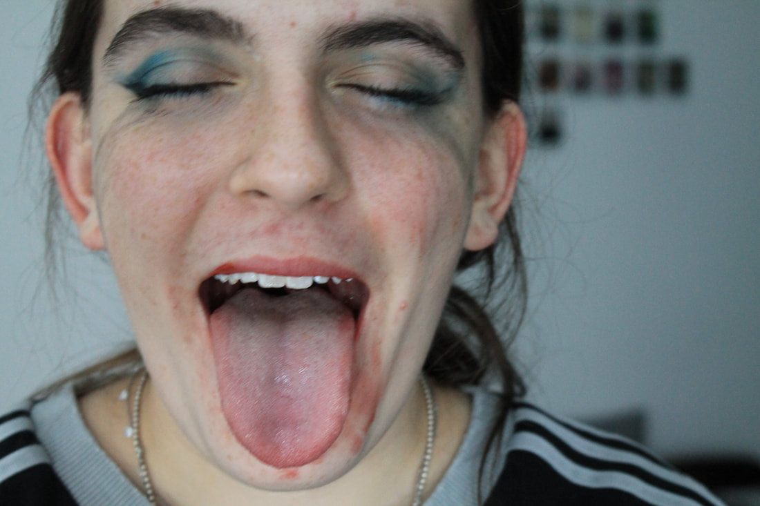
For this task I wanted to develop Blumenfeld's style but put my own twist on it . All of his art work focused on beauty and perfection and I wanted to show a side of his work that not everything is perfect. To edit these images I made her skin lighter by washing over it with white and the started to colour in the background and blend into the skin. Then to bolden the makeup I matched up the colour and went over the make up marks on the face.
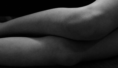
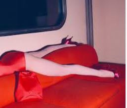
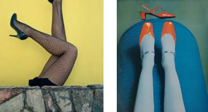
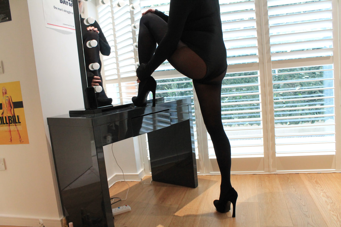
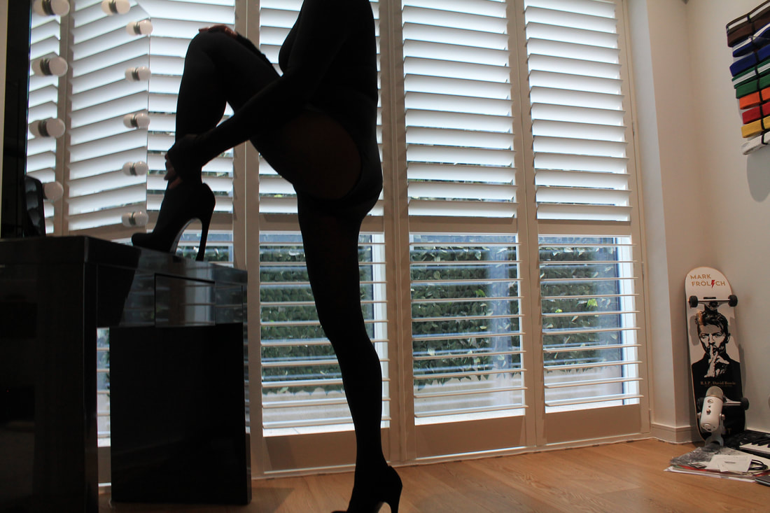
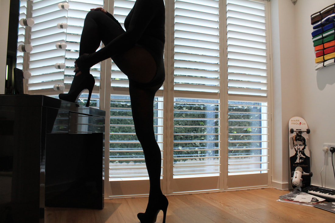
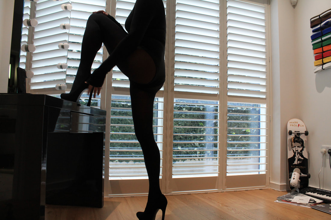
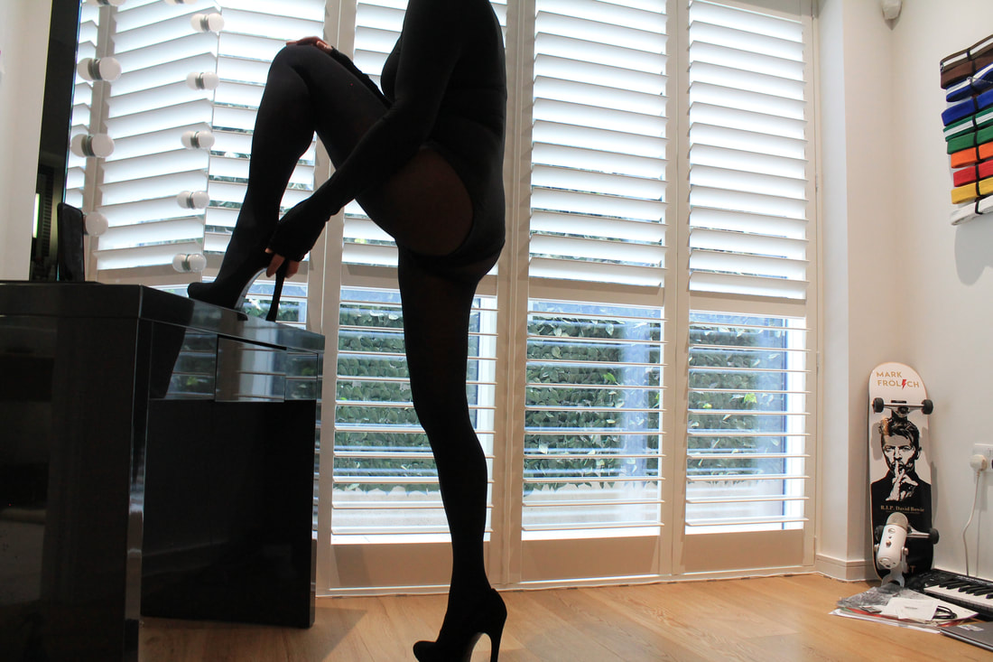
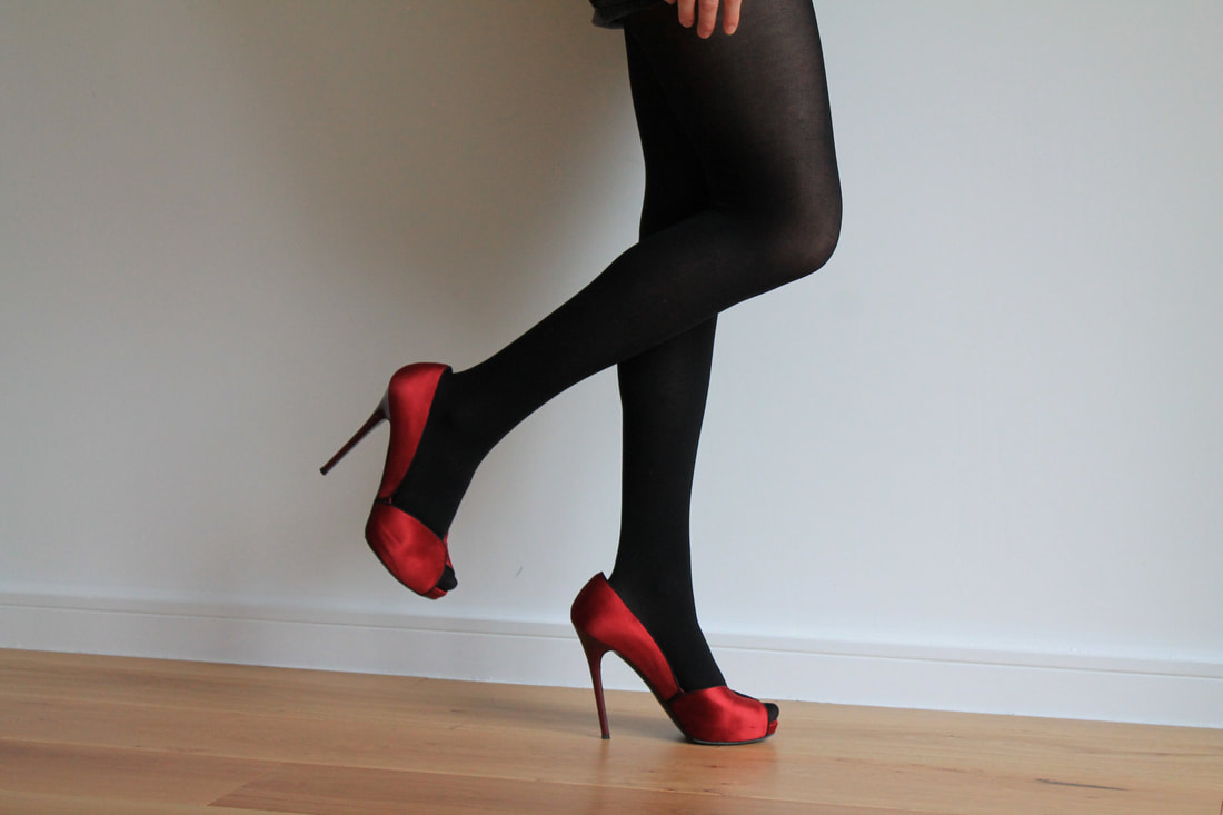
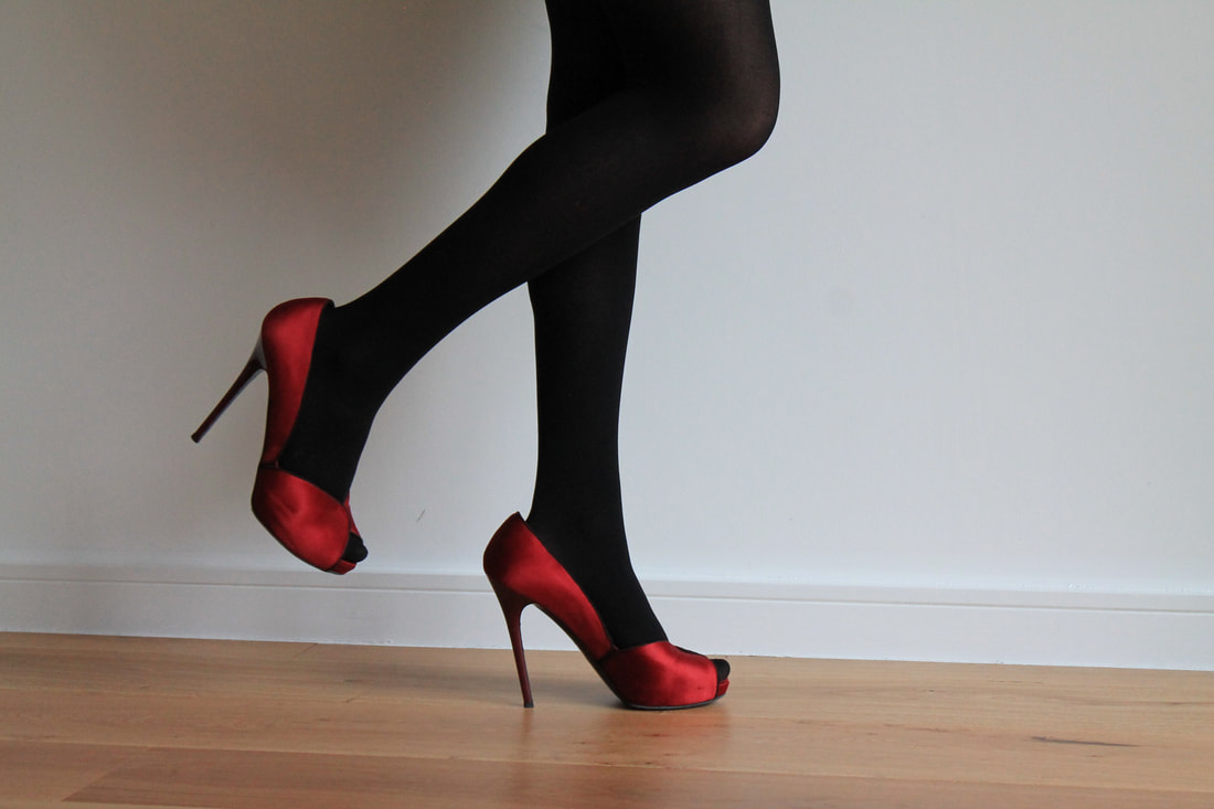
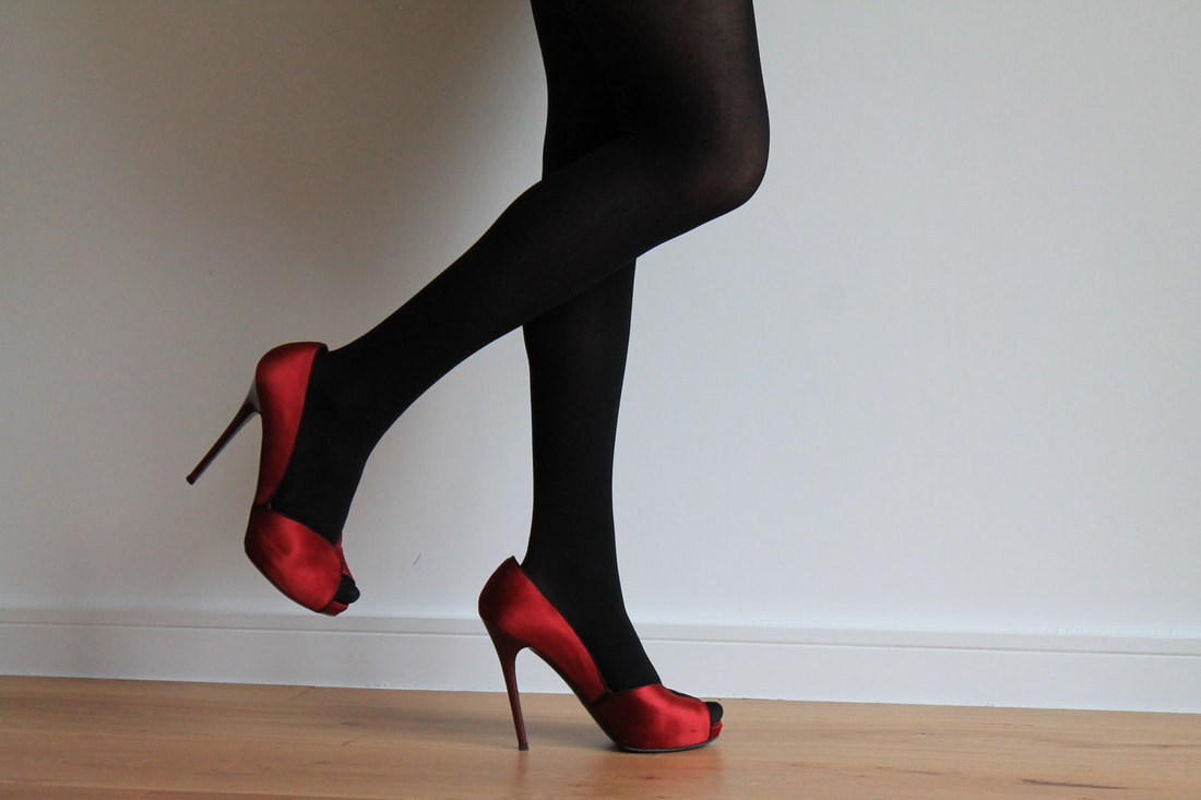
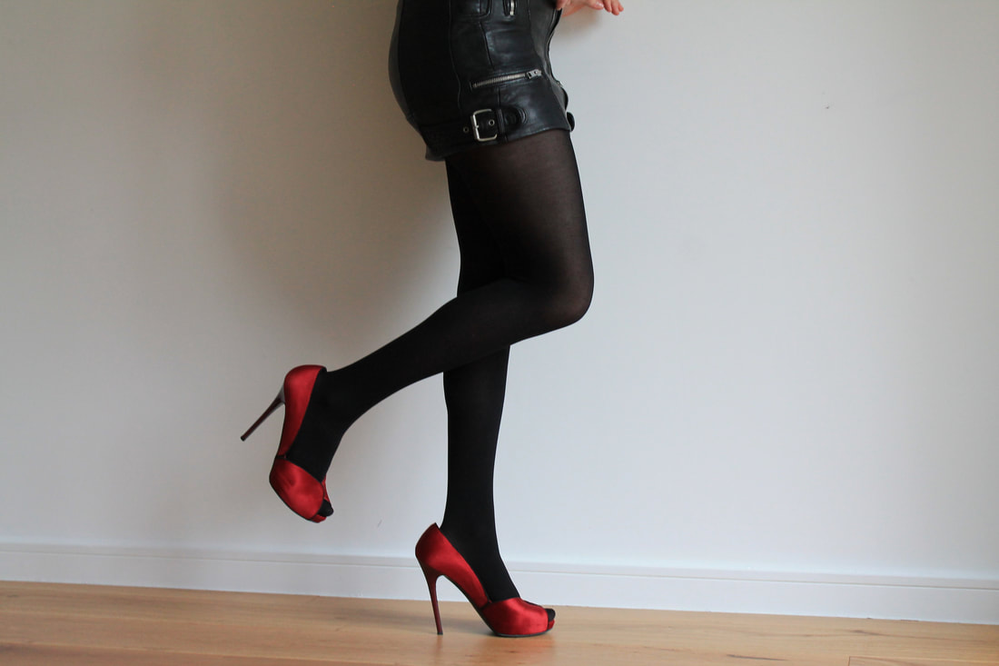
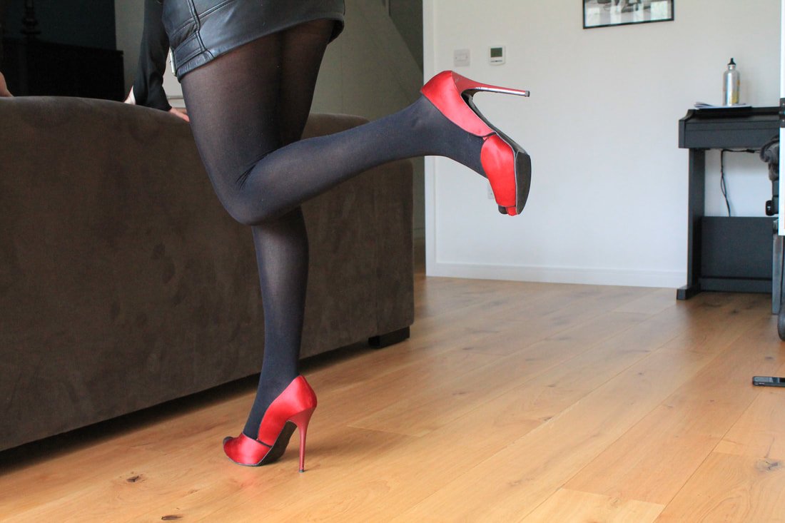
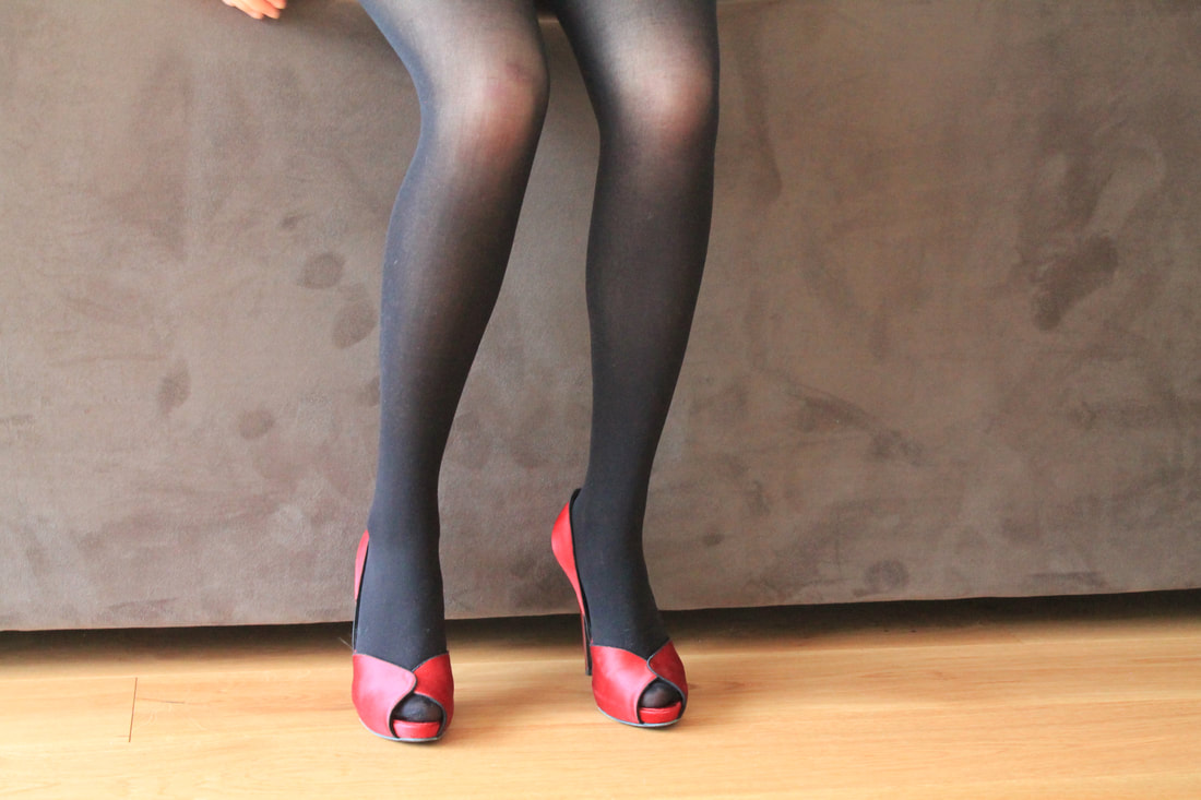
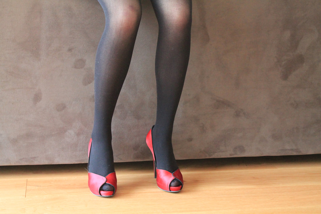
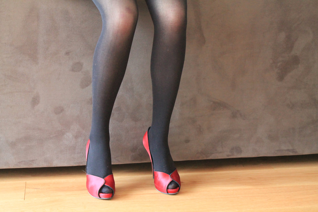
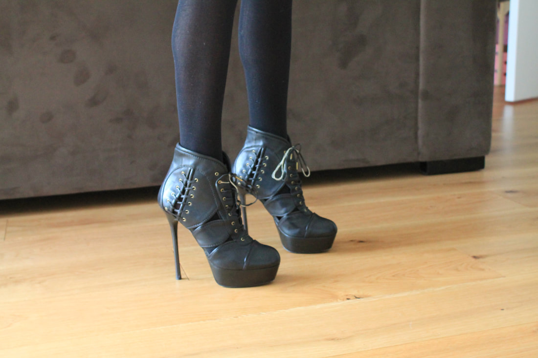
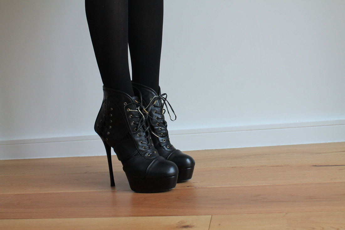
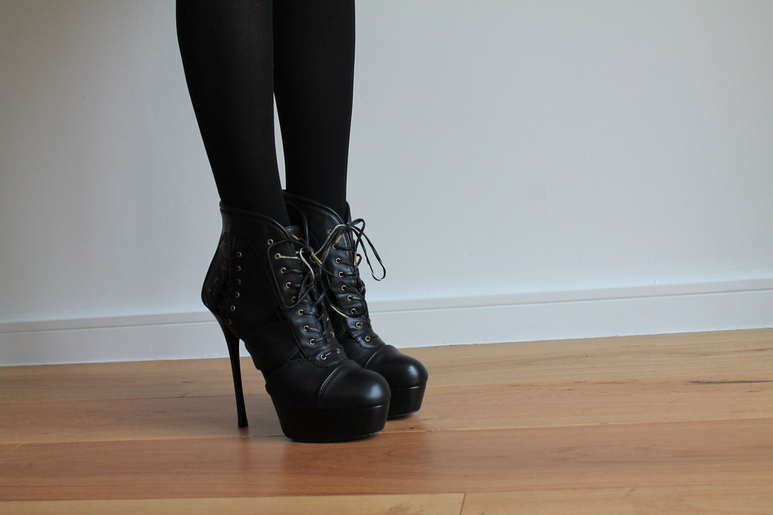
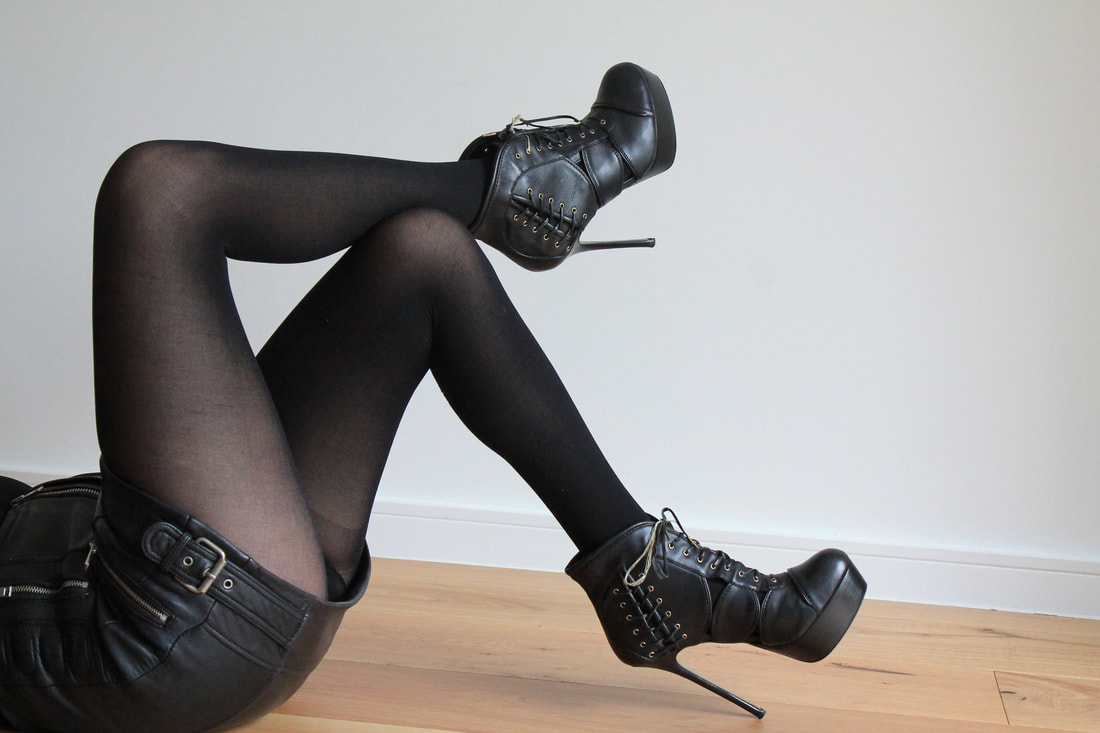
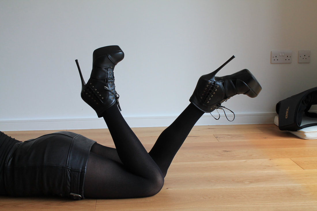
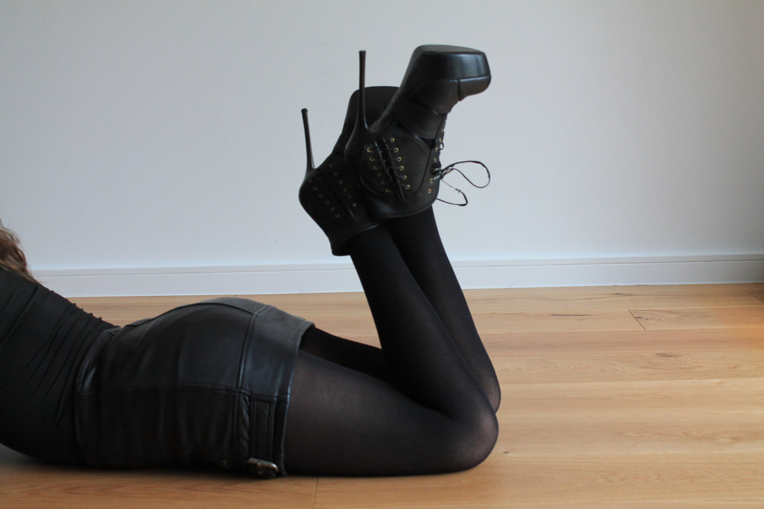
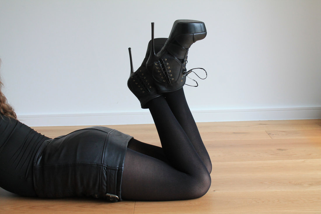
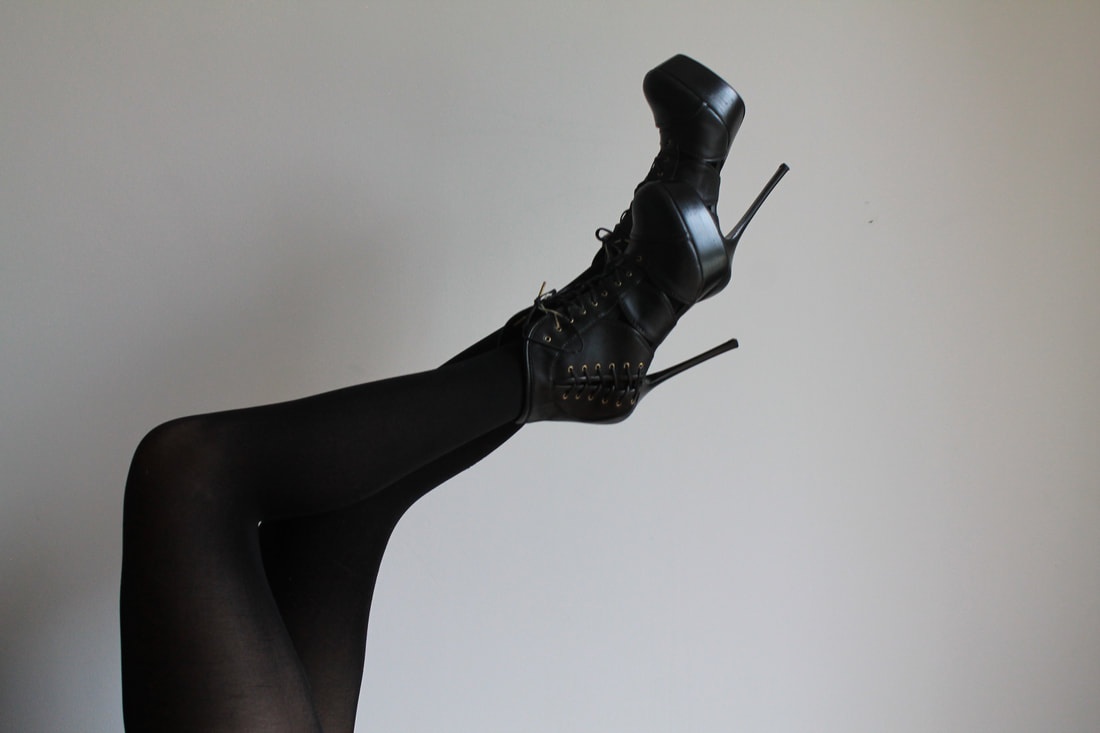
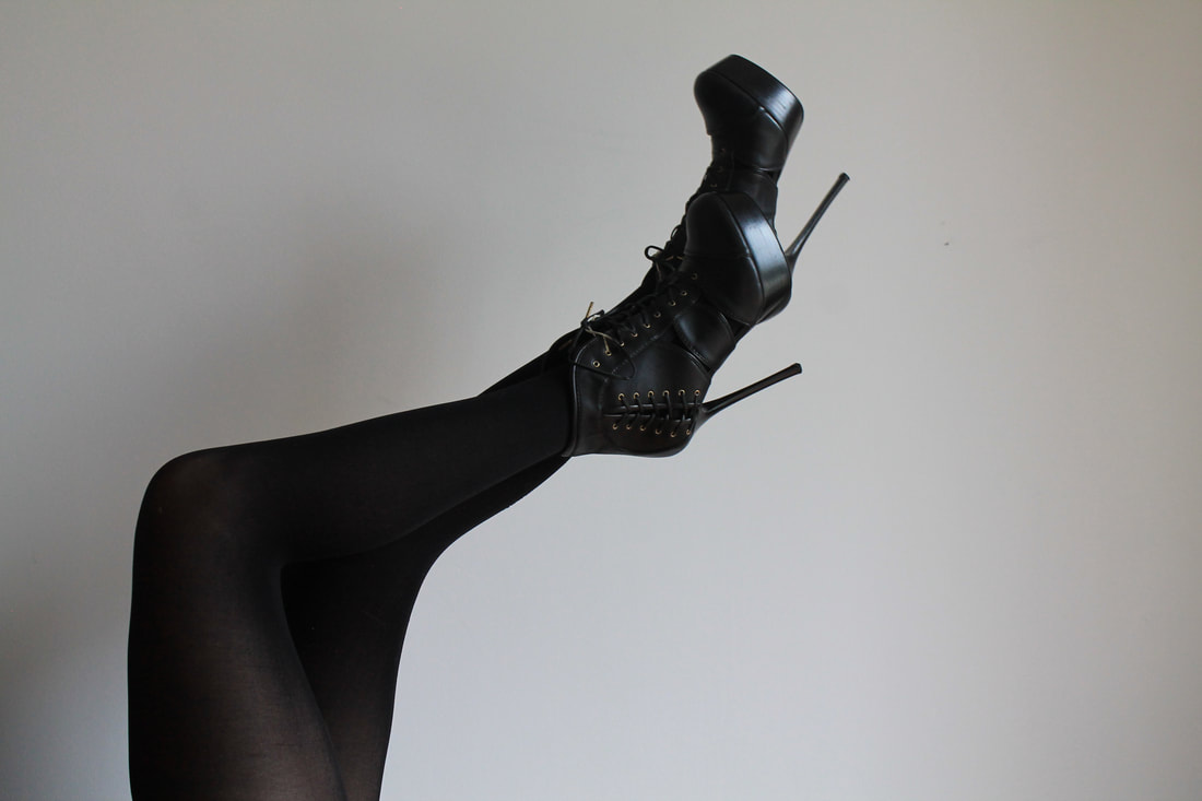
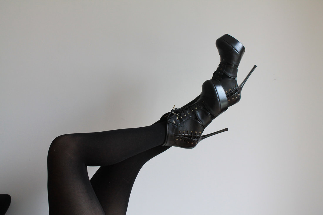
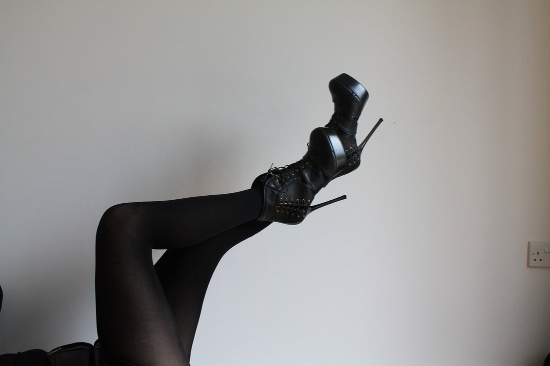
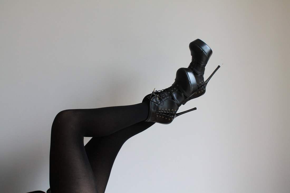
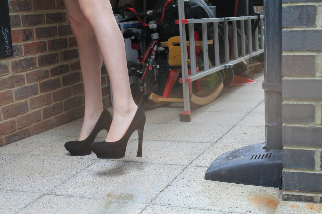
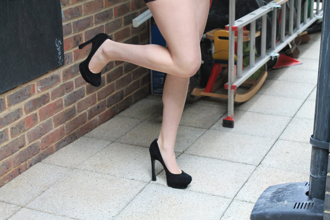
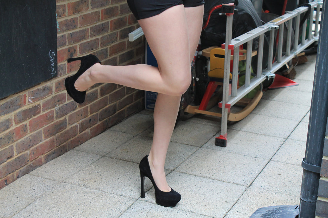
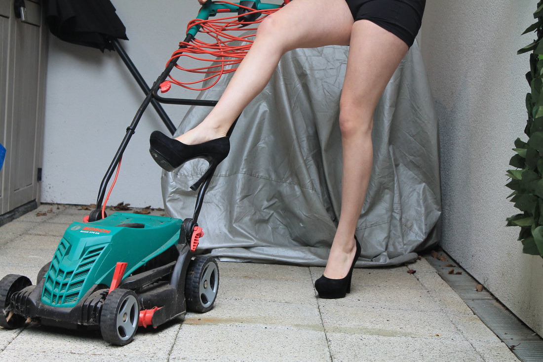
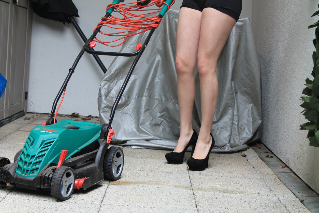
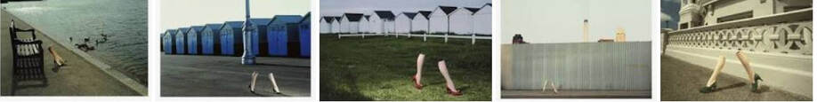
Guy Bourdin
second development
|
|
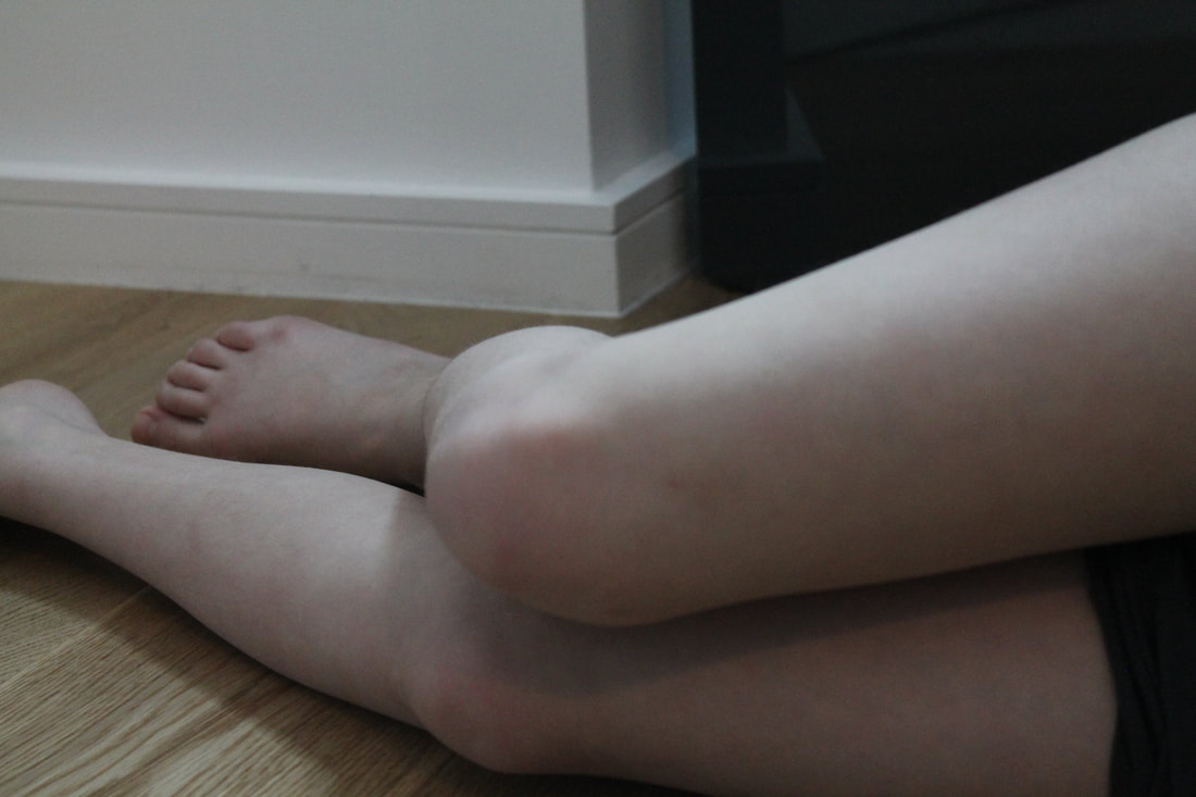
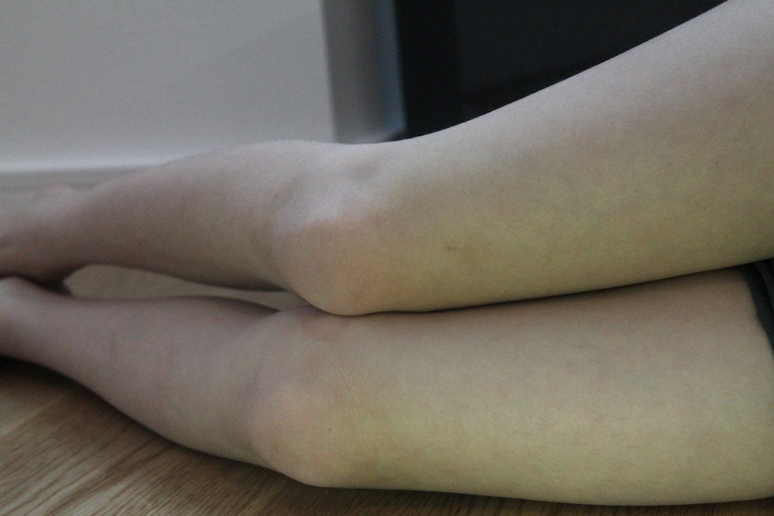
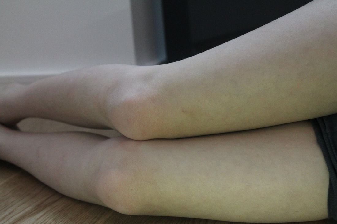
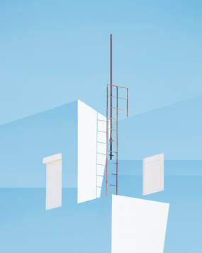
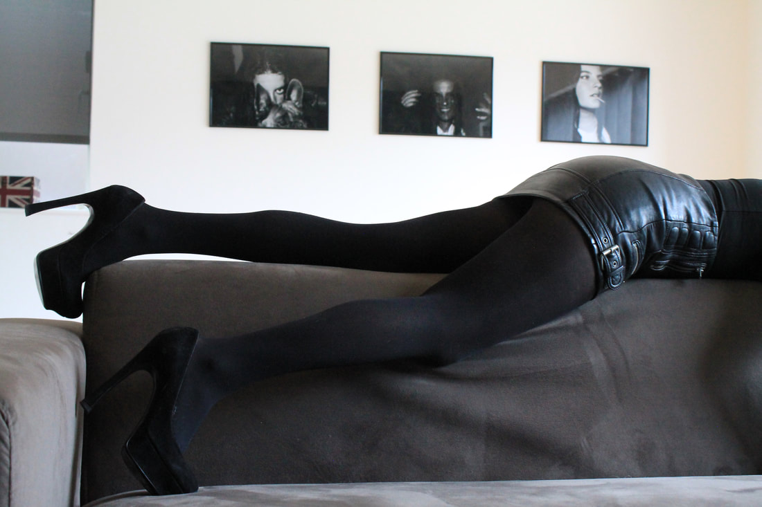
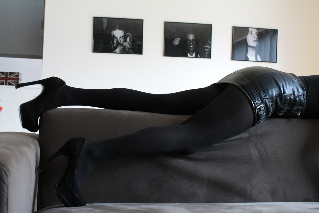
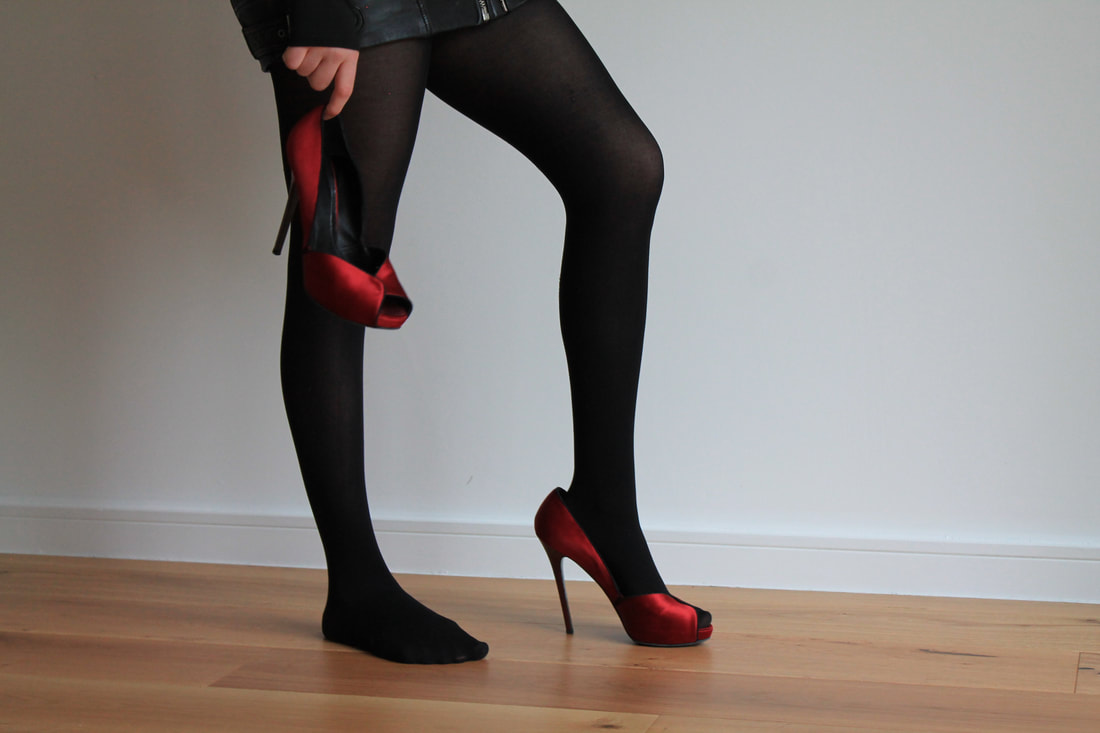
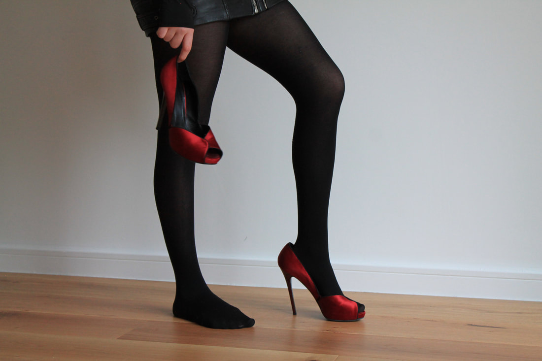
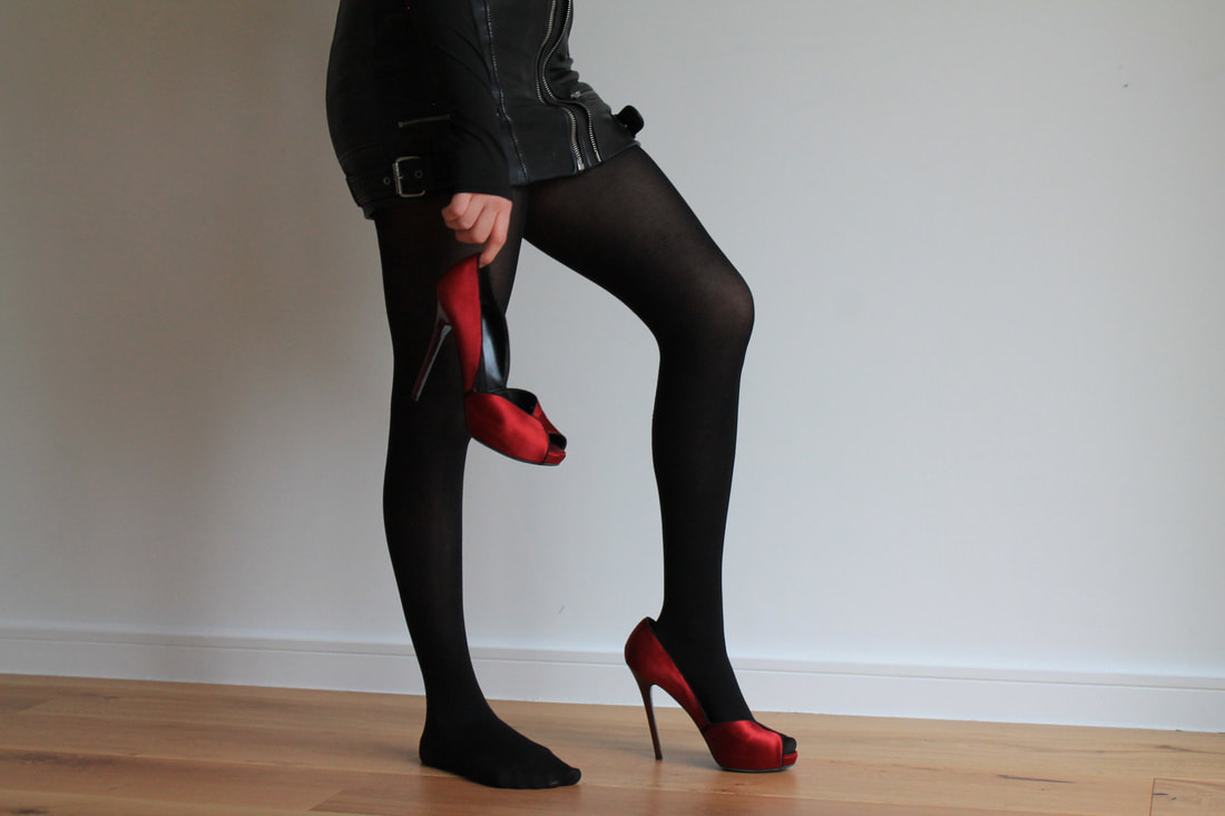
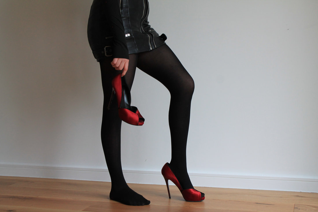
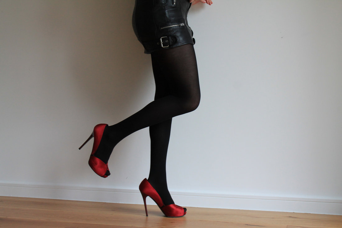
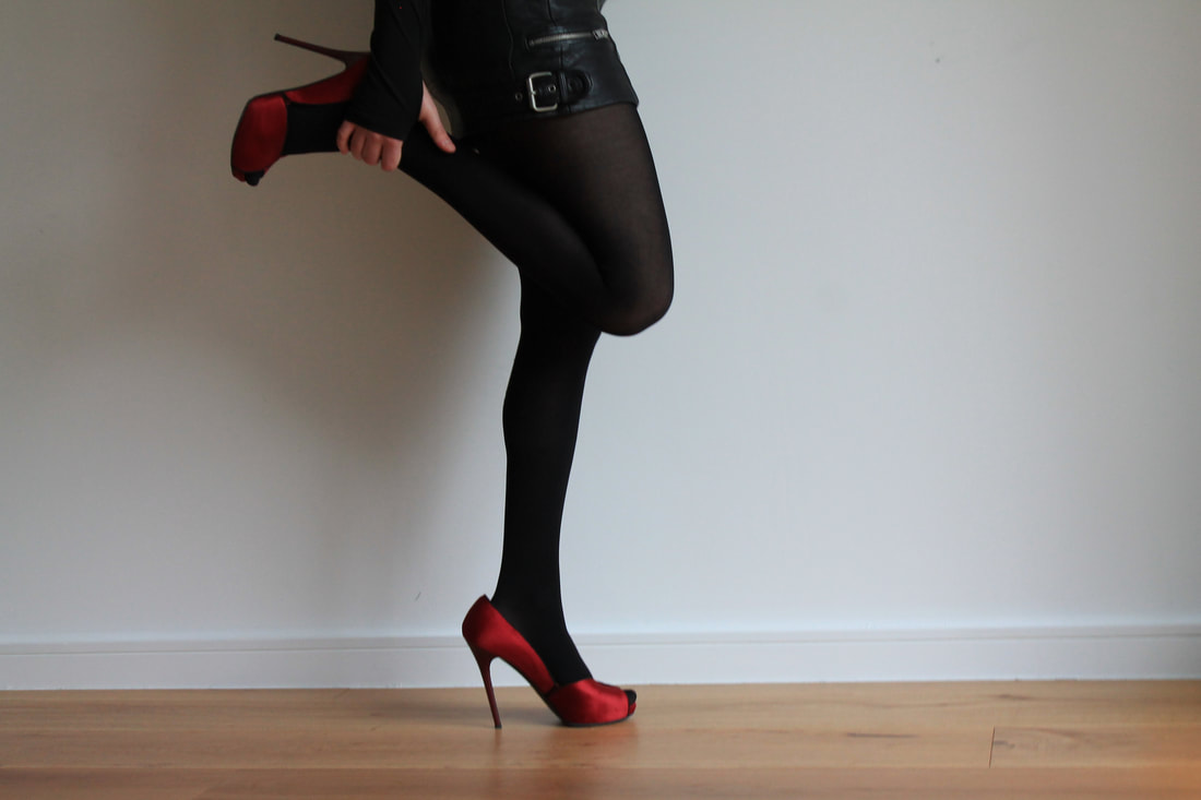
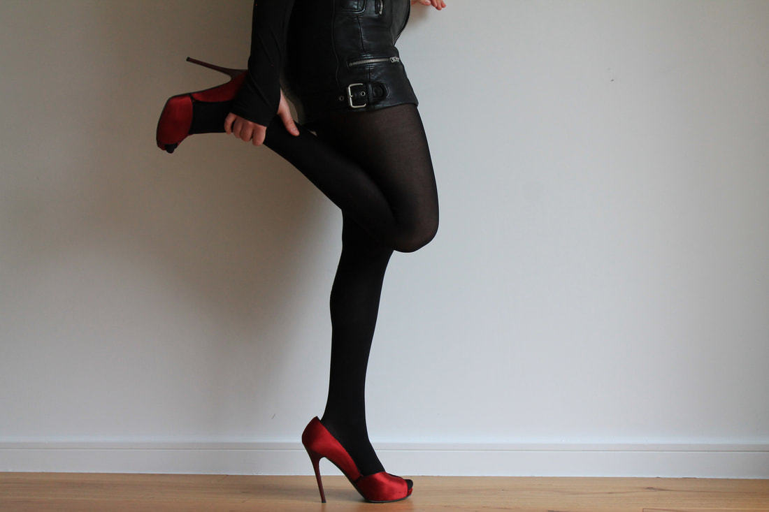
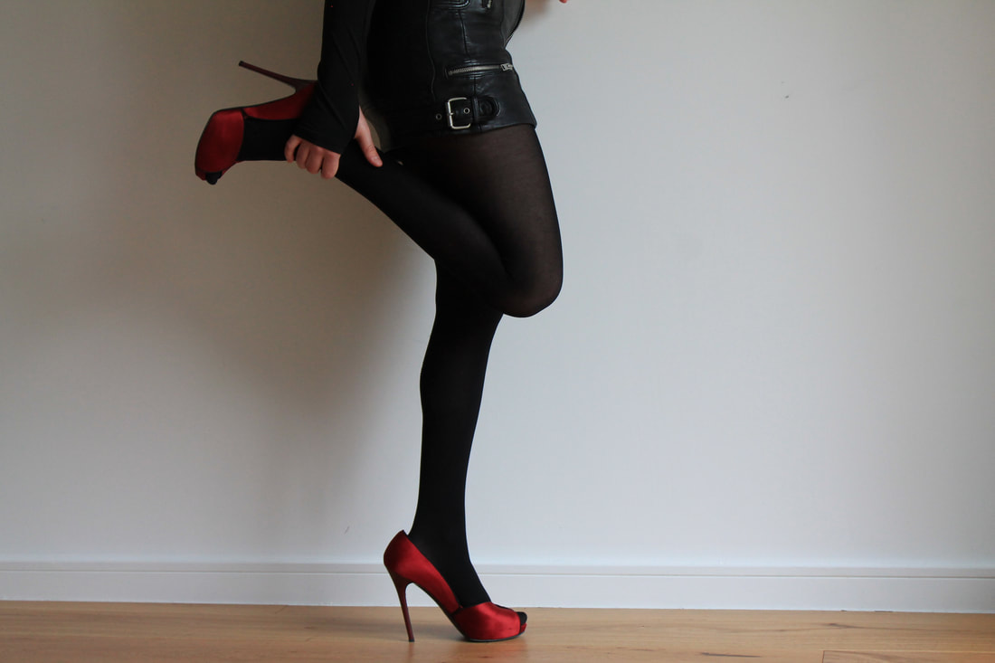
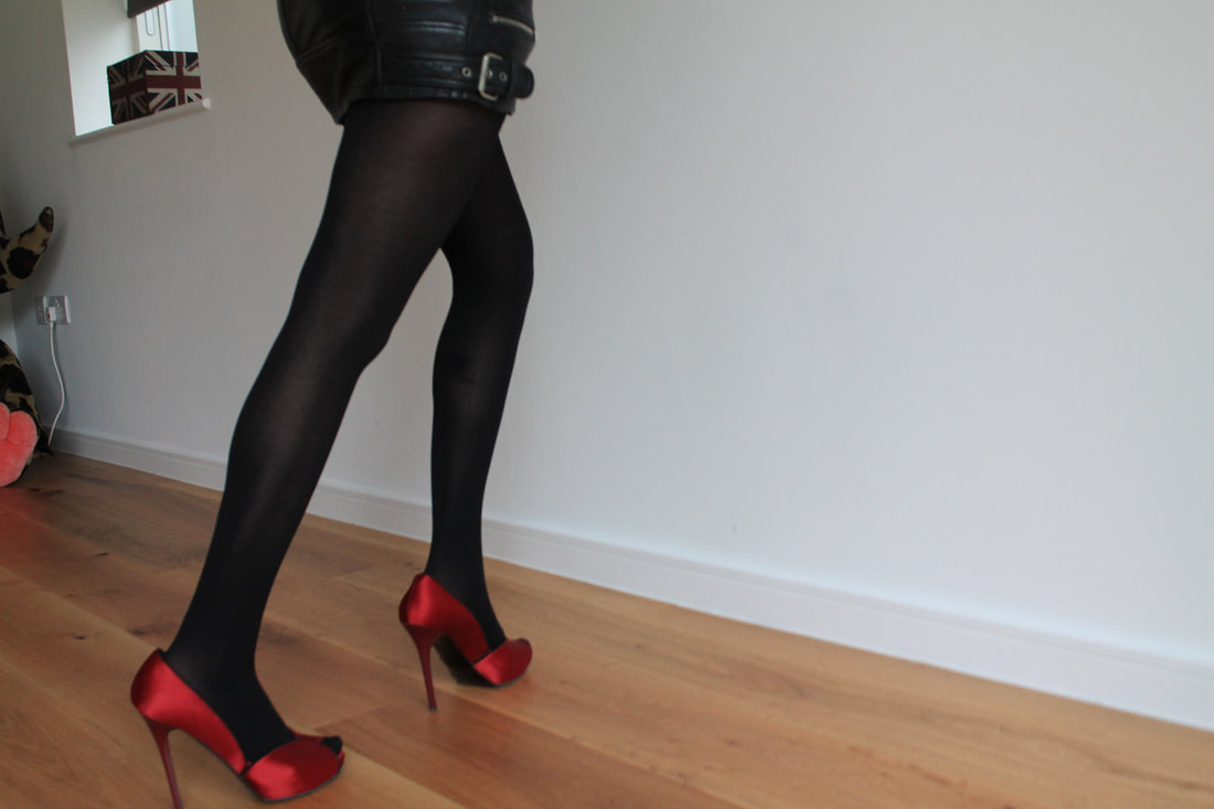
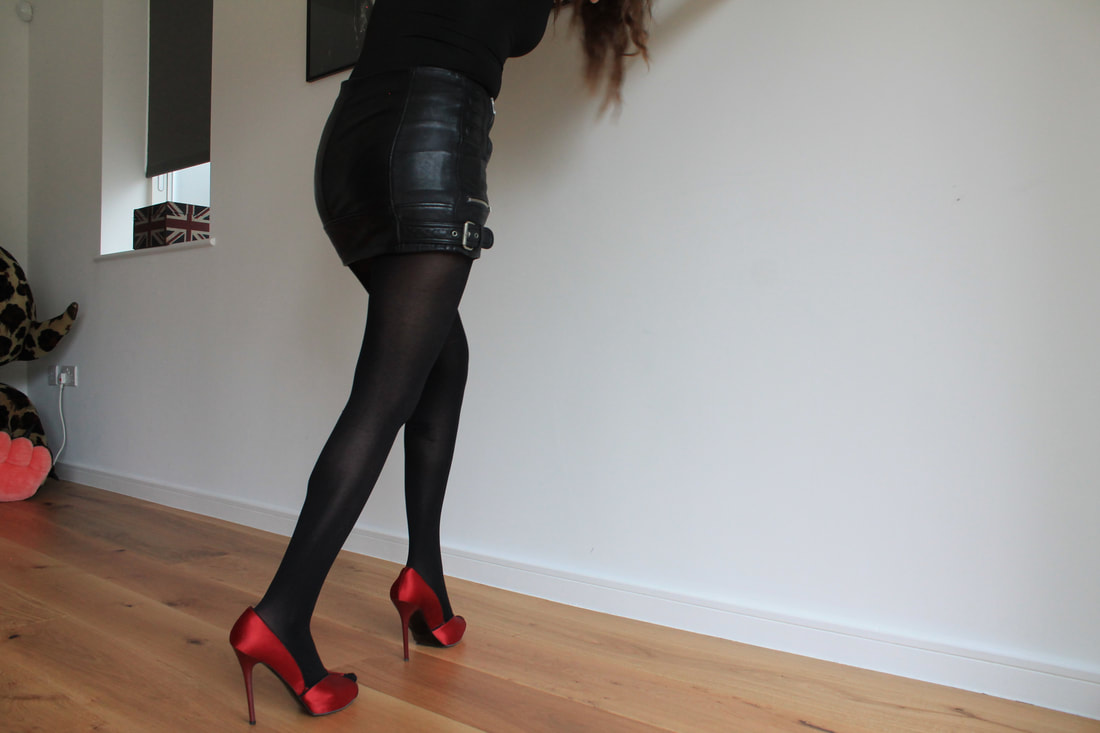
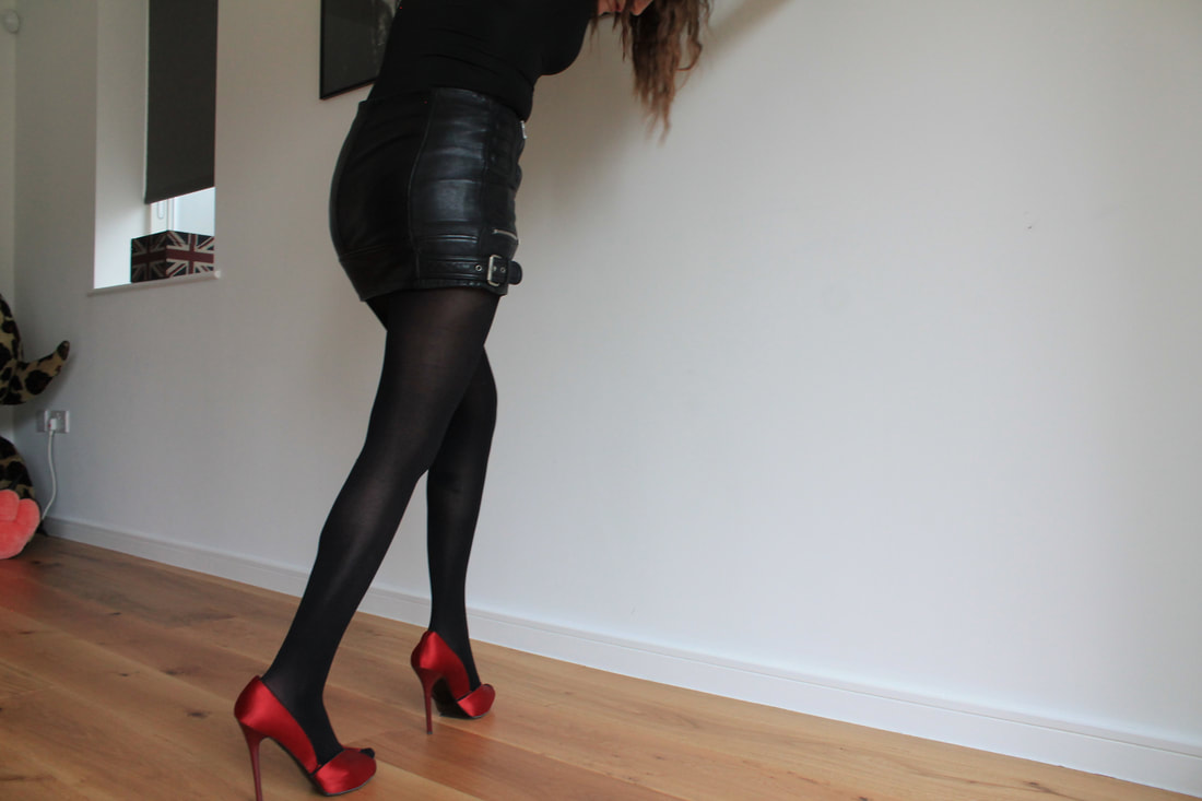
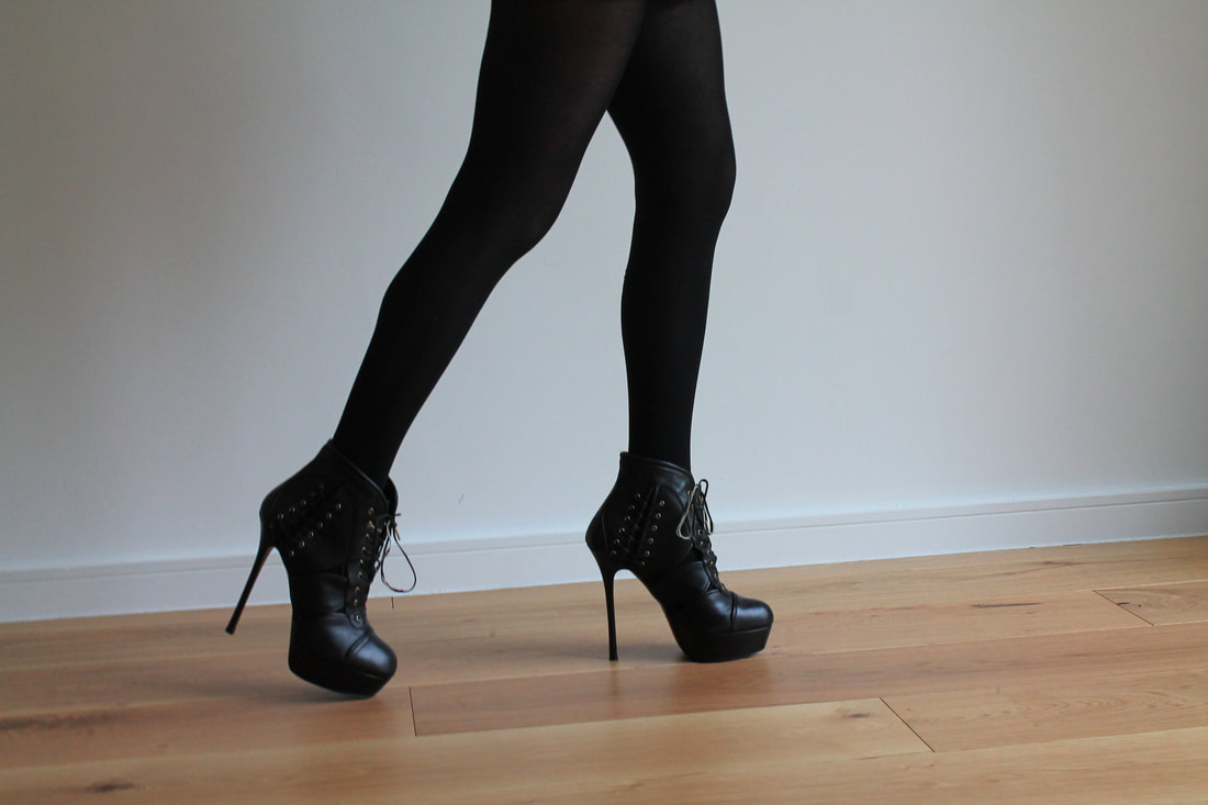
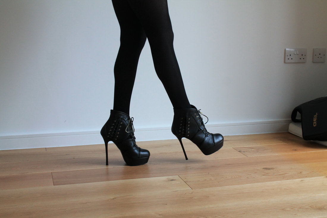
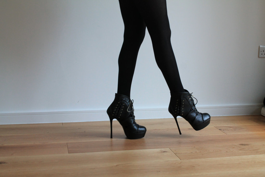
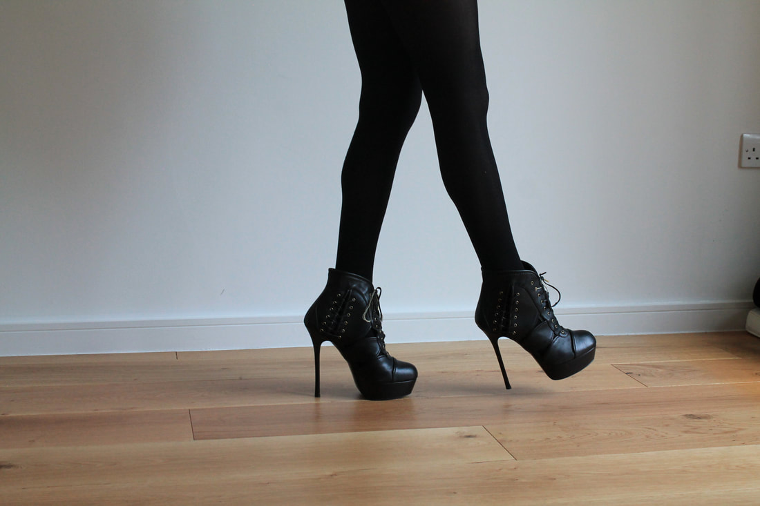
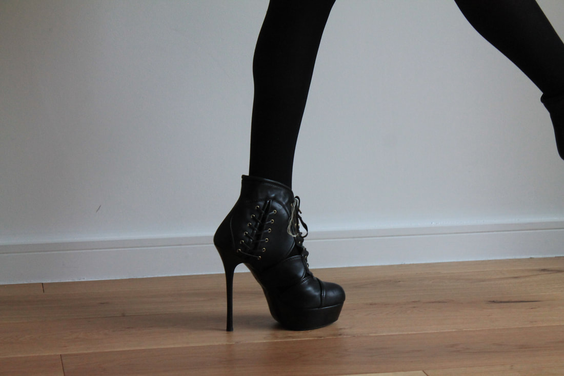
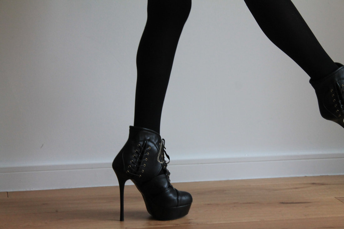
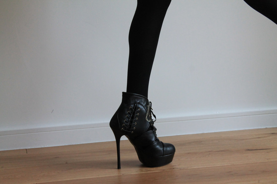
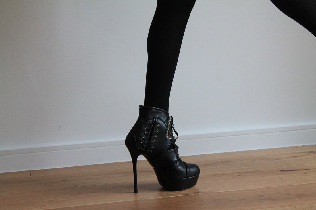
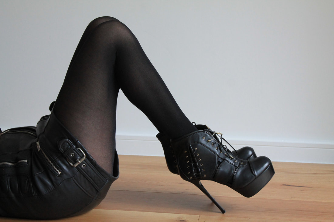
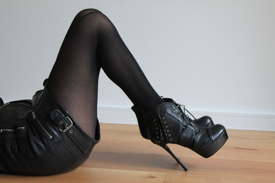
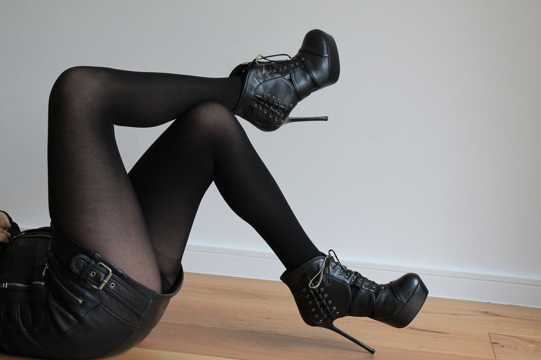
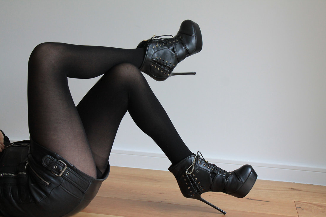
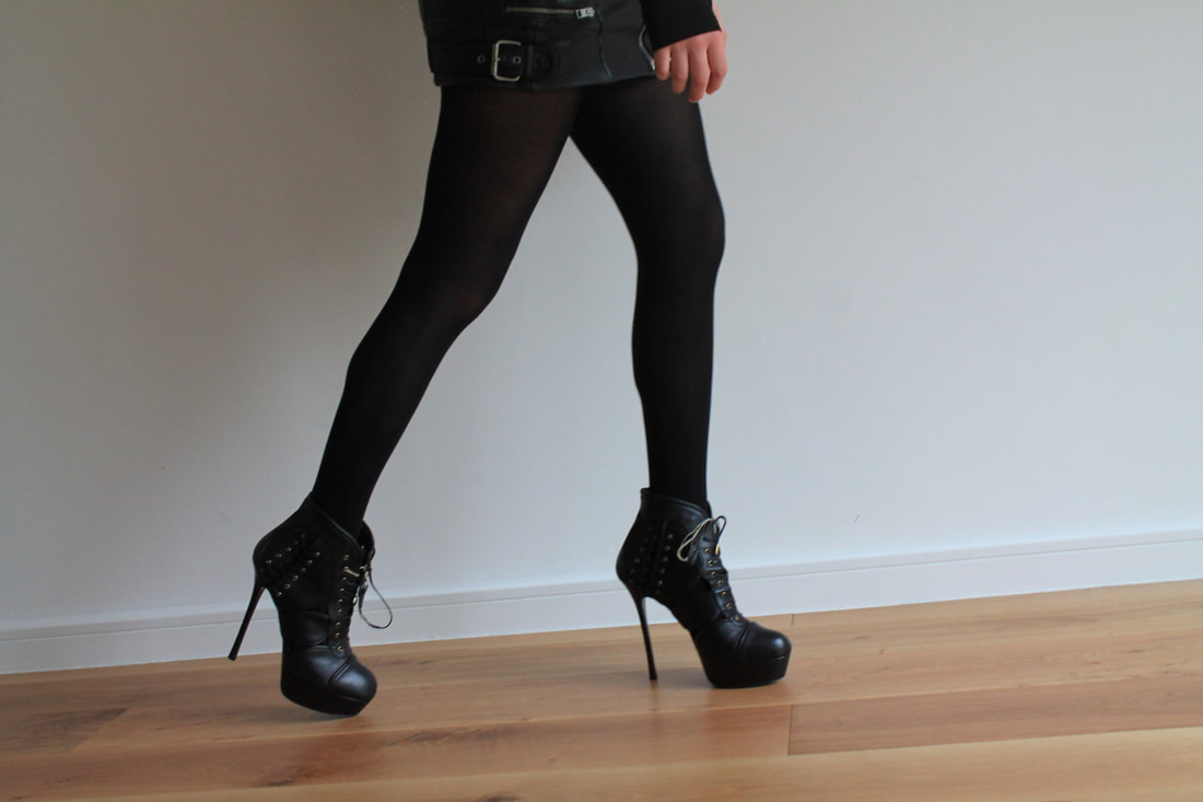
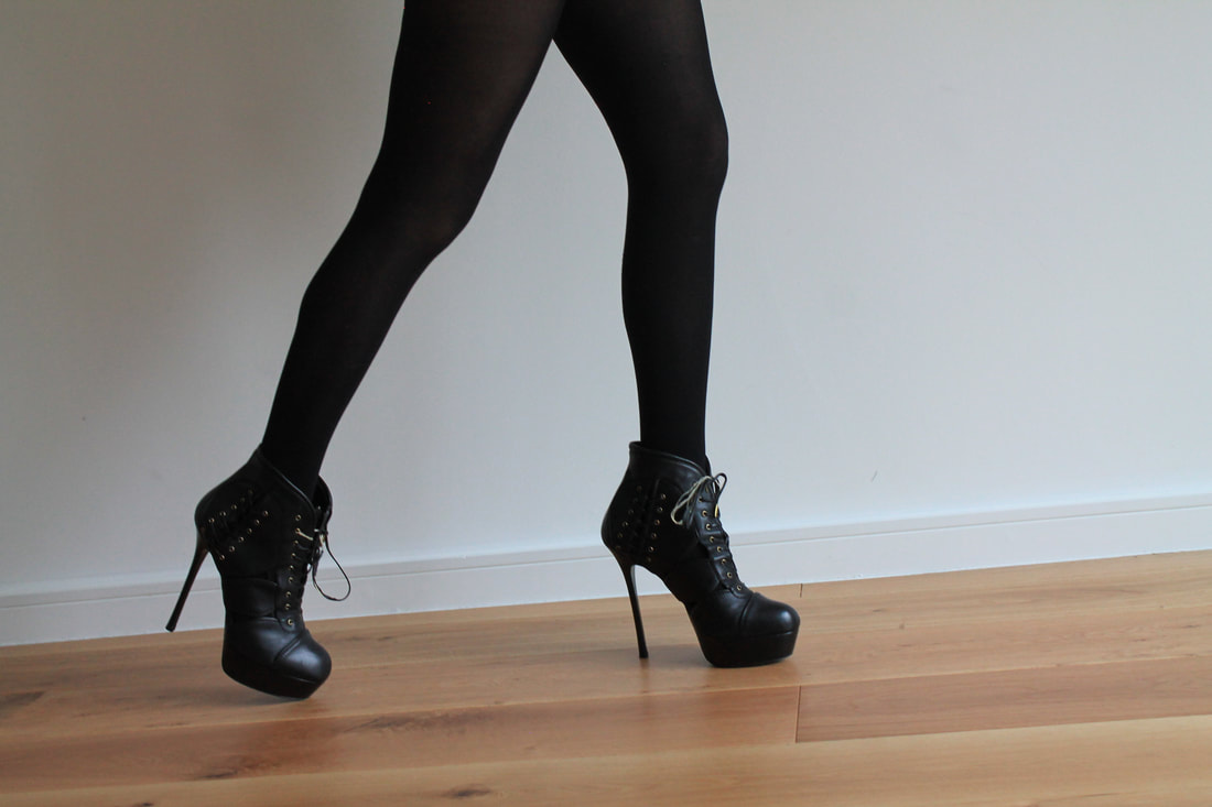
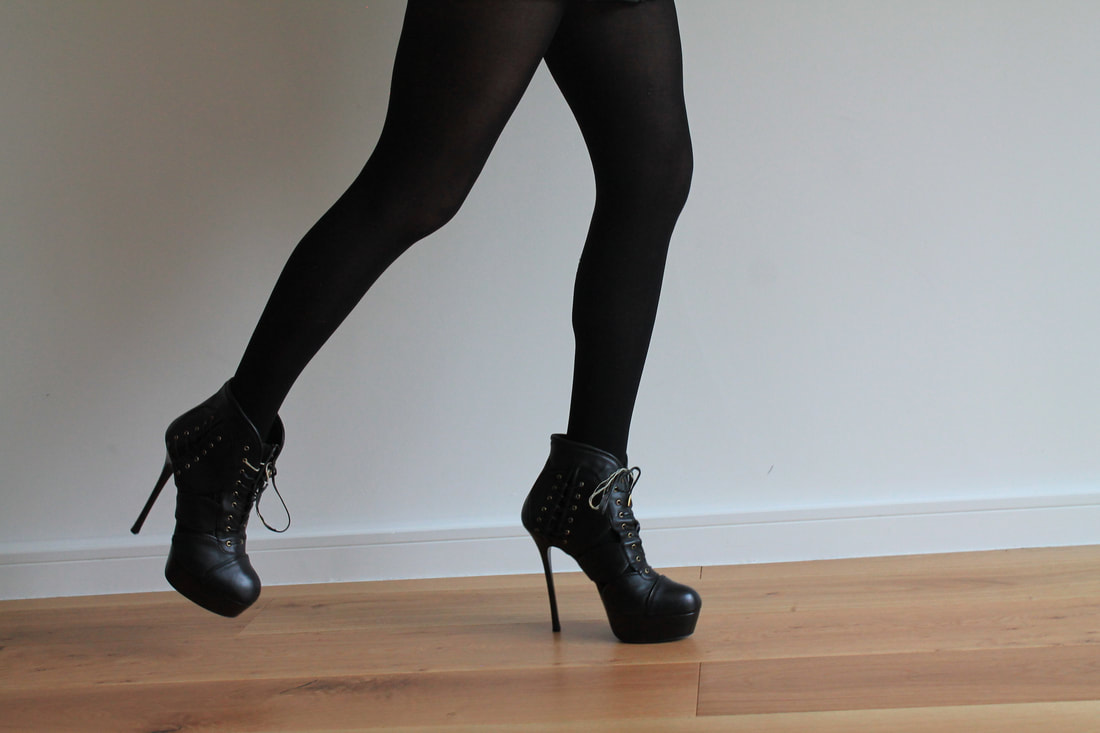
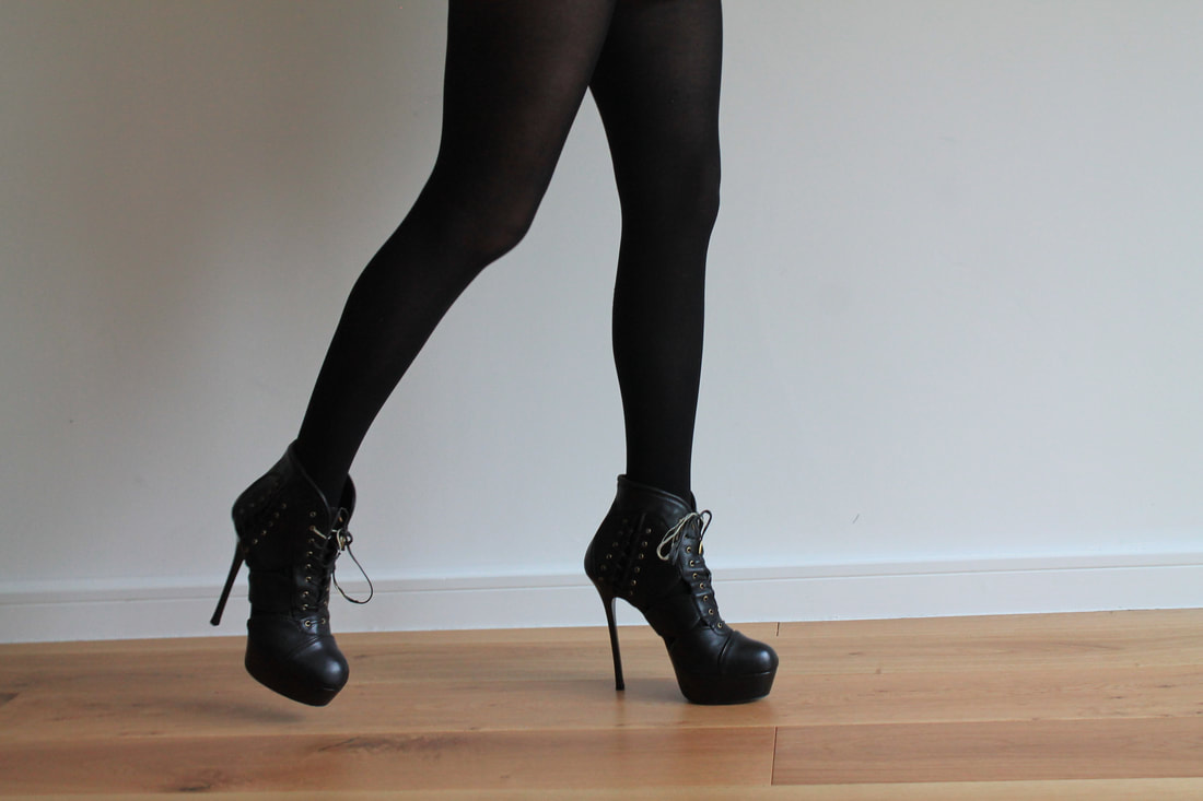
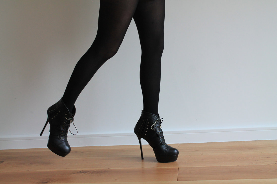
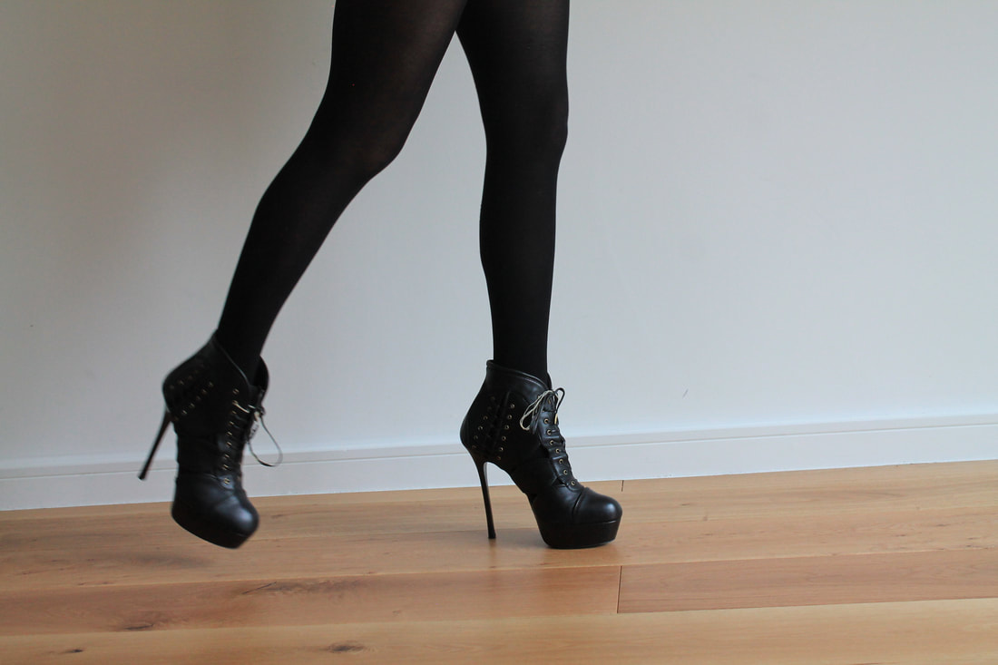
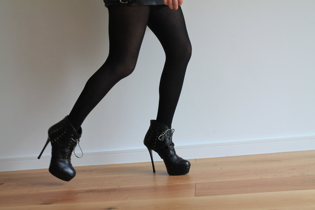
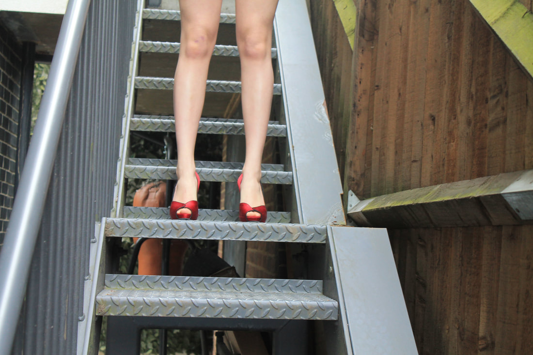
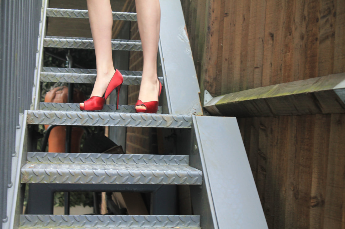
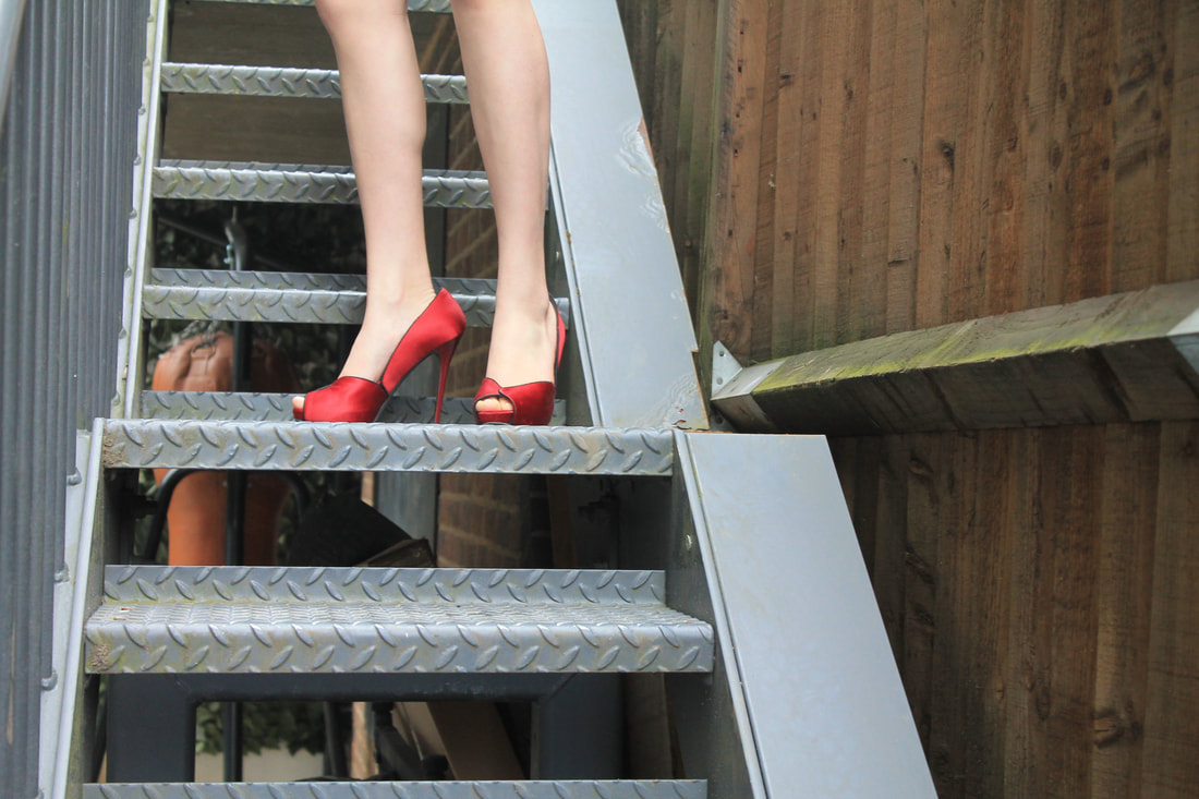
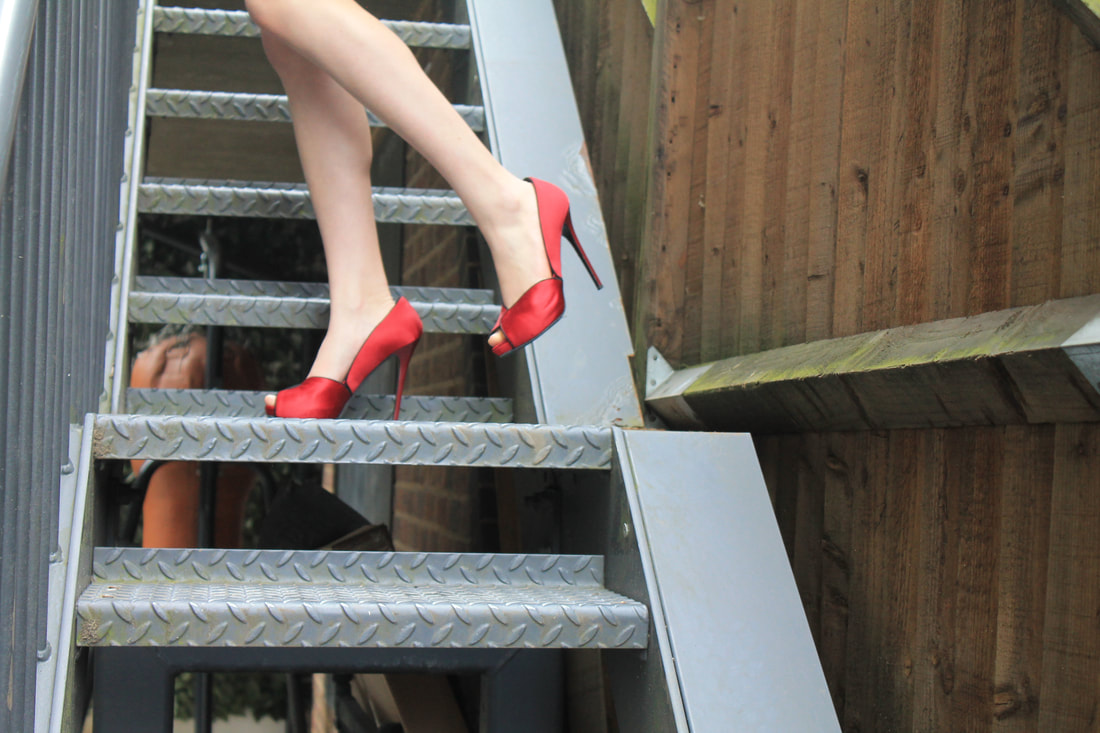
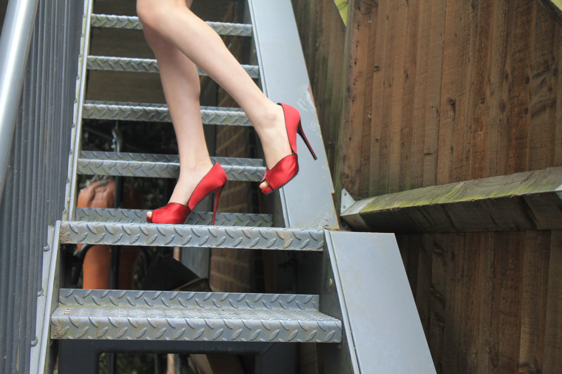
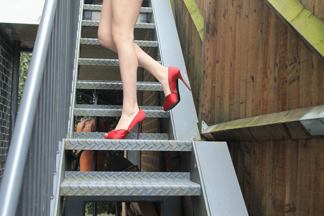
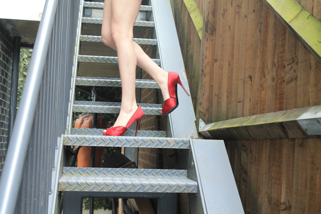
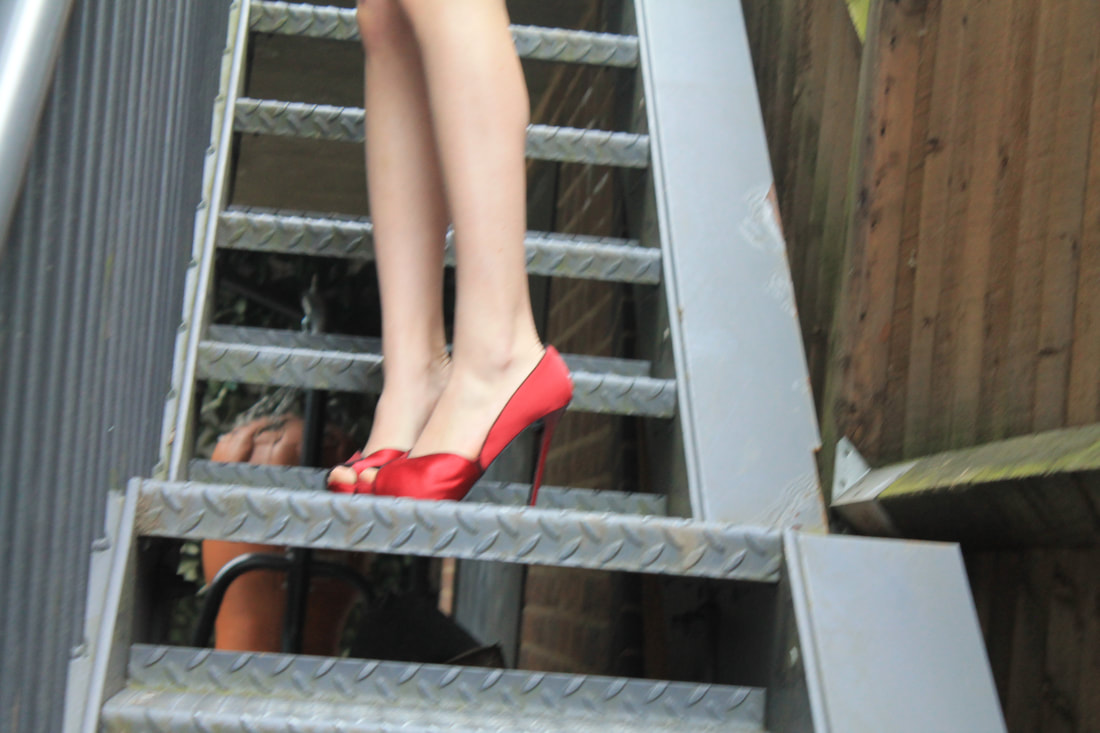
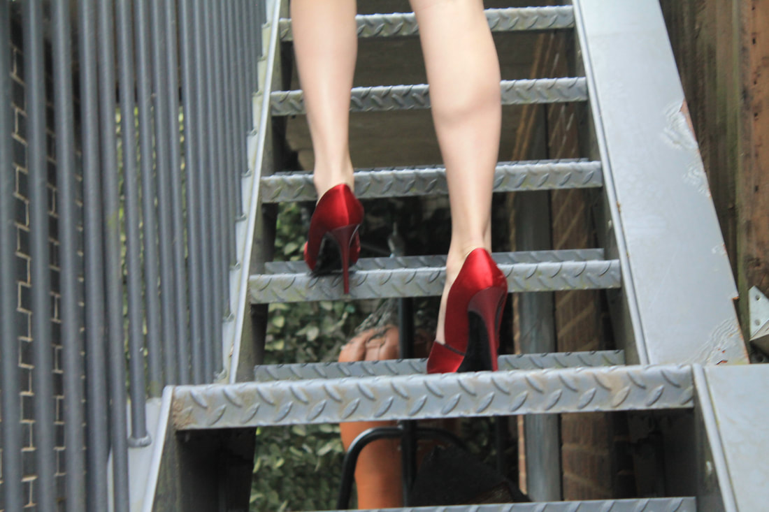
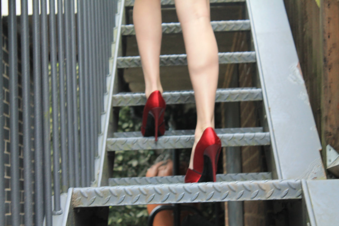
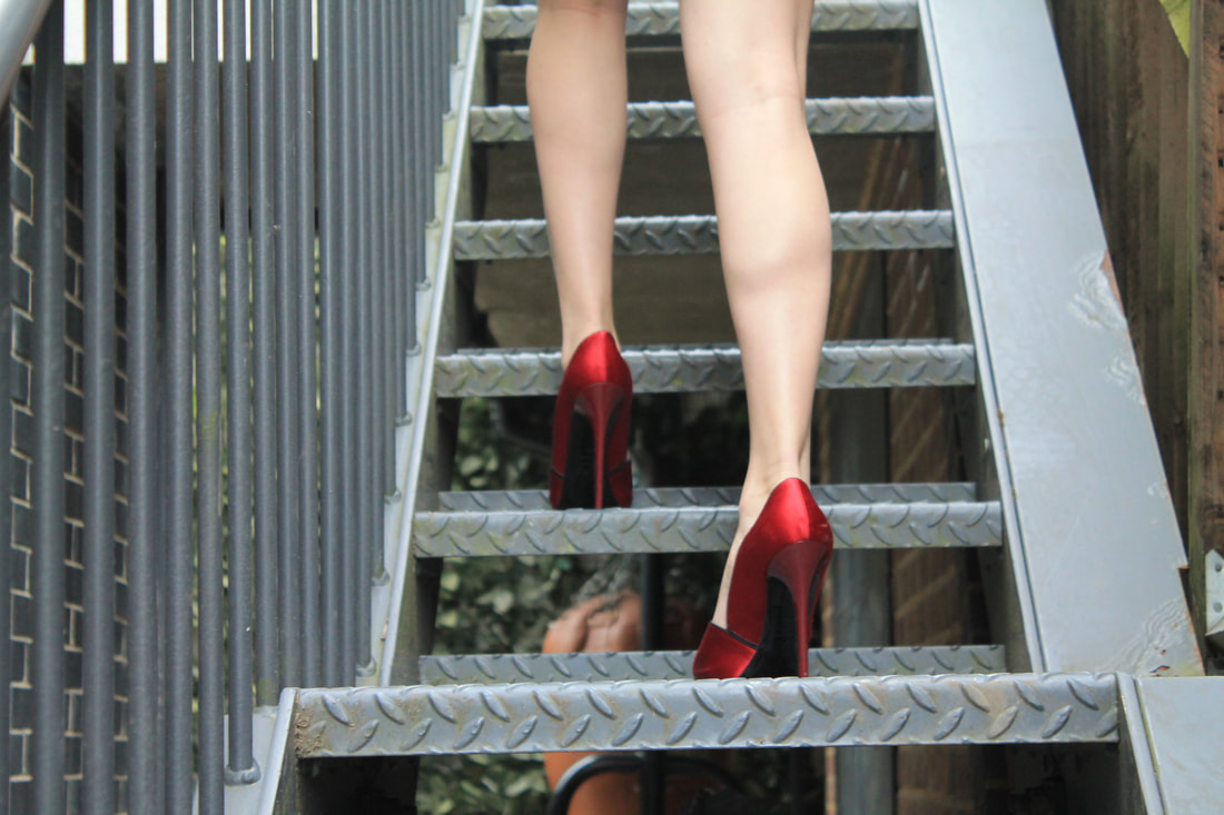
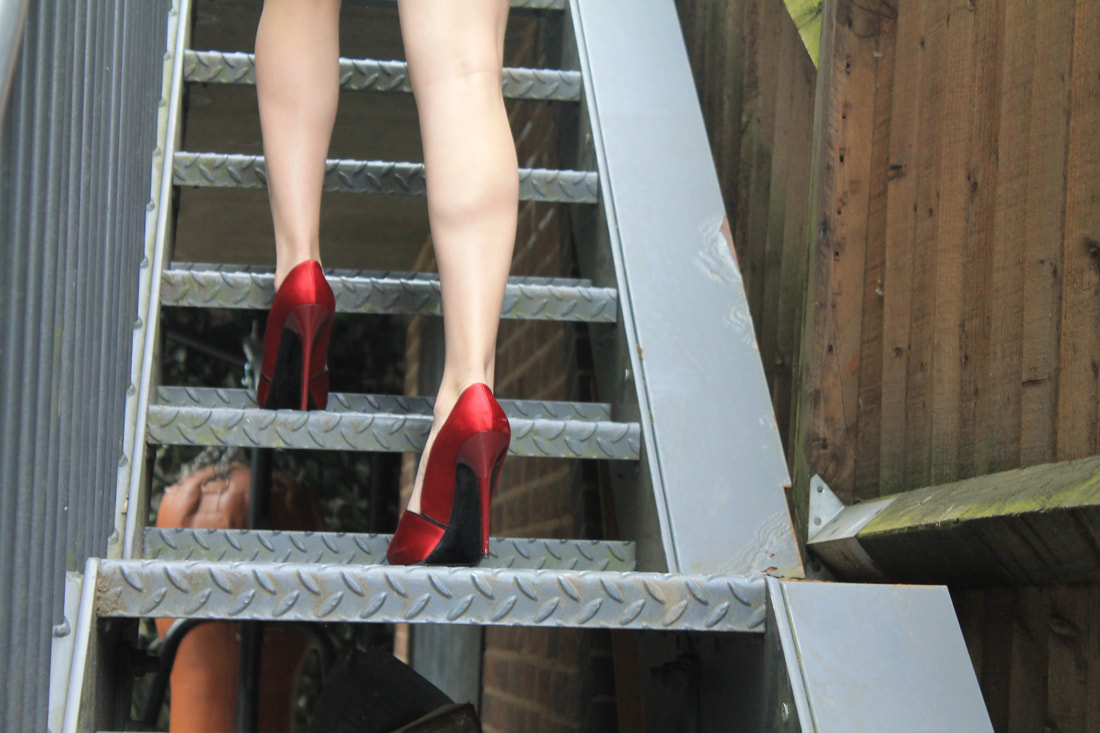
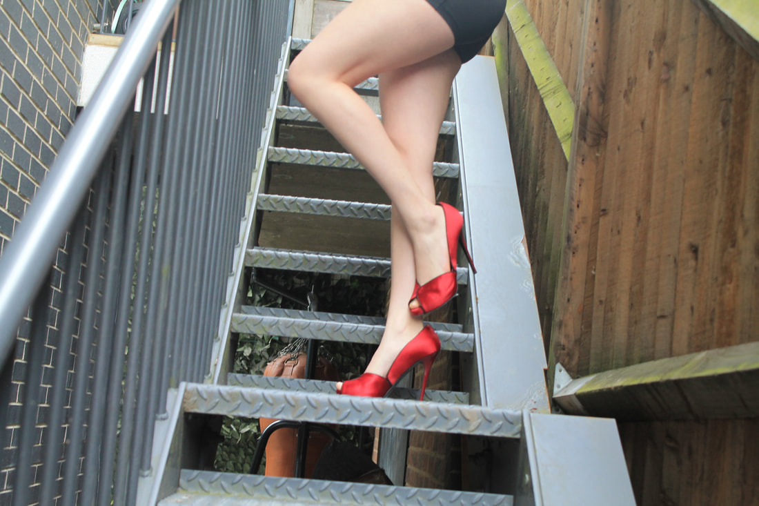
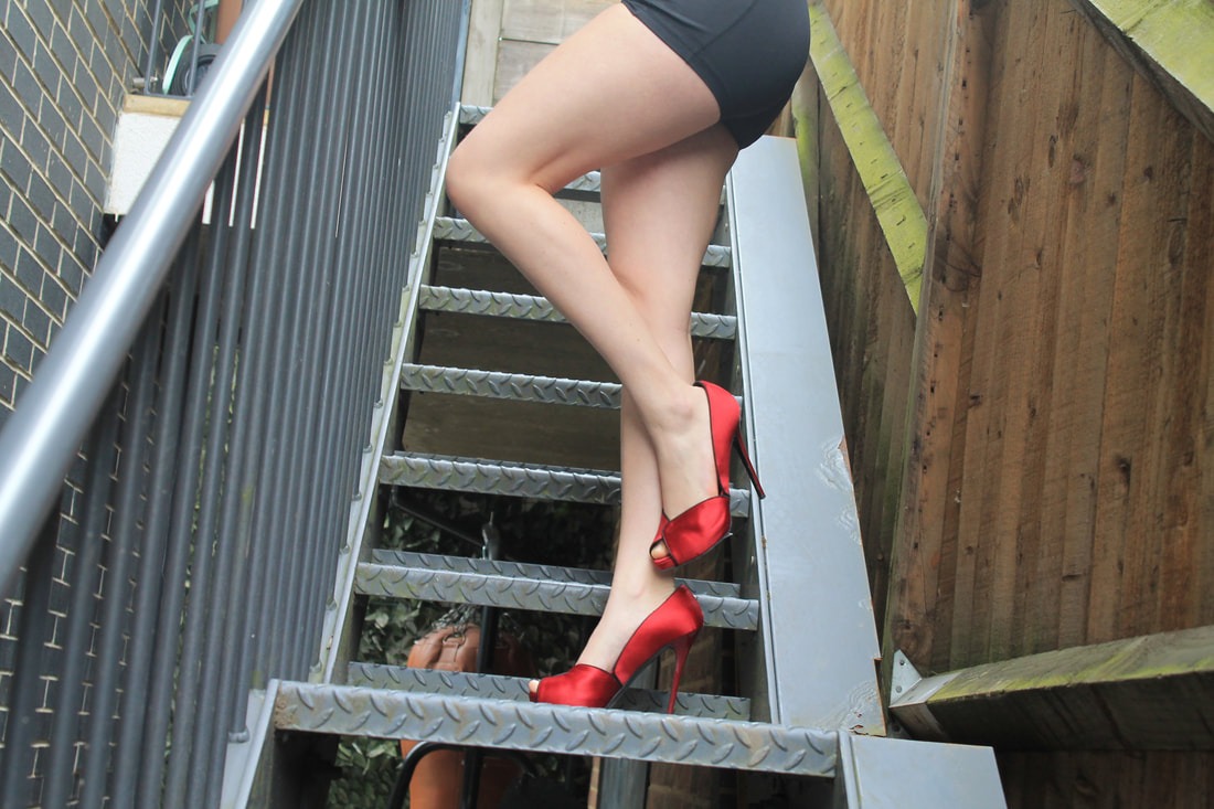
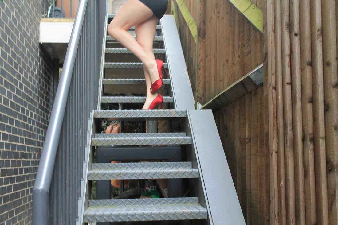
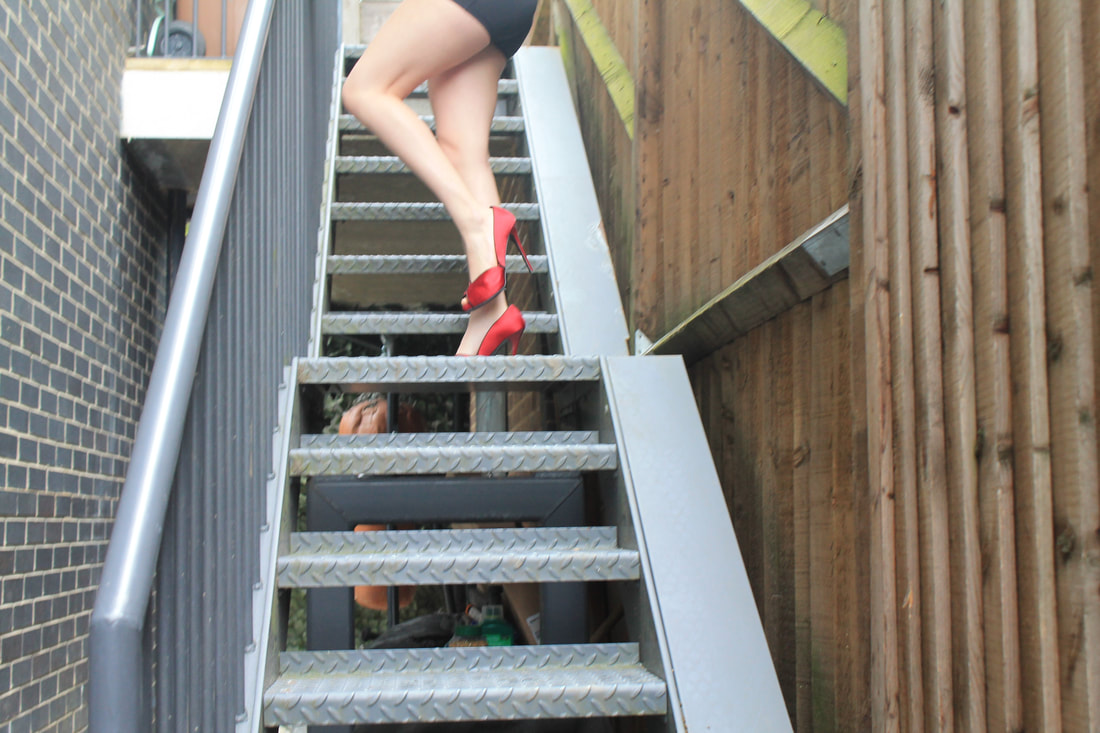
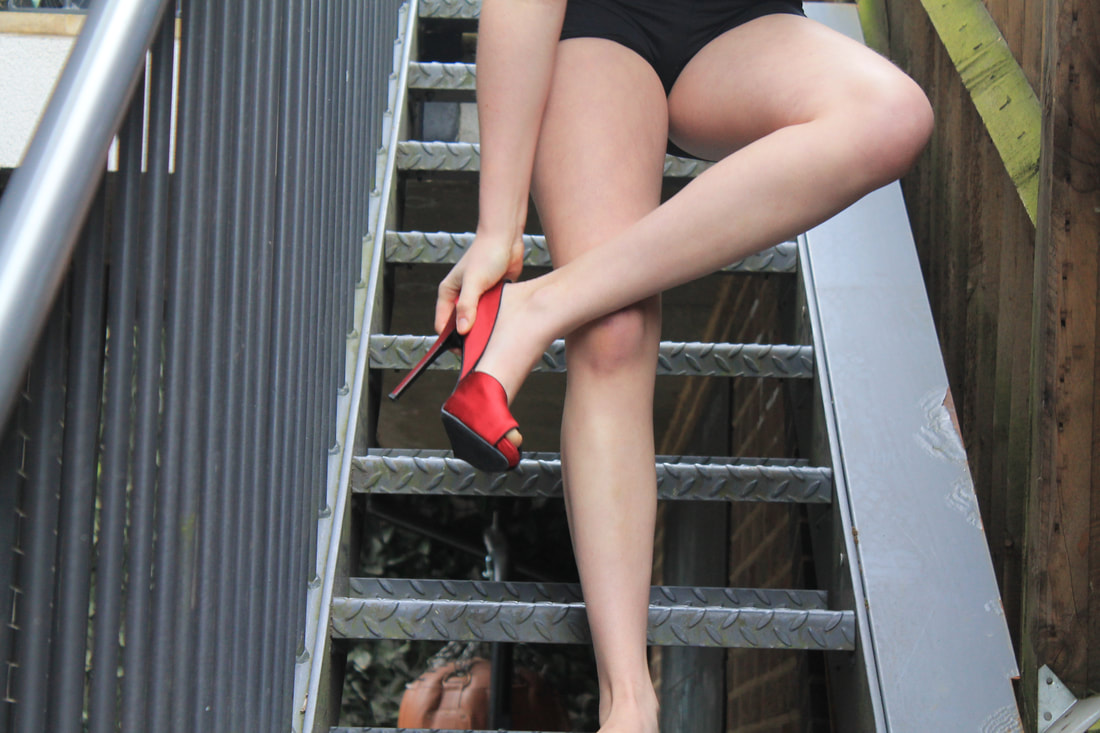
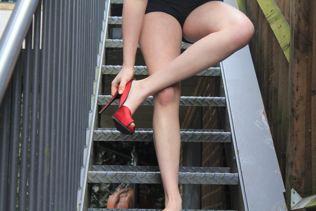
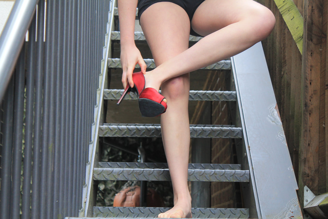
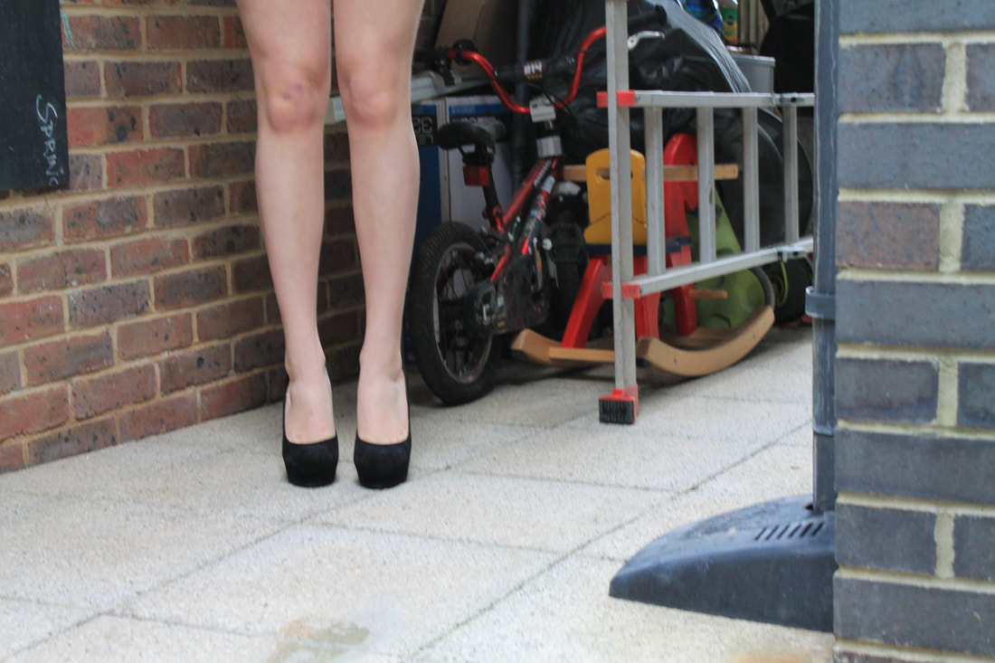
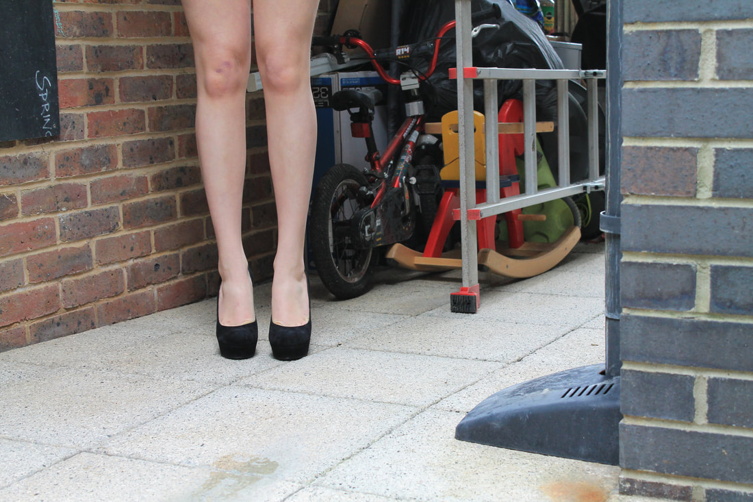
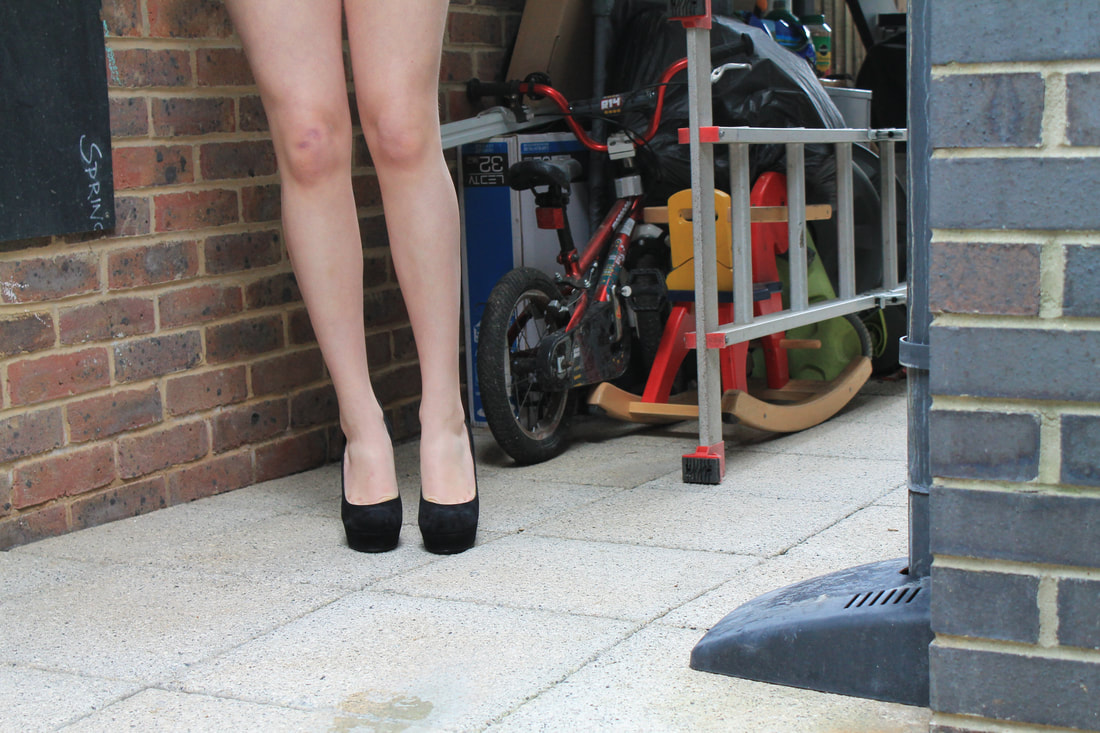
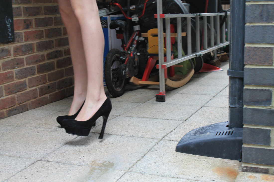
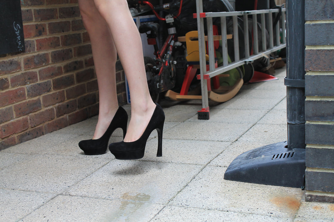
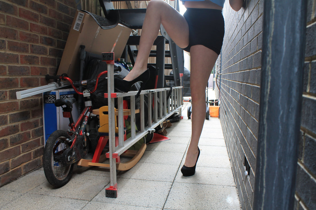
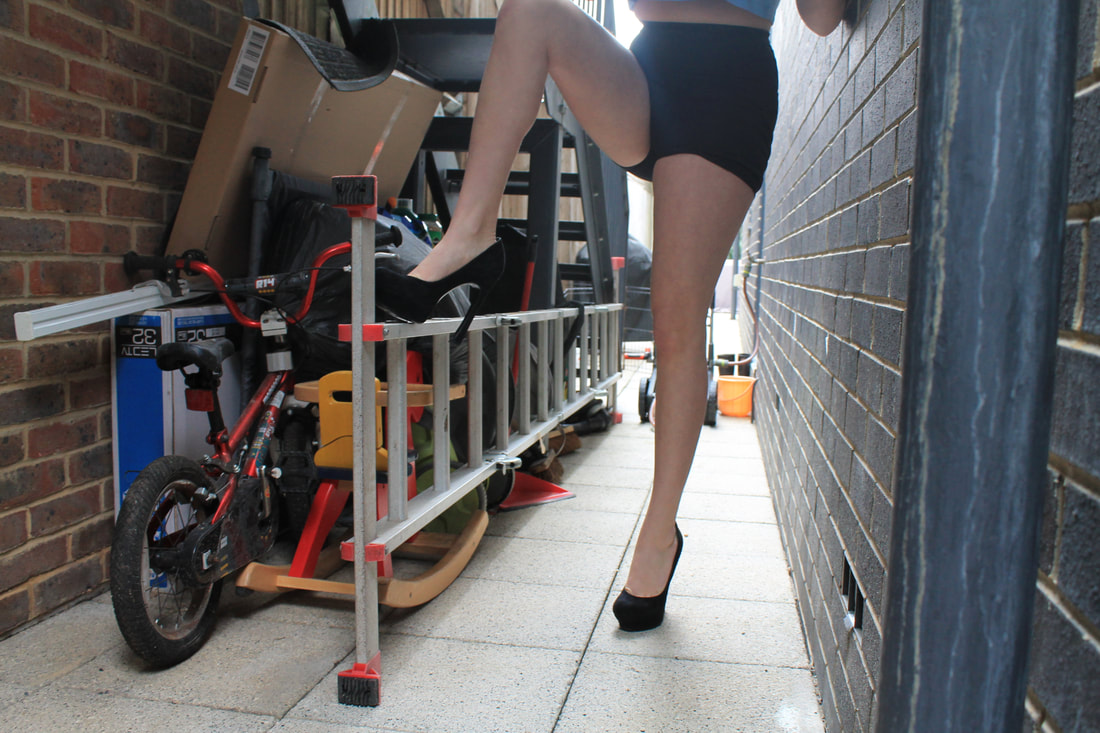
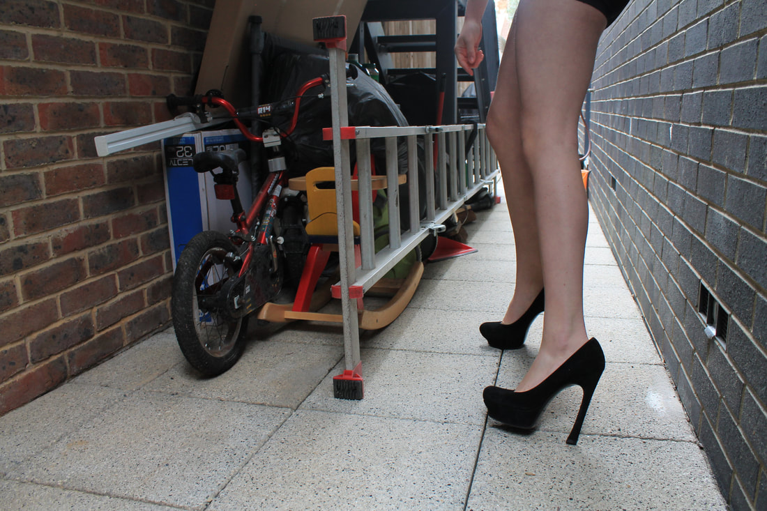
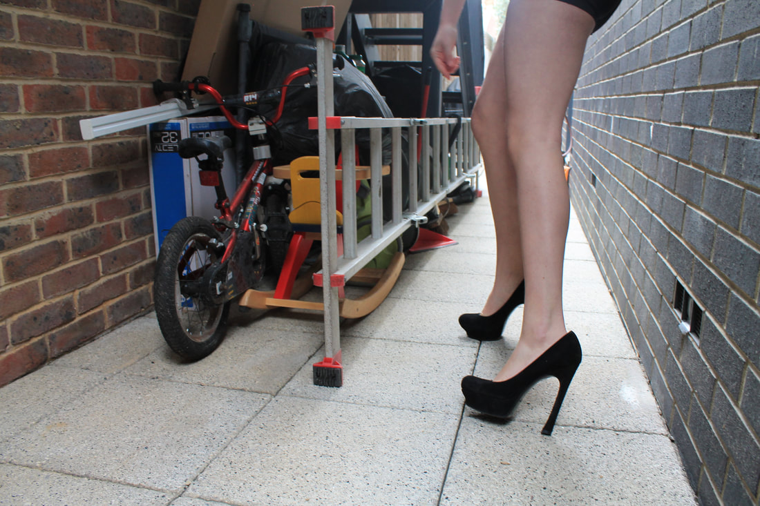
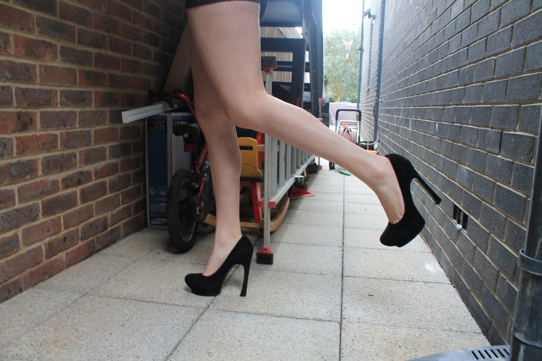
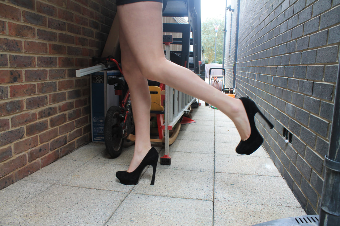
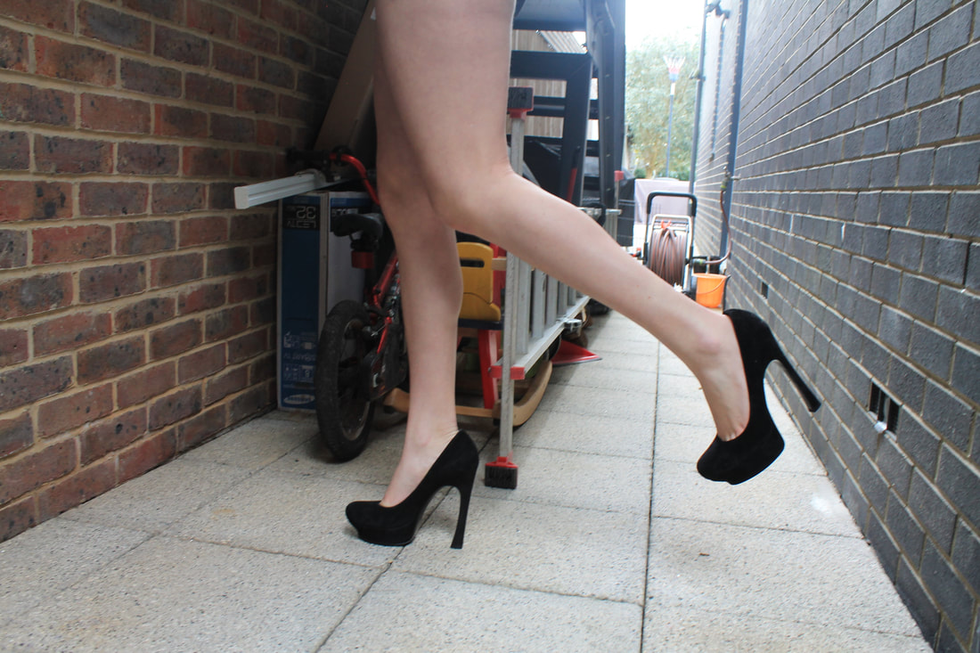
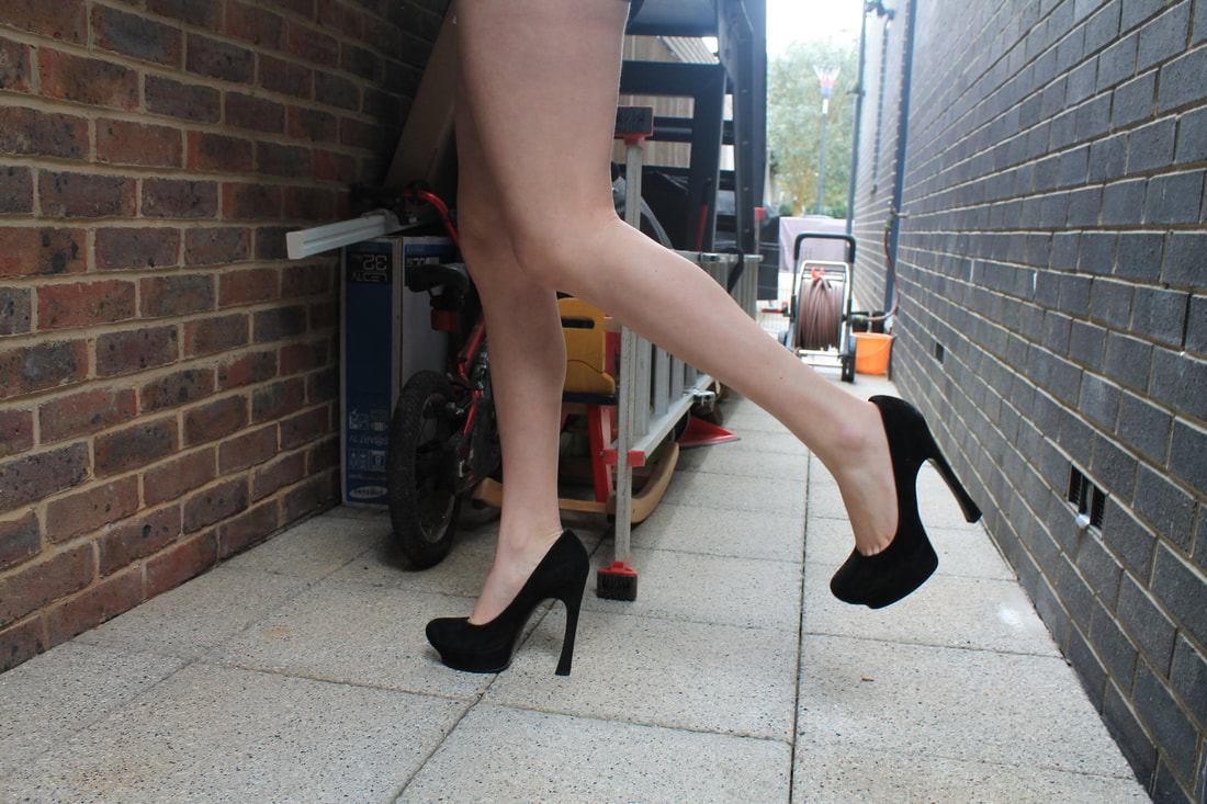
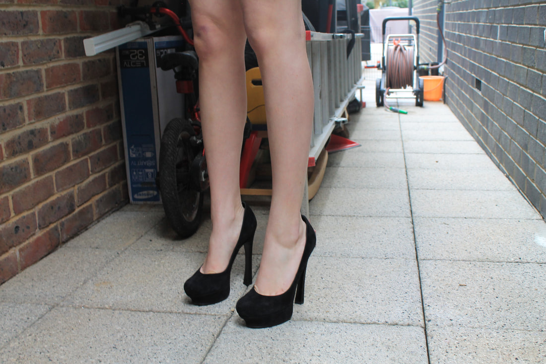
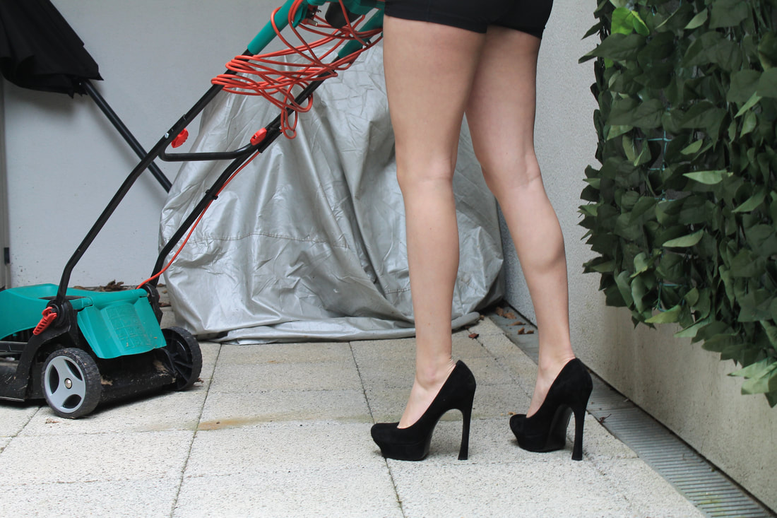
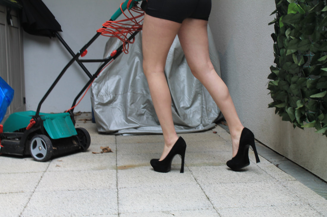
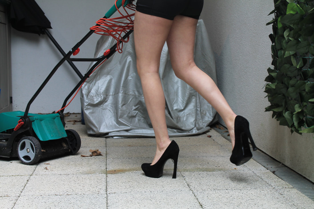
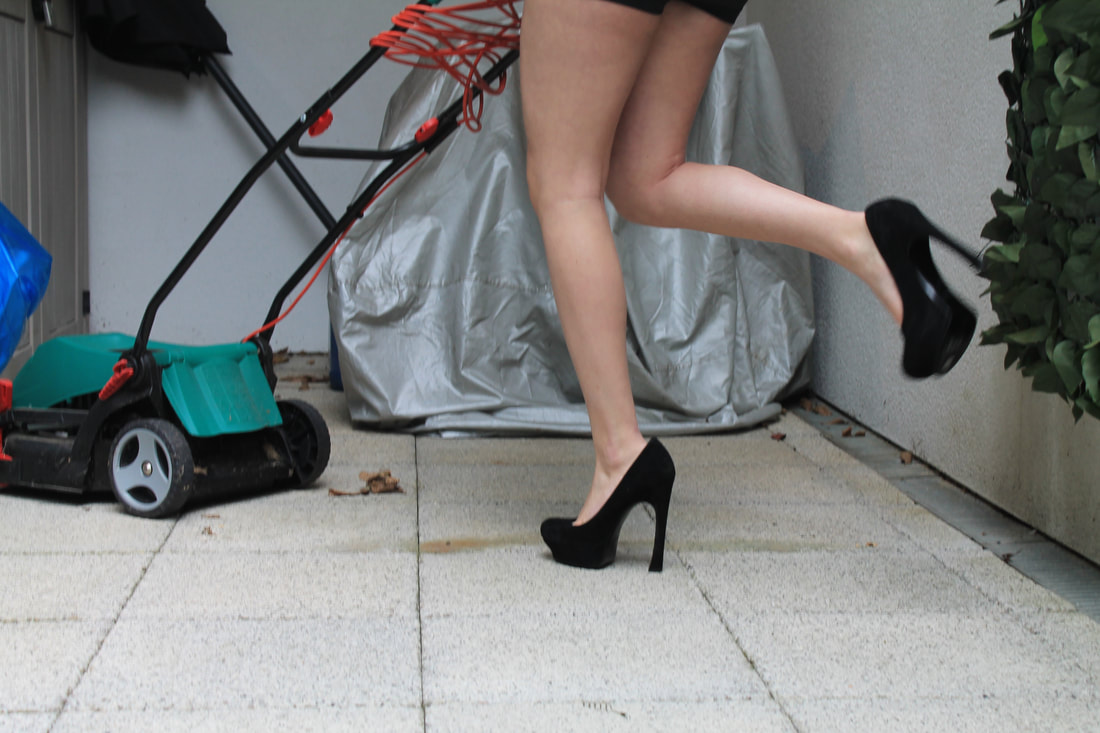
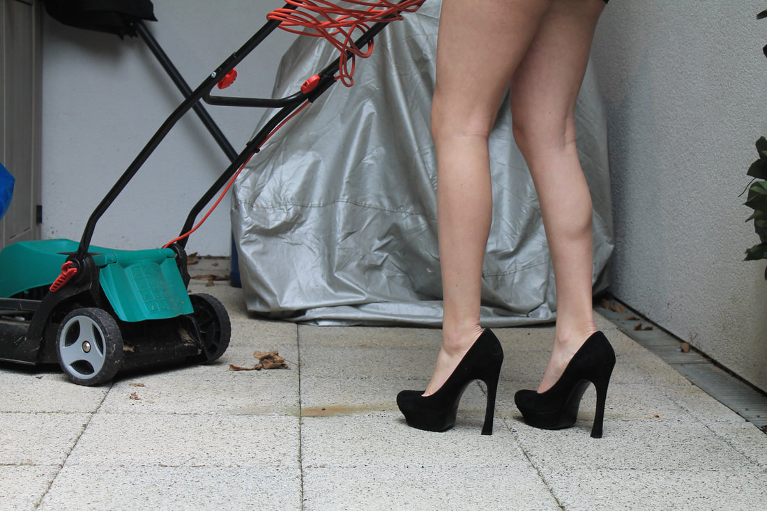
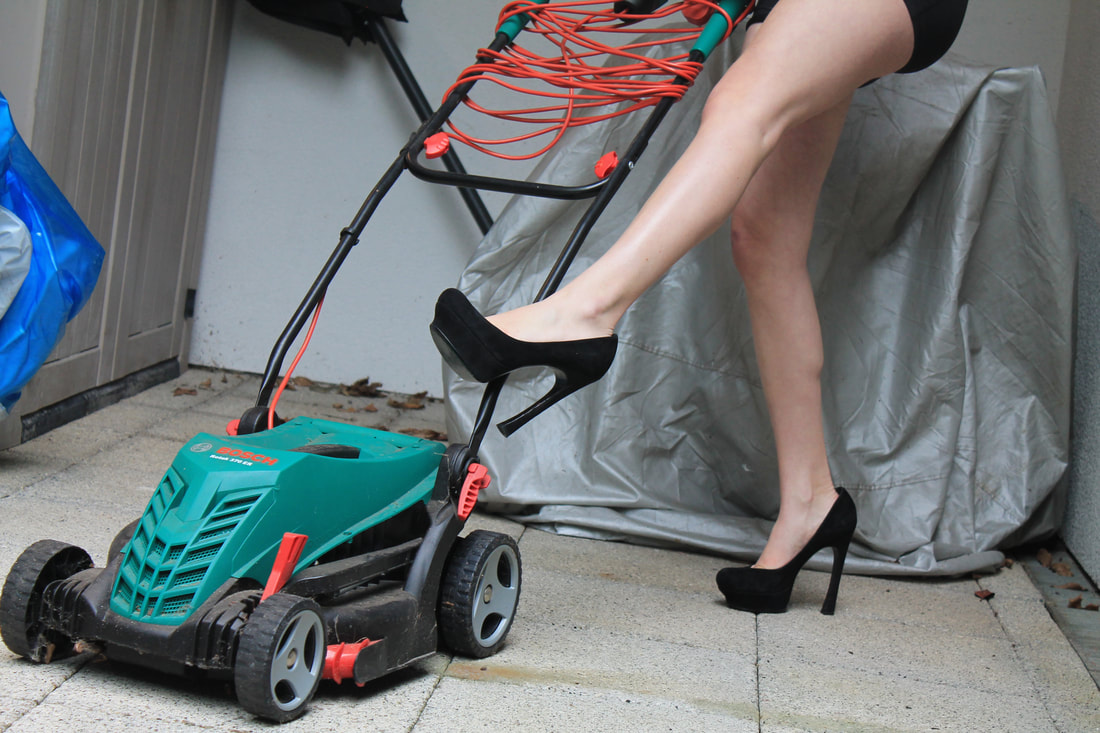
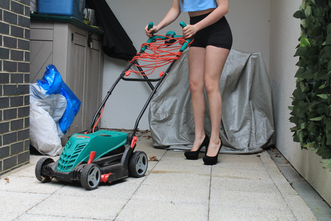
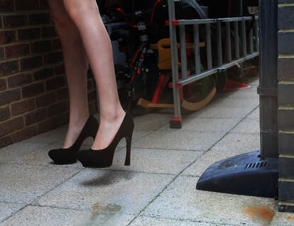
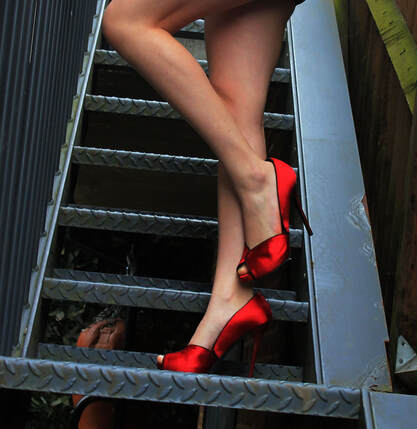
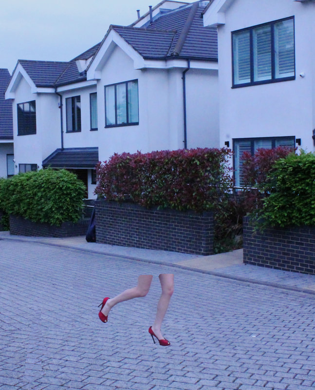
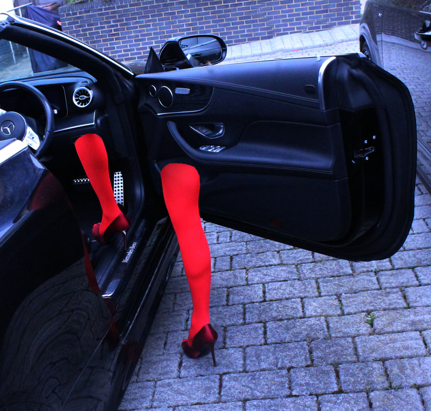
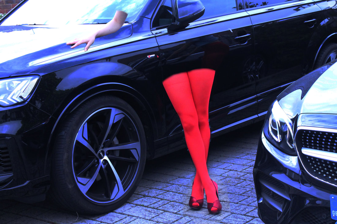
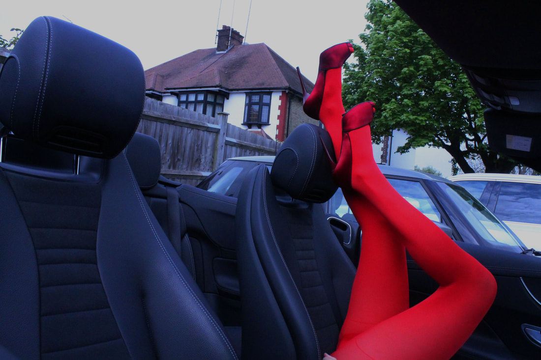
For this development I looked at guy Bourdin's leg images. I took images of my subjects posing in a few different styles of shoes. However I feel that there is alack of colour contrast that is defiantly a big part of Bourdin's work and aesthetic. so to further this development I'm going to take images of my subject in bright coloured tights and will try different backgrounds that look out of place with those styles of shoes.
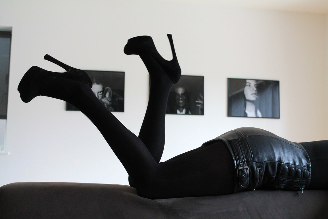
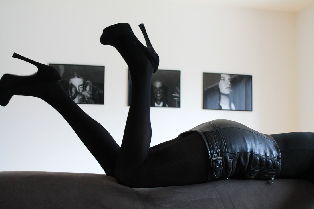
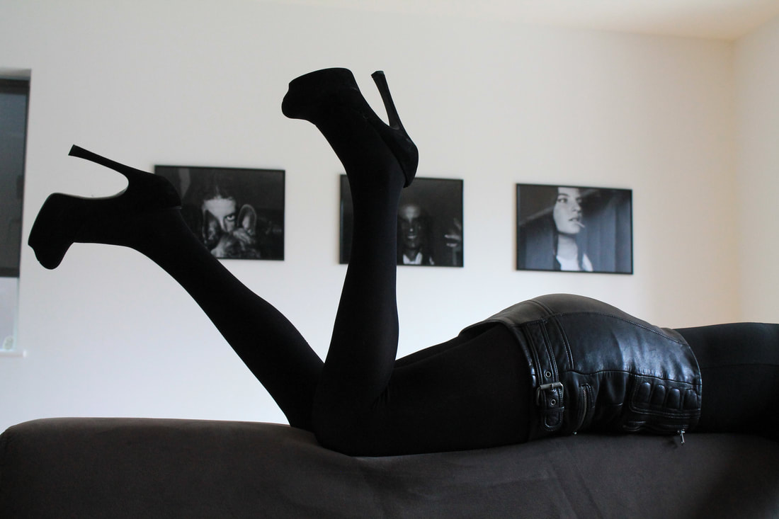
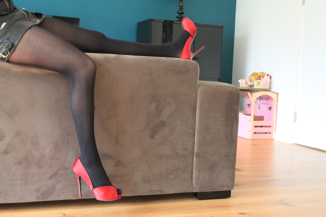
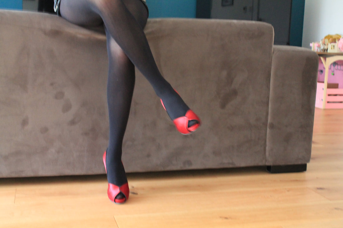
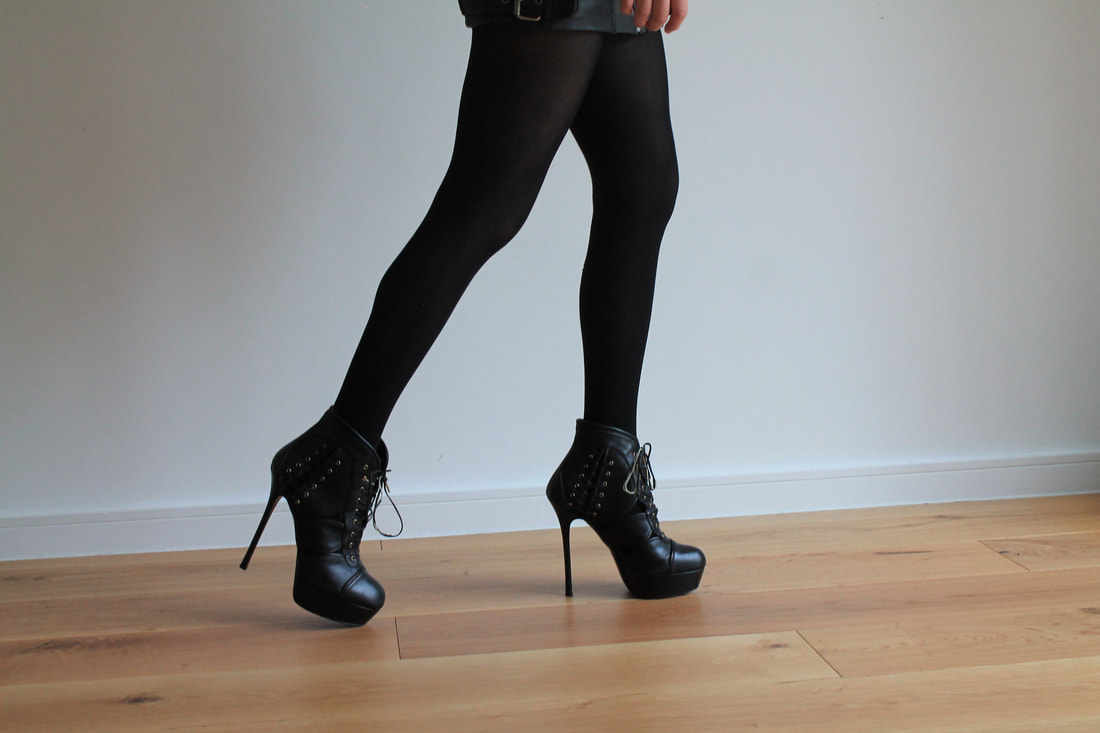
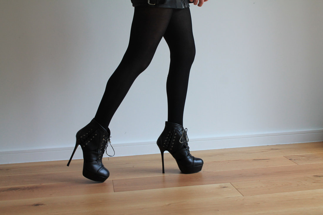
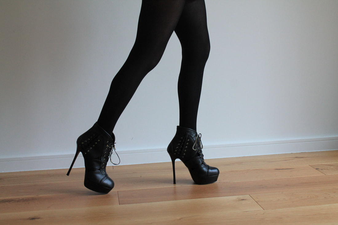
Third development
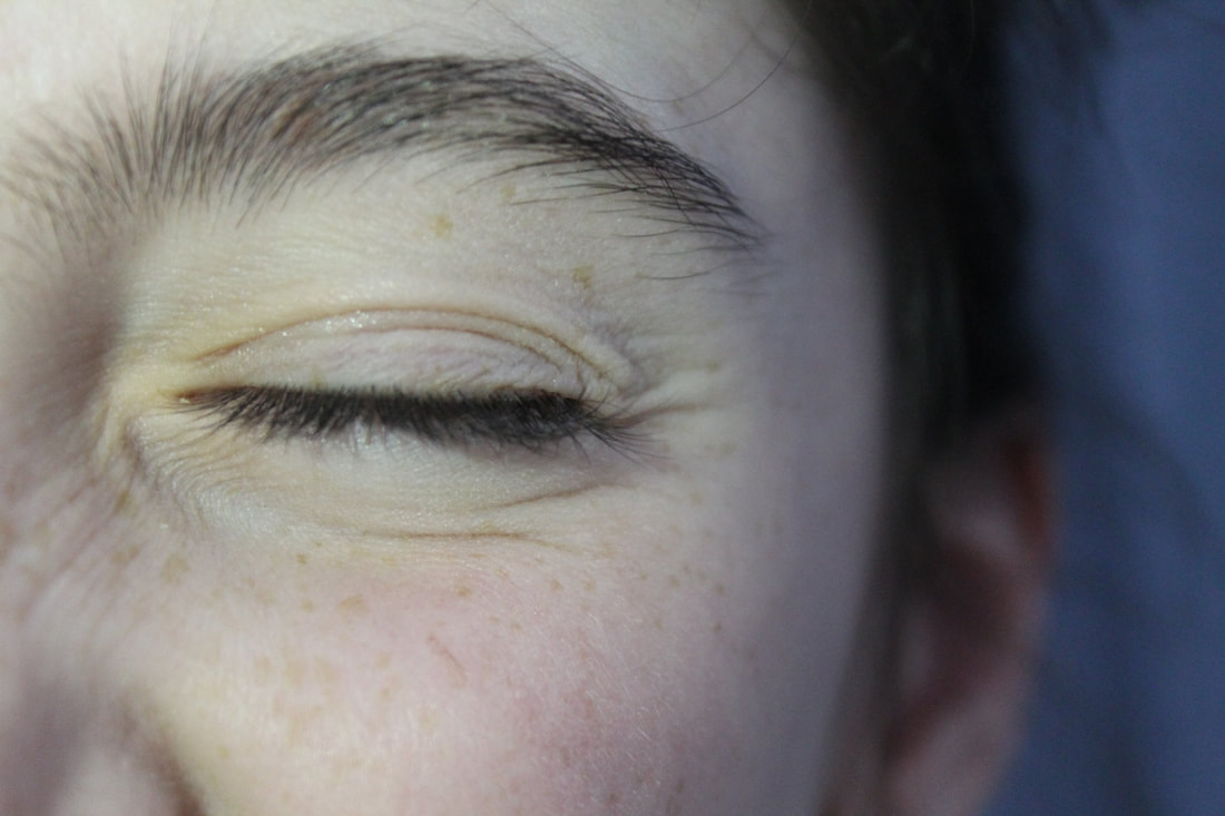
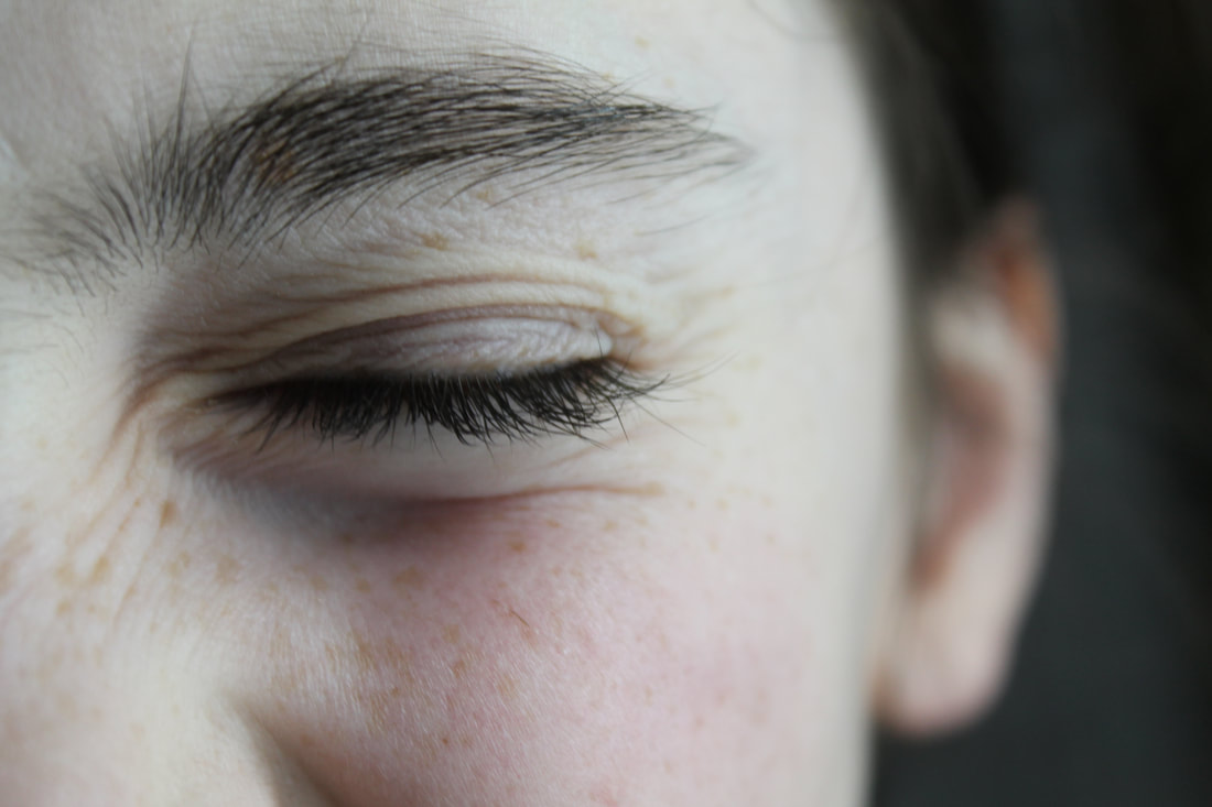
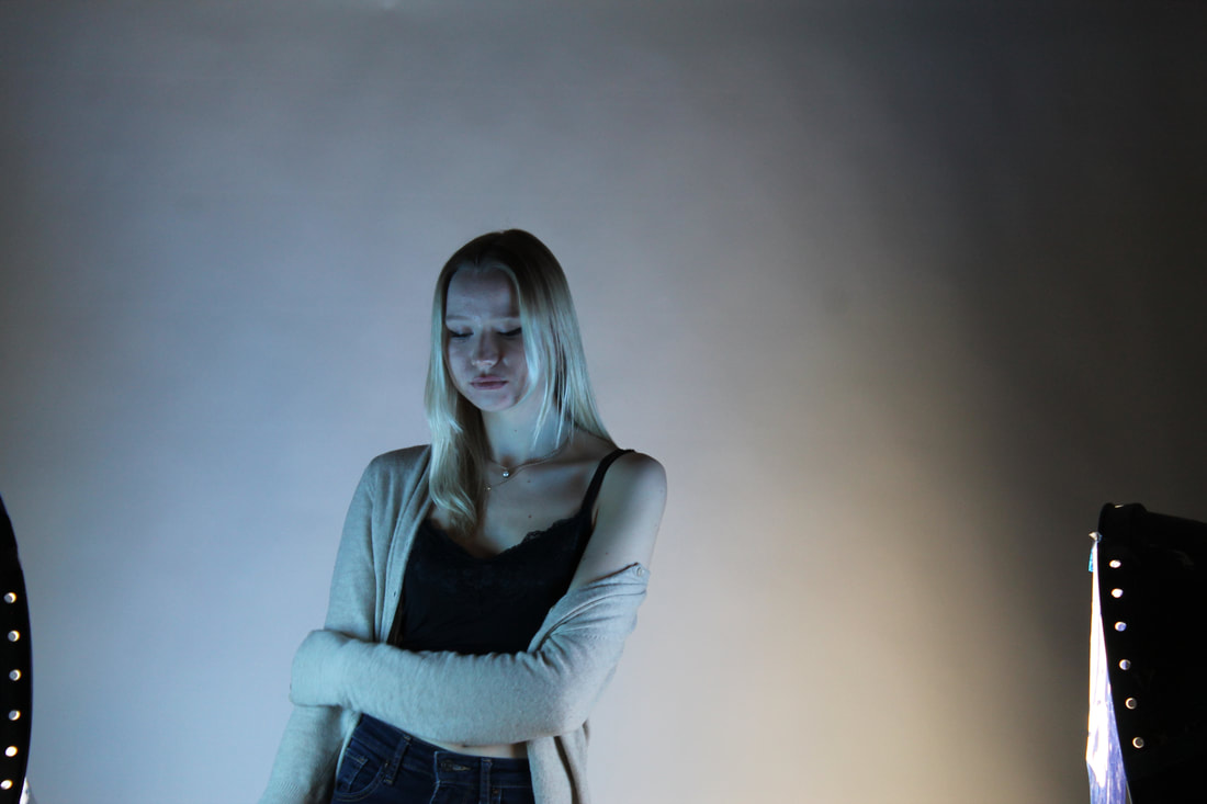
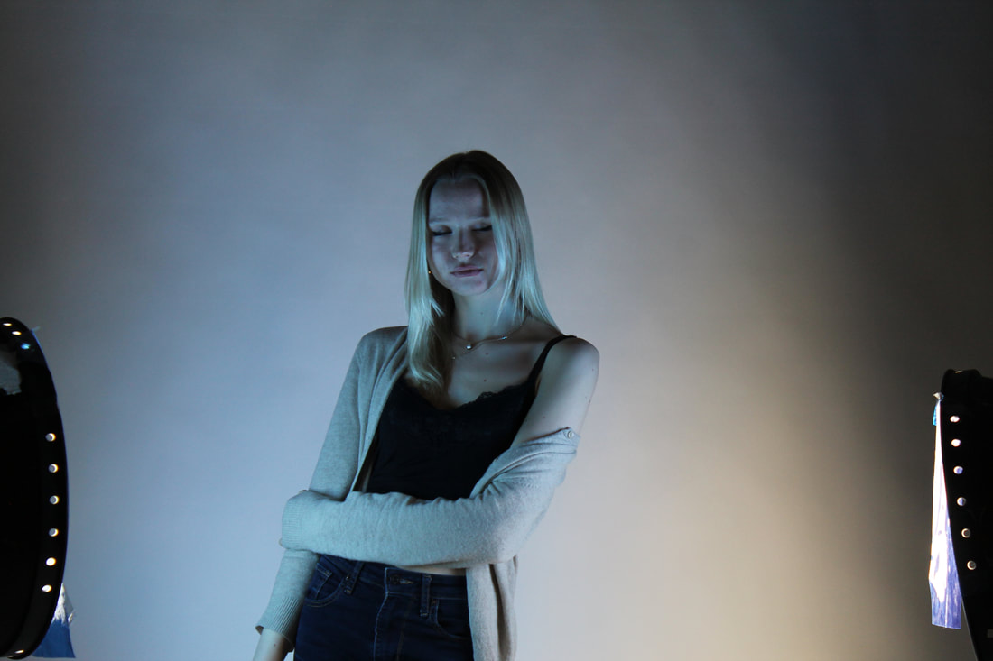
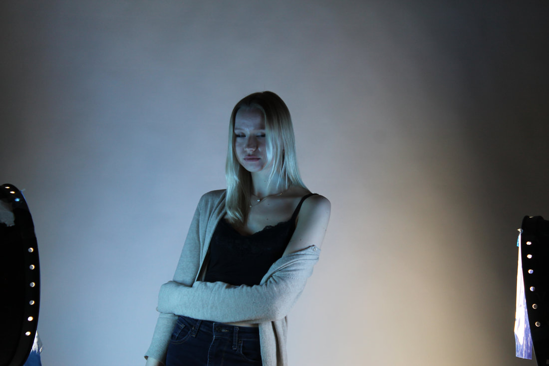
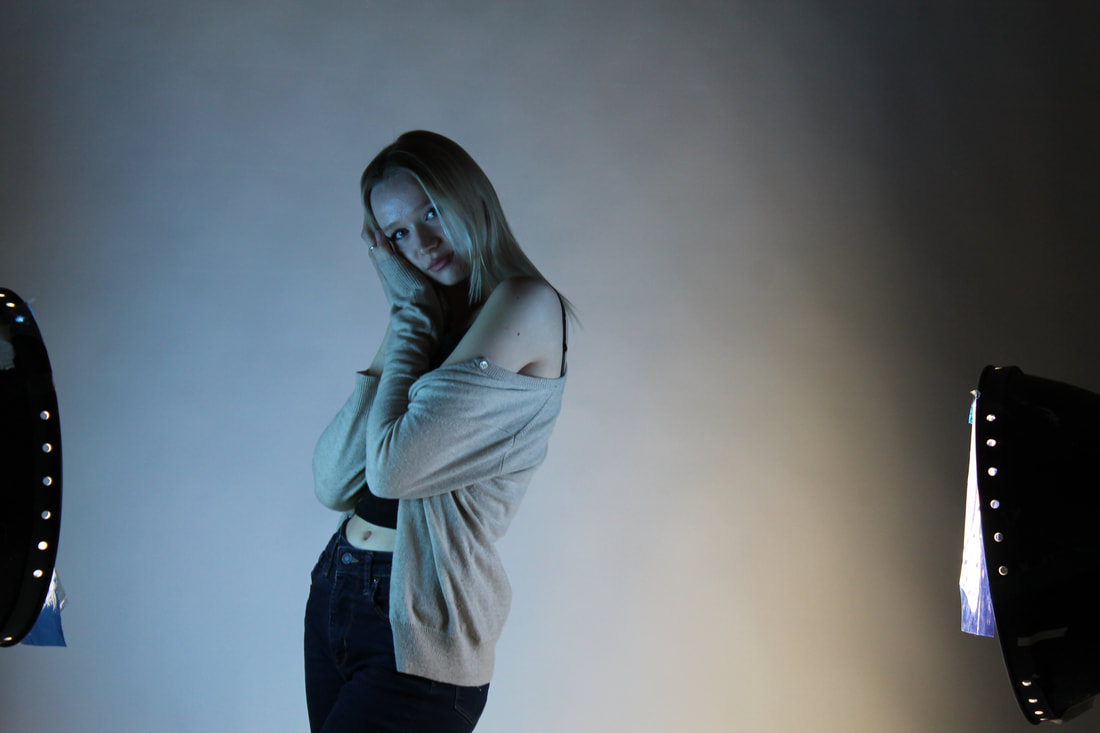
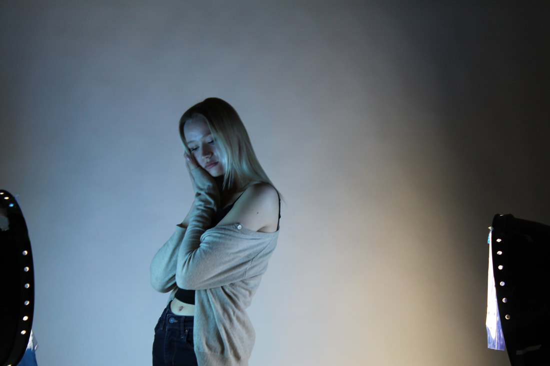
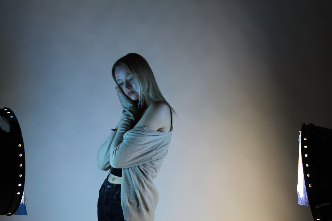
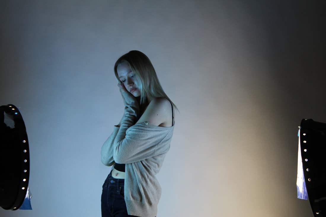
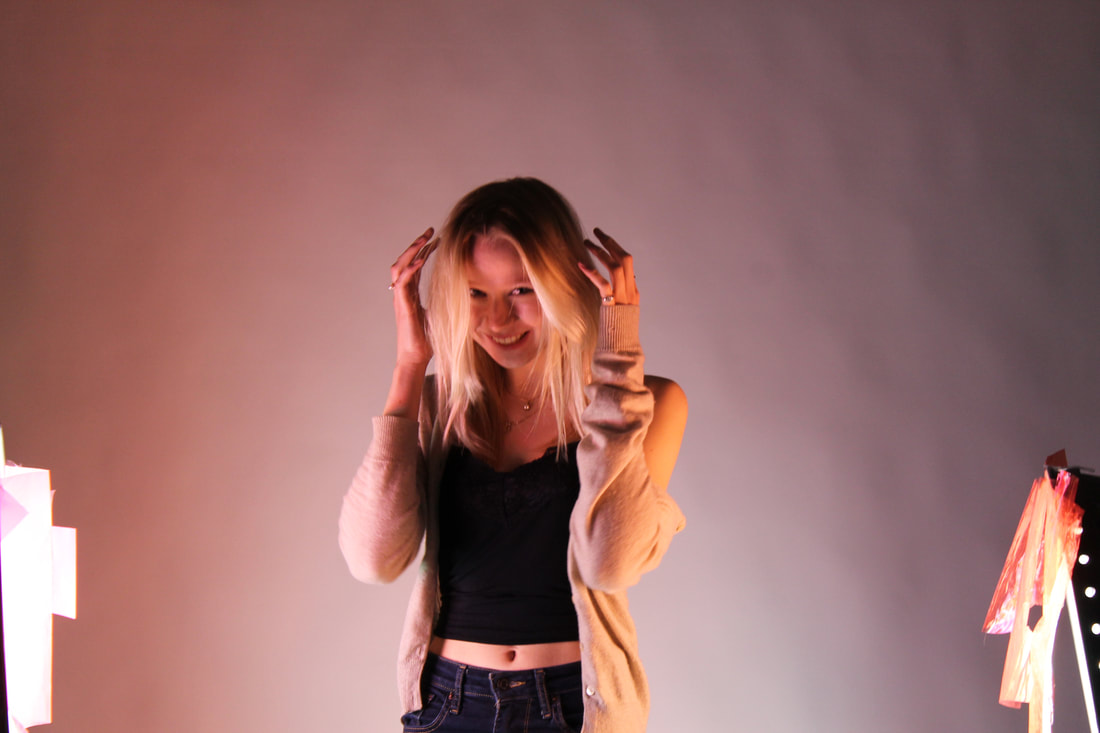
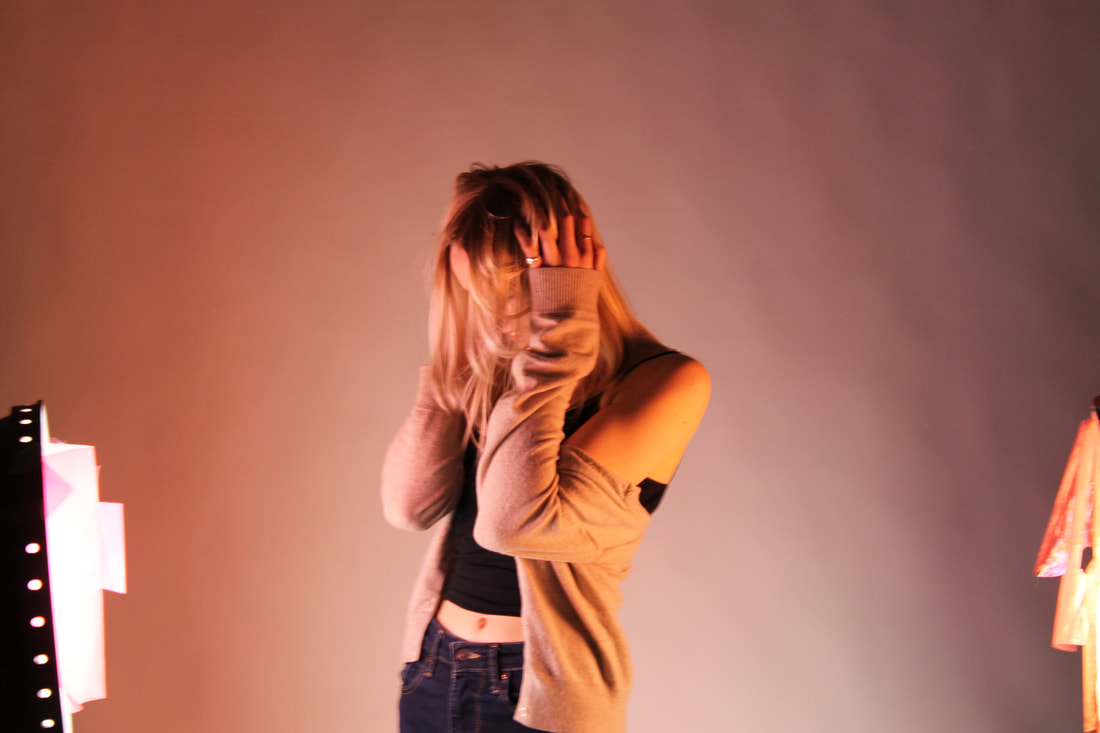
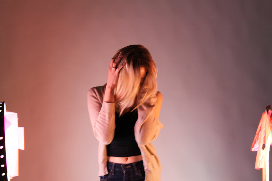
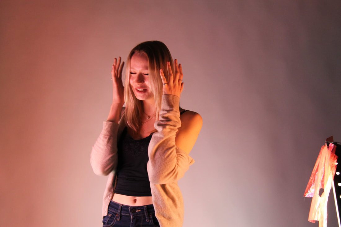
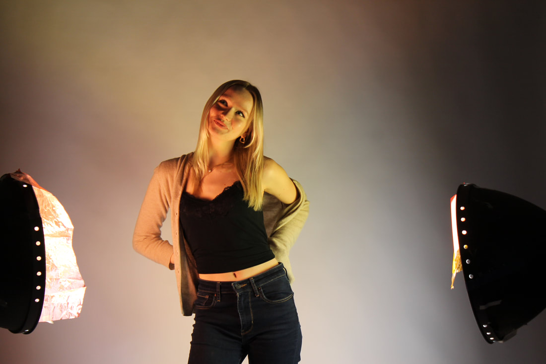
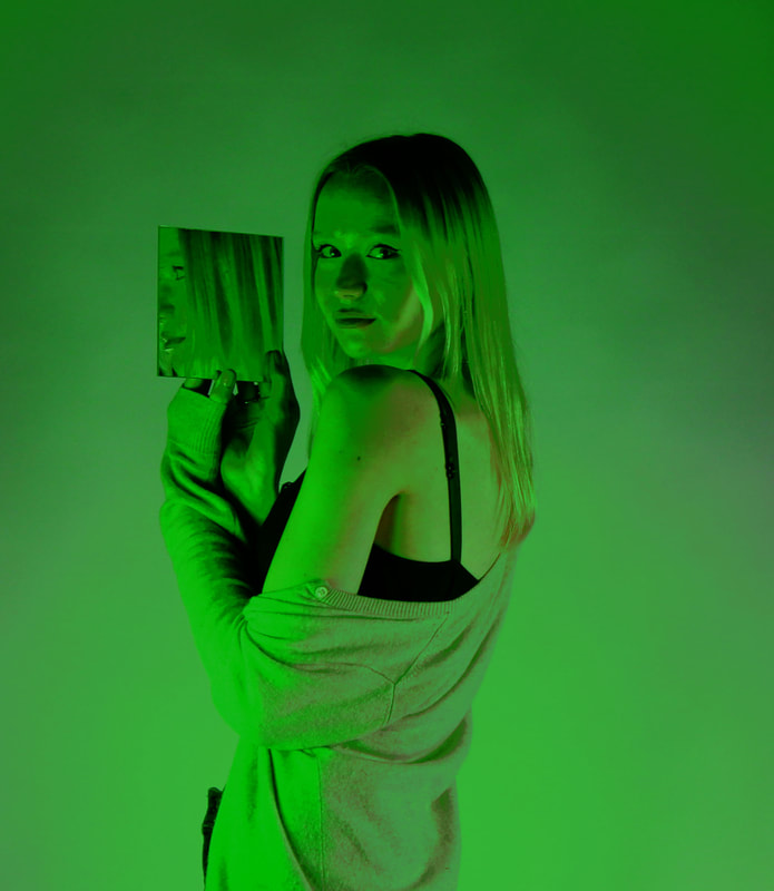
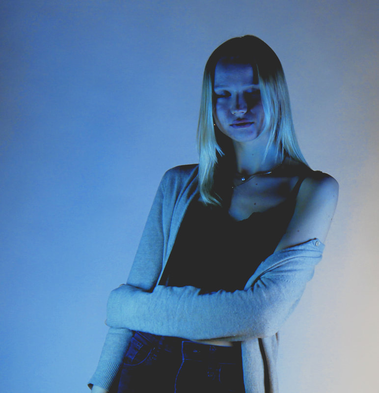
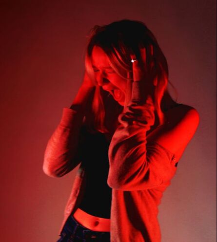
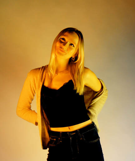
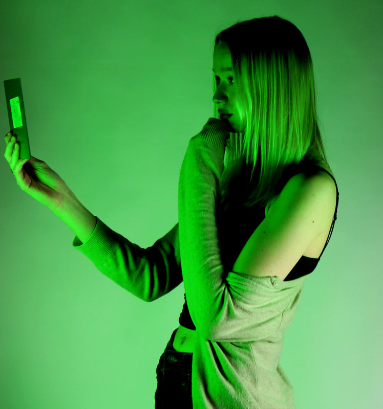
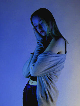
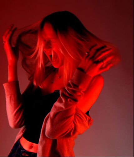
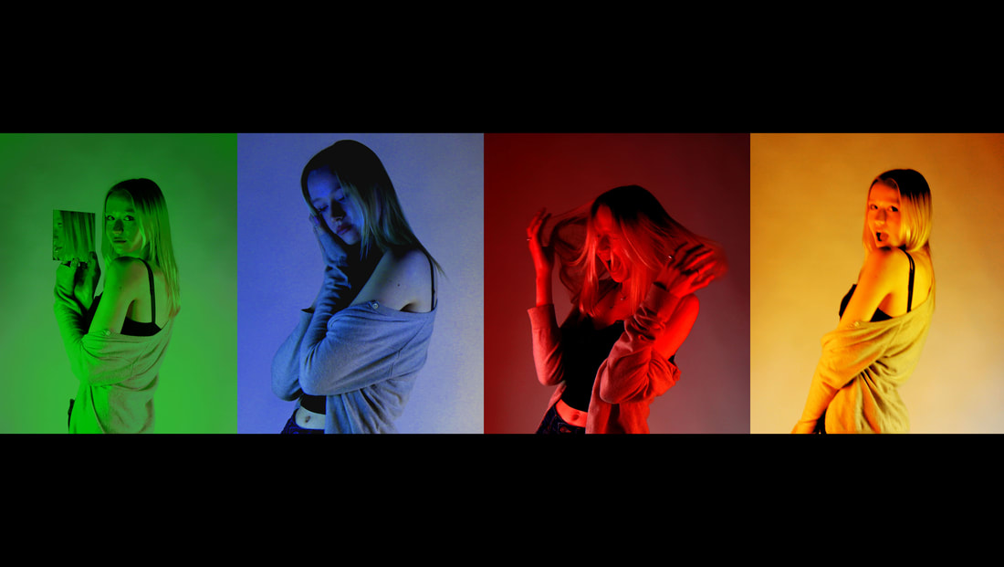
for this development I used Blumenfelds silhouette images. My idea waste capture my model In different lights that displayed a different emotion. To edit each photo I enhanced the colour then to put them together by putting them on a black background next to each other.
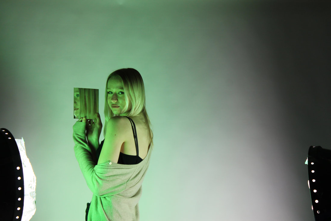
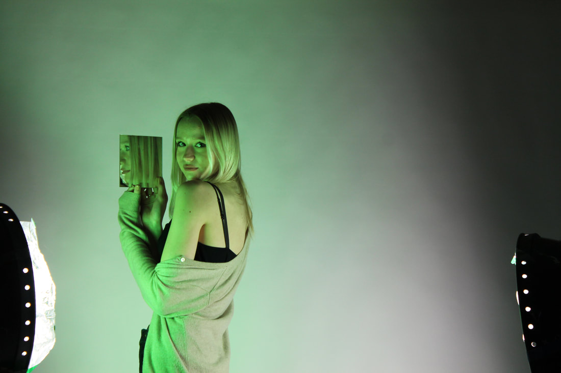
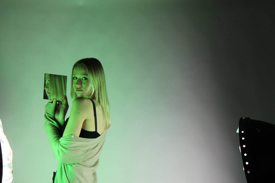
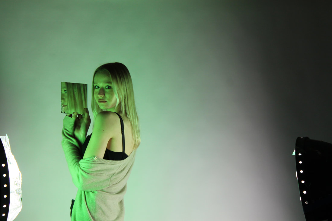
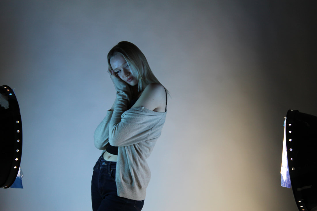
|
|
final piece
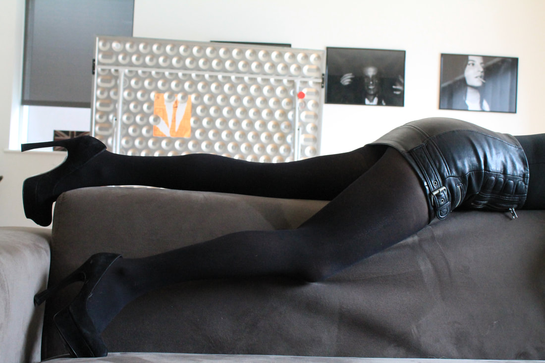
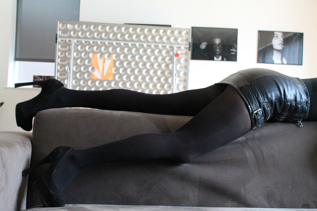
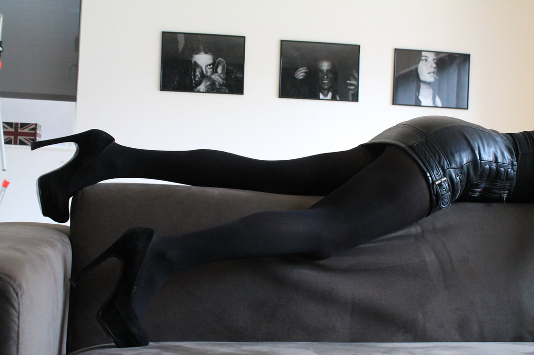
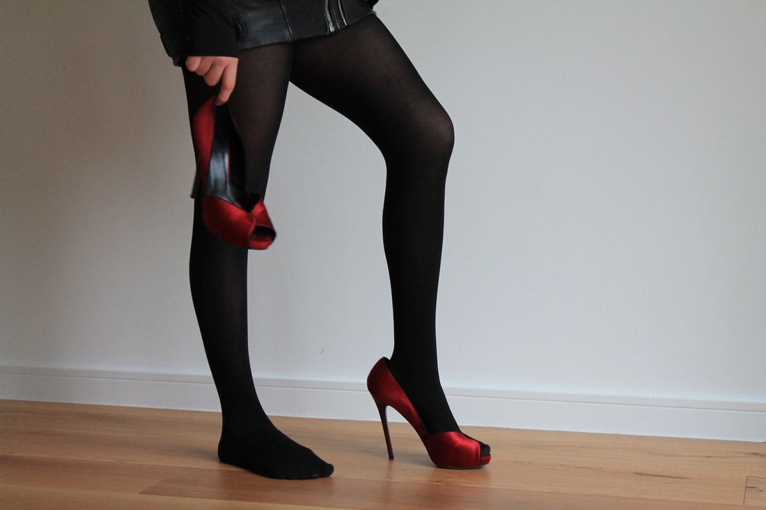
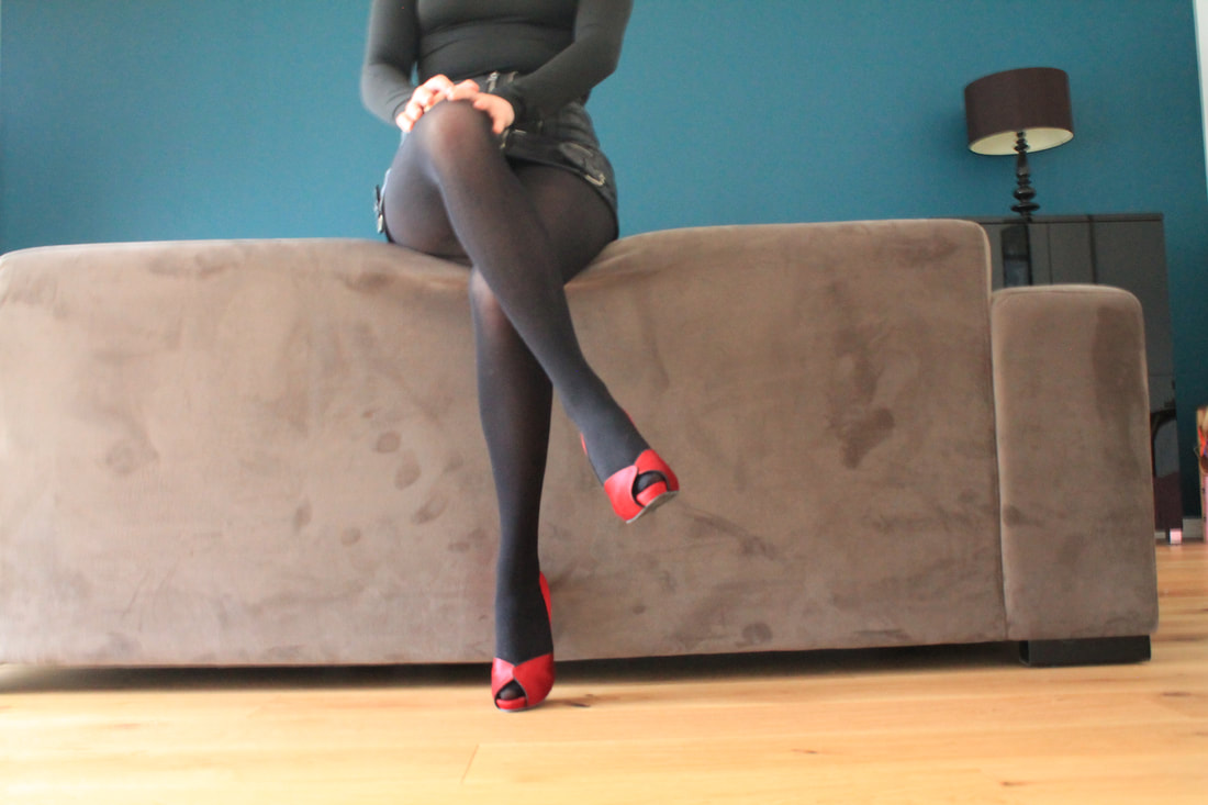
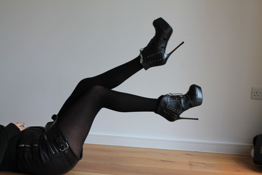
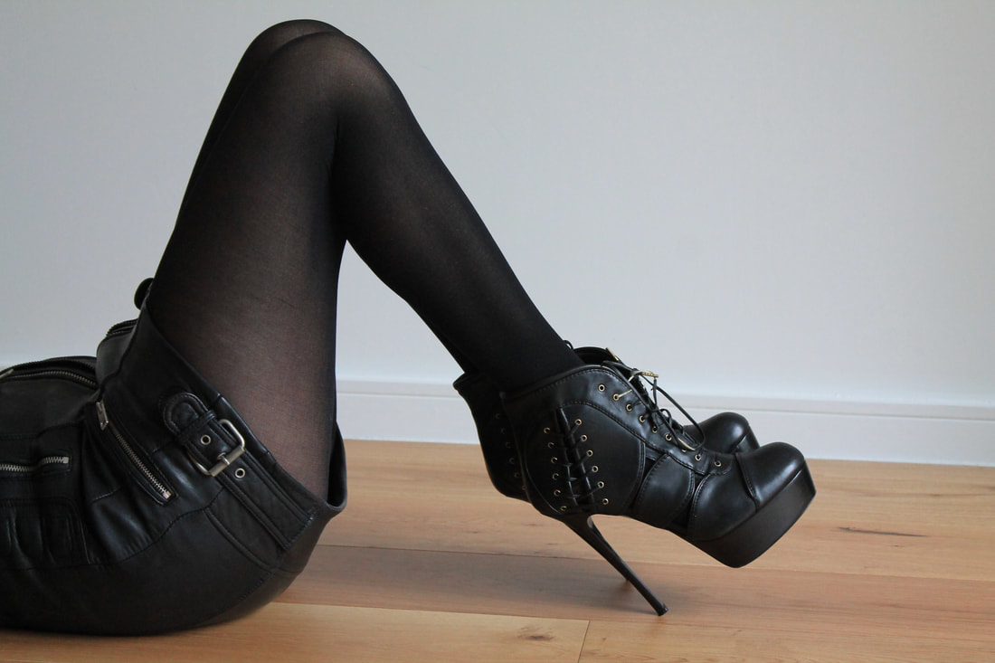
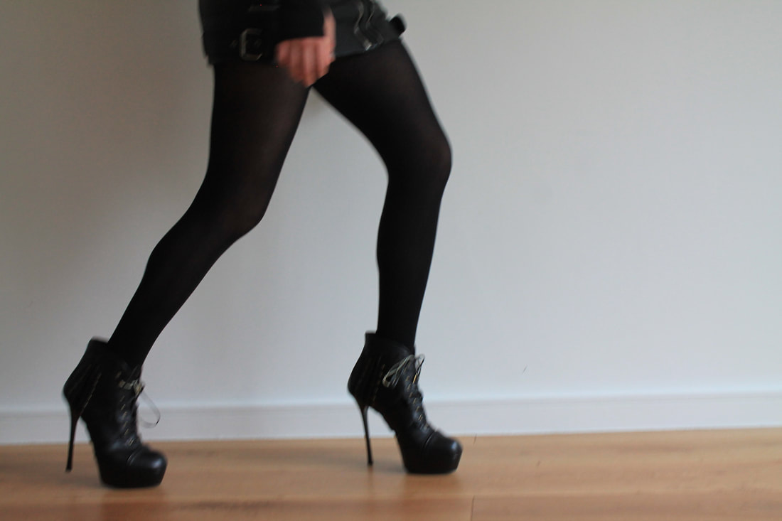
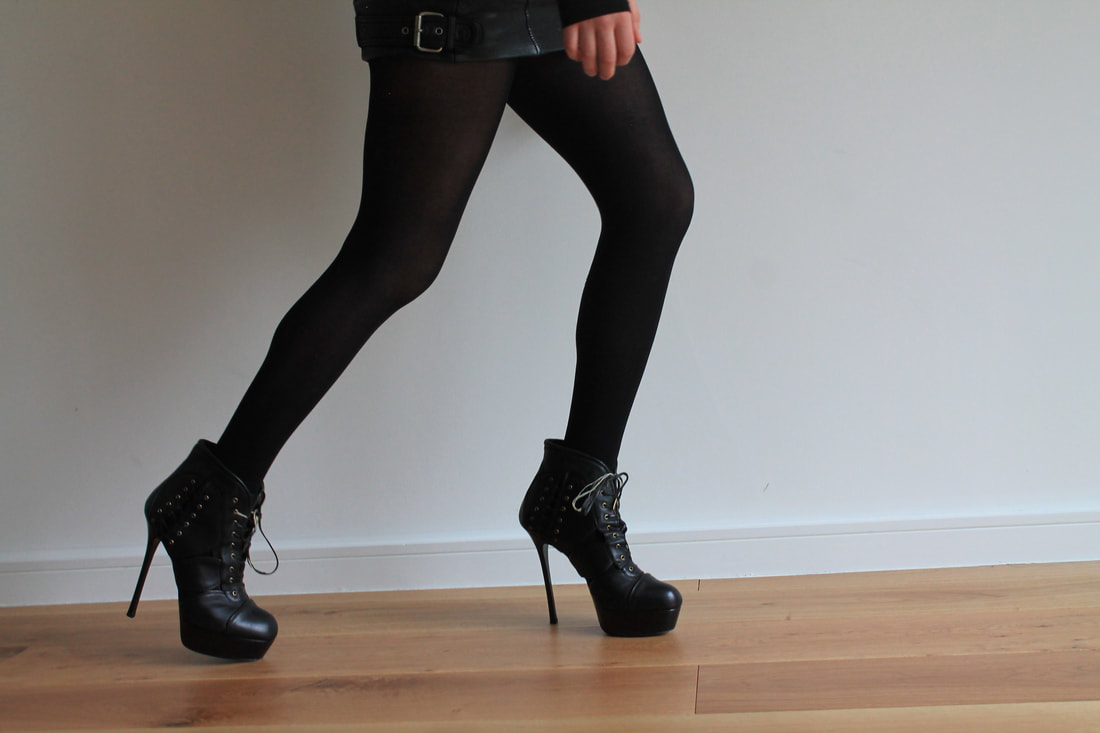
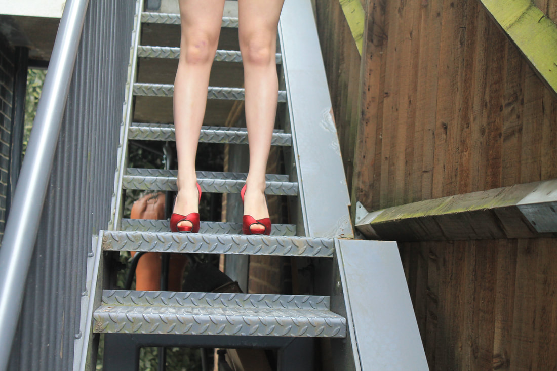
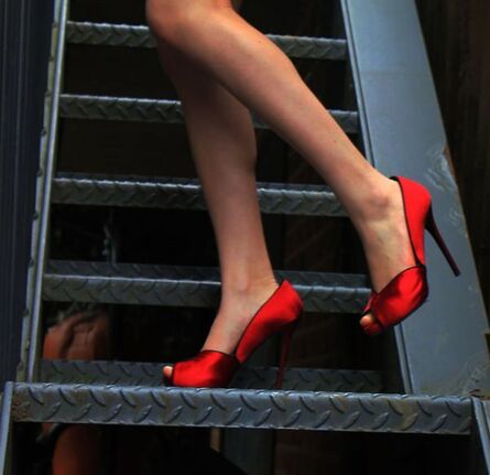
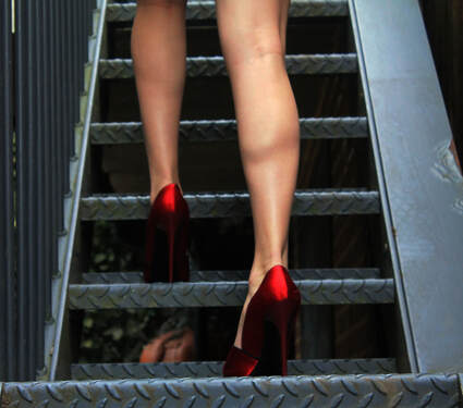
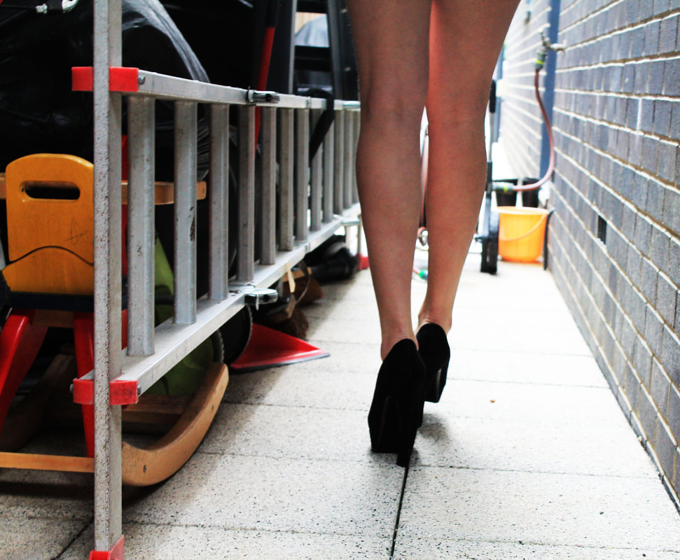
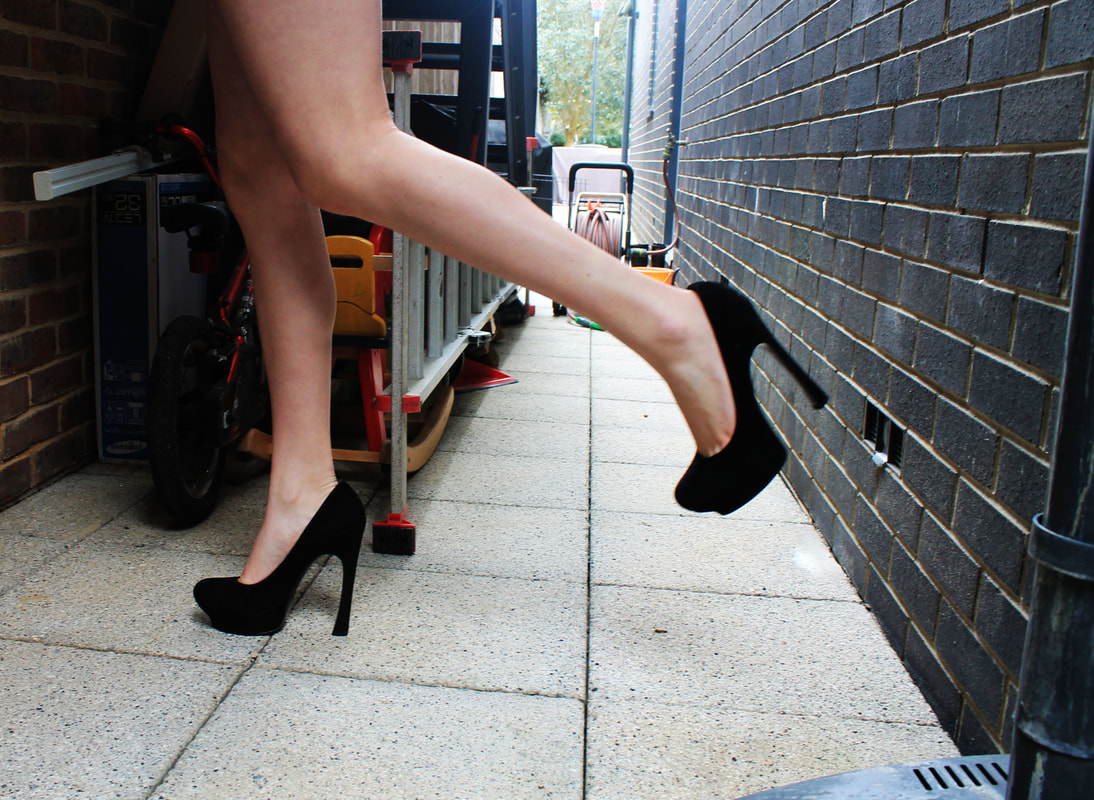
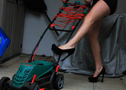
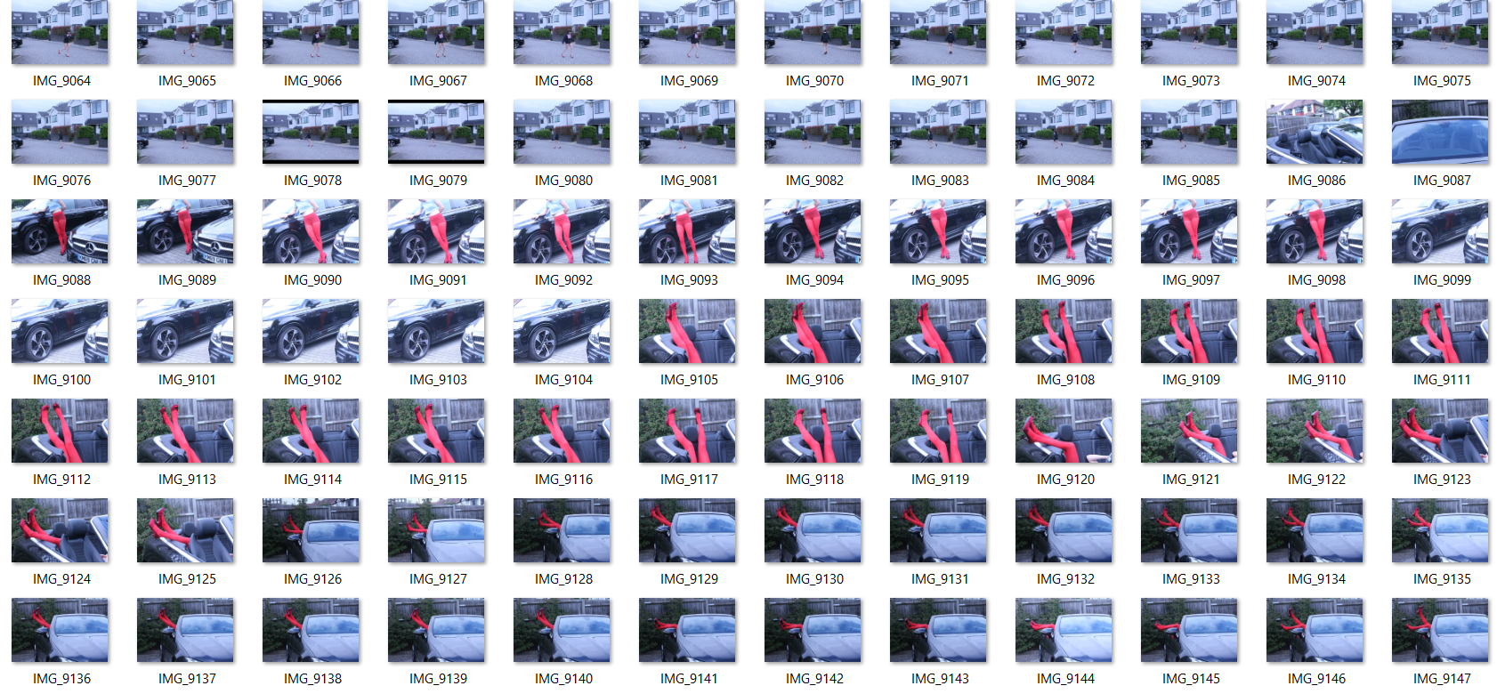
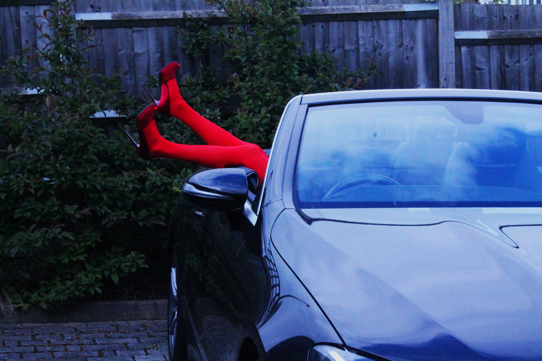
For my Final piece I chose to do another development Guy Bourdin's leg images. However this time to develop it further I used the idea of juxtaposition by getting my model to pose in the beautiful high heels in dirty and destroyed areas . This worked better than the first time I took these images as there was such a strong contrast and they worked better in colour. To edit these photos I just took down the brightness and put the contrast up to 100% which brought out all the colours and the rust and imperfections in the surroundings.
Edits
|
|
Final piece
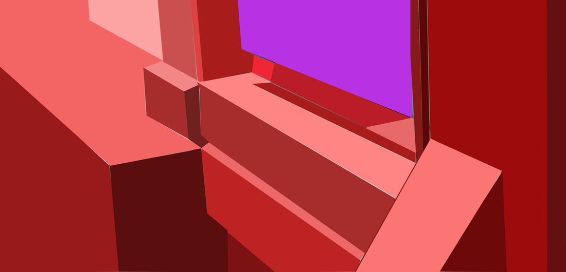
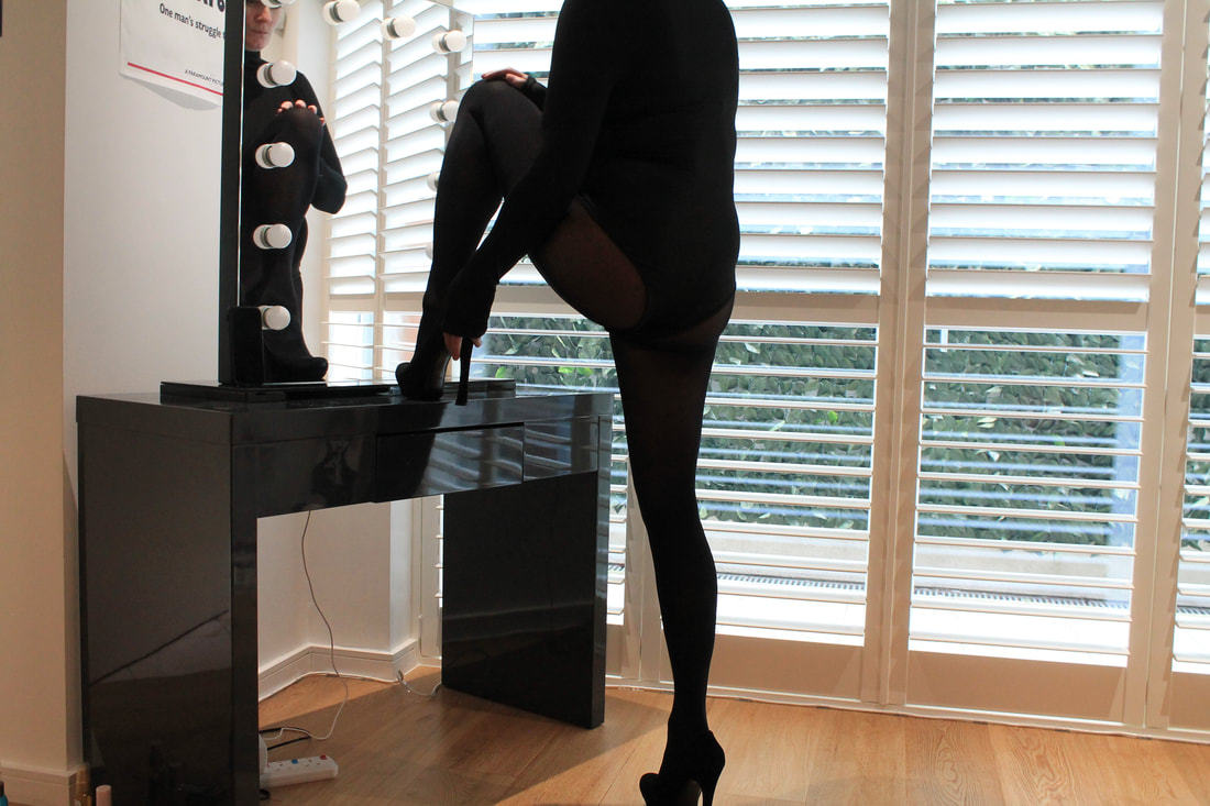
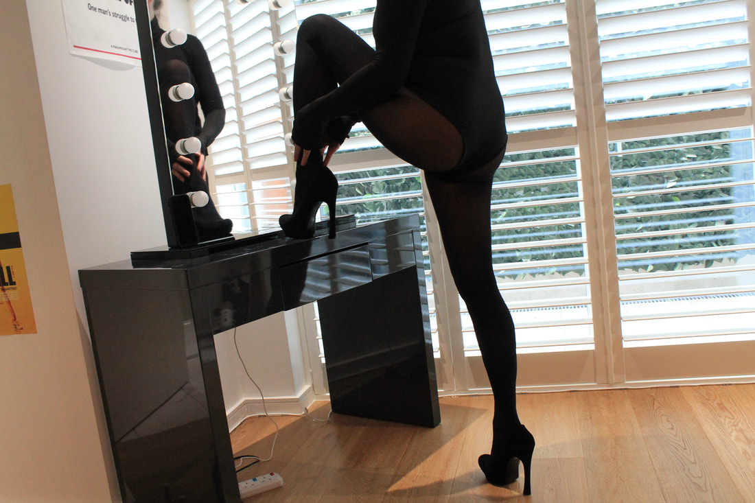
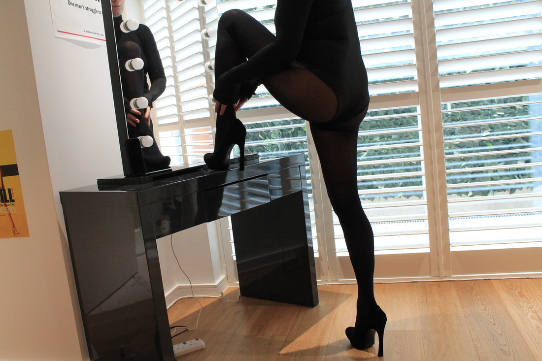
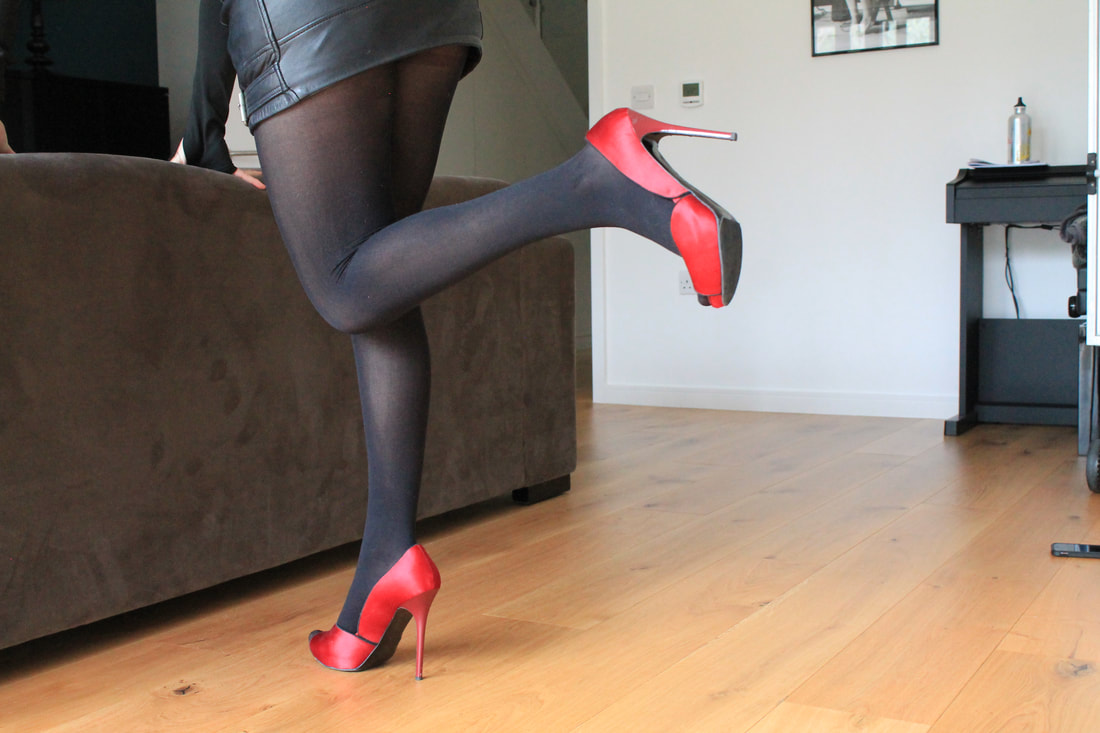
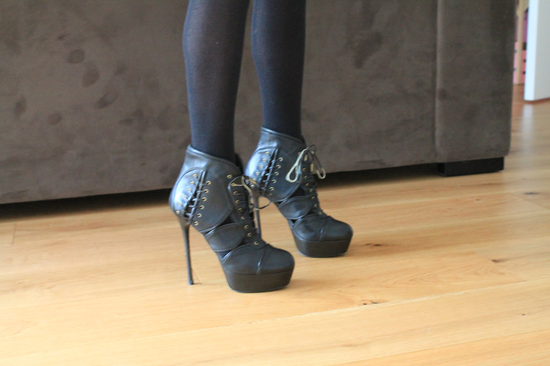
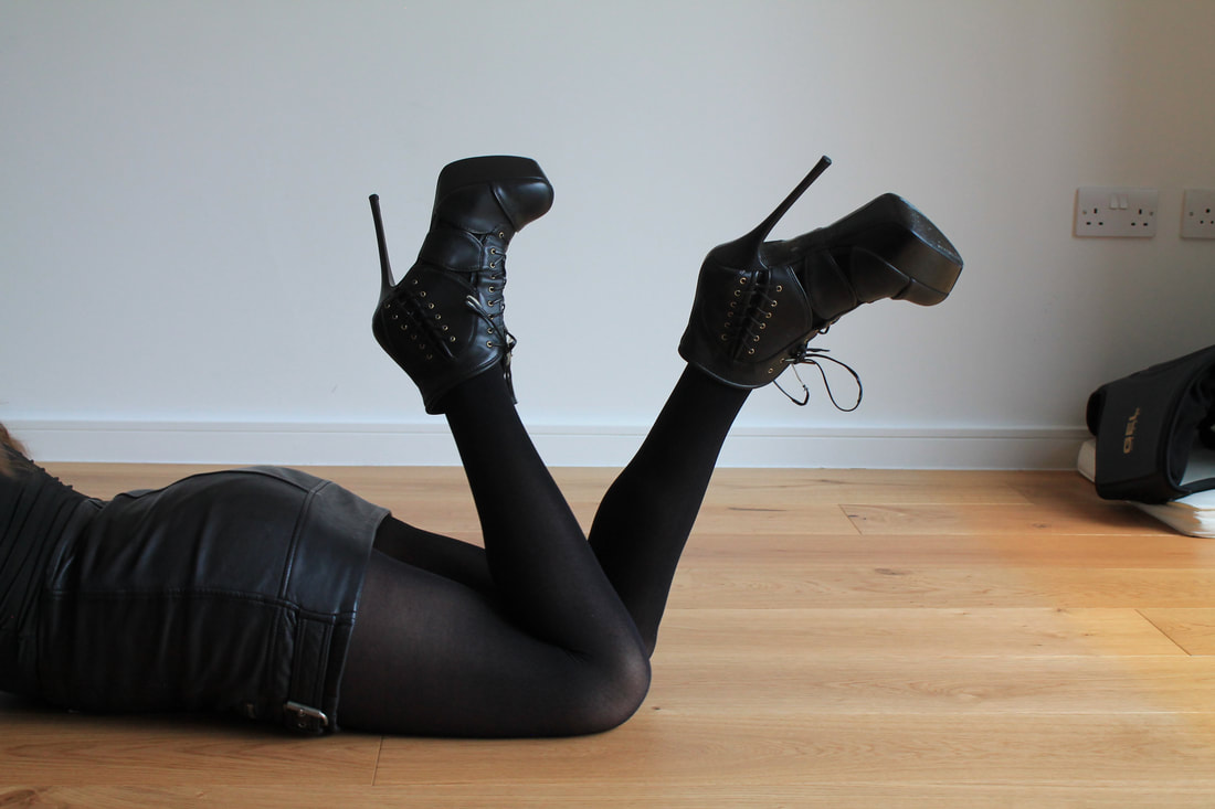
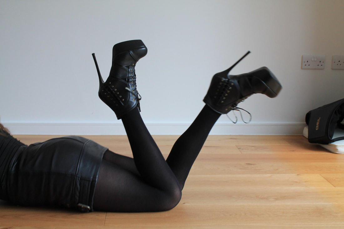
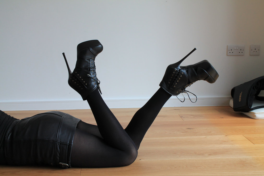
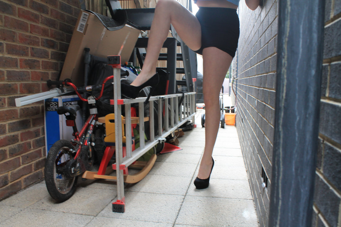
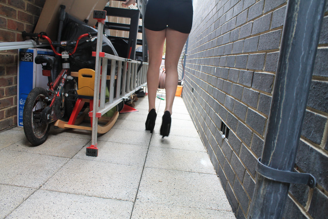
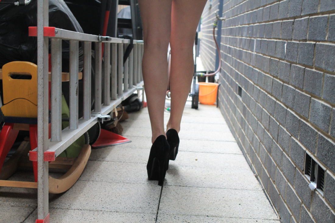
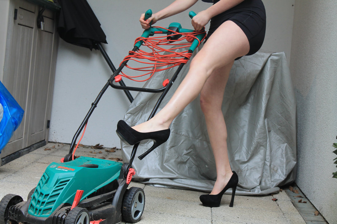
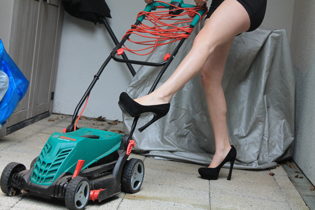
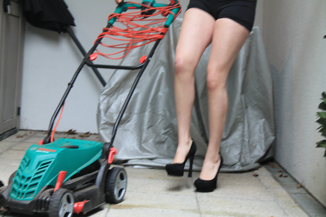
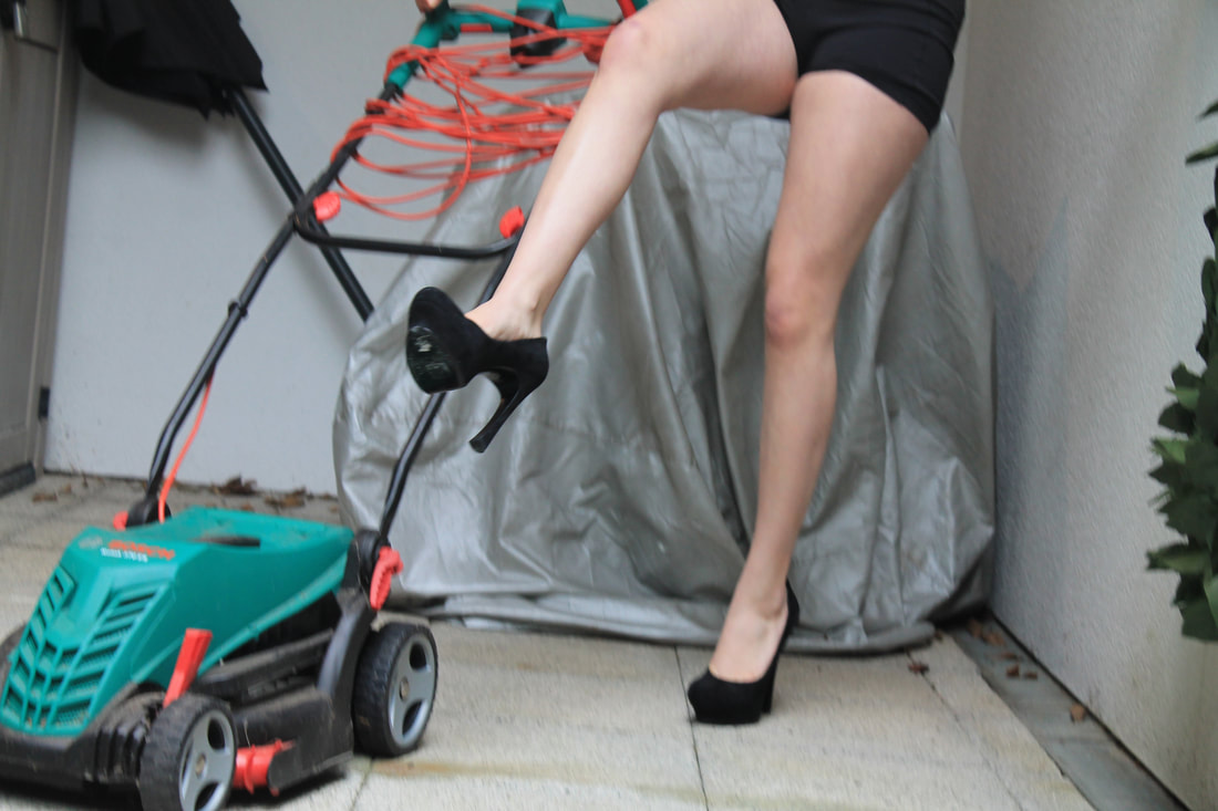
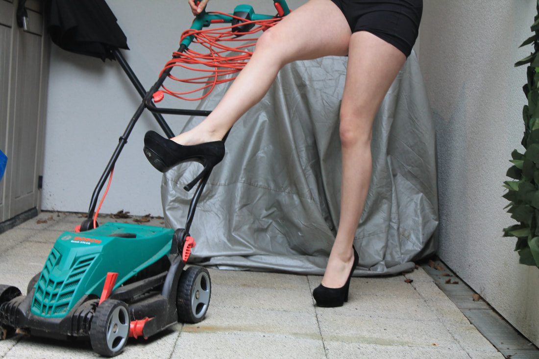
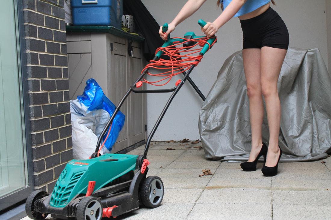
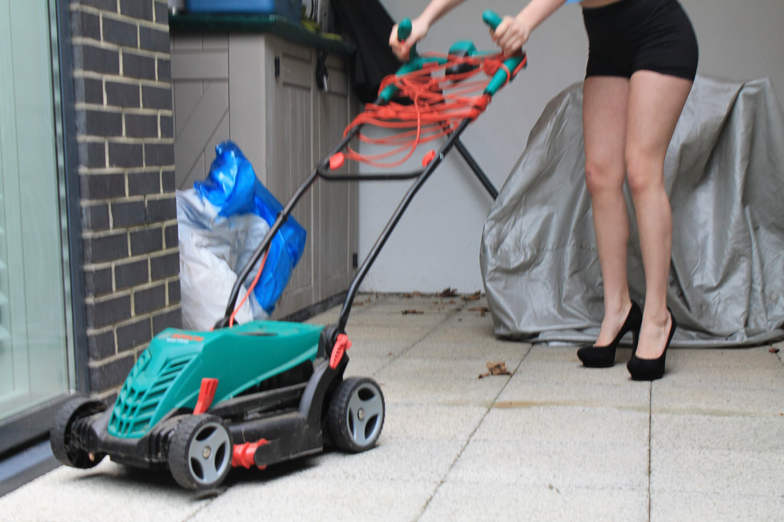
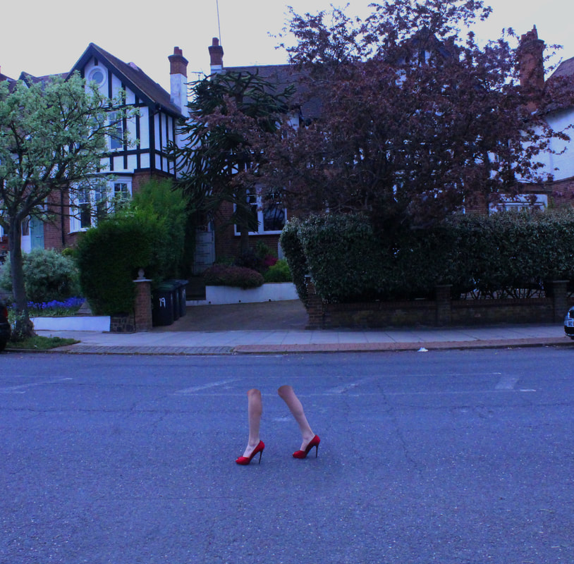
second attempt
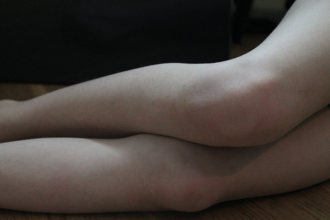
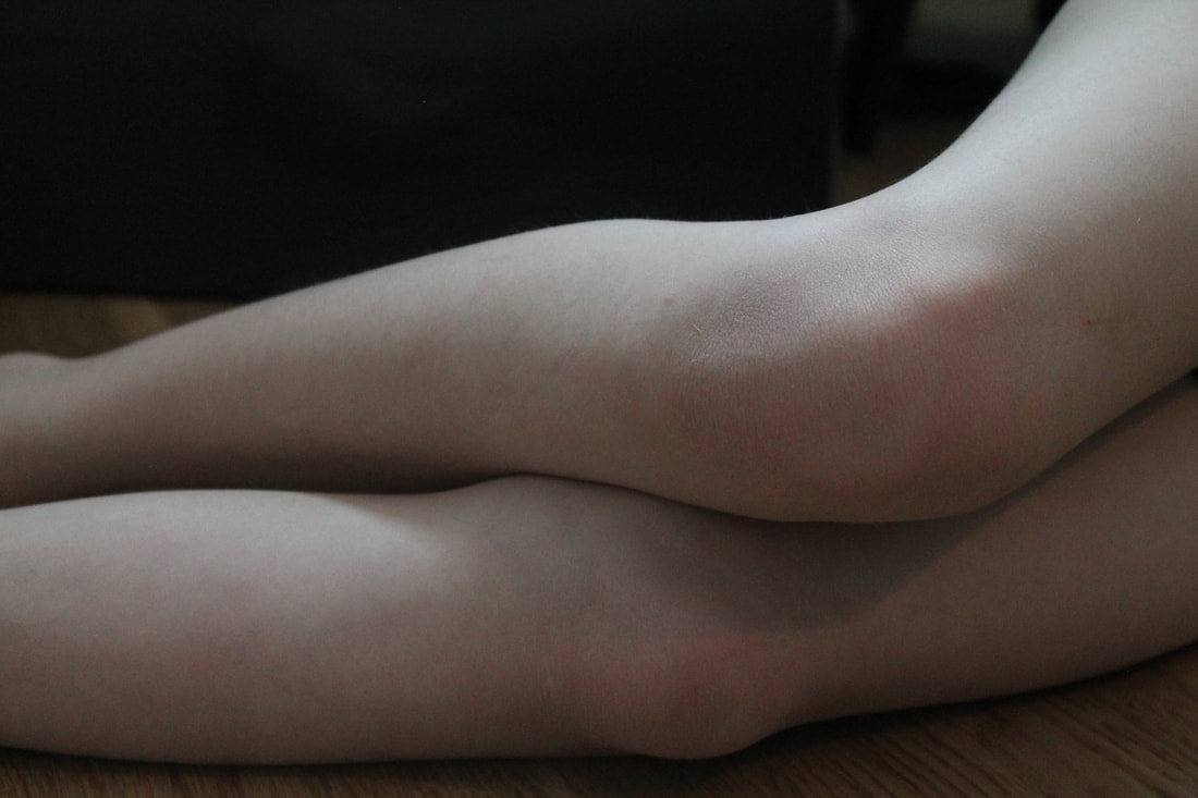
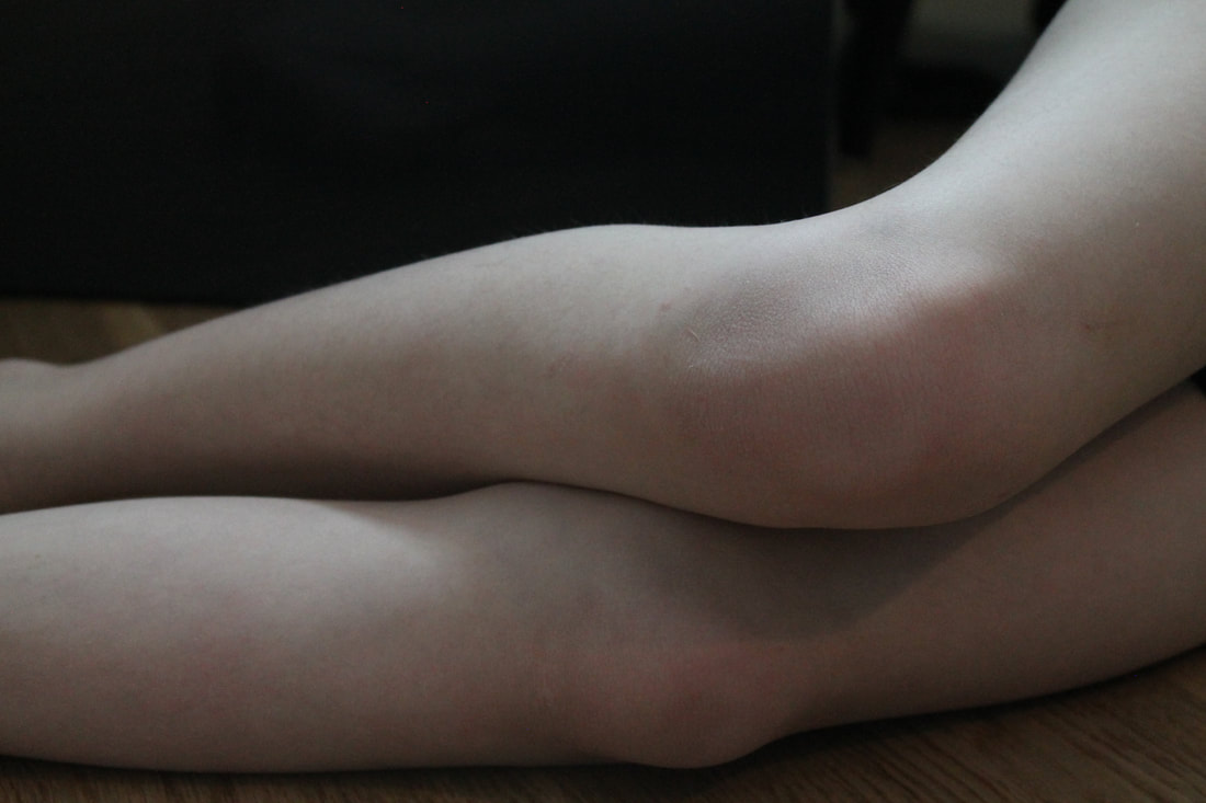
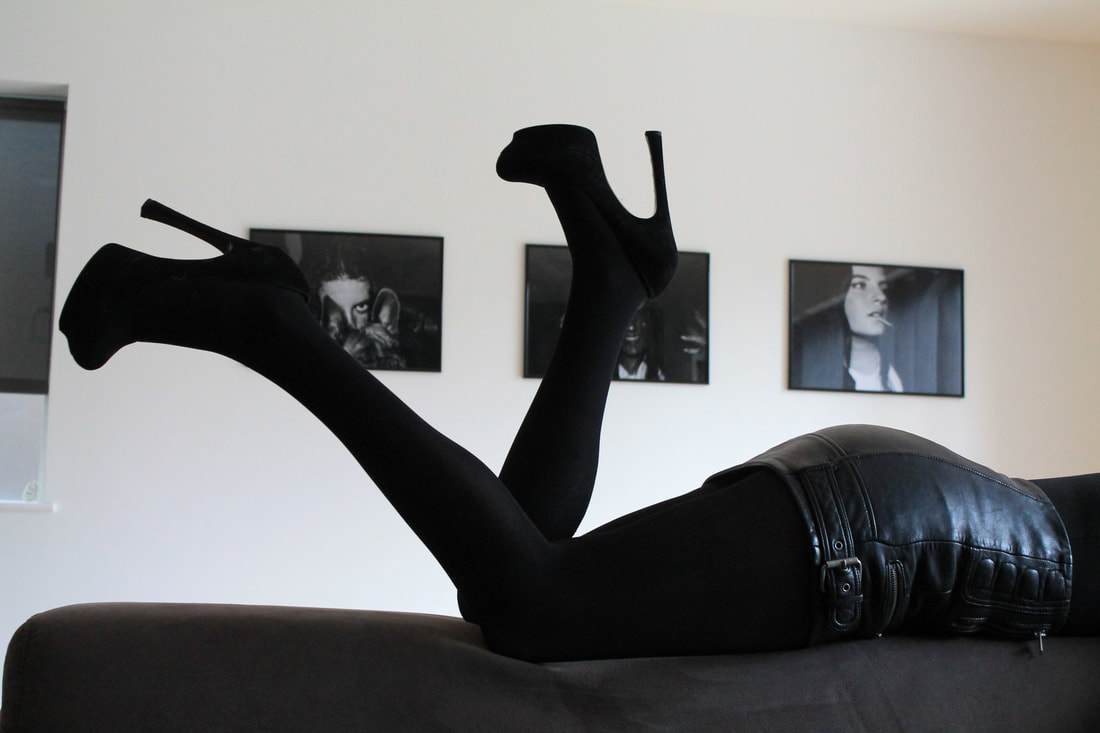
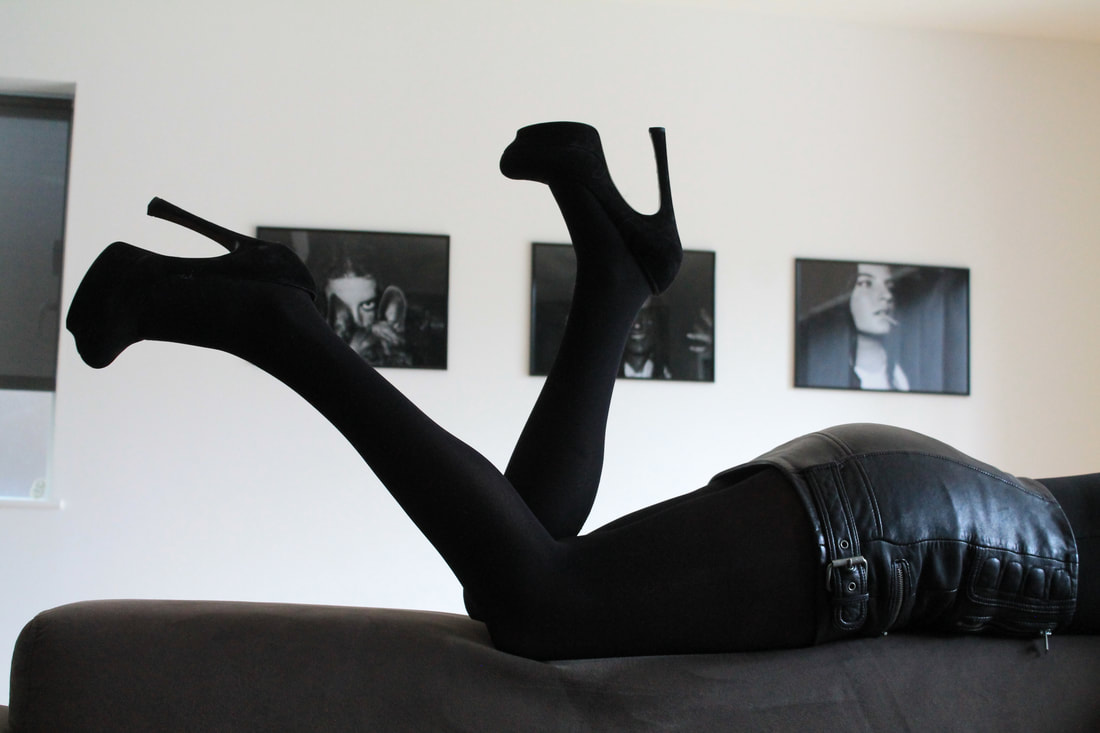
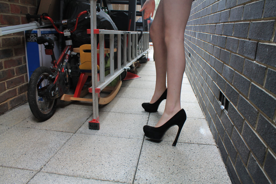
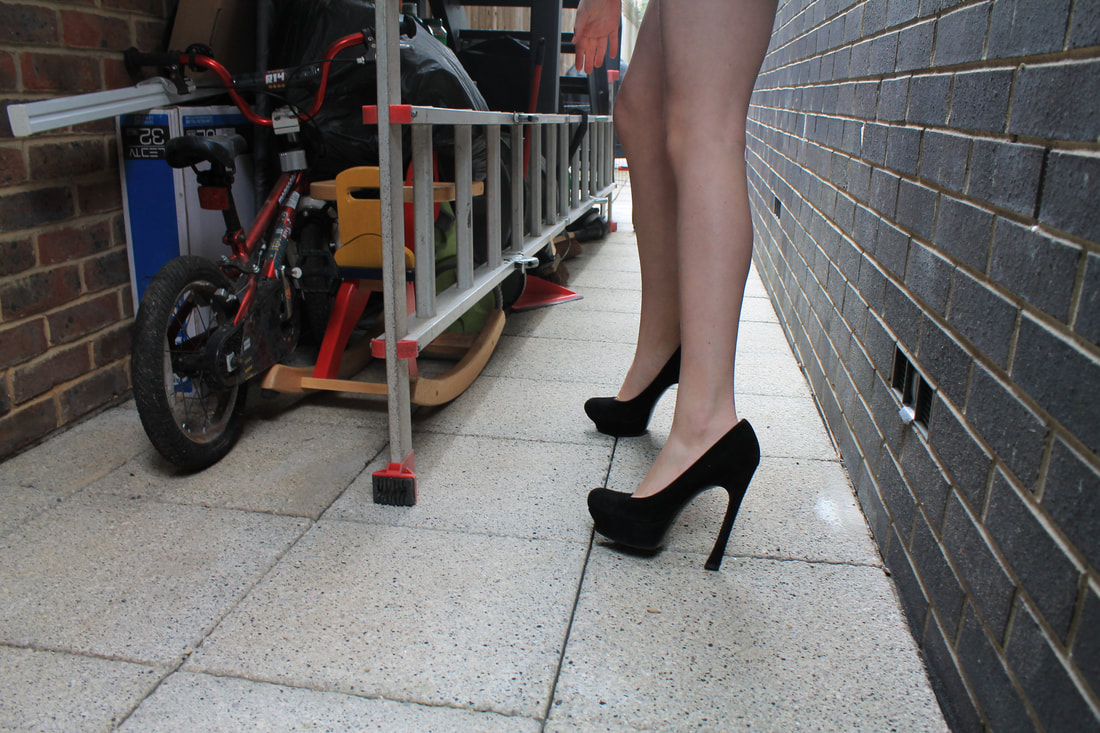
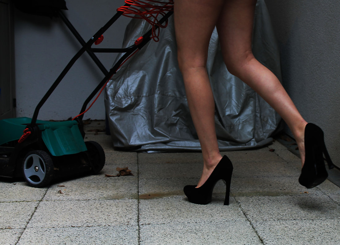
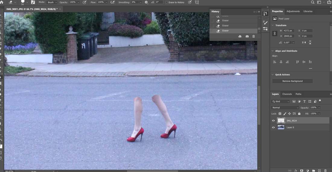
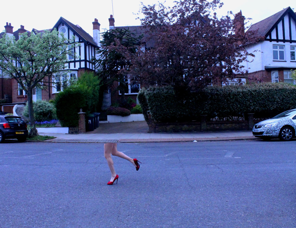
For this shoot I wanted to create images of the legs once again but this time cut the legs off from the body of the model. For this shoot I used a tripod to keep the camera still while I took the image of the background then with the model inside the had to be the same as to edit I needed the images to be the exact same to create images like the ones above.
|
|
To edit I had to layer the background image and the image of the model on top of each other. I then rubbed out the models body leaving just the legs the process is shown in the screen shot below. Then I adjusted the brightness and contrast and saturation to get the desired look.
Edits
|
|
